Difference between revisions of "Testing Article1"
| Line 1: | Line 1: | ||
| − | ==About the | + | ==About the Comment Boxes Tab== |
| − | + | This tab controls the appearance of '''Comment boxes''' and looks like this: | |
| − | <center>[[File: | + | <center>[[File:P70-21_11_1_7-70-(1)-10202020.png]]</center> |
| − | <!--<center> | + | <!--<center>P70-21_11_1_7-70-(1)-10202020.png</center>--> |
| − | + | '''Comment boxes''' are attached to '''selected '''task bars/milestone symbols in the chart and are presented using the parameters initially set in the '''Comment Boxes''' tab. | |
| − | + | The controls discussed in this article pertaining to OnePager Pro also apply to the controls for '''Comment boxes''' for OnePager Express. | |
| − | + | ==Application of Comment Box Tab Edits to the Chart== | |
| − | + | '''Comment boxes''' are created in the chart by first selecting a task bar/milestone symbol and clicking the '''Comment Box''' icon on the OnePager '''Insert''' ribbon tool bar tab shown here: | |
| − | + | <center>[[File:P70-21_11_1_7-70-(1A)-10202020.png]]</center> | |
| + | <!--<center>P70-21_11_1_7-70-(1A)-10202020.png</center>--> | ||
| − | + | Only one task bar/milestone symbol can be selected for the addition of a '''Comment box''' at a time. When you click the '''Comment Box icon''', the '''Create or edit comment box''' form is accesses as shown below: | |
| − | + | <center>[[File:P70-21_11_1_7-70-(1B)-10202020.png]]</center> | |
| + | <!--<center>P70-21_11_1_7-70-(1B)-10202020.png</center>--> | ||
| − | + | After establishing the appropriate settings in the '''Create or edit comment box''' form, click the '''OK''' button to '''create the Comment box'''. | |
| − | + | For more information on '''creating and editing comment boxes''', please see the article at: [[Creating and Managing Comment Boxes for Version 7.0 | Creating and Managing Comment Boxes]] <!--13.0.1-70--> | |
| − | <!-- | + | |
| − | + | The controls in the '''Comment Box''' tab of the '''Chart Properties''' form are '''applied to new '''Comment boxes created''' AFTER''' the '''edits''' to the form are made. If you make any '''edit''' in the '''Comment Box''' tab and click the '''OK''' button on the form, the '''NEXT Comment box created''' in the chart uses those '''edited parameters''' when '''creating''' the '''Comment box.''' If any changes are made to '''control/parameters''' in the '''Comment Box''' tab '''AFTER Comment boxes were created''' in the chart, these '''existing Comment boxes do not''' display the most recent '''edits''' made in the '''Comment Box''' tab. | |
| − | + | ==Global Editing Controls for Comment Boxes== | |
| − | === | + | ===Font Controls=== |
| − | The ''' | + | The '''Font''' dropdown provides access to the standard OnePager '''Font properties''' form that allows you to change the '''font properties''' of the '''Comment box''' text as shown below: |
| − | <center>[[File: | + | <center>[[File:P70-21_11_1_7-70-(2)-10202020.png]]</center> |
| − | <!--<center> | + | <!--<center>P70-21_11_1_7-70-(2)-10202020.png</center>--> |
| − | The ''' | + | The standard '''Font properties''' form allows you to set the '''Comment box text's''' '''font type''', '''color''' using the standard OnePager '''Color Chooser''' form, the '''font size''' in pixels, and the '''Bold -''' ''Italics'' '''- [[Underline]]''' settings. |
| − | === | + | ===Box Size Controls=== |
| − | The ''' | + | The '''Box Size''' sub-control group has two windows, shown below, that allow you to set the '''width and height''' in '''inches''' or '''centimeters''' for the dimensions of all '''Comment boxes''' depending on the '''Template Properties''' form being used. |
| − | + | <center>[[File:P70-21_11_1_7-70-(2A-1)-10202020.png]]</center> | |
| + | <!--<center>P70-21_11_1_7-70-(2A-1)-10202020.png</center>--> | ||
| − | == | + | ===Box Offset from Anchor Controls=== |
| − | + | If the '''Set Globally''' checkbox is checked '''ON''', the '''X and Y values''' appearing in the windows adjacent to the right are '''enabled''' and can be '''edited''' to establish different '''horizontal and vertical''' displacements of the '''Comment boxes''' from their '''anchor''' locations on the task bars/milestone symbols as shown here: | |
| + | <center>[[File:P70-21_11_1_7-70-(2B)-10202020.png]]</center> | ||
| + | <!--<center>P70-21_11_1_7-70-(2B)-10202020.png</center>--> | ||
| − | + | The values for '''X''' and '''Y''' are in '''inches or centimeters''' depending on the '''Template Properties''' form being used. The '''X''' value measures distance from the anchor in the horizontal direction form the anchor and the '''Y''' value measures distance from the anchor in the vertical direction. Values can be either '''positive''' or '''negative'''. If the '''Set Globally''' checkbox is checked '''OFF''', all '''Comment boxes''' created in the chart are all '''offset from their anchor point''' by the '''default values''' shown in the windows adjacent to the right as shown in the example below where the '''offsets''' are the '''default values''' of '''X=1.0''' and '''Y=1.0''': | |
| − | + | ||
| − | + | <center>[[File:P70-21_11_1_7-70-(3)-10302019.png]]</center> | |
| + | <center>P70-21_11_1_7-70-(3)-10302019.png</center> | ||
| − | + | ===Transparent, Connecting Line, and Background Color Controls=== | |
| − | + | The '''Transparent''' checkbox when used in conjunction with the '''Show connecting lines when transparent''' checkbox are used to remove the '''Comment box's''' border while leaving the '''text''' untouched. When the '''Transparent''' checkbox is checked '''ON''', the '''Show connecting lines when transparent''' checkbox is '''enabled''' with its '''default''' value of checked '''OFF''', and the '''Background color''' is '''disabled''' as shown below: | |
| − | + | ||
| − | + | <center>[[File:P70-21_11_1_7-70-(4)-10202020.png]]</center> | |
| + | <!--<center>P70-21_11_1_7-70-(4)-10202020.png</center>--> | ||
| + | The '''Transparent''' checkbox, when checked '''ON''', makes all '''Comment box''' and its '''connecting line''' subsequently '''created''' in the chart '''transparent''' as shown in the example below: | ||
| − | <center>[[File: | + | <center>[[File:P70-21_11_1_7-70-(5)-10312019.png]]</center> |
| − | + | <center>P70-21_11_1_7-70-(5)-10312019.png</center> | |
| − | + | ====Show connecting lines when transparent Checkbox==== | |
| − | + | When the '''Transparent''' checkbox is checked '''ON''' and the '''Show connecting lines when transparent''' checkbox is also checked '''ON''' the '''border''' of the '''Comment box''' is not shown but the '''connecting line''' to the '''Comment box's''' anchor point is displayed as shown here: | |
| − | + | ||
| − | + | <center>[[File:P70-21_11_1_7-70-(6)-10312019.png]]</center> | |
| + | <center>P70-21_11_1_7-70-(6)-10312019.png</center> | ||
| − | + | ====Background Color==== | |
| − | + | The '''Background Color''' dropdown provides access to the OnePager standard '''Color Chooser'''. The selected '''color''' fills the '''Comment box''', however, the '''connecting line''' and the '''border color''' of the '''comment box''' remain the same '''color''' as the '''selected''' task bar/milestone symbol as shown in the example below: | |
| − | + | ||
| − | + | <center>[[File:P70-21_11_1_7-70-(7)-10202020.png]]</center> | |
| + | <!--<center>P70-21_11_1_7-70-(7)-10202020.png</center>--> | ||
| − | + | The '''default Background color''' starts out always the same as the '''fill color''' of the task bar/milestone symbol to which the '''Comment box''' is anchored. The '''Background color''' is '''disabled''' when the '''Transparent''' checkbox is checked '''ON''' as discussed above. | |
| − | + | ||
| − | === | + | ===Anchor Position Slider Bar Control=== |
| − | The ''' | + | 16) The '''Anchor Position slider bar''' sets the location along the task bar at which '''Comment boxes''' are '''anchored''' as illustrated below: |
| − | <center>[[File: | + | <center>[[File:P70-21_11_1_7-70-(7A)-10202020.png]]</center> |
| − | <!--<center> | + | <!--<center>P70-21_11_1_7-70-(7A)-10202020.png</center>--> |
| − | + | 17) The '''value''' of the '''position''' is a '''percentage of the duration''' of the task bar as measured from its '''Start date'''. | |
| − | + | 18) Below is an example of a '''Comment box positioned''' at the 25% '''position''' on the '''selected''' task bar: | |
| − | [[ | + | <center>[[File:P70-21_11_1_7-70-(8)-10312019.png]]</center> |
| + | <center>P70-21_11_1_7-70-(8)-10312019.png</center> | ||
| − | ( | + | ===Anchor Shape Selection Control=== |
| + | |||
| + | The '''Anchor marker''' control consists of two (2) controls as shown below: | ||
| + | |||
| + | <center>[[File:P70-21_11_1_7-70-(9)-10202020.png]]</center> | ||
| + | <!--<center>P70-21_11_1_7-70-(9)-10202020.png</center>--> | ||
| + | |||
| + | The '''None''' checkbox, when checked '''ON''', '''disables''' the showing of any '''Anchor marker''' associated with all '''Comment boxes''' in the '''graph'''. With the '''None''' checkbox checked '''OFF''', the '''Anchor marker''' dropdown list is '''enabled''' and you can use this dropdown list to select an appropriate '''Anchor marker''' for all '''anchor points''' for '''Comment boxes''' in the chart. The list of '''Anchor markers''' are the same as the list of Milestone symbols available for use and found at the '''Milestones''' tab of the '''Template Properties''' and '''Chart Properties''' forms. | ||
| + | |||
| + | ===Anchor Color Control=== | ||
| + | |||
| + | The '''Anchor Color''' dropdown provides access to the standard OnePager '''Color Chooser''' that you can use to establish the '''color''' of the '''Anchor marker''' as shown here: | ||
| + | |||
| + | <center>[[File:P70-21_11_1_7-70-(10)-10202020.png]]</center> | ||
| + | <!--<center>P70-21_11_1_7-70-(10)-10202020.png</center>--> | ||
| + | |||
| + | As an example, selecting the '''color green''' for the '''Anchor marker color''' produces a '''Comment box''' with an '''Anchor marker''' that looks like this: | ||
| + | |||
| + | <center>[[File:P70-21_11_1_7-70-(11)-10312019.png]]</center> | ||
| + | <center>P70-21_11_1_7-70-(11)-10312019.png</center> | ||
| + | |||
| + | ===Attach To All Snapshots Checkbox=== | ||
| + | |||
| + | The '''Attach to All Snapshots''' checkbox, shown below, when checked '''ON''' assures that all '''Comment box''' appears in '''all snapshots'''. | ||
| + | |||
| + | <center>[[File:P70-21_11_1_7-70-(12)-10202020.png]]</center> | ||
| + | <!--<center>P70-21_11_1_7-70-(12)-10202020.png</center>--> | ||
| + | |||
| + | The '''default''' setting is to attach a new '''Comment boxes''' to all '''snapshots'''. | ||
| + | |||
| + | ==Related Link== | ||
| + | |||
| + | [[Creating and Managing Comment Boxes for Version 7.0 | Creating and Managing Comment Boxes]] <!--13.0.1-70--> | ||
| + | |||
| + | [[Creating and Managing Free Boxes for Version 7.0 | Creating and Managing Free Boxes]] <!--14.0.1-70--> | ||
| + | |||
| + | (21.11.1-70) | ||
[[Category:Version 7.0]] | [[Category:Version 7.0]] | ||
[[Category:Editing the Chart]] | [[Category:Editing the Chart]] | ||
| − | |||
[[Category:Task/Milestone Editing]] | [[Category:Task/Milestone Editing]] | ||
[[Category:Task/Milestone Decorations]] | [[Category:Task/Milestone Decorations]] | ||
| − | [[Category: | + | [[Category:Comment Boxes]] |
| − | + | ||
| − | + | ||
| − | + | ||
| − | + | ||
[[Category:Ribbon]] | [[Category:Ribbon]] | ||
[[Category:Snapshots]] | [[Category:Snapshots]] | ||
| Line 112: | Line 148: | ||
[[Category:Templates]] | [[Category:Templates]] | ||
[[Category:Chart Properties Form]] | [[Category:Chart Properties Form]] | ||
| + | [[Category:OnePager Pro]] | ||
[[Category:OnePager Express]] | [[Category:OnePager Express]] | ||
Revision as of 16:15, 20 January 2021
Contents
- 1 About the Comment Boxes Tab
- 2 Application of Comment Box Tab Edits to the Chart
- 3 Global Editing Controls for Comment Boxes
- 4 Related Link
About the Comment Boxes Tab
This tab controls the appearance of Comment boxes and looks like this:
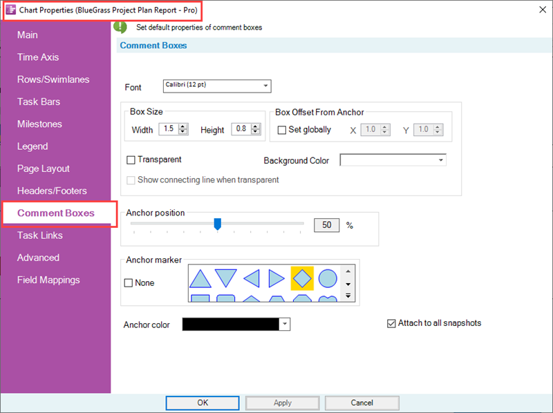
Comment boxes are attached to selected task bars/milestone symbols in the chart and are presented using the parameters initially set in the Comment Boxes tab.
The controls discussed in this article pertaining to OnePager Pro also apply to the controls for Comment boxes for OnePager Express.
Application of Comment Box Tab Edits to the Chart
Comment boxes are created in the chart by first selecting a task bar/milestone symbol and clicking the Comment Box icon on the OnePager Insert ribbon tool bar tab shown here:

Only one task bar/milestone symbol can be selected for the addition of a Comment box at a time. When you click the Comment Box icon, the Create or edit comment box form is accesses as shown below:
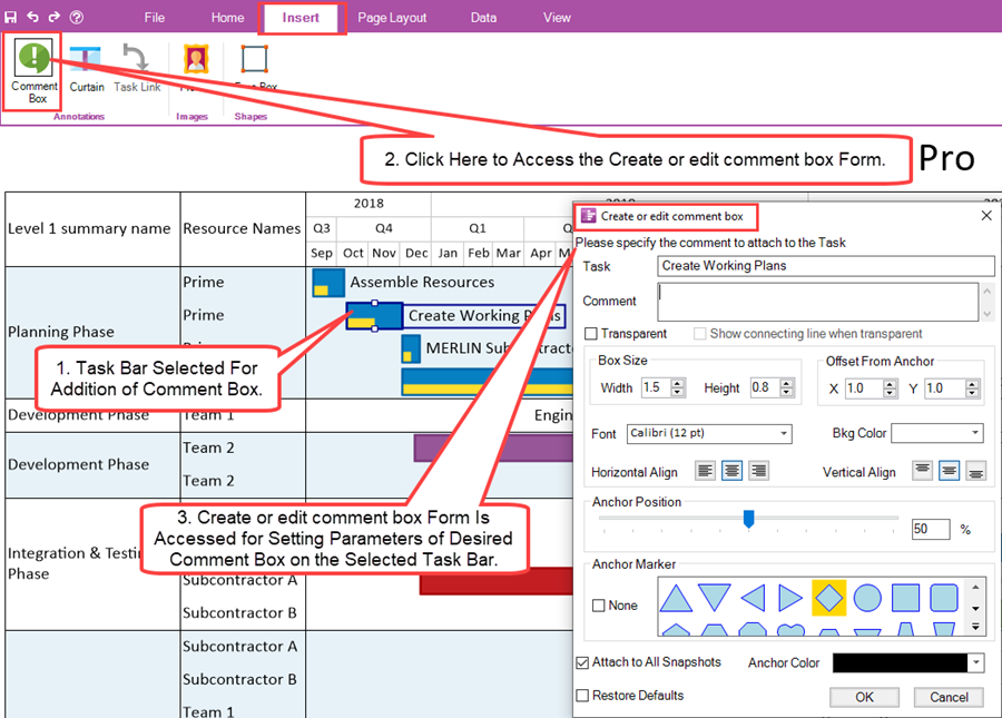
After establishing the appropriate settings in the Create or edit comment box form, click the OK button to create the Comment box.
For more information on creating and editing comment boxes, please see the article at: Creating and Managing Comment Boxes
The controls in the Comment Box tab of the Chart Properties form are applied to new Comment boxes created AFTER the edits to the form are made. If you make any edit in the Comment Box tab and click the OK button on the form, the NEXT Comment box created in the chart uses those edited parameters when creating the Comment box. If any changes are made to control/parameters in the Comment Box tab AFTER Comment boxes were created in the chart, these existing Comment boxes do not display the most recent edits made in the Comment Box tab.
Global Editing Controls for Comment Boxes
Font Controls
The Font dropdown provides access to the standard OnePager Font properties form that allows you to change the font properties of the Comment box text as shown below:
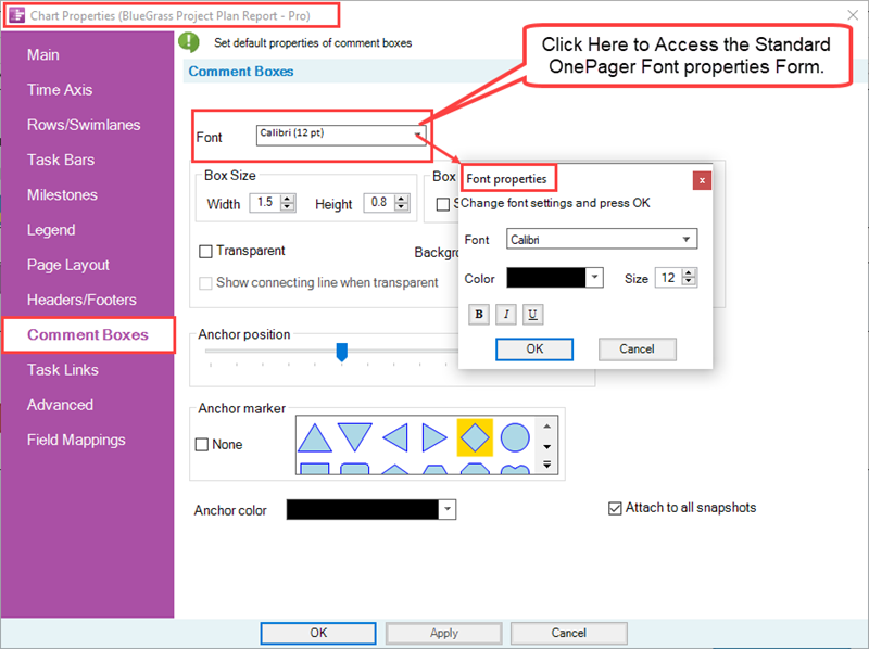
The standard Font properties form allows you to set the Comment box text's font type, color using the standard OnePager Color Chooser form, the font size in pixels, and the Bold - Italics - Underline settings.
Box Size Controls
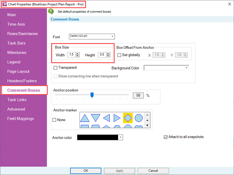
The Box Size sub-control group has two windows, shown below, that allow you to set the width and height in inches or centimeters for the dimensions of all Comment boxes depending on the Template Properties form being used.
Box Offset from Anchor Controls
If the Set Globally checkbox is checked ON, the X and Y values appearing in the windows adjacent to the right are enabled and can be edited to establish different horizontal and vertical displacements of the Comment boxes from their anchor locations on the task bars/milestone symbols as shown here:
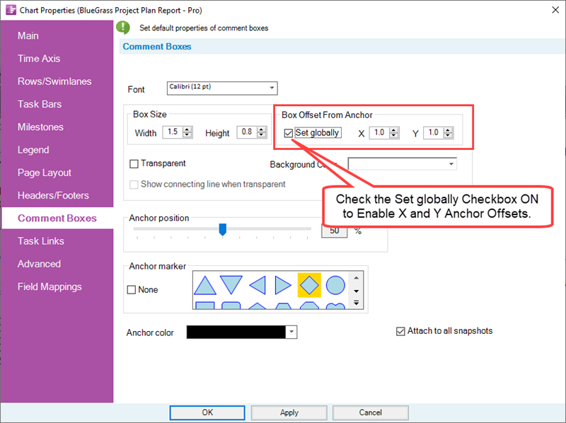
The values for X and Y are in inches or centimeters depending on the Template Properties form being used. The X value measures distance from the anchor in the horizontal direction form the anchor and the Y value measures distance from the anchor in the vertical direction. Values can be either positive or negative. If the Set Globally checkbox is checked OFF, all Comment boxes created in the chart are all offset from their anchor point by the default values shown in the windows adjacent to the right as shown in the example below where the offsets are the default values of X=1.0 and Y=1.0:

Transparent, Connecting Line, and Background Color Controls
The Transparent checkbox when used in conjunction with the Show connecting lines when transparent checkbox are used to remove the Comment box's border while leaving the text untouched. When the Transparent checkbox is checked ON, the Show connecting lines when transparent checkbox is enabled with its default value of checked OFF, and the Background color is disabled as shown below:
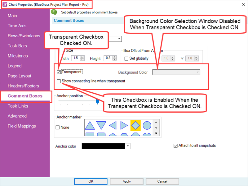
The Transparent checkbox, when checked ON, makes all Comment box and its connecting line subsequently created in the chart transparent as shown in the example below:

Show connecting lines when transparent Checkbox
When the Transparent checkbox is checked ON and the Show connecting lines when transparent checkbox is also checked ON the border of the Comment box is not shown but the connecting line to the Comment box's anchor point is displayed as shown here:

Background Color
The Background Color dropdown provides access to the OnePager standard Color Chooser. The selected color fills the Comment box, however, the connecting line and the border color of the comment box remain the same color as the selected task bar/milestone symbol as shown in the example below:
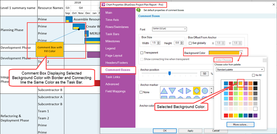
The default Background color starts out always the same as the fill color of the task bar/milestone symbol to which the Comment box is anchored. The Background color is disabled when the Transparent checkbox is checked ON as discussed above.
Anchor Position Slider Bar Control
16) The Anchor Position slider bar sets the location along the task bar at which Comment boxes are anchored as illustrated below:
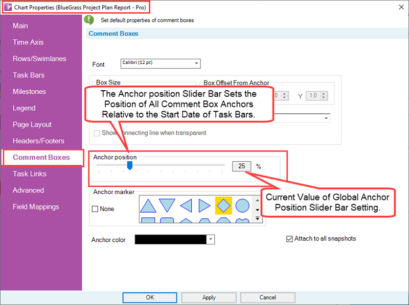
17) The value of the position is a percentage of the duration of the task bar as measured from its Start date.
18) Below is an example of a Comment box positioned at the 25% position on the selected task bar:

Anchor Shape Selection Control
The Anchor marker control consists of two (2) controls as shown below:
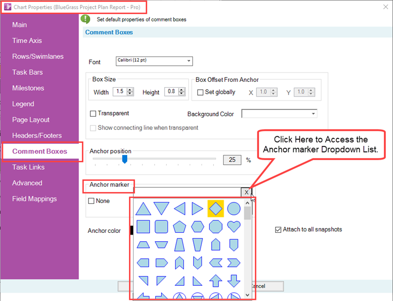
The None checkbox, when checked ON, disables the showing of any Anchor marker associated with all Comment boxes in the graph. With the None checkbox checked OFF, the Anchor marker dropdown list is enabled and you can use this dropdown list to select an appropriate Anchor marker for all anchor points for Comment boxes in the chart. The list of Anchor markers are the same as the list of Milestone symbols available for use and found at the Milestones tab of the Template Properties and Chart Properties forms.
Anchor Color Control
The Anchor Color dropdown provides access to the standard OnePager Color Chooser that you can use to establish the color of the Anchor marker as shown here:
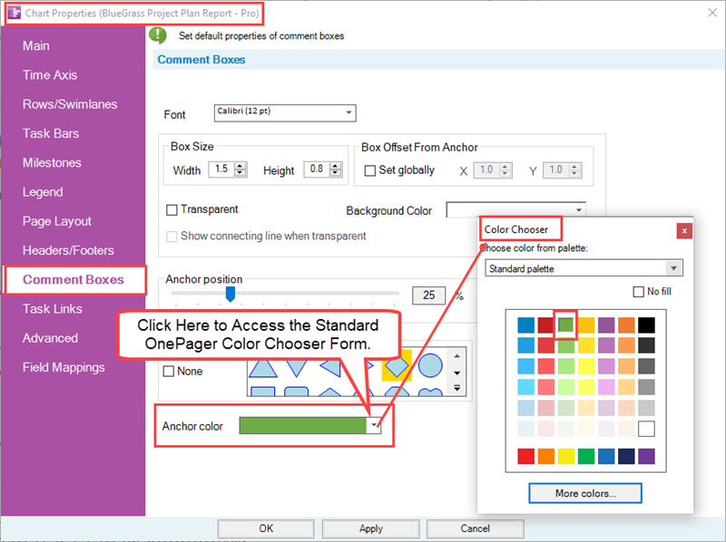
As an example, selecting the color green for the Anchor marker color produces a Comment box with an Anchor marker that looks like this:

Attach To All Snapshots Checkbox
The Attach to All Snapshots checkbox, shown below, when checked ON assures that all Comment box appears in all snapshots.
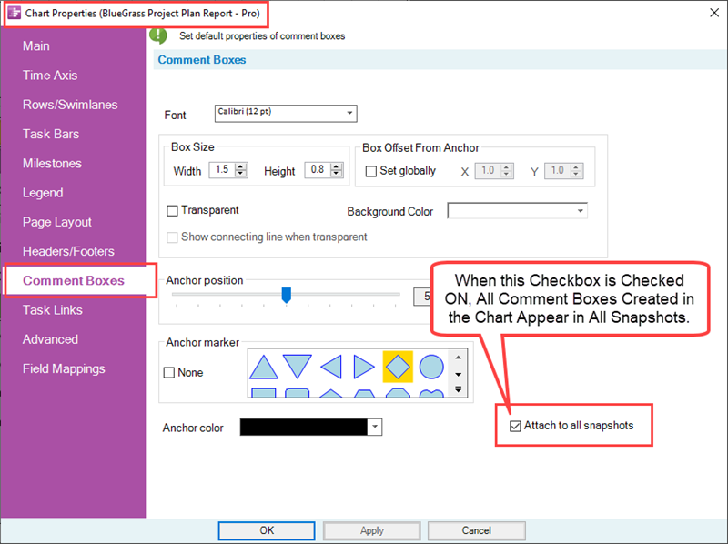
The default setting is to attach a new Comment boxes to all snapshots.
Related Link
Creating and Managing Comment Boxes
Creating and Managing Free Boxes
(21.11.1-70)