Task Bars Tab for Version 7.0 (OnePager Pro)
Contents
About the Task Bars Tab for OnePager Pro
1) This tab page, shown below, lets you control the style and decoration of task bars.
2) Additionally, within this tab are the controls for creating and managing conditional formatting rules.
Default Task Bar Styles
Default Task Bar Styles
3) Collected in this sub-control group are all the controls associated with defining or changing the properties of task bars properties.
4) These controls include:
Shape
5) The dropdown menu shows the eight (8) varieties of task bar shapes available for use as shown here:
Fill
6) This dropdown menu shows the five (5) available task bar fill patterns or texture options as shown below:
Task Bar Height
7) These two radio buttons and their associated value windows allow you to set the task bar height as an absolute quantity (inches or centimeters) or as a percentage of the row height, which is shown in parentheses for reference as shown here:
8) The values shown in the illustration above are the default settings established in most OnePager distributed Template forms.
Border Controls
9) In the upper right corner of the form, there are three controls that allow you change (1) the color of task bar border, (2) the width of the border and (3) the border’s style as shown below with the Border Color dropdown clicked to access the standard Color Chooser form:
10) Further, you have the capability to establish the border color to be the same as the task bar fill color which effectively makes the task bar border disappear.
11) Clicking the dropdown button on the Border Color control accesses the standard Color Chooser form as shown in the above illustration.
12) The Border Width control allows you to set the value window for the width of the task bar's border in inches or centimeters depending on the Template form being used.
13) There are five (5) Border Styles to select from with the default style set at Solid as shown below:
Task Bar/Milestone Fill Color
14) The Task Bar/Milestone Fill Color sub-control group provides two options for assigning initial colors to task bars and is shown below:
15) You can specify a single color for all task bars via the standard Color Chooser form when the Use on color: radio button is is checked On.
16) More commonly, clicking the Color-code based on radio button allows you to select a field from your Microsoft Project source plan to assign a data driven color to each task.
17) The data driven color assignment is sometimes referred to as round-robin color.
- a) OnePager goes in sequence through the color palette and assigns a new color when it finds a new distinct value in the data.
- b) If it finds more distinct values than there are colors in the palette, it starts over at the beginning of the palette and uses each color for a second data value, and so on.
18) Also note that the Color-code based on selects a single data field that applies to both task bars and milestones as shown here:
19) This is one of the few places where task bars and milestone symbols are constrained to have the same default behavior.
Mirror format settings between task bars and milestones
20) This single checkbox sub-control is used so that you have the option to simply apply any property edits you make to task bars to milestone symbols without having to go to the Milestones tab of the Chart Properties form.
21) When this checkbox is checked On, OnePager automatically makes any changes to Milestones properties that are made to Task Bar properties for all settings where a blue dot appears to the right of the setting as in the illustration below where the checkbox is checked On:
Task Bar Decorations Control Group
22) There are seven (7) decorations for Task bars.
23) Each can be turned On by checking the associated checkbox to the left of the control's label as shown here:
24) Each of these decoration’s controls can be accessed by clicking the adjacent button as shown in the illustration above.
25) When any of the seven(7) decoration buttons are clicked, OnePager accesses a form with specific controls to manage the decorations for that decoration type.
26) What follows is a description of each of the specific control forms associated with each of the seven (7) decoration types:
Task Bar Label Properties...
27) Clicking this button accesses the Set Label Properties form shown below wherein the source plan field name for the task bar, task bar label font properties, label positions, and label text collision avoidance controls can be set as shown here:
Task Bar Name Field Selection
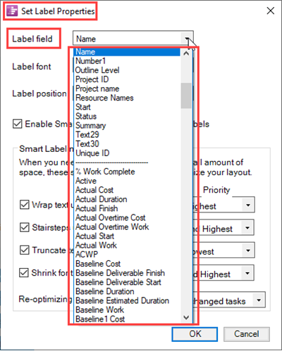
28) The Set Label Properties form's Label field dropdown as shown below allows you to access the full list of source plan field names imported by OnePager and select from the dropdown the field name OnePager uses to provide a visible task label into the chart for each visible task/milestone shape:
Task Bar Label Font Properties
29) Clicking the Label font dropdown button accesses the standard Font properties form as shown below:
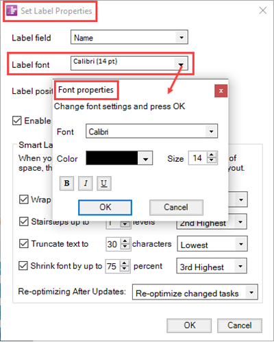
30) The standard Font properties form allows you to set the Label text's font type, color using the standard Color Chooser form, the font size in pixels, and the Bold - Italics - Underline settings.
=Task Bar Label Position
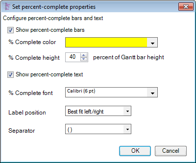
- b) %Complete Properties…. Clicking this button displays the Set percent-complete properties form shown below which controls the display characteristics of the %Complete representation.
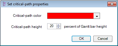
- c) Critical Path Properties. This button, when clicked, displays the Set critical-path properties form shown below which allows you to control the color and height, with respect to the height of the Gantt bar, of the critical path representation.
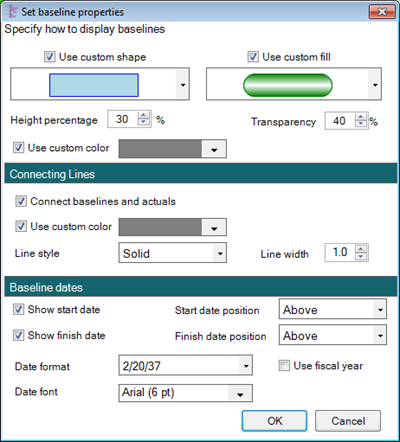
- d) Baseline Properties. Clicking this button displays the Set baseline properties form shown below which controls the shape, fill, and color of baseline bars, the connecting line properties, and how the baseline dates are displayed.
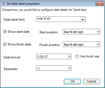
- e) Date Label Properties…. This button, when clicked, displays the Set date label properties form shown below which allows you to control the properties of the date label. You can control the date label’s font properties, the position and display of the start and finish date, the format of the date label, and how to separate the date from the task bar’s label text.
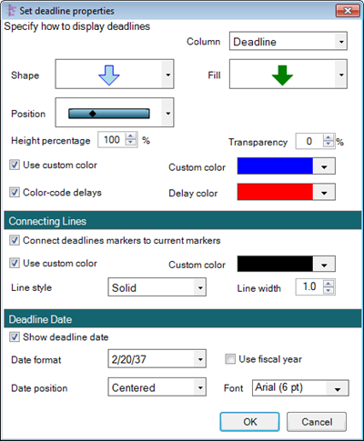
- f) Deadline Properties…. Clicking this button displays the Set deadline properties form shown below which controls for the shape, fill, and position of the deadline controls. It also lets you set a special color to denote deadlines that have not been met. Additionally, as with the Baseline Properties form described above, the Set deadline properties form controls connecting lines for deadlines and the properties of deadline date display.
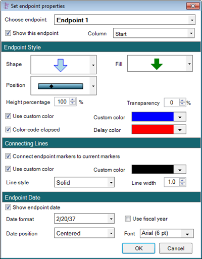
- g) Endpoint Properties…. Clicking this button displays the Set endpoint properties form shown below which controls all properties for up to four endpoints. Each endpoint can display the date imported from any date field from Microsoft Project. These properties are controlled essentially the same way as described above for Deadline Properties form, above.
Conditional Formatting
1) Conditional Formatting. This group on the Task Bar tab has one button, the Manage Rules… button.
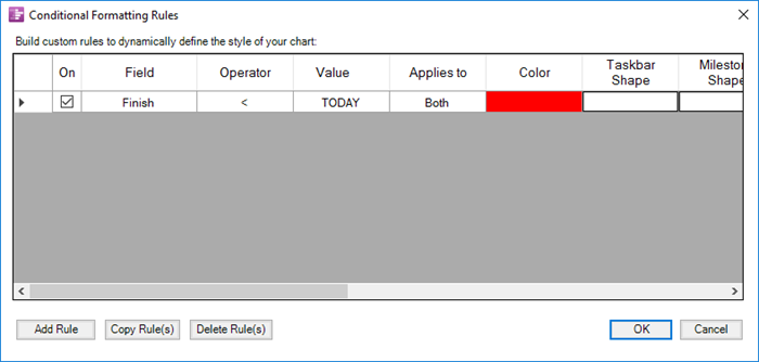
- a) Clicking this button displays the Conditional Formatting Rules form shown below which permits you to define, change, delete, and copy rules governing the display of task bars based on data imported from your Microsoft Project source plan.
- b) There are two ways to get to the same Conditional Formatting Rules form:
- (1) via the Task Bar tab or
- (2) via the Milestones tab.
2) Complete details on how to use conditional formatting can be found at Conditional Formatting (Portal). 11.0.1-70
Related Links
Labeling Task/Milestone Dates for OnePager Pro 10.1.1-70
Percent complete for OnePager Pro 10.3.1-70
Baselines for OnePager Pro 10.5.1-70
Critical path for OnePager Pro 10.7.1-70
Deadlines for OnePager Pro 10.9.1-70
Endpoints for OnePager Pro 10.11.1-70
Order of Tasks/Milestones Decorations 10.13.1-70
(21.3.1-70)