Templates versus Charts for Version 7.0
Overview
Charts and Templates both let you customize your work and save time making new graphs or updating existing ones.
Charts and Templates have some similar looking forms, so it is important to understand how they differ and what roles they play.
Templates
A Template is a framework from which you create new charts.
It contains no imported tasks or milestones and it is never displayed on the screen as graphics. It is just a convenient way of standardizing the parameters for creating new charts.
The Template establishes default settings for color assignments, row and swimlane assignments, font properties, time axis choices, headers, footers, task links, and comment boxes.
It also tells OnePager which fields to import from a Microsoft Project or a Microsoft Excel source plans when a new chart is created.
Once you have created a chart using a Template, the chart becomes independent of the Template. You can change the Template and it has no further effect on the chart.
Chart
The chart is the graphical representation of the data imported from your Microsoft Project or Microsoft Excel source plan under the control of the the current Template.
The chart can be manually edited on the screen which is called the Chart Editor. See the article at this link: Manual versus Data-Driven Editing (Portal) 9.0.1-70 for additional information.
You can also use the Chart Properties form accessed from the Home tab to make edits and changes to the chart which override the settings in the Template. These Chart Properties form changes do not change the settings in the current Template.
Finally, you can convert a chart and its property settings into a Template for future use and save it under a file name of your selection.
The Chart Versus Template Relationship
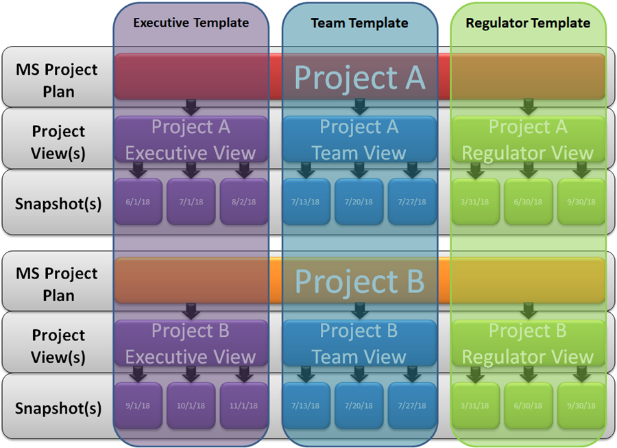
Given the explanations provided above for charts and Templates, we can visualize the relationship between the two and include the relationship between charts and snapshots as well. The figure below shows this relationship:

The vertical columns overlaying Project A and B represent the control that the three Templates have over the look and feel of the charts and snapshots created for each of the three audience groups - Executives, the project Team, and Regulators. Each Template can create different charts that are tailored to the needs of each audience when it comes to telling a part of the schedule story.
Templates can be applied to many different projects as show above and can be tailored with different settings as required.
The charts and their snapshots respond to the settings in their respective Template by displaying tasks/milestones, decorations, adornments, and other chart features in accordance with Template settings.
For more information on Templates, please see the articles in this series: Managing Templates (Portal). 24.0.1-70
For more information on the management of charts, please see the articles at: Managing Chart Data (Portal). 23.0.1-70
(4.0.1.3-70)