|
|
| (564 intermediate revisions by 2 users not shown) |
| Line 1: |
Line 1: |
| − | ==About Managing the Legend== | + | ==Introduction== |
| | | | |
| − | The capability to use the '''color dimension''' in the chart to reflect differences between task bar/milestone symbols is one of the most significant features of OnePager. The '''Legend''' is the displayed component that '''communicates''' the '''meaning''' of each '''color''' and '''shape''' to your audience with respect to task bars and milestone symbols in the chart. Accordingly, OnePager provides you total control over the '''color dimension''' in your OnePager charts and snapshots through a control structure that begins when the chart is first '''created''' and throughout your project as needs change. The "Legend''' can be '''shown''' or '''hidden''' in the chart as your needs dictate, but a certain amount of thought about the '''color dimension''' is recommended before '''creating''' your first chart from your Microsoft Project or Excel '''source plan'''.
| + | This article is focused on using the ''' Column Splitting''' feature with OnePager Bundle '''Standalone''' and '''imported''' Asana '''source plans'''. |
| | | | |
| − | If you are already knowledgeable about this subject, you may prefer to skip the next section and continue on at this section: [[Managing the Legend in the Chart for Version 7.0#Showing and Hiding the Legend | Showing and Hiding the Legend]] <!--15.1.1-70-->
| + | ==About Splitting and Parsing Fields== |
| | | | |
| − | ===A Discussion On Setting the Color Dimension===
| + | The OnePager '''column splitting''' feature allows you to '''duplicate task bars''' when a task in your Asana '''source plan''' is assigned to '''multiple resources''' (or anything else). Because assignments from Asana often are '''comma-delimited''', this feature enables OnePager to '''parse the comma-delimited list''' and '''create a unique task bar''' for each instance in the '''comma-separated''' list. |
| | | | |
| − | When you are first '''creating''' a chart, your first opportunity to address the '''color dimension''' is when you select the Microsoft Project or Excel '''field''' that is to be used to create task bar/milestone symbol '''colors''' in the chart.
| + | ===Split Resource Names Example=== |
| | | | |
| − | ===OnePager Choices Form - Page 2===
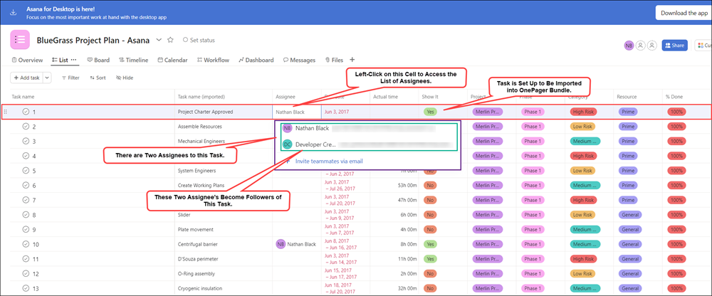
| + | Say you want to use '''color-codes''' on task bars/milestone symbols based upon your Asana '''source plan’s Assigned to''' column as shown below: |
| | | | |
| − | This first opportunity is presented in the '''OnePager choices''' ('''OPC''') form's second page as shown below:
| + | <center>[[File:P72-24_5_3-72-(1)-11022023.png]]</center> |
| | + | <center>P72-24_5_3-72-(1)-11022023.png</center> |
| | | | |
| − | <center>[[File:P70-15_1_1-70-(1)-10092019.png]]</center>
| + | Some of the entries in the '''Assigned to''' column consist of multiple, '''comma-separated''' items and some tasks only used one '''resource'''. Without the '''column splitting''' feature, a chart '''created''' from these data and assigned task bar/milestone symbol '''colors''' based upon the '''Assigned to''' column looks like this: |
| − | <!--<center>P70-15_1_1-70-(1)-10092019.png</center>-->
| + | |
| | | | |
| − | The '''Color by''' dropdown contains a list of all '''source plan''' fields that OnePager encountered in its initial '''import''' of your '''source plan's''' data. As a short aside, the '''Conditional Import Filters''' feature should be a considered factor as well.
| + | <center>[[File:P72-24_5_3-72-(5)-11272023.png]]</center> |
| | + | <center>P72-24_5_3-72-(5)-11272023.png</center> |
| | | | |
| − | For more information about '''Conditional Import Filters''', please see the article at: [[Conditional Import for Version 7.0 (Portal) | Conditional Import Filters (Portal)]] <!--7.18.1-70-->
| + | OnePager, in this case, treats the '''entire string''' as an individual '''Assigned to''' value. To provide more flexibility in displaying task bars that have '''multiple resources''' assigned, OnePager supports the concept of a '''column splitting'''. This feature recognizes '''comma-separated''' values in a '''designated column''' and '''creates a separate task bar''' for each of the '''comma-separated''' values. |
| | | | |
| − | ===Template Properties Form's Task Bars Tab=== | + | ===Enabling Splitting=== |
| | | | |
| − | The initial selection of '''Resource Names''' in the illustration above is taken from the current '''Template Properties''' form's '''Task Bars''' or '''Milestone''' tab's '''Task Bars/Milestone Fill Color''' control group being used in the process to '''create''' the chart as shown here:
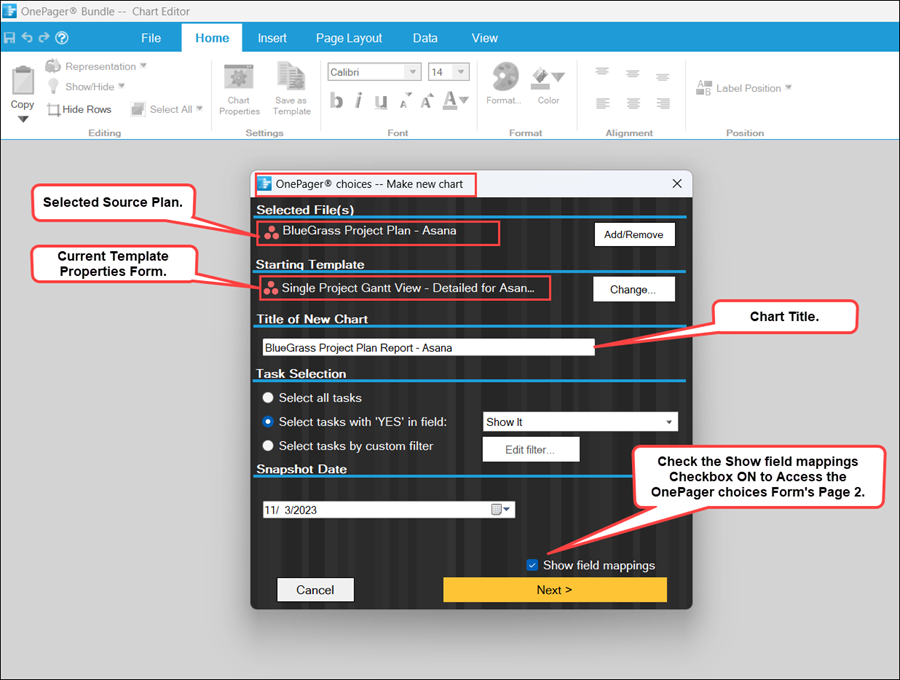
| + | To use this feature requires turning '''ON''' the feature in the Asana '''Template Properties''' form you intend to use to make the chart. The setting must be turned '''ON''' before the chart is created so launch OnePager Bundle from the '''desktop icon''', click the '''NEW''' button on the '''OnePager Bundle Start''' form to access the '''OnePager choices''' form, '''select''' your Asana '''source plan''', and type in the chart's '''title''' as shown here: |
| | | | |
| − | <center>[[File:P70-15_1_1-70-(2-2)-09152020.png]]</center> | + | <center>[[File:P72-24_5_3-72-(2A)-11022023.png]]</center> |
| − | <!--<center>P70-15_1_1-70-(2-2)-09152020.png</center>-->
| + | <center>P72-24_5_3-72-(2A)-11022023.png</center> |
| | | | |
| − | Shown in the above illustration, the '''Color-code based on''' radio button is selected and the Microsoft Project or Excel field name of '''Resource Names''' is selected from the dropdown list.
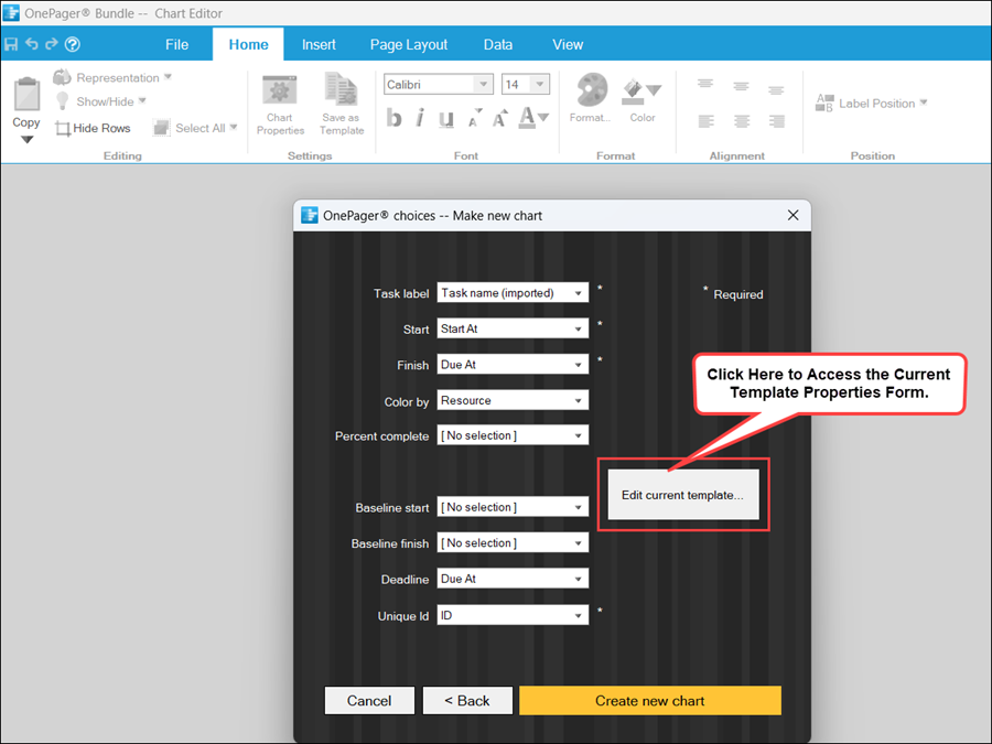
| + | When you click the '''Next>''' button at the bottom of the form, OnePager accesses the second page of the '''OnePager choices''' form shown below: |
| | | | |
| − | For '''Template Properties''' forms distributed for OnePager Pro, the '''Color-code based on''' '''field''' is preset to '''Resource Names''' since every Microsoft Project '''source plan''' contains this field. For '''Template Properties''' form's distributed for OnePager Express, the '''Color-code based on''' '''field''' is filled by OnePager Express based on an examination of the Microsoft Excel row 1 contents in the '''source plan''' and an educated guess on a suitable field to use. You can always change this '''field''' upon creation of the OnePager Express chart when you encounter page 2 of the '''OPC''' form.
| + | <center>[[File:P72-24_5_3-72-(2AA)-11022023.png]]</center> |
| | + | <center>P72-24_5_3-72-(2AA)-11022023.png</center> |
| | | | |
| − | Selecting another Microsoft Project or Excel '''field''' for the '''Color-code based on''' window in the '''Template Properties''' form also changes the value in the '''Color by''' dropdown list '''field''' selected in the second page of the '''OnePager choices''' ('''OPC''') form also shown above. Regardless of whether the '''Template Properties''' form is '''updated''' as described above or you continue to use the original '''Color-code based on''' value for the '''color dimension''' in the chart, clicking the '''Create New Chart''' button at the bottom of the second page of the '''OPC''' form produces the first chart in the '''Chart Editor''' using the selected Microsoft Project or Excel '''field''' to drive the '''color''' selection. As a convenience, OnePager, when '''creating''' the first chart, uses a '''round-robin color assignment''' scheme to assign specific '''colors''' to task bar/milestone symbols based on their corresponding value found for the '''Color-code based on''' '''field'''. That is, all task bar/milestone symbols in the chart with the same value for '''Resource Names''' in this case display the '''same color'''.
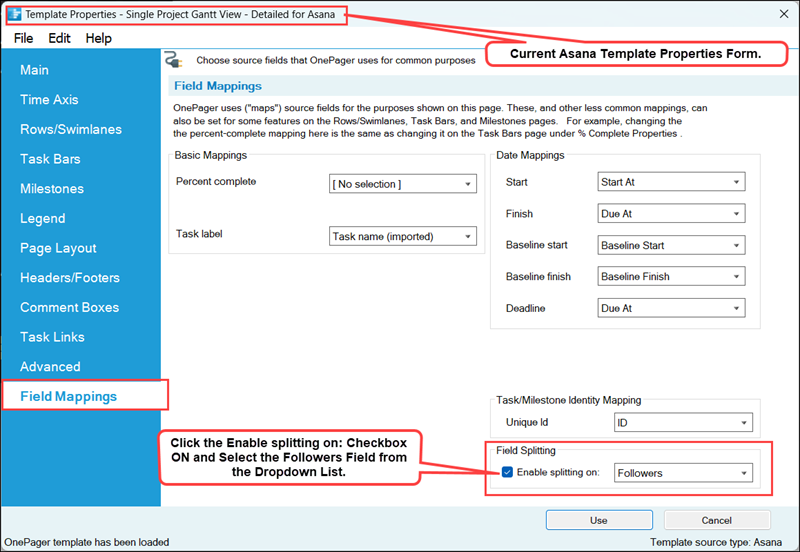
| + | Clicking the '''Edit current template''' button accesses the current '''Template Properties''' form. Navigate to the '''Field Mappings''' tab on the form, check the '''Enable splitting on:''' checkbox to '''ON''' and (in this example) select the '''Assigned To''' column from the dropdown list provided. The results are shown here: |
| | | | |
| − | ==Example Chart==
| + | <center>[[File:P72-24_5_3-72-(2AAA)-11022023.png]]</center> |
| | + | <center>P72-24_5_3-72-(2AAA)-11022023.png</center> |
| | | | |
| − | A typical chart is shown below where the '''Color-code based on''' value is '''Resource Names''' and the '''round-robin color assignment''' scheme is used:
| + | Click the '''Save and use''' button to complete the process and close the current '''Template Properties''' form returning you to the second page of the '''OnePager choices''' form show above. |
| | | | |
| − | <center>[[File:P70-15_1_1-70-(3)-10092019.png]]</center>
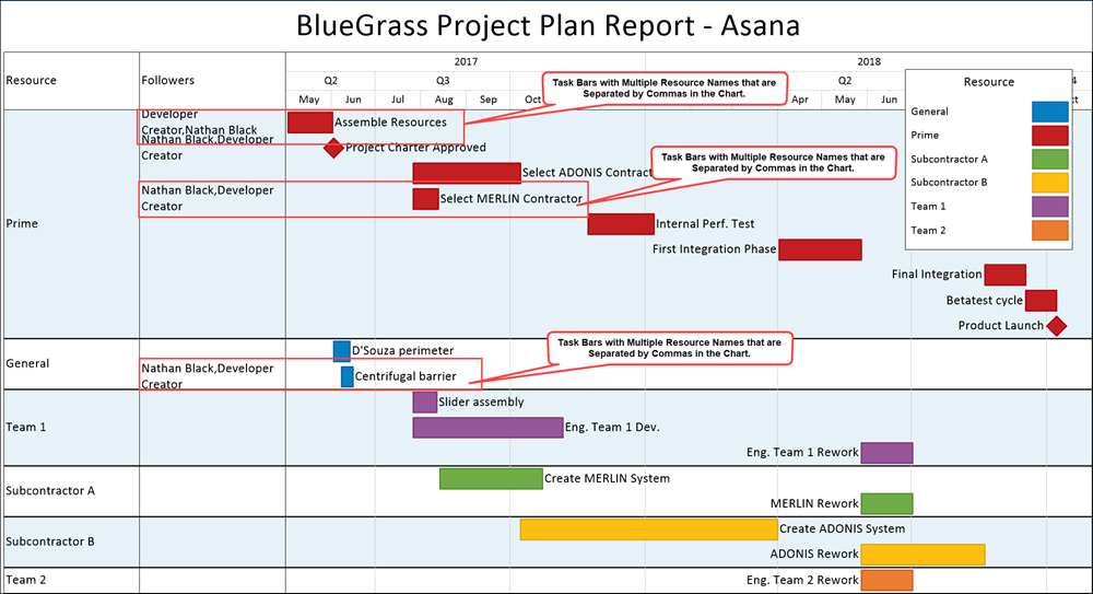
| + | ===Split Resources in the Chart=== |
| − | <!--<center>P70-15_1_1-70-(3)-10092019.png</center>-->
| + | |
| | | | |
| − | Once the chart is '''created''', OnePager assures that the '''same colors''' representing the values of the selected '''Color-code base on''' value for each task bar/milestone symbol is maintained as snapshots are added to the chart. This feature assures that there is '''color use continuity''', including within the '''Legend''', for all snapshots as long as you do not manually '''maverick''' or change the '''color assignments''' later on.
| + | Clicking the '''Create new chart''' button completes the process and creates the chart with the '''column splitting''' feature in use. The chart with '''splitting''' looks like this: |
| | | | |
| − | ===References to More Legend Articles===
| + | <center>[[File:P72-24_5_3-72-(2)-11022023.png]]</center> |
| | + | <center>P72-24_5_3-72-(2)-11022023.png</center> |
| | | | |
| − | Reference is made in the table below to the other articles in this series that deal with detailed '''editing''', '''positioning''', and the controls provided to accomplish these functions:
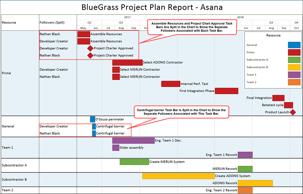
| + | In the chart with '''column splitting''' shown above, there are now several more task bars in the '''Chart Editor''' than there were before. The task bar for '''Plate Movement''' is now '''split into two (2) separate task bars''', one for each of the '''two resources assigned'''. The task bar for '''Centrifugal Barrier''' is now '''split into three (3) separate task bars''', one for each of the '''three resources''' that were assigned to this task in the Asana '''source plan'''. Each of the '''resources''' has a unique '''color''' assigned. Each of the '''resources''' appears by itself in the '''Legend'''. The '''Legend title''' shows the '''column name''' that is used for '''splitting the columns'''. |
| | | | |
| − | <center>
| + | With this feature, you can use '''column splitting''' just like any other column by using the dropdowns in the '''Template Properties''' form or '''Chart Properties''' form to assign '''colors, highlight task bars and milestone symbols, and to define and label rows and swimlanes'''. |
| − | {| class="wikitable"
| + | |
| − | | [[Legend Position Options for Multi-Page Outputs for Version 7.0 | Legend Position Options for Multi-Page Outputs]] <!--15.2.1-70-->
| + | |
| − | |-
| + | |
| − | | [[Legend Editing Controls for OnePager Pro for Version 7.0 | Legend Editing Controls for OnePager Pro]] <!--15.3.1-70-->
| + | |
| − | | [[Legend Editing Controls for OnePager Express for Version 7.0 | Legend Editing Controls for OnePager Express]] <!--15.3.2-70-->
| + | |
| − | |}
| + | |
| − | </center>
| + | |
| | | | |
| − | The remainder of this article deals with how to '''show''' or '''hide''' the '''Legend''' in the chart and how to '''show''' or '''hide''' individual '''Legend Items'''.
| + | ==Splitting Resources and Task Links== |
| | | | |
| − | For more information on '''editing task bar/milestone symbols''' and '''text labels''' in the chart, please see the articles at: [[Manual Editing Task/Milestone Shapes and Text Labels for Version 7.0 (Portal) | Manual Editing Task/Milestone Shapes and Text Labels (Portal)]] <!--9.0.1-70-->
| + | When task bars with '''Data-Driven''' or manual '''Task Links''' are '''split''', the '''Task Links''' ('''Data-Driven''' and manual) are '''not shown'''. Further, the '''Task Links''' that are now '''hidden''' and '''do not''' have entries in the '''Where are My Links?''' form. |
| | | | |
| − | ==Showing and Hiding the Legend== | + | ==Related Links== |
| | | | |
| − | Given the assumption that the chart is '''created''' with a '''Legend''' being displayed, you have controls available to '''show''' or '''hide''' the '''Legend''' as desired.
| |
| − |
| |
| − | ===Global and Chart Level Controls for Showing or Hiding the Legend===
| |
| − |
| |
| − | The '''Template Properties''' form establishes the '''color dimension''' for the chart. The '''Template Properties''' form has a '''Legend''' tab containing controls for establishing '''global''' settings for the '''Legend''' as shown below:
| |
| − |
| |
| − | <center>[[File:P70-15_1_1-70-(4-1)-09152020.png]]</center>
| |
| − | <!--<center>P70-15_1_1-70-(4-1)-09152020.png</center>-->
| |
| − |
| |
| − | The governing control is the '''Show legend''' checkbox. Checking the '''Show legend''' checkbox '''ON''' '''enables''' all the controls in the tab and, when the '''Save and use''' button at the bottom of the form is clicked, the '''Legend''' appears in the chart. Checking the '''Show legend''' checkbox '''OFF''' '''disables''' all controls in the tab and, when applied, the '''Legend''' is no longer visible in the chart. The controls in the '''Template Properties''' form's '''Legend''' tab are replicated in the '''Chart Properties''' form's '''Legend''' tab.
| |
| − |
| |
| − | ===Using the Chart Properties Form===
| |
| − |
| |
| − | Discussions on the controls in the '''Chart Properties''' form's '''Legend''' tabs for OnePager Pro and Excel can be found at:
| |
| − |
| |
| − | <center>
| |
| | {| class="wikitable" | | {| class="wikitable" |
| − | | [[Legend Editing Controls for OnePager Pro for Version 7.0 | Legend Editing Controls for OnePager Pro]] <!--15.3.1-70--> | + | | [[Templates versus Charts for Version 7.2 | Templates versus Charts]] 4.0.1.3-72 |
| − | | [[Legend Editing Controls for OnePager Express for Version 7.0 | Legend Editing Controls for OnePager Express]] <!--15.3.2-70--> | + | | [[Linking Task and Milestones Using Manual and Data-Driven Task Links for Version 7.2 | Linking Task and Milestone Using Manual and Data-Driven Task Links (Portal)]] 19.0.1-72 |
| | + | |- |
| | + | | [[Editing with the Chart Properties form for Version 7.2 (Portal) | Editing with the Chart Properties form (Portal)]] 21.0.1-72 |
| | + | | [[Template Only Features for OnePager Pro for Version 7.2 | Template Only Features for OnePager Pro]] 24.1.1-72 |
| | + | |- |
| | + | | [[Template Only Features for OnePager Express for Version 7.2 | Template Only Features for OnePager Express]] 24.2.1-72 |
| | + | | [[Template Only Features for Primavera P6 Source Plans in OnePager Version 7.2 | Template Only Features for Primavera P6 Source Plans in OnePager]] 24.2.2-72 |
| | + | |- |
| | + | | [[Template Only Features for Smartsheet Source Plans in OnePager Version 7.2 | Template Only Features for Smartsheet Source Plans in OnePager]] 24.2.3-72 |
| | + | | [[Splitting and Parsing Columns for OnePager Pro for Version 7.2 | Splitting and Parsing Fields for OnePager Pro]] 24.4.1-72 |
| | + | |- |
| | + | | [[Splitting and Parsing Columns for OnePager Express for Version 7.2 | Splitting and Parsing Fields for OnePager Express]] 24.5.1-72 |
| | + | | [[Splitting and Parsing Columns for Primavera P6 Source Plans in OnePager Version 7.2 | Splitting and Parsing Columns for Primavera P6 Source Plans in OnePager]] 24.5.2-72 |
| | + | |- |
| | + | | [[Splitting and Parsing Columns for Smartsheet Source Plans in OnePager Version 7.2 | Splitting and Parsing Columns for Smartsheet Source Plans in OnePager]] 24.5.3-72 |
| | + | | [[Splitting and Parsing Columns for Project for the Web Source Plans for Version 7.2 | Splitting and Parsing Columns for Project for the Web Source Plans]] 24.5.5-72 |
| | + | |- |
| | + | | [[Splitting and Parsing Columns for Planisware Enterprise Source Plans for Version 7.2 | Splitting and Parsing Columns for Planisware Enterprise Source Plans]] 24.5.7-72 |
| | + | | [[Splitting and Parsing Columns for Wrike in OnePager Version 7.2 | Splitting and Parsing Columns for Wrike in OnePager]] 24.5.11-72 |
| | |} | | |} |
| − | </center>
| |
| | | | |
| − | ===Using the OnePager View Ribbon Tool Bar Tab to Show or Hide the Legend===
| + | (24.5.9-72) |
| | | | |
| − | The OnePager '''View''' ribbon tool bar tab has controls for '''showing/hiding''' chart components as shown below:
| + | [[Category:Version 7.2]] |
| − | | + | |
| − | <center>[[File:P70-15_1_1-70-(5-1)-09152020.png]]</center>
| + | |
| − | <!--<center>P70-15_1_1-70-(5-1)-09152020.png</center>-->
| + | |
| − | | + | |
| − | The illustration above shows the '''Legend''' checkbox in the '''Graphic elements''' control group of the '''View''' ribbon tool bar tab on the ribbon checked '''ON'''. In this configuration, the '''Legend''' is shown in the chart. Checking the '''Legend''' checkbox '''OFF''' '''hides''' the '''Legend''' from view in the chart.
| + | |
| − | | + | |
| − | ===Hiding the Legend in A Snapshot===
| + | |
| − | | + | |
| − | When the '''Legend''' checkbox is checked '''ON''', the '''Legend''' appears in all snapshots. In a chart with multiple snapshots, the '''Legend''' can be '''shown''' or '''hidden''' in individual snapshots by using the '''legend''' right-click '''context menu's Hide legend''' command as shown here:
| + | |
| − | | + | |
| − | <center>[[File:P70-15_1_1-70-(5A)-10092019.png]]</center>
| + | |
| − | <!--<center>P70-15_1_1-70-(5A)-10092019.png</center>-->
| + | |
| − | | + | |
| − | ==Moving and Resizing the Legend==
| + | |
| − | | + | |
| − | ===Moving the Legend Using Drag and Drop===
| + | |
| − | | + | |
| − | With the '''Legend''' displayed in the chart, the '''Legend''' itself can be '''moved''' manually with the '''select, drag, and drop''' operation. Use the mouse left click button to '''select''' a white space location inside the '''Legend box'''. Holding down the mouse left click button, '''drag''' the mouse to the new desired location. The mouse cursor is in the shape of a '''four-headed arrow shape''' at the location corresponding to the location originally '''selected''' in the '''Legend box''' in its original position. During the '''drag''' operation, the '''Legend box''' outline is displayed as shown below:
| + | |
| − | | + | |
| − | <center>[[File:P70-15_1_1-70-(6)-10092019.png]]</center>
| + | |
| − | <!--<center>P70-15_1_1-70-(6)-10092019.png</center>-->
| + | |
| − | | + | |
| − | When the mouse left-click button is released, the '''Legend box''' is displayed in its new position as shown here:
| + | |
| − | | + | |
| − | <center>[[File:P70-15_1_1-70-(7)-10092019.png]]</center>
| + | |
| − | <!--<center>P70-15_1_1-70-(7)-10092019.png</center>-->
| + | |
| − | | + | |
| − | ===Repositioning the Legend Using the Controls in the Template Properties and Chart Properties Form's Legend Tab===
| + | |
| − | | + | |
| − | There are controls provided in the '''Template Properties''' and '''Chart Properties''' form's '''Legend''' tab for you to establish one of eight (8) '''Legend''' position options under four (4) '''anchoring/docking''' options. These controls are shown here for illustration purposes for the '''Chart Properties''' form's '''Legend''' tab:
| + | |
| − | | + | |
| − | <center>[[File:P70-15_1_1-70-(8-1)-09152020.png]]</center>
| + | |
| − | <!--<center>P70-15_1_1-70-(8-1)-09152020.png</center>-->
| + | |
| − | | + | |
| − | '''Legend''' positioning has some complicating implications in the context of '''multi-page''' output media and is further complicated when '''rows and swimlanes''' are also considered in '''multi-page''' output media presentations.
| + | |
| − | | + | |
| − | Given these implications, detailed instructions for using the controls shown above are provided in the article at: [[Legend Position Options for Multi-Page Outputs for Version 7.0 | Legend Position Options for Multi-Page Outputs]] <!--15.2.1-70-->
| + | |
| − | | + | |
| − | ===Manually Resizing the Legend===
| + | |
| − | | + | |
| − | If you '''select''' the '''Legend''' with a mouse left click, it resembles a '''Free box''' in terms of the eight '''grab boxes and circles''' that appear on its '''border''' as shown here:
| + | |
| − | | + | |
| − | <center>[[File:P70-15_1_1-70-(9)-10092019.png]]</center>
| + | |
| − | <!--<center>P70-15_1_1-70-(9)-10092019.png</center>-->
| + | |
| − | | + | |
| − | The '''resizing''' approach for '''Legend''' is the same for the '''Free boxes'''. Mouse over one of the '''grab boxes or circles''' until the mouse cursor becomes a '''double-arrow''' shape. Hold down the mouse left click button at which point the mouse cursor becomes a '''plus sign''' and the '''border of the Legend''' is represented by a thin line. Continue to hold down the mouse left click button and '''drag''' the '''plus sign''' cursor in the allowable direction until the '''Legend''' is '''resized'''. Release the mouse left click button to complete the operation at which point the '''Legend''' is resized.
| + | |
| − | | + | |
| − | For reference to the '''resizing of Free boxes''' please see the section in the article at: [[Creating and Managing Free Boxes for Version 7.0#Resizing a Free Box | Creating and Managing Free Boxes-Resizing a Free Box]] <!--14.0.1-70-->
| + | |
| − | | + | |
| − | ===Resizing the Legend Using the Controls in the Template Properties and Chart Properties Form's Legend Tab===
| + | |
| − | | + | |
| − | There are controls provided in the '''Template Properties''' and '''Chart Properties''' form's '''Legend''' tab for you to '''edit''' the '''dimensions/size''' of the '''Legend''' . These controls are shown here for illustration purposes for the '''Chart Properties''' form's '''Legend''' tab:
| + | |
| − | | + | |
| − | <center>[[File:P70-15_1_1-70-(10-1)-09152020.png]]</center>
| + | |
| − | <!--<center>P70-15_1_1-70-(10-1)-09152020.png</center>-->
| + | |
| − | | + | |
| − | '''Legend''' '''resizing''' using the controls in the '''Legend''' tab of the '''Chart Properties''' form is done exactly like using the corresponding controls for the '''Comment box''' at the '''Chart Properties''' form's '''Comment Box''' tab.
| + | |
| − | | + | |
| − | Given the similarity, detailed instructions for using the '''resizing''' controls shown for the '''Comment box''' can be found in the section in this article at: [[Creating and Managing Comment Boxes for Version 7.0#Box Size Controls for Comment Boxes | Creating and Managing Comment Boxes-Box Size Controls for Comment Boxes]] <!--13.0.1-70-->
| + | |
| − | | + | |
| − | ==Showing and Hiding Individual Legend Items==
| + | |
| − | | + | |
| − | There are occasions where you might want to '''hide''' an individual '''Legend''' item from view in the '''Legend'''. This might be the case because you've manually '''hidden''' a particular task bar/milestone symbol corresponding to that '''Legend''' item. Additionally, there are instances where the '''Legend''' displays '''duplicate Legend''' items as a result of '''Conditional Formatting Rules'''.
| + | |
| − | | + | |
| − | For more information on '''Conditional Import Rules, please see the articles at: [[Conditional Import for Version 7.0 (Portal) | Conditional Import Filters (Portal)]] <!--7.18.1-70-->
| + | |
| − | | + | |
| − | Typically, the '''Legend''' is built '''showing''' all the '''Legend''' items acquired from the '''import''' of '''source plan''' data corresponding to the '''Color-code based on''' value selected.
| + | |
| − | | + | |
| − | ===Selecting a Legend Item to Hide===
| + | |
| − | | + | |
| − | With the '''Legend''' in its entirety showing in the chart, use the mouse to right click on the '''Legend''' item name or the '''Legend''' item's '''color shape''' which accesses the '''Edit Legend Item''' form shown below:
| + | |
| − | | + | |
| − | <center>[[File:P70-15_1_1-70-(11)-10092019.png]]</center>
| + | |
| − | <!--<center>P70-15_1_1-70-(11)-10092019.png</center>-->
| + | |
| − | | + | |
| − | ===Hide the Selected Legend Item===
| + | |
| − | | + | |
| − | When you check the '''Show Legend Item''' checkbox '''OFF''', the '''selected Legend''' item is '''hidden''' in the '''Legend''' as shown here:
| + | |
| − | | + | |
| − | <center>[[File:P70-15_1_1-70-(12)-10092019.png]]</center>
| + | |
| − | <!--<center>P70-15_1_1-70-(12)-10092019.png</center>-->
| + | |
| − | | + | |
| − | ===Restoring a Hidden Legend Item===
| + | |
| − | | + | |
| − | '''Legend''' items can always be made to '''show''' later by right-clicking in the '''Legend''' in white space to access the '''legend''' right-click '''context menu''' and then clicking the '''Unhide all items''' command as shown below:
| + | |
| − | | + | |
| − | <center>[[File:P70-15_1_1-70-(13)-10092019.png]]</center>
| + | |
| − | <!--<center>P70-15_1_1-70-(13)-10092019.png</center>-->
| + | |
| − | | + | |
| − | After the '''Unhide all items''' command is clicked, the '''Legend''' looks like this:
| + | |
| − | | + | |
| − | <center>[[File:P70-15_1_1-70-(14)-10092019.png]]</center>
| + | |
| − | <!--<center>P70-15_1_1-70-(14)-10092019.png</center>-->
| + | |
| − | | + | |
| − | Please note that the '''restored previously hidden Legend''' item may not be '''shown''' in its original position in the '''Legend''' as shown above. There are controls in the '''Edit Legend Item''' form, discussed above where you can change the position of any '''Legend''' item '''showing''' in the '''Legend''' as illustrated here:
| + | |
| − | | + | |
| − | <center>[[File:P70-15_1_1-70-(15)-10092019.png]]</center>
| + | |
| − | <!--<center>P70-15_1_1-70-(15)-10092019.png</center>-->
| + | |
| − | | + | |
| − | Instructions for using the other controls in the '''Edit Legend Item''' form are found in the article at: [[Editing, Repositioning Legend Items, and Formatting the Legend for Version 7.0 | Editing, Repositioning Legend Items, and Formatting the Legend ]] <!--15.3.1-70-->
| + | |
| − | | + | |
| − | ==Related Links==
| + | |
| − | | + | |
| − | [[Conditional Import for Version 7.0 (Portal) | Conditional Import Filters (Portal)]] <!--7.18.1-70-->
| + | |
| − | | + | |
| − | [[Manual Editing Task/Milestone Shapes and Text Labels for Version 7.0 (Portal) | Manual Editing Task/Milestone Shapes and Text Labels (Portal)]] <!--9.0.1-70-->
| + | |
| − | | + | |
| − | [[Creating and Managing Comment Boxes for Version 7.0 | Creating and Managing Comment Boxes]]. 13.0.1-70
| + | |
| − | | + | |
| − | [[Creating and Managing Free Boxes for Version 7.0#Resizing a Free Box | Creating and Managing Free Boxes-Resizing a Free Box]] <!--14.0.1-70-->
| + | |
| − | | + | |
| − | (15.1.1-70)
| + | |
| − | | + | |
| − | [[Category:Version 7.0]]
| + | |
| | [[Category:Editing the Chart]] | | [[Category:Editing the Chart]] |
| − | [[Category:Legend]] | + | [[Category:Task/Milestone Editing]] |
| | + | [[Category:Column Splitting]] |
| | + | [[Category:Charts]] |
| | + | [[Category:Task Links]] |
| | [[Category:Ribbon]] | | [[Category:Ribbon]] |
| | [[Category:Snapshots]] | | [[Category:Snapshots]] |
| − | [[Category:Charts]] | + | [[Category:Template Properties Form]] |
| − | [[Category:OnePager - Tool Bar]]
| + | |
| − | [[Category:Templates]]
| + | |
| | [[Category:Chart Properties Form]] | | [[Category:Chart Properties Form]] |
| − | [[Category:OnePager Pro]] | + | [[Category:Asana]] |
| − | [[Category:OnePager Express]] | + | [[Category:OnePager Bundle]] |
