Adding Conditional Formatting Rules for OnePager Express for Version 7.0
Contents
About the Conditional Formatting Rules Form
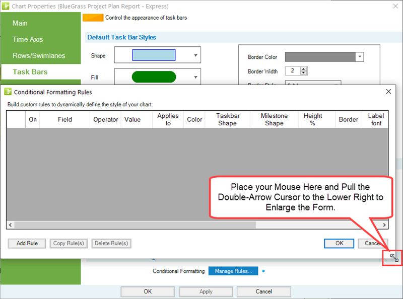
The next sub-section provides an overview of Conditional Formatting and what can be done when Conditional Formatting Rules are added to the form. However, first let's go over the Conditional Formatting Rules form itself. The Conditional Formatting Rules form has columns with headings that can accommodate source plan field names and various values of differing lengths. The form can be enlarged or shrunk as with most Windows forms by using your mouse to grab a corner of the form and expanding/shrinking the form with the left click as shown here:
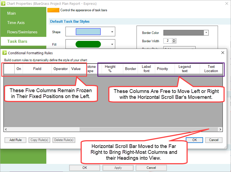
A horizontal scroll bar is provided in the form so you can scroll right or left in order to place any of the form's column headings and columns into clear view as shown below with the horizontal scroll bar moved to the far right:
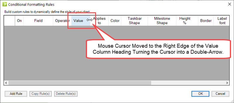
As mentioned above, the Conditional Formatting Rules form can accommodate source plan field names and grid values of differing sizes. If you need to widen a columns in the form, this can be done with your mouse by going to the desired column heading, moving the mouse over the column heading's vertical boundary edge until the mouse cursor becomes a double-arrow, and then left-clicking the mouse and dragging the mouse left or right to change the width of the selected column heading as shown below:
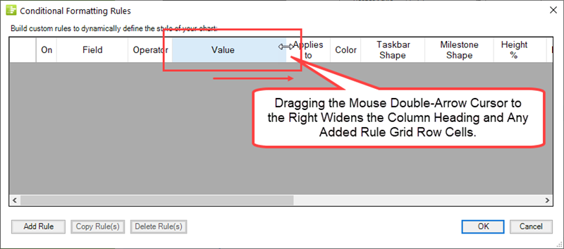
After the double-arrow mouse cursor is moved to the right to widen the column heading's width, the form looks like this:
When a Conditional Formatting Rule grid row is added in the form, the grid row and the widened column looks like this:
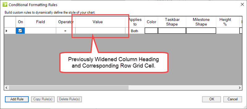
After data are entered into Conditional Formatting Rule grid row cells OnePager adjusts the width of the column heading and row grid cells to the width of the largest value to assure that as many row grid cells and their column headings can be visible in the form. Changing the width of a column heading and their corresponding grid row cells can be done at any time when Conditional Formatting Rules are being added or edited.
About Adding Conditional Formatting Rules
Conditional Formatting is a capability in OnePager Express that you can use to tailor various attributes of task bars/milestone symbols in the chart depending on the data imported from your Microsoft Excel source plan. You can define one or more conditional formatting rules that apply your specified actions to appropriate task bars/milestone symbols when the specified conditions in your defined rules are true. For example, you can define a rule that changes the color of a task bar depending on the value contained the Category field (used to report risk in the example below) imported from your Microsoft Excel source plan. In this example, suppose the Category field is used to import Risk information in the form of High, Medium, and Low. You can add rules that tell OnePager Express, for instance, to set the color Red for task bars associated with a Category value of High, set the color yellow for task bars associated with a Category value of Medium, and set the color green for task bars associated with a Category value of Low.
A video illustrating this example is available at: Conditional Formatting Tutorial Video.
There are nine (9) sets of task bar/milestone symbol attributes that can be altered to respond to condition statement established in your conditional formatting rule sets. This article provides the basic instructions to for adding conditional formatting rules to OnePager which can be done at the Template Properties or Chart Properties forms level. These conditional formatting rules can be edited at any time in terms of the contents of condition columns and action columns found in the Conditional Formatting Rules form discussed below. Use the following steps to add a conditional formatting rule or rules to the Conditional Formatting Rules form's grid:
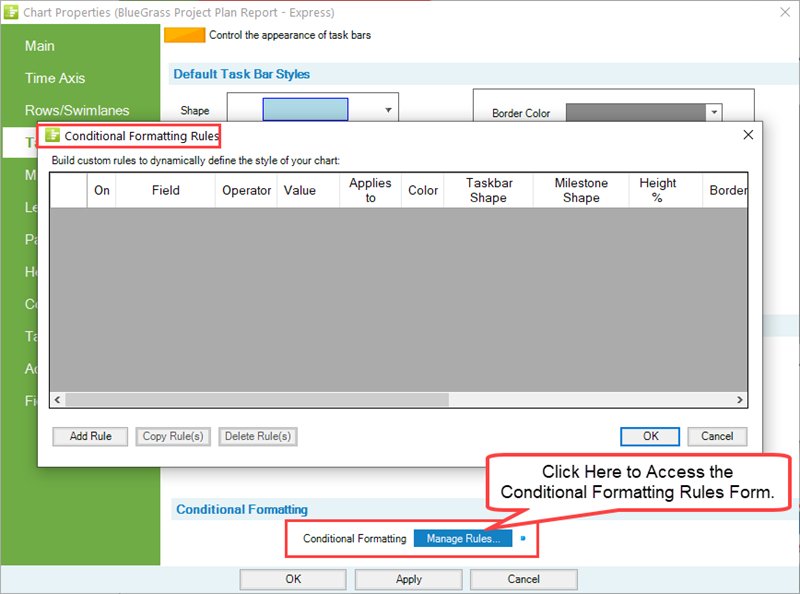
From either the Task Bars or Milestones tab of the Chart Properties or Template Properties forms, click the Manage Rules... button:
You are now ready to add rules. Click the Add Rule button and OnePager then creates a blank line in the window shown above so you can enter the first rule. The line consists of three (3) major components:
- The rule select and enable/disable checkboxes.
- The rule condition columns.
- The rule action columns.
Adding, editing, copying, and deleting conditional formatting rules is very similar to the process for doing the same with respect to Conditional Import Filter Rules which are described in the article at: Conditional Import Filters (Portal)
The sections that follow cover each of the major components of a conditional formatting rule.
Rule Selection and Enable/Disable Checkboxes
Rule Selection Columns
The left most column in the grid, shown below, has the following function:
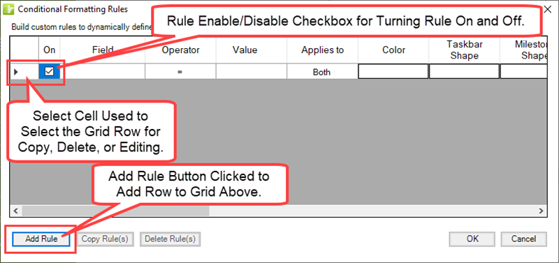
The Rule Select checkbox is provided so you can select the rule for editing, copying, or deletion.
Enable/Disable or On Column
The checkbox to the right of the Rule Select cell with the column heading of ON provides control over turning the rule ON and OFF. When the ON checkbox in the column above is checked, the columns that include the rule conditions and actions are enabled. It may become useful to have sets of rules in the Conditional Formatting Rules form and by turning them ON or OFF as required you can achieve a variety of results.
Rule Condition Columns
There are three rule condition columns as shown below:
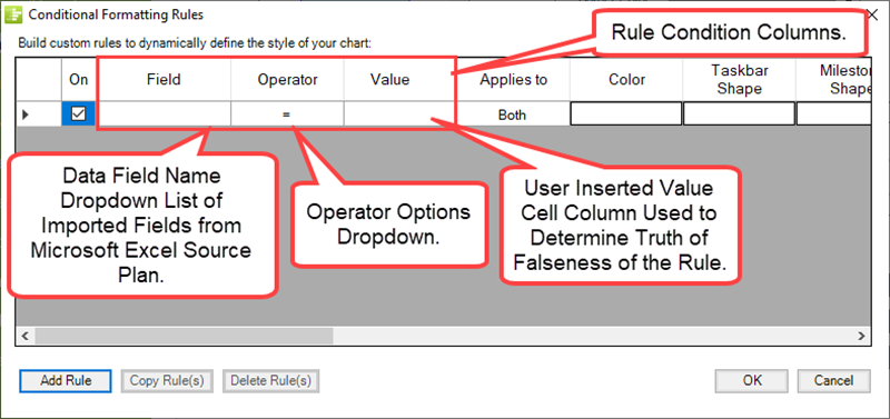
Field Column
In the Field column shown below is a dropdown that allows you to select the field from your Microsoft Excel source plan.
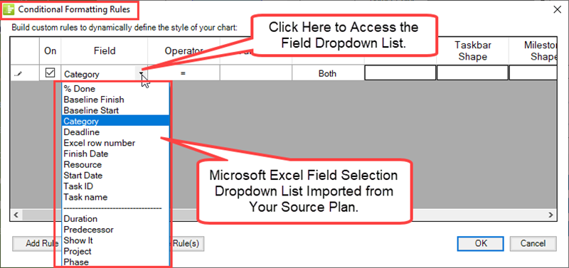
OnePager Express imports all the fields from your Microsoft Excel source plan so they are all available for use as a Field in a conditional formatting rule.
Operator Column
The Operator column shown below is a dropdown that allows you to pick from a list of operators depending on the data type of the Field selected as discussed above:
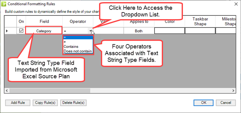
Since OnePager Express knows the field type imported from your Microsoft Excel source plan, the Operator column shows the appropriate operator selections when the dropdown menu above is accessed.
Text String Field Types
For Text String field types there are four operators:
- equal
- not equal
- Contains
- Does not contain
Numeric and Data Field Types
For Numeric and Date field types, the operators are shown here:
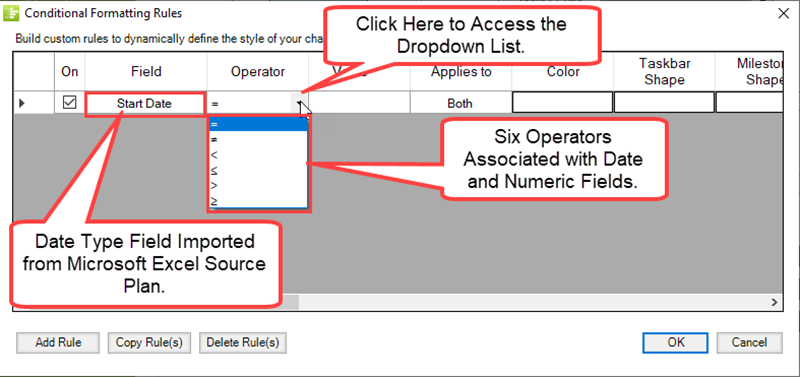
For Numeric and Date field types there are six operators:
- equal
- not equal
- less than
- less than or equal
- greater than
- greater than or equal
Boolean Field Types
For Boolean fields types (i.e., Yes/No, True/False) the operators are shown below.
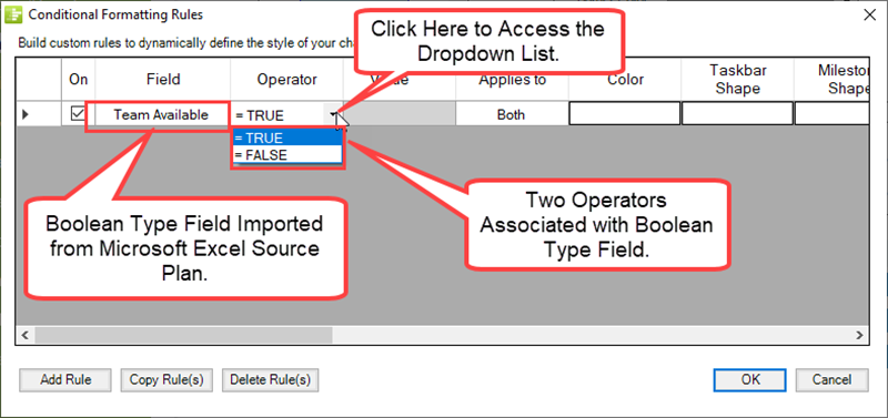
For Boolean field types there are two operators that can be expressed in two (2) different ways as shown below:
- Yes or 1
- No or 0
The Value column is ghosted since selecting the Operator satisfies the need for a value.
Value Column
The Value column is the grid cell that you fill in that is the match desired against the Field Column given the contents of the Operator Column.
Boolean Field Types
The Value column is not used when the Field column is a Microsoft Project Boolean type.
Text String Field Types
For Text String type fields, any text that might appear in a Microsoft Excel text string field can be typed in to the Value column's grid cell for a rule. Note that for string matches, it is permissible to have the Value column be a set of strings separated by commas. In this situation, the rule is matched when the column value is equal to any of the comma separated values. To make the comparison between text data specified in the Field column of the Conditional Formatting Rules form, OnePager trims leading and trailing white space such as blanks or control characters. However, OnePager does not trim excess white space within a valid character string.
Numeric Field Types
For Numeric type matches any integer or integer with a decimal fraction is permissible.
Date Field Types
For Date type matches the Value Column provides the standard OnePager calendar when you click in the Value Column and the Field Column is a date type field as shown below:
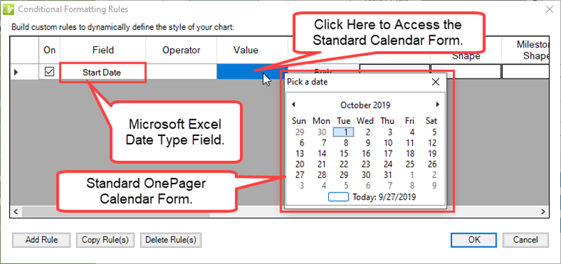
The Value column can be used to compare against today’s date by clicking the Today: ... checkbox in the Pick a date Calendar form shown above. This is useful for establishing a rule where it is important to color or otherwise highlight a task whose Finish date is less than or equal to today’s date, for example.
Applies to Column
OnePager Express performs the evaluation and then applies the formats specified in the rule to the task bars, milestone symbols, or both as determined by the Applies to column as shown here:
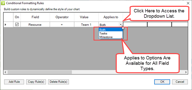
To tell OnePager whether to apply a rule to task bars, to milestone symbols, or to both, there are three options for the Applies to column as shown below:
- Both
- Tasks
- Milestones
Rule Action Columns
To the right of the columns in the Conditional Formatting Rules form's grid Condition columns are nine (9) Action columns. When a condition in the rule matches or is true all valid actions specified in the Action columns are applied to the task bars/milestone symbols in the chart. If the rule's condition does not match or is false, none of the actions specified in the Action columns are taken or applied to the task bars/milestone symbols in the chart. The Conditional Formatting Rules form's grid has a horizontal scroll bar allowing you to scroll to the left or right to being all of the nine Action columns into view within the grid as shown in the illustrations below:
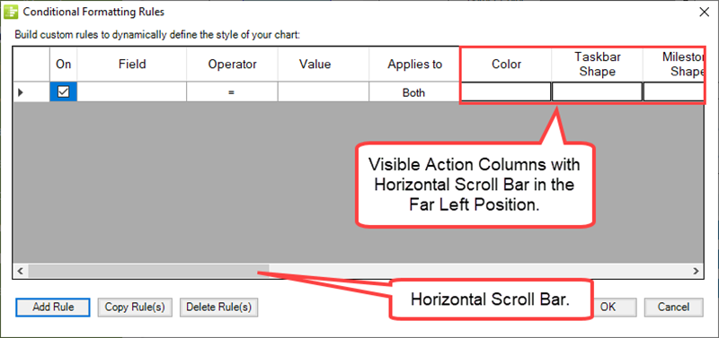
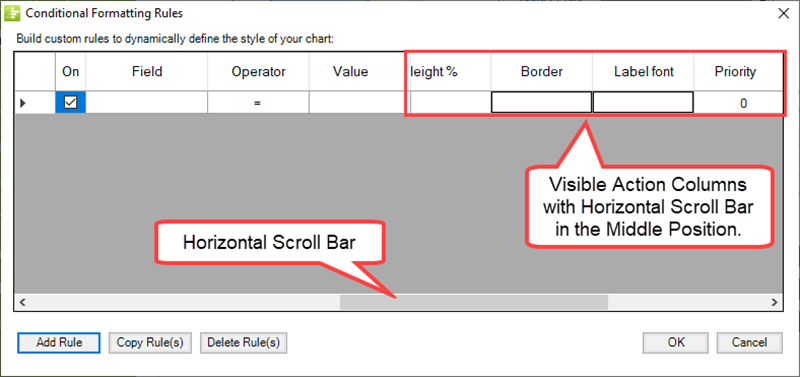
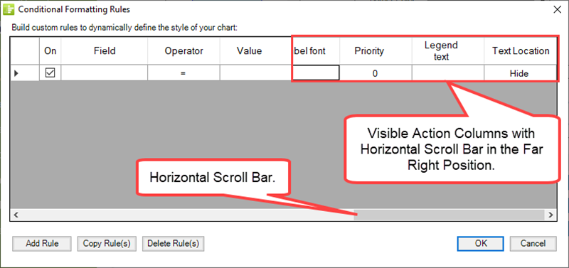
In the three illustrations above the thee Conditions columns of Field, Operator, and Value remain fixed in the grid and do not scroll left or right. It is important to note that whenever a rule's conditions result in a match or true result, all of the Action columns that are not blank are applied to the appropriate task bars/milestone symbols in the chart. Accordingly, while you may have more than one Action column associated with a specific condition, we recommend that minimizing the number of Action columns you intend to apply in one rule. As you have have capability to turn rules ON and OFF, you can define many rules in the grid and turn the desired rules ON when they meet your schedule conversation needs with the chart. In the following sub-sections are discussions of the attributes of each of the nine Action columns available.
Color Action Column
To add a color to the Color Action column, click on the cell for the specific rule to access the standard Color Chooser as shown below:
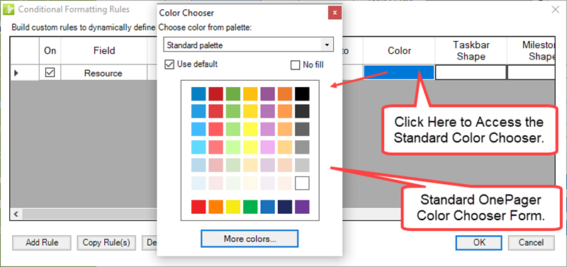
For more information on using the standard Color Chooser form, please see the section in the articles at: Changing Individual Task/Milestone Shape Colors
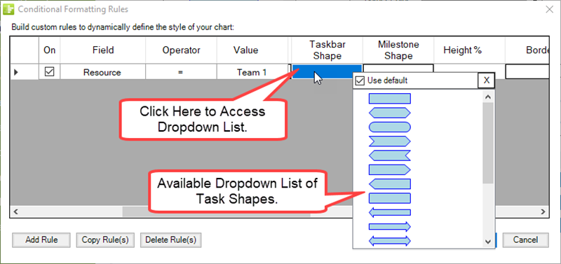
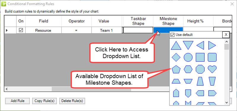
Taskbar and Milestone Shape Action Columns
Clicking the Taskbar Shape Action column cell accesses the standard Task Shape dropdown list as shown below:
In a similar way, clicking the Milestone Shape Action column cell accesses the standard Milestone Shape dropdown list as shown here:
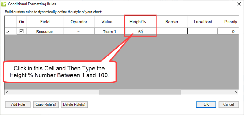
Height % Action Column
You can manage the height of a task bar or milestone symbol as a percentage of the height of the row occupied by the task bar/milestone symbol. The default Height % for task bars/milestone symbols is 91% of the height of the row. As shown below, the Height % for the rule shown is set to 50% by typing in the number 50 as the value:
Border Action Column
Using the Border Action column, you can automatically change the look of the task bar or milestone symbol's border if the rule results in a match or true. To do this, clicking on the Border Action column's grid cell accesses the Border Style Rules form where the Use default checkbox is checked ON as shown below:
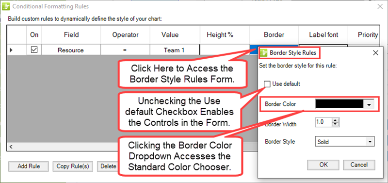
To edit any of the parameters of the task bars/milestone symbol's border uncheck the Use default checkbox and use the Border Color, Border Width, and Border Style controls as appropriate.
For more information on task/milestone border management, please see the section in the articles at: Changing Task/milestone Shape Borders
Label Font Action Column
Using the Label Font Action column, you can change the look of the task bars/milestone symbol's label text if the rue results in a match or true result. Clicking the Label font Action column's grid cell accesses the standard Font properties form as shown here:
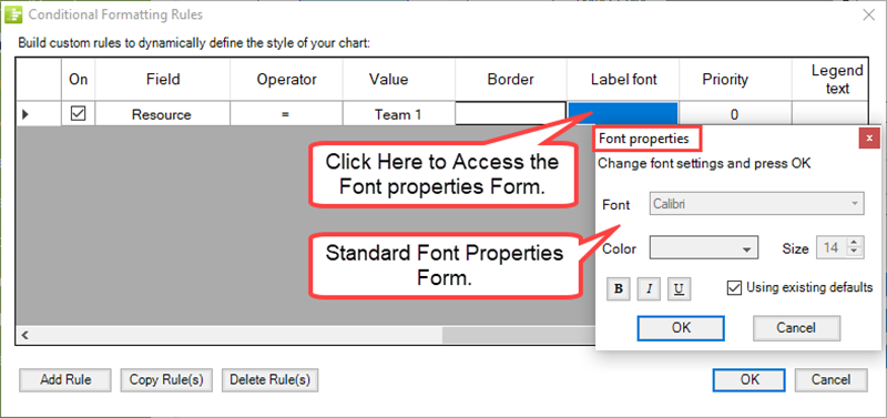
Using the standard Font properties form has the controls for editing the important characteristics of the label text.
For more information on task bar/milestone symbol label text management, please see the section in the articles at: Use the Context Menus
Priority Action Column
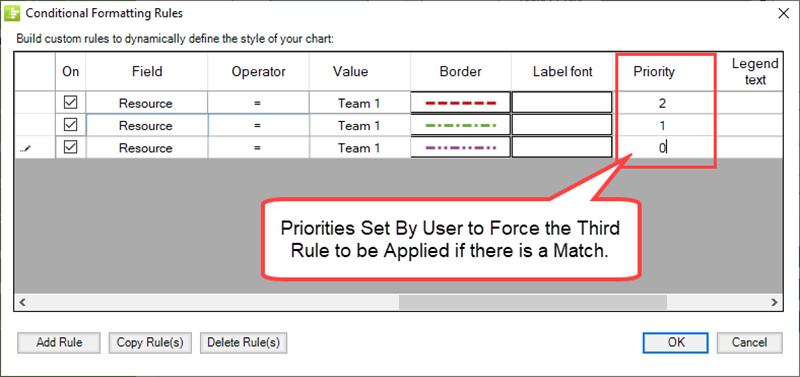
The Priority Action column is set and mostly managed by OnePager Express. That is, each time you add a new rule to the grid, OnePager increments the value in the Priority Action column's grid cell by one starting at zero (0) for the first rule in the grid. If several rules are in competition to set a particular formatting property (i.e., color, border, etc.) , the rule with the lowest Priority number has priority over all the others. You can change the values in the Priority column at any time after the rule is completely defined, and any numeric value is acceptable. In this way you can define several identical condition columns and use a single Action column with different values and control their priority manually to achieve a desired result as shown in the example below:
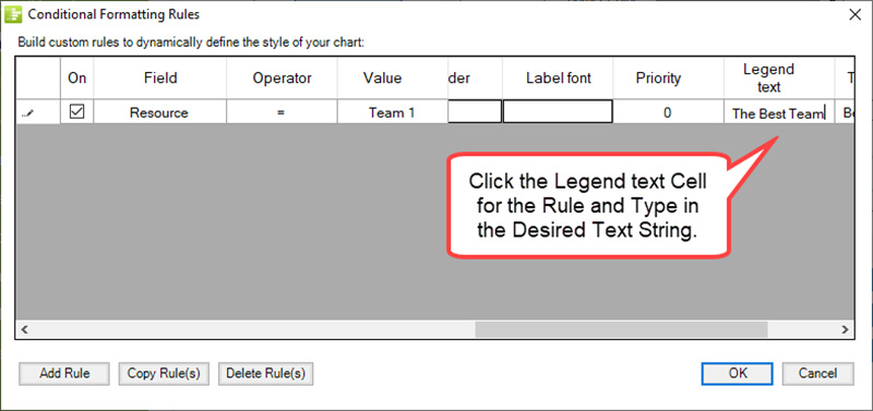
Legend Text Action Column
Using the Legend Text Action column, you can change the text appearing in the Legend of the task bar/milestone symbol to any desired text string if the rule results in a match or true. Clicking the Legend Text Action column's grid cell allows you to enter the desired text string as shown here:
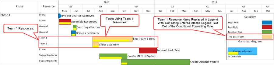
It is recommended that the Color Action column also be set to a unique color when the Legend Text Action column grid cell is selected so that a color is shown in the chart for the task bars/milestone symbols involved as well as in the Legend item added. When a match or true condition is found for the rule, the Legend in the chart is updated to reflect the text string entered in the Legend text grid cell as shown here:
For more information on Legend management, please see the articles in the series at: The Chart Legend (Portal)
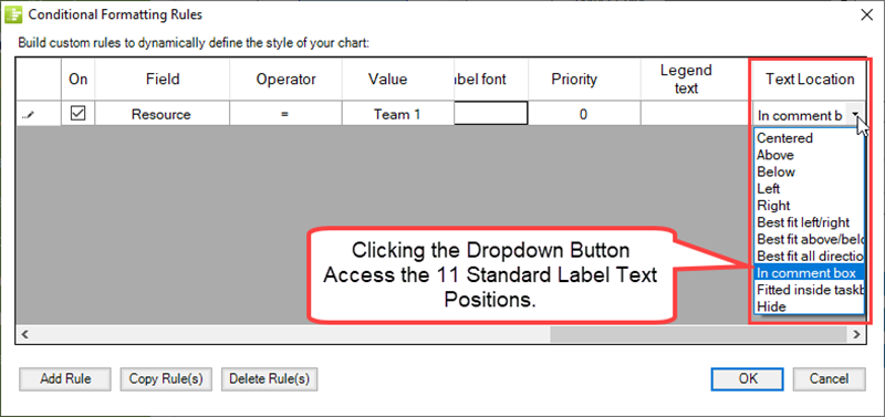
Text Location Action Column
You can change the position of the label text for a task bar/milestone symbol to any one of eleven (11) standard positions the rule results in a match or true. Clicking the Text Location Action column's grid cells accesses the label text position dropdown as shown below:
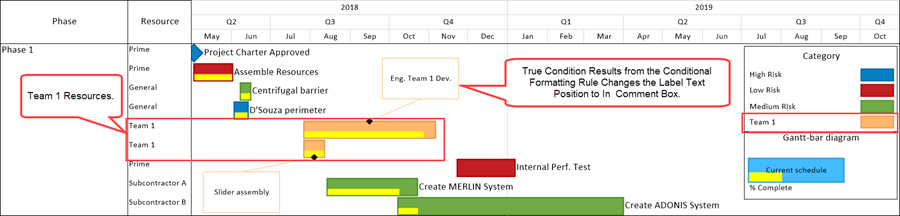
It is recommended that the Color Action column also be set to a unique color when the Text Location Action column grid cell is selected so that a color is shown in the chart for the task bar/milestone symbols involved as well as in the Legend item added. When a match or true condition is found for the rule, OnePager re-positions the associated task bars/milestone symbol's label text to the position selected in the rule as shown here where the In comment box option is selected for Team 1 in this example:
For more information on Label Text Management, please see the articles in the series at: Manual Editing Task/Milestone Shapes and Text Labels (Portal)
Related Links
Conditional Import Filters (Portal)
Manual Editing Task/Milestone Shapes and Text Labels (Portal)
Changing Individual Task/Milestone Properties (Color, Shapes, Labels, etc.)
Modifying Decorations on Tasks/Milestones (Portal)
Editing with the Chart Properties form (Portal)
Conditional Formatting Tutorial Video
Blog-Display Certainty in Your Plan by Using Conditional Formatting
Using Microsoft Project Flag Fields with OnePager Pro's Conditional Formatting Rules
(11.4.1-70)