Drop Shadows for Task Bars and Milestone Symbols Version 7.2
Contents
- 1 Introduction
- 2 Overview
- 3 Global Drop Shadow Controls
- 4 Drop Shadows with Task Bar/Milestone Symbol Decorations
- 5 Drop Shadows for Milestone Symbols
- 6 Drop Shadow Representation
- 7 Related Links
Introduction
Illustrations used in this article are from OnePager Pro using data from Microsoft Project but the features, functions, controls, and manual edits apply equally to other OnePager editions that import from data sources like Microsoft Excel, Microsoft Project Online, Microsoft Project Server, Microsoft Project for the Web, Smartsheet, Oracle Primavera P6, Planisware Enterprise, Asana, and Wrike.
This article describes OnePager’s Drop Shadows feature.
Overview
OnePager charts have traditionally appeared to be flat, with all shapes at the same level or hidden behind or showing in front of one another. OnePager Version 7.2 adds the perception of depth to the chart by the inclusion of the drop shadow feature that can be found in other graphic applications like Microsoft PowerPoint.
As an example, the chart below exists in a two-dimensional plane:
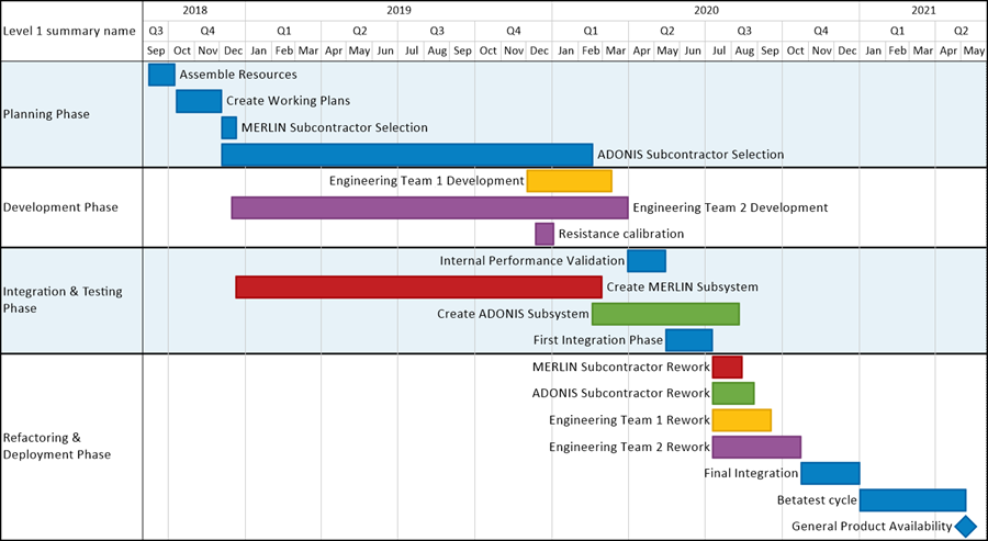
If we apply the new default drop shadow feature to this chart, we get this representation:

The drop shadows shown above are subtle but display a shadow created as if the light is coming from the upper left to create a task-bar shadow to the lower right. The preset drop shadows can be created with the illumination coming from nine (9) different directions. Additionally, you can create custom drop shadows using six (6) controls provided in the form that appears when you click Shadow Properties in the Chart Properties Form.
The following illustration shows the drop shadow feature with more prominent shadows configured:

The drop shadow feature not only includes task bar/milestone symbols but also baselines, deadlines, and endpoints, as are demonstrated in this article. For example, below is a chart with baselines and deadlines showing exaggerated drop shadows:

The purpose of this article is to introduce the new OnePager Version 7.2 Drop Shadow feature and explain the use of new controls that either select preset drop shadow options or let you create your own custom drop shadow designs.
Before we proceed, please bear in mind that Drop shadows are snapshot independent and are the same for every shape in the chart. You cannot ‘maverick’ the drop-shadow’s existence or its properties for individual shapes. Hence all control of drop shadows is global.
Global Drop Shadow Controls
Global drop shadow controls are available before creating your chart in the Template Properties form’s Task Bars and Milestones tabs and after creating your chart in the Chart Properties form’s Task Bars and Milestones tabs as shown below:
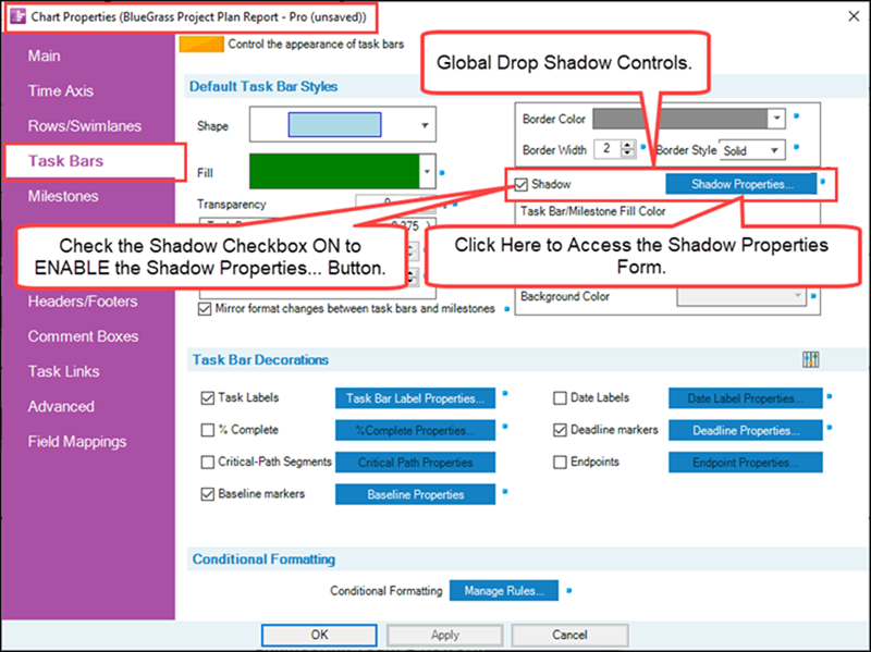
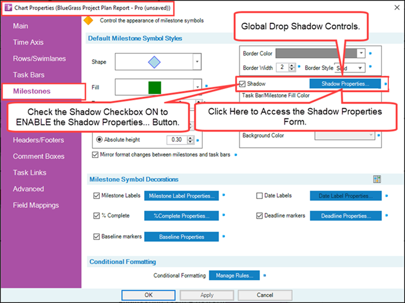
In order to access the Shadow Properties form you must first check the Shadow checkbox ON as shown above. This action ENABLES the Shadow Properties… button. Clicking the Shadow Properties… button accesses the Shadow Properties form as shown here:
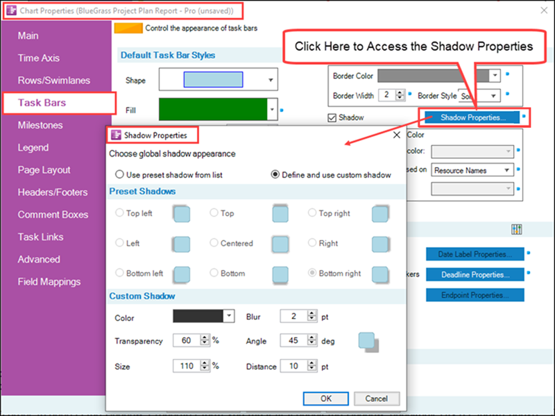
The Shadow Properties form shown above has two control groups: (1) Preset Shadows and (2) Custom Shadow. These two control groups are explained in the sub-sections that follow.
Shadow Properties Form – Preset Shadows Control Group
The Preset Shadows control group is ENABLED when the Use present shadow from list radio button is clicked ON as shown here:
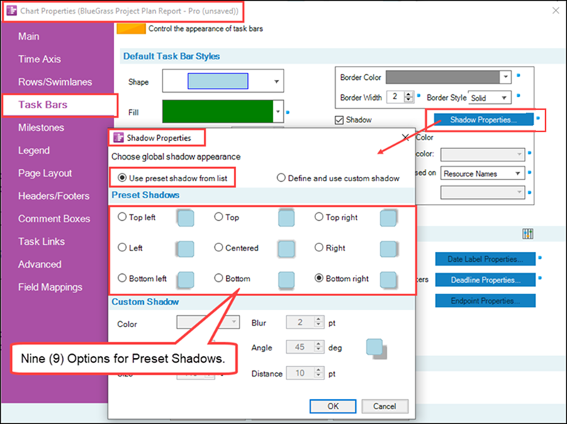
The default option is Bottom right, indicated above by the selected radio button. Each option is distinguished by where the drop shadow appears relative to the task bar, milestone, baseline, deadline, and endpoint symbols on the screen. The selected drop shadow option is applied to all such symbols on the chart. As noted before, there is no mavericking of drop shadows on individual chart shapes.
Each of the nine (9) radio button options is accompanied with a graphic that shows the position of the drop shadow for the chosen option.
Shadow Properties Form – Custom Shadow Control Group
The Custom Shadow control group is ENABLED when the Define and use custom shadow radio button is clicked ON as shown here:
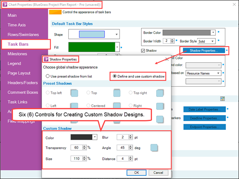
As shown above, the default custom drop shadow is the same as the default preset drop shadows, but you can change it in several ways and then use it for all the shapes in your chart. For each combination of the six (6) controls in the Custom Shadow control group, OnePager provides a graphic that shows how the combination of controls look when applied to the chart. You can use this graphic to help customize the drop shadow characteristics you are looking for.
The six (6) controls are applied to the drop shadow itself as shown in the examples that follow.
Custom Shadow Controls - Color
Clicking the Color dropdown accesses the standard OnePager Color Chooser form as shown here:
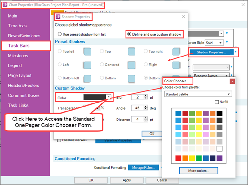
If the color red is selected and all other controls are kept at the default values, the chart looks like this:

Custom Shadow Controls - Transparency
As with all transparency-value controls in OnePager, increasing the transparency value increases the amount of transparency for the drop shadow. Transparency can be considered as being similar to the intensity of the light casting the shadow. The higher the transparency, the lower the intensity of light and the less visible is the drop shadow. Conversely, the lower the transparency value, the higher the intensity of the light and the sharper the drop shadow appears, as with the example below where the transparency value is set to zero-percent (0%):

As a further illustration, below is a chart where the drop shadow’s transparency value is ninety-five percent (95%):

Drop shadow transparency values greater than 75% are probably going to be difficult for your audience to see depending on the display medium and the settings of the other controls.
Custom Shadow Controls - Size
The default Size value of custom drop shadows is set to 110%. The Size value represents size of the shadow relative to the size of the shape that is casting the shadow. You can also think of it as controlling the height of the task bar/milestone symbol above the plane of the chart. Therefore, the greater the Size value, the higher the task bars/milestone symbols appear to be above the plane of the chart and the larger the shadow it casts. The default value for the Size control is shown here:
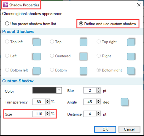
Since task bars/milestone symbols cast their drop shadows down onto rows and rows may be close together vertically, some care must be taken in selecting a Size value to avoid too much row overlap of drop shadows. We recommend conducting some trials with various drop shadow Size values and row heights to achieve the effect you want. For example, if the drop shadow Size value is set to 175% with the default row height value, a portion of the chart might look very crowded like this:

Custom Shadow Controls – Blur
The Blur setting gives you control over how diffuse the drop shadow appears on the plane of the chart and can be thought of as how diffuse the light source is. The default Blur setting is two points (2 pts) (1pt is 1/72 inch) which makes a Color setting of Black fade gradually through shades of gray to white over a distance of 2 pts as is shown in the chart illustrations above. The default Blur setting is shown here:
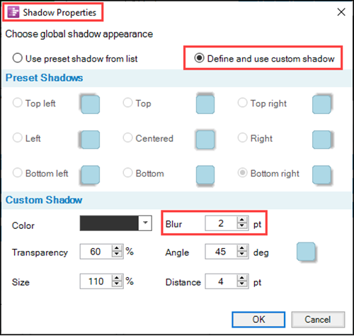
The Blur setting only accepts positive integer value. Increasing the Blur setting too high renders the drop shadow invisible at some point. As suggested above, some trials of different Blue setting can achieve the desired visual effects.
Custom Shadow Controls – Angle
The Angle setting in degrees represents the direction from which the illuminating light originates from the task bar/milestone symbol and casts the drop shadow down onto the plane of the chart. The default Angle setting is 45 degrees as shown in the Shadow Properties form shown below:
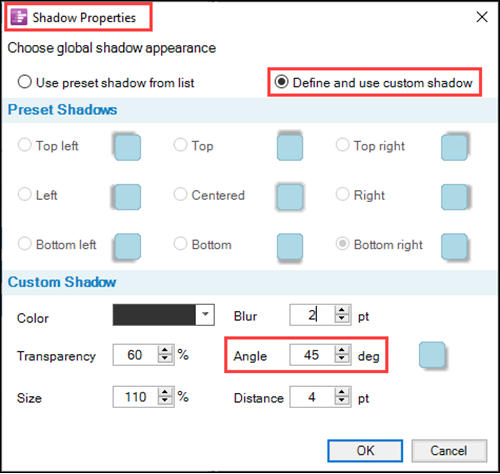
Shown above, the Angle setting of 45 degrees casts a drop shadow to the bottom right indicating that the illumination source comes from the upper left. The zero (0) degrees Angle setting has the illumination coming from the left and casts a drop shadow to the right. Increasing Angle settings from zero (0) degrees through three-hundred-sixty (360) degrees cause the drop shadow to be cast in a clockwise rotation from the right through the bottom right and so forth through the full circle. Valid Angle settings are from zero (0) degrees to three-hundred-sixty (360) degrees. Any higher values entered into the Angle setting window defaults to 360 degrees. Zero (0) degrees and three-hundred-sixty (360) degrees, of course, have the same effect on the shadow position.
As an illustration, the chart below has an Angle setting of 270 degrees and a Size value of 115%:

Custom Shadow Controls – Distance
The Distance value is an analog for the inclination angle of the illumination source to the plane of the chart. If the light is directly overhead, the distance is zero because the shadow is directly underneath the symbol. As the illumination source moves away from directly overhead, the shadow moves away from the symbol. Recall that the Size value represented the height of the symbol analogously above the plane of the chart. These two controls work together to create the drop shadow affect. The higher the Distance value, the further the center of the drop shadow moves from the center of the symbol. The default Distance value is four (4) pts as shown below in the Shadow Properties form:
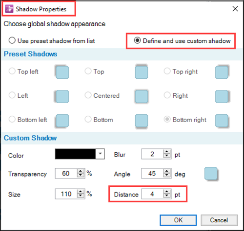
Again, for an example of the effect of the Distance value, the illustration below has a Distance value reset to 10 pts and all other controls remaining at their default values:

If we increase the Distance value to 20 pts the chart looks like this:

Further increases to the Distance value to 30 pts changes the chart portion as shown below:

As can be seen in the sequence of illustrations shown above, increasing the Distance value has the effect of moving the drop shadow further from its associated symbol as an analog to moving the light source away from high-noon position toward (but never reaching) the sunrise or sunset positions.
Drop Shadows with Task Bar/Milestone Symbol Decorations
Up to this point the discussion of drop shadows was focused just on the task bars and milestone symbols. Drop shadows also can be shown along with baselines, deadlines, and endpoints. For example, if we turn ON the baseline shapes in our sample BlueGrass Project OnePager chart (using the default drop shadow setting), the chart looks like this:

This may be difficult to see, so if we customize the drop shadow by changing the Distance value to 10 pts, the updated chart can be seen below:

As shown in the above illustration, the baseline shapes can be clearly seen in the drop shadow.
Additionally, deadlines and endpoints are displayed with drop shadows if the drop shadow feature is turned ON:

Endpoints can be shown in drop shadows as well but are not illustrated here. Some care should be taken when exaggerating the screen space taken up by drop shadows as their use may clutter the chart, conflict with task bar/milestone symbol name labels and other shapes in the graph area. Drop shadows are intended to enhance the presentation and care is required to assure that they do not distract.
Drop Shadows for Milestone Symbols
Drop shadows can also be produced on milestone symbols in the same way as for task bars using the Milestone tab of the Chart Properties form or Template Properties form:

Using a chart where task bars are all represented as milestones at their Finish date and selecting the drop shadow default preset option, the chart looks like this:

Note that the configuration for milestone symbol’s drop shadows is separate from that for task bars, so you could make them different, as shown below:
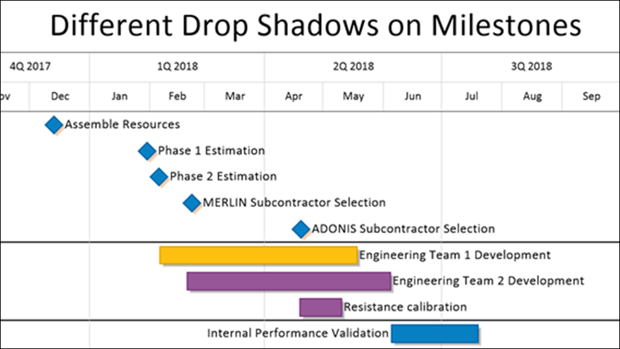
In addition to Dynamic shapes used as milestone symbols, you have the option to use Emoji shapes to represent milestone symbols. As an example, the illustration below uses an Emoji shape to represent the milestone symbols from the chart illustrated above with a drop shadow using the Custom Shadow feature with a Distance value of 10 pts:

Some Emoji shapes are quite complex and their resulting drop shadows are complex as well. We recommend some experimentation when using Emoji shapes and drop shadows in your charts.
For a complete list of Dynamic and Emoji shapes, please see the article at:
| Gallery of Dynamic Shapes and Emoji Symbols |
Drop Shadow Representation
Using Drop Shadows in OnePager charts is useful in creating a sense of depth and hopefully in drawing the attention of your audience to your chart as a visual aid in schedule conversations.
The degree to which drop shadows can be used to enhance OnePager charts for presentations is dependent on the schedule issues being discussed and how your audience might react to your presentation. Drop shadows, especially the custom shadows feature, are provided to give you the greatest flexibility possible in configuring your chart to support your schedule conversations and presentations.
Related Links
| Transparent Fills | Drop Shadows |
(10.21.1-72)