Comment Boxes Tab for Version 7.2
Contents
- 1 Overview
- 2 About the Comment Boxes Tab
- 3 Application of Comment Box Tab Edits to the Chart
- 4 Global Editing Controls for Comment Boxes
- 5 About Hover Boxes
- 6 Hover Box with Custom Text Feature
- 7 Related Links
Overview
The Comment Boxes tab is modified in version 7.1 and later to include a sub-control group supporting the enhanced Hover Box feature. This feature provides you with controls to: (1) control the font properties of the text elements shown in the Hover Box and to select an alternative source plan field in the Hover Box.
This article has two major sections, one devoted to the controls associated with Comment Boxes and the other providing details of the controls for the enhanced Hover Box feature. These two links below can be used to access either of these two major sections:
| About the Comment Boxes Tab |
| About Hover Boxes |
Illustrations used in this article are from OnePager Pro using data from Microsoft Project but the features, function, controls, and manual edits apply equally to other OnePager editions that import from data sources like Microsoft Excel, Smartsheet, Oracle Primavera P6, Planisware Enterprise, Asana, and Wrike.
About the Comment Boxes Tab
This tab controls the appearance of Comment boxes and looks like this:
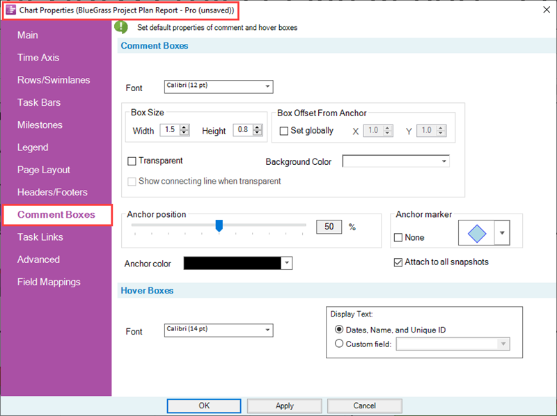
Comment boxes are attached to selected task bars/milestone symbols in the chart and are presented using the parameters initially set in the Comment Boxes tab.
Application of Comment Box Tab Edits to the Chart
Comment boxes are created in the chart by first selecting a task bar/milestone symbol and clicking the Comment Box icon on the OnePager Insert ribbon tool bar tab shown here:

Only one task bar/milestone symbol can be selected for the addition of a Comment box at a time. When you click the Comment Box icon, the Create or edit comment box form is accesses as shown below:
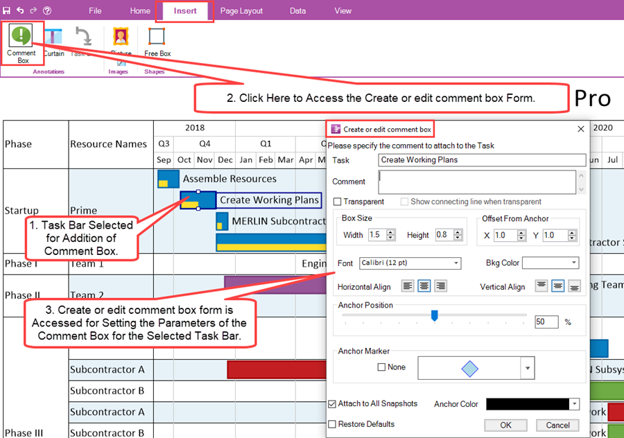
After establishing the appropriate settings in the Create or edit comment box form, click the OK button to create the Comment box.
For more information on creating and editing comment boxes, please see the article at:
| Creating and Managing Comment Boxes |
The controls in the Comment Box tab of the Chart Properties form are applied to new Comment boxes created AFTER the edits to the form are made. If you make any edit in the Comment Box tab and click the OK button on the form, the NEXT Comment box created in the chart uses those edited parameters when creating the Comment box. If any changes are made to control/parameters in the Comment Box tab AFTER Comment boxes were created in the chart, these existing Comment boxes do not display the most recent edits made in the Comment Box tab.
Global Editing Controls for Comment Boxes
Font Controls
The Font dropdown provides access to the standard OnePager Font properties form that allows you to change the font properties of the Comment box text as shown below:
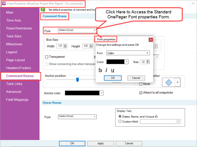
The standard Font properties form allows you to set the Comment box text's font type, color using the standard OnePager Color Chooser form, the font size in pixels, and the Bold - Italics - Underline settings.
Box Size Controls
The Box Size sub-control group has two windows, shown below, that allow you to set the width and height in inches or centimeters for the dimensions of all Comment boxes depending on the Template Properties form being used.
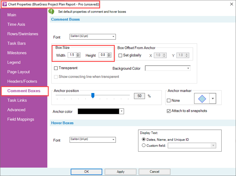
Box Offset from Anchor Controls
If the Set Globally checkbox is checked ON, the X and Y values appearing in the windows adjacent to the right are enabled and can be edited to establish different horizontal and vertical displacements of the Comment boxes from their anchor locations on the task bars/milestone symbols as shown here:
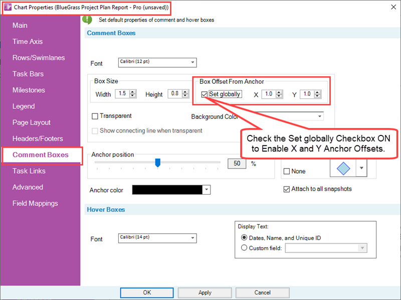
The values for X and Y are in inches or centimeters depending on the Template Properties form being used. The X value measures distance from the anchor in the horizontal direction form the anchor and the Y value measures distance from the anchor in the vertical direction. Values can be either positive or negative. If the Set Globally checkbox is checked OFF, all Comment boxes created in the chart are all offset from their anchor point by the default values shown in the windows adjacent to the right as shown in the example below where the offsets are the default values of X=1.0 and Y=1.0:

Transparent, Connecting Line, and Background Color Controls
The Transparent checkbox when used in conjunction with the Show connecting lines when transparent checkbox are used to remove the Comment box's border while leaving the text untouched. When the Transparent checkbox is checked ON, the Show connecting lines when transparent checkbox is enabled with its default value of checked OFF, and the Background color is disabled as shown below:
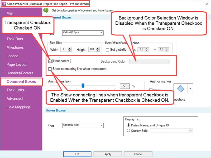
The Transparent checkbox, when checked ON, makes all Comment box and its connecting line subsequently created in the chart transparent as shown in the example below:

Show connecting lines when transparent Checkbox
When the Transparent checkbox is checked ON and the Show connecting lines when transparent checkbox is also checked ON the border of the Comment box is not shown but the connecting line to the Comment box's anchor point is displayed as shown here:

Background Color
The Background Color dropdown provides access to the OnePager standard Color Chooser. The selected color fills the Comment box, however, the connecting line and the border color of the comment box remain the same color as the selected task bar/milestone symbol as shown in the example below:
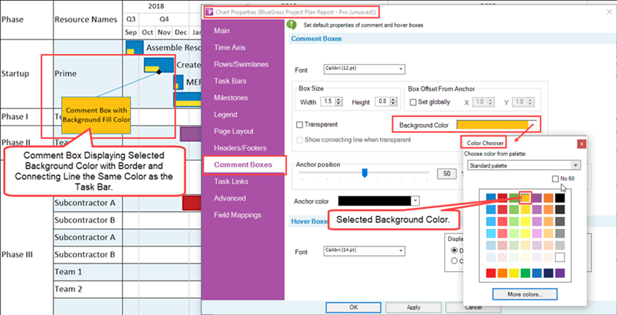
The default Background color starts out always the same as the fill color of the task bar/milestone symbol to which the Comment box is anchored. The Background color is disabled when the Transparent checkbox is checked ON as discussed above.
Anchor Position Slider Bar Control
The Anchor Position slider bar sets the location along the task bar at which Comment boxes are anchored as illustrated below:
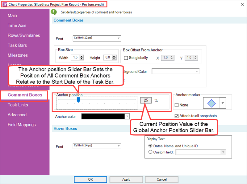
The value of the position is a percentage of the duration of the task bar as measured from its Start date.
Below is an example of a Comment box positioned at the 25% position on the selected task bar:

Anchor Shape Selection Control
The Anchor marker control consists of two (2) controls as shown below:
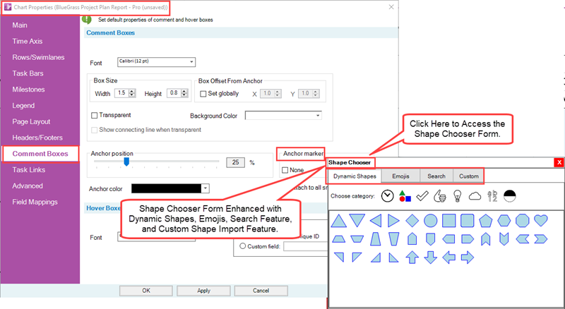
The None checkbox, when checked ON, disables the showing of any Anchor marker associated with all Comment boxes in the graph. With the None checkbox checked OFF, the Anchor marker dropdown list is enabled and you can use this dropdown list to select an appropriate Anchor marker for all anchor points for Comment boxes in the chart. The list of Anchor markers are the same as the list of Milestone symbols available for use and found at the Milestones tab of the Template Properties and Chart Properties forms.
For more information on using the new Shape Chooser form for configuring Comment Box Anchor Shapes, please see these links:
| Shapes - New Milestone Symbol Shapes for Version 7.2 |
| Other Enhanced Features |
Anchor Color Control
The Anchor Color dropdown provides access to the standard OnePager Color Chooser that you can use to establish the color of the Anchor marker as shown here:
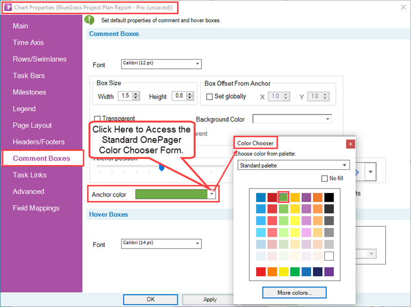
As an example, selecting the color green for the Anchor marker color produces a Comment box with an Anchor marker that looks like this:

If you select an Emoji to serve as the anchor shape, the Anchor color control is inoperative because Emojis have their colors fixed. Selection of a Dynamic shape allows an Anchor color to be applied.
Attach To All Snapshots Checkbox
The Attach to All Snapshots checkbox, shown below, when checked ON assures that all Comment box appears in all snapshots.
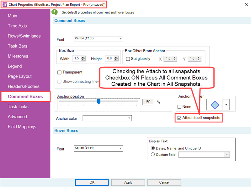
The default setting is to attach a new Comment boxes to all snapshots.
About Hover Boxes
OnePager Pro, OnePager Express, and OnePager Bundle version 7.1 and later are upgraded with the addition of an enhanced Hover Box feature.
Hover Box with Custom Text Feature
The Hover Box is a feature within the Chart Editor that, when turned ON, allow you to hover your mouse over a task bar/milestone symbol in the chart and quickly see the task bar’s start/finish dates, task name, and Unique ID number. Using new controls provided in the Template Properties and Chart Properties form’s Comment Box tab, you have the capability to change the font properties of the text elements contained in the Hover Box and to select an alternative field from your source plan to be shown in the Hover Box instead of the text elements mentioned previously as standard.
Standard Hover Box Text Elements
The standard text elements in the OnePager Hover Box looks like the example below:

As shown above, the Hover Box shows the task bar’s Start/Finish dates in the top line, the Task Name in the second line, and the task bar’s Unique ID in the third line. Moving the mouse cursor off the task bar or milestone symbol causes the Hover Box to disappear from the graph.
Alternative Custom Text for the Hover Box
The controls associated with the Hover Box with Custom Text feature are contained in the Template Properties and Chart Properties form’s Comment Box tab as shown below in the Hover Boxes sub-control group:
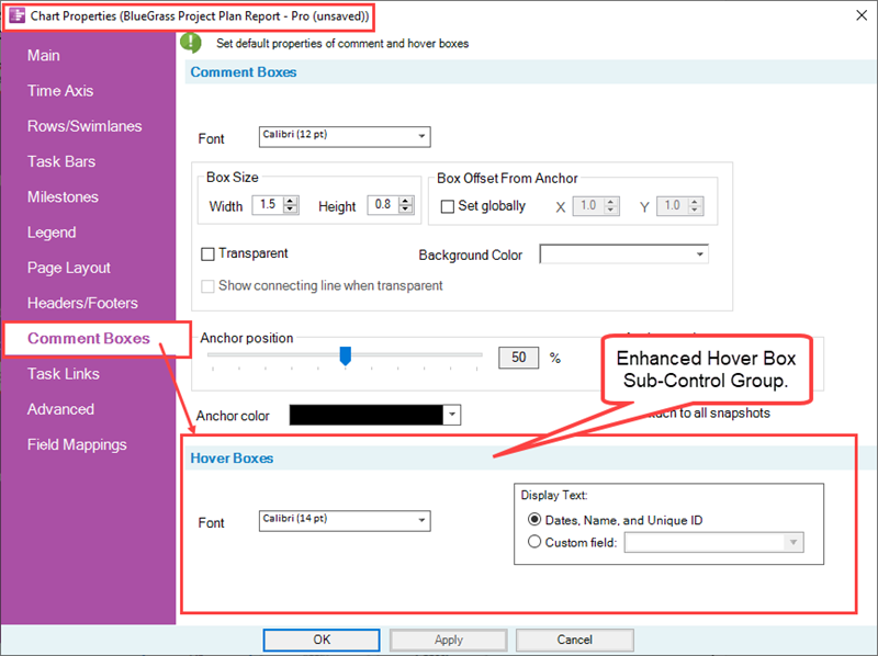
There are two controls shown in the Hover Boxes sub-control group shown above.
The Font dropdown accesses the standard Font properties form as shown here:
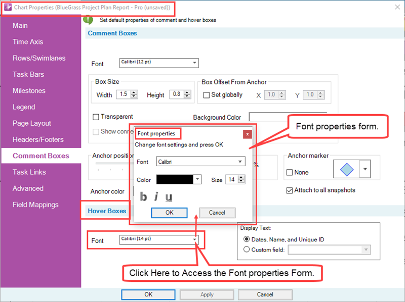
The Display Text: sub-control group provides the option, using radio buttons, to (1) display the standard text elements in the Hover Box or (2) select an alternative source plan field to display as the only text element in the Hover Box as illustrated below:
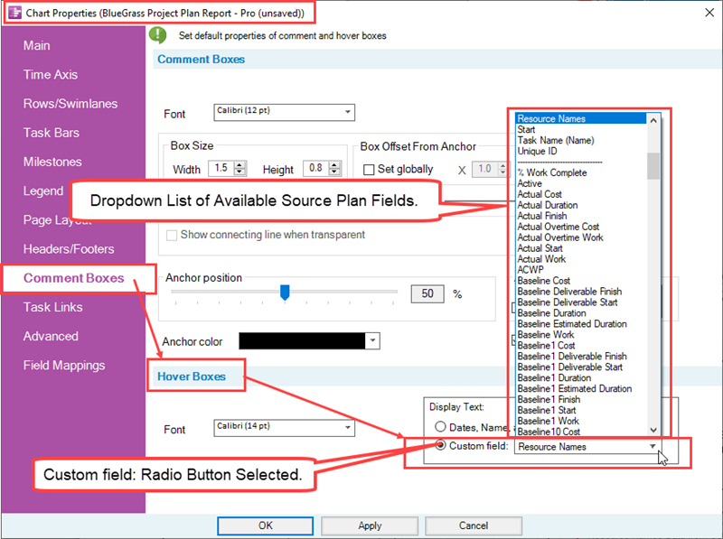
In the illustration above, the Custom field: radio button is selected which enables the field selection dropdown. Resource Names is the source plan field selected and when the Hover Box is turned ON and the mouse is hovered over a task bar or milestone symbol, that task bar or milestone symbol’s name is the text content of the Hover Box as shown here:

The Font properties form can be accessed at any time to change the font appearance of the Hover box text elements as you require. The feature automatically creates multi-line text elements depending on the font size and the length of the text element string.
If the selected Custom field does not contain any data or is blank, the Arrow head-plus cursor symbol is shown when you mouse over the task bar/milestone symbol as shown below:

Turning the Hover Box Feature ON and OFF
The Hover Box feature can be turned ON and OFF from the checkbox on the View tab of the OnePager ribbon tool bar tab as shown below with the checkbox checked ON:
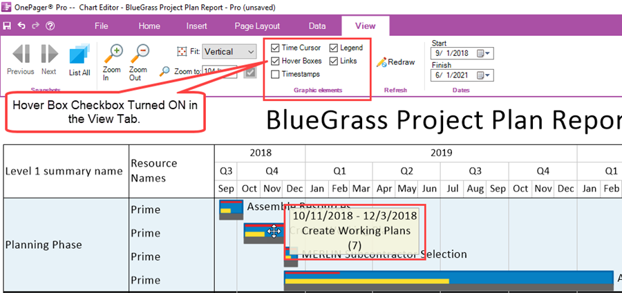
As a reminder where the controls are located for managing the enhanced Hover Box feature, a tool tip is provided as shown below:

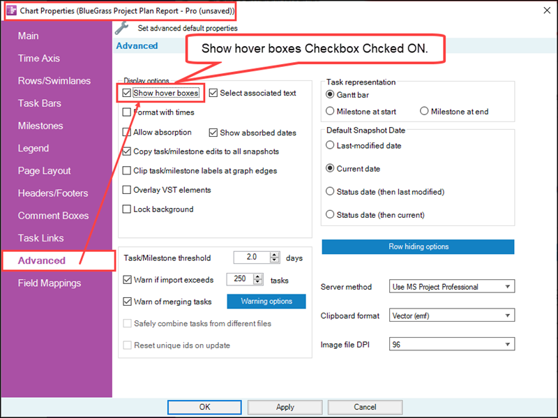
Additionally, there is a Hover Box control checkbox available in the Template Properties and Chart Properties form’s Advanced tab in the Display options sub-control group as shown below for the Chart Properties form:
Related Links
(21.11.1-72)