OnePager's Ribbon Tool Bar View Tab for Version 7.2
Contents
Overview
Illustrations used or referenced in this article are from OnePager Pro using data from Microsoft Project but the features, function, controls, and manual edits apply equally to other OnePager editions that import from data sources like Microsoft Excel, Oracle Primavera P6, Smartsheet, Planisware Enterprise, Project for the Web, Asana, and Wrike.
OnePager's Ribbon Tool Bar View Tab
The OnePager Ribbon Tool Bar View tab is shown in detail below:

The View tab is useful for managing the contents of the Chart Editor with respect to which snapshots are shown, for Zooming in and out on specific sections of the chart, for controlling the display of graphic elements, refreshing the chart, and altering the chart’s extent by changing its Start/Finish dates. The five (5) sub-sections of the View tab are discussed below:
View Tab – Snapshots Sub-Section
The three (3) controls in the Snapshots sub-section are enabled only when the chart contains two ( 2) or more snapshots.
Previous/Next Buttons
The left and right pointing arrows, shown below, are enabled only when, from the current Chart Editor snapshot being displayed, there is a Previous snapshot or a Next snapshot from the perspective of the current snapshot being displayed in the Chart Editor. Clicking the Previous or left point arrow when it is enabled causes the Chart Editor to display the previous snapshot in the sequence of snapshot dates. Clicking the Next or right pointing arrow when it is enabled takes you to the next or further dated snapshot available in the chart.

List All Button
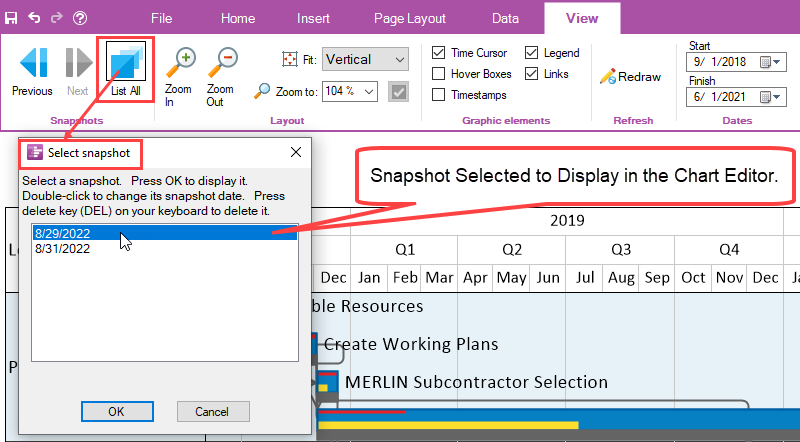
When you click the List All button, OnePager accesses the Select snapshot form which lists all the snapshots by date in the chart. Selecting a snapshot date in the grid displays that selected snapshot in the Chart Editor when you click the OK button on the Select snapshot form as shown below:
View Tab – Layout Sub-Section
There are four (4) controls in the Layout sub-section, shown below, used for controlling the “look” in the Chart Editor with respect to magnification and orientation on your screen. These four (4) controls are discussed in detail below:

Zoom In/Zoom Out Buttons
The Zoom In/Zoom Out buttons change the magnification (Zoom factor) within the graph and allow you to focus in or away from portions of the chart as demonstrated below:
Suppose the chart’s Zoom factor is set to 100% as shown here:
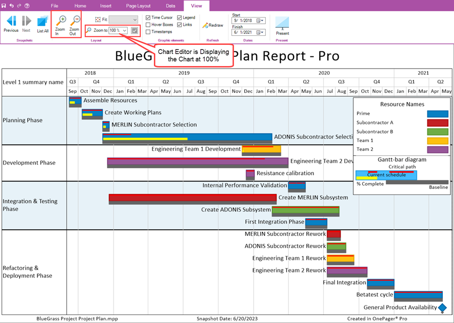
In the illustration above, the Zoom to: window show 100%. If the Zoom In button is clicked once, the Zoom factor changes to 110% and, as shown in the illustration below, the swimlanes and task bars appear larger and less of the chart appears on your screen.
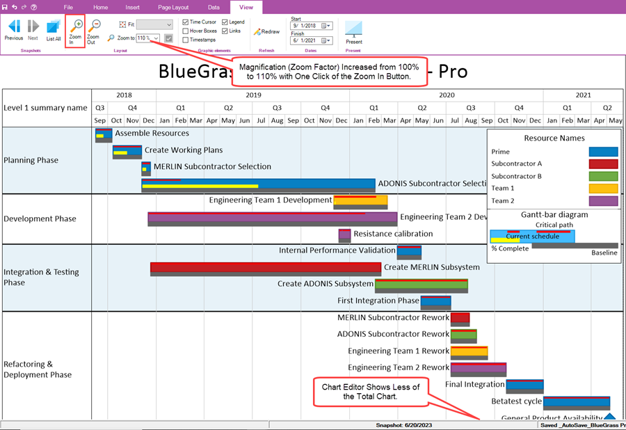
Additional clicks on the Zoom In button increases the Zoom factor and ultimately OnePager provides horizontal and vertical scroll bars for navigation in the Chart Editor.
Clicking the Zoom Out button reduces the magnification making the graph look smaller in the Chart Editor.
Each time either the Zoom In or Zoom Out button is clicked, the value in the Zoom to: window is changed to reflect the change in Zoom factor.
Zoom To: Dropdown and Window
The Zoom to: window has a dropdown list of most use Zoom factors as shown below:

Clicking the Zoom to: dropdown accesses the dropdown list shown above. Select the desired Zoom factor with a left click and the selected value is entered into the Zoom to: window.
You also have the option to set the Zoom factor to by clicking in the Zoom to: window and typing the desired value. After typing in the value, the checkbox to the left of the Zoom to: window is enabled and clicking this checkbox sets the new Zoom factor value into the Chart Editor. The values accepted range from 5% to 500%.
Fit: Dropdown
The Fit: dropdown lets you set the orientation of the graph in the Chart Editor to either Vertical or Horizontal as shown in the dropdown below:

The Vertical Fit option assures that the single page in the Chart Editor shows all the rows and swimlanes vertically even if the screen is not filled to the right as shown below:
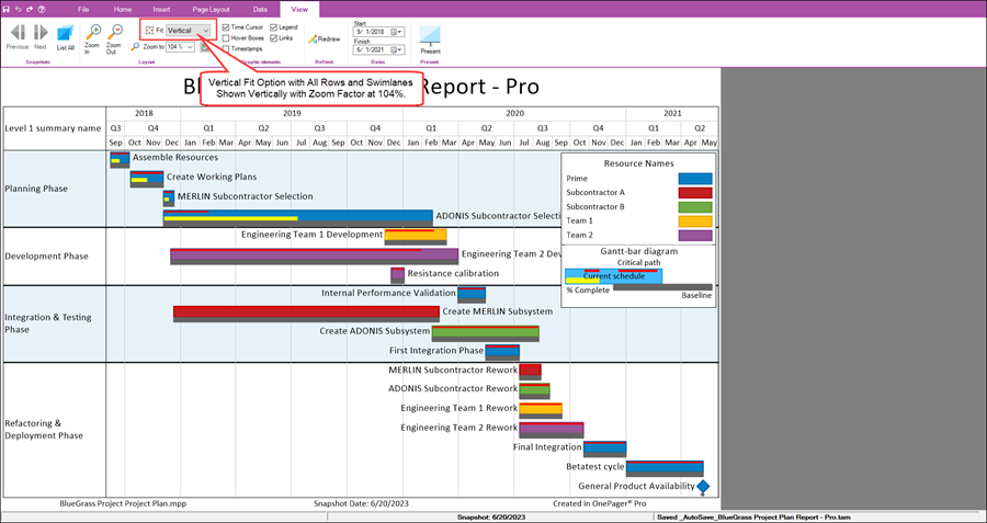
The Vertical Fit: option shows the entire chart vertically in the Chart Editor’s viewing area. If the extent is large in terms of the charts Start/Finish dates. A horizontal scroll bar is provided on the bottom of the chart.
Selecting the Horizontal Fit option produces the screen view of the Chart Editor shown below:
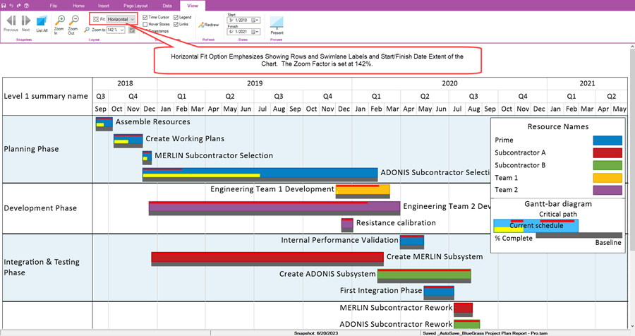
In this Fit: option the chart fills the width of the Chart Editor’s viewing area but the vertical portion is cut off and available using the scroll bar on the right.
View Tab – Graphic Elements Sub-Section
There are five (5) checkbox controls in the Graphic Elements sub-section used for controlling which graphic elements such as the time cursor, Hover Boxes, Timestamps, The Legend, or Task Links are shown in the chart. These five (5) checkbox controls are discussed in detail below:

Time Cursor Checkbox
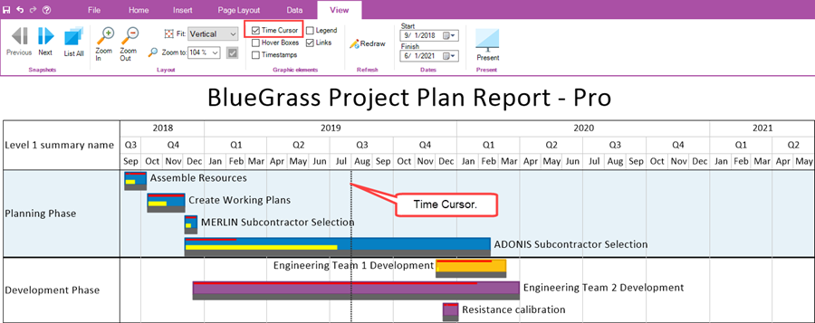
When the Time Cursor checkbox is checked ON, the time cursor is shown in the graph if the snapshot date is within the Start/Finish date extent of the chart as shown below:
Hover Boxes Checkbox
Checking the Hover Boxes checkbox ON turns on the Hover Box feature allowing you to use the Hover Box to examine task bars and milestone symbols and obtain additional information as shown below:
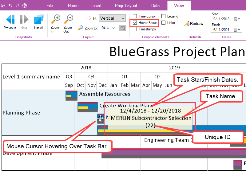
The Hover Box as shown above provides the task bar/milestone symbol’s start/finish dates, task name, and Unique ID.
Timestamps Checkbox
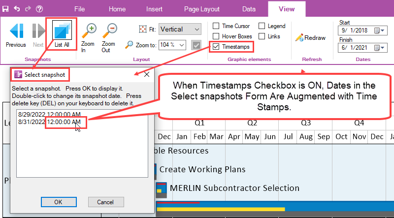
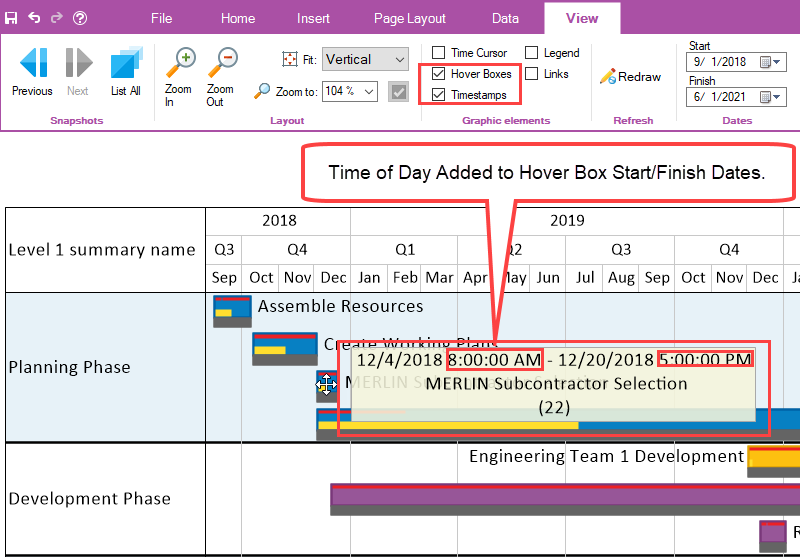
When the Timestamps checkbox is turned ON, some dates in the chart are augmented with the time of day data taken from the source plan, if provided. For example, with the Timestamps checkbox checked ON, dates in the Select snapshot form are augmented with time of day information as shown below:
As another example, if the Hover Boxes checkbox is also turned ON, the task Start/Finish dates in the Hover Box are also augmented with time of day values from the source plan as shown here:
Legend Checkbox
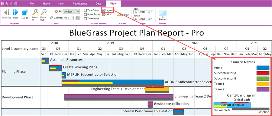
Turning ON the Legend checkbox immediately causes the display of the Legend in the chart at the location determined by the Template Properties or Chart Properties form’s Legend tab. An example is shown here:
Links Checkbox
When the Links checkbox is checked ON and manual or Data-Driven Task Links are imported from the source plan, the Chart Editor displays the task links in the graph as shown here:
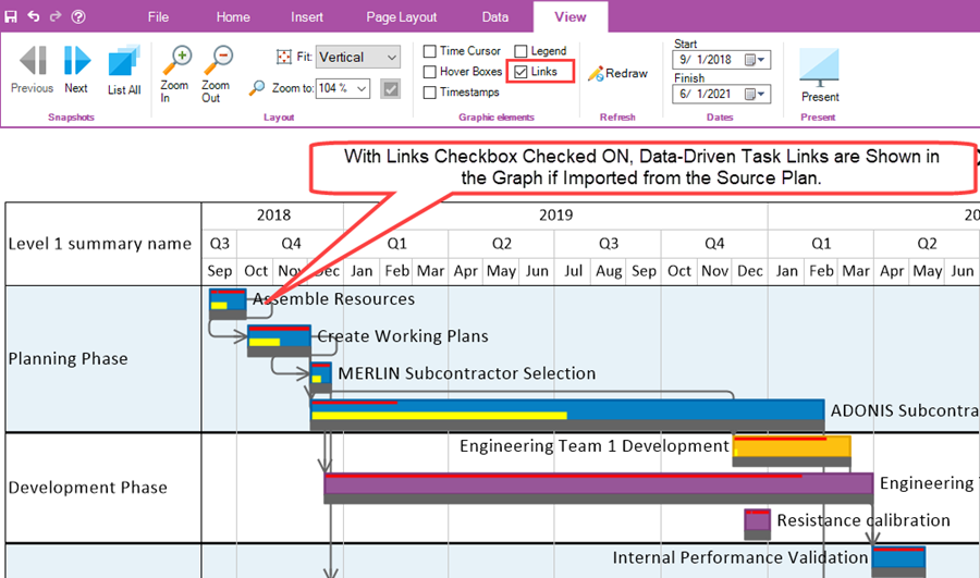
In order to insert manual Task Links into the graph as discussed in the Insert sub-section above, the Links checkbox in the Graphic elements sub-section of the View tab must be checked ON.
View Tab – Refresh Sub-Section
The Refresh sub-section contains the Redraw button discussed below.
Redraw Button
The Redraw button forces the Chart Editor to redraw all graphics in the chart. This function is useful when occasionally you may find an artifact in the graph or are unsure that the chart is perfectly up-to-date. The Redraw button is shown below:

View Tab – Dates Sub-Section
The Dates sub-section contains two (2) Date Picker dropdowns for the chart’s Start date and Finish date, respectively as shown below:

The Dates sub-section is discussed in detail below:
Start Date Picker Dropdown
Clicking on the Start date picker dropdown accesses the OnePager standard Date Picker form as shown below:

With the Start date picker form accessed, you can use the form to set the Start date that is used to define the left side of the graph. This Start date is separate and apart from the start date provided by the source plan. The chart’s start date is for the purpose only of establishing the visible left or earliest date for the chart. Based on the Start date selected, the chart may have empty space to the left of the first task bar/milestone symbol or some task bar/milestone symbols may be cut off on the left side of the chart with consideration of the display or swimlane and/or row label cells.
Finish Date Picker Dropdown
Clicking on the Finish date picker dropdown accesses the OnePager standard Date Picker form as shown below:

With the Finish date picker form accessed, you can use the form to set the Finish date that is used to define the right side of the graph. This Finish date is separate and apart from the finish date provided by the source plan. The chart’s finish date is for the purpose only of establishing the visible right or latest date for the chart. Based on the Finish date selected, the chart may have empty space to the right of the latest task bar/milestone symbol or some task bar/milestone symbols may be cut off on the right side of the chart.
View Tab - Present Sub-Section
The Present sub-section has one control button, the Present button as shown below:

Clicking the Present button places the Chart Editor into Presentation Mode and removes the OnePager tool bar from the screen.
For more information on Presentation Mode, please see the article at:
| Using Presentation Mode with OnePager |
Related Links
(4.0.2.2.9-72)