OnePager's Ribbon Tool Bar Home Tab for Version 7.2
Contents
Overview
Illustrations used or referenced in this article are from OnePager Pro using data from Microsoft Project but the features, function, controls, and manual edits apply equally to other OnePager editions that import from data sources like Microsoft Excel, Oracle Primavera P6, Smartsheet, Planisware Enterprise, Project for the Web, Asana, and Wrike.
OnePager's Ribbon Tool Bar Home Tab
The OnePager Ribbon Tool Bar Home tab is shown in detail below:

The Home tab has six (6) sub-sections as shown above. The first two sub-sections, Editing and Settings, for the most part contain controls that apply to the entire chart while the remaining four (4) sub-sections are enabled whenever a task bar/milestone symbol or text component is selected in the graph. Each sub-section is discussed below.
Home Tab – Editing Sub-Section
There are five (5) controls in this sub-section. Three (3) are always enabled (i.e., Copy, Show/Hide, and Select All). The Representation control is enabled whenever a task bar/milestone symbol is selected in the graph. The Hide Rows control is enabled whenever at least one row is empty of task bars or milestone symbols.
Copy Dropdown
The Copy dropdown control applies to the copying the graph to the Windows clipboard from which the chart may be pasted into other applications as desired. The Copy dropdown has three (3) options as shown here:
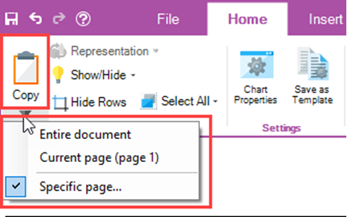
Clicking the Copy dropdown accesses the dropdown menu shown above which has three (3) option controls:
- Entire document – Copy the entire document area to the Windows clipboard. The document area is defined in the Glossary and is illustrated below:
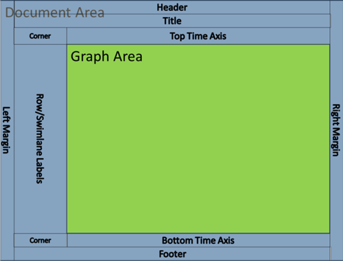
- If the chart is multi-page, all pages are copied to the Windows clipboard.
- Current Page (page n) – The copy current page option places the page currently displayed in the Chart editor into the Windows clipboard. The page number shown in parentheses shows which page of the multi-page chart is showing and is about to be placed in the Windows clipboard.
- Specific page … - Clicking on the Specific page… option accesses the Choose page form where there is roller control available for you to select the specific page you wish to place in the Windows clipboard as shown below:
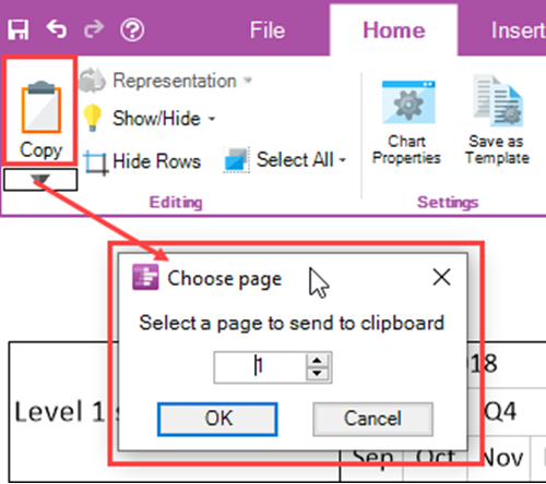
The default page number displayed is “1” and the maximum number available is the highest numbered page available from the multi-page chart. Upon making your selection, click OK to complete the action which closes the form.
Representation Dropdown
For the Representation dropdown to be enabled you must select one or more task bar/milestone symbols and/or one or more task bar/milestone symbol names. When enabled the Representation dropdown has four (4) options as shown below:
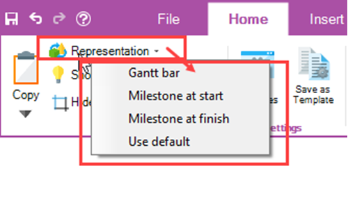
- Gantt bar – Selecting the Gantt bar option, changes the selected task bar/milestone symbol into a Gantt bar configuration. This option selection is effective only in the case where the selected milestone symbol is associated with a start-finish date duration of greater than one day. Attempting to change a milestone symbol where the start and finish dates are the same is a null operation.
- Milestone at start – When the Milestone at start option is selected for a task bar; the task bar is changed to a milestone symbol positioned in the chart at the original task bar’s start date.
- Milestone at finish - When the Milestone at finish option is selected for a task bar; the task bar is changed to a milestone symbol positioned in the chart at the original task bar’s finish date.
- Use default – Selecting the Use default option has an effect dependent on the setting established in the Template Properties form’s Advanced tab’s Task representation sub-control group. For most Template Properties form’s distributed with OnePager, the default setting is the Gantt bar.
Show/Hide Dropdown
The Show/Hide dropdown contains seven (7) commands of which the first five (5) are disabled until an action is taken in the chart to enable them. The bottom two (2) commands can be clicked when you need access to either of the two (2) forms for which the commands are named. The Show/Hide dropdown list is shown below:
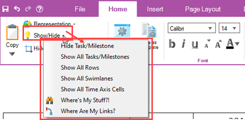
The actions needed to enable the top five commands and the forms accessed using the bottom two commands are discussed below:
- Hide Task/Milestone – This command is used to hide a selected task bar/milestone symbol in the chart. The command is enabled whenever a task bar or bars are selected. Clicking the Hide Tasks/Milestone command when enabled hides the selected a task bar/milestone symbol or symbols.
- Show All Tasks/Milestones – The Show All Tasks/Milestones is enabled only when one (1) or more task bars or milestone symbols are hidden in the chart. Clicking the command unhides all hidden task bars and milestone symbols except where rows are hidden.
- Show All Rows – This command is enabled when one (1) or more rows are hidden in the chart. Clicking this command unhides all hidden rows and any task bars or milestone symbols in the unhidden row or rows.
- Show All Swimlanes – The Show All Swimlanes command is enabled whenever one (1) or more swimlanes are hidden. Clicking this command unhides all hidden swimlanes, their component rows, and any task bars or milestone symbols.
- Show All Time Axis Cells – This command is enabled whenever a time axis cell at any level or levels is hidden in the time axis component of the chart. Clicking the Show All Time Axis Cells unhides these hidden cells and restores them to their last unhidden configuration.
- Where’s My Stuff?! – This command accesses the Where’s My Stuff?! form and places it on top of the Chart Editor. The Where’s My Stuff?! form is useful for determining why a task bar or milestone symbol is hidden in the chart. Clicking the Where’s My Stuff?! command accesses the form and each grid row in the form identifies a hidden task bar or milestone symbol and shows why the component is hidden. The Where’s My Stuff?! form is always accessible even when no components of the chart are hidden.
- Where Are My Links? – The Where Are My Links? command access the Where Are My Links? form which keeps track of manual and Data-Driven task links that are hidden. When accessed, each grid row in the form identifies task links between two (2) task bars or milestone symbols that are hidden. The form can be accessed when manual and/or Data-Driven task links are not imported or when none are hidden.
Hide Rows Button
The Hide Rows Button is enabled whenever a row has hidden task bar/milestone symbols. The purpose of the Hide Rows Button is to provide you with options to select on how rows with hidden task bar/milestone symbols should be handled. When there is at least one (1) empty row and you click the Hide Rows button, the Row hiding choices form is accessed as shown here:
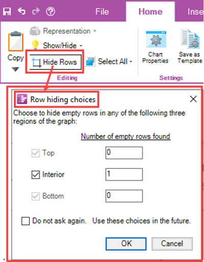
The Row hiding choices form provides information on the number of rows hidden in each of the three (3) chart regions shown with the checkboxes and, using the checkboxes, you can specify where empty rows should be hidden.
Select All Dropdown
The Select All dropdown is always enabled and is used to make chart-wide selections of chart components including task bars/milestone symbols, comment boxes, task links, free shapes, curtains, and images. The Select All dropdown is useful for setting up editing of all of a type of component in the entire chart. The Select All dropdown list is shown here:
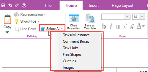
Each of the six (6) commands in the Select All dropdown list is discussed below:
- Task/Milestones – The Tasks/Milestones command selects all task bars/milestone symbols in the chart. When the Select associated text checkbox is checked ON, clicking the Tasks/Milestones command also selects all task bar/milestone symbol name labels as well. The Select associated text checkbox is located in the Advanced tab of the Template Properties and Chart Properties form in the Display options sub-control group.
- Comment Boxes – This command selects all Comment boxes shown in the chart. If there are no Comment boxes in the chart, the command is ignored.
- Task Links – The Task Links command, when clicked, selects all showing manual and Data-Driven task links. Hidden task links are ignored. If there are no manual or Data-Driven task links defined or imported in the chart, the command is ignored.
- Free Shapes - This command selects all Free Shapes shown in the chart. If there are no Free Shapes in the chart, the command is ignored.
- Curtains - This command selects all Curtains shown in the chart. If there are no Curtains in the chart, the command is ignored.
- Images - This command selects all Inserted Images shown in the chart. If there are no Inserted Images in the chart, the command is ignored.
Home Tab – Settings Sub-Section
There are two (2) buttons in this sub-section. The Chart Properties and Save as Template buttons are always enabled. The Home tab – Settings Sub-Section is shown below:
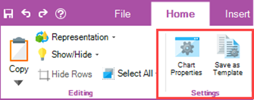
The two (2) buttons are discussed below:
- Chart Properties – Clicking the Chart Properties button accesses the Chart Properties form either at the Main tab of the form if the access is the first access after the chart is created or opened or at the last tab accessed if the form was accessed previously. The Chart Properties form consists of twelve (12) tabs and is used for making global edits to the chart and its components.
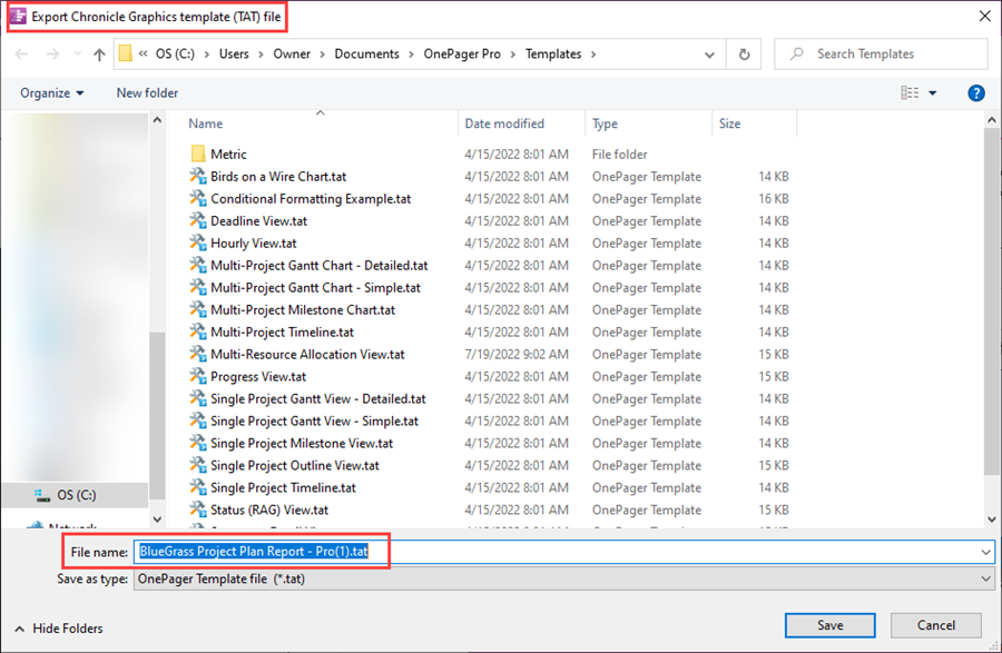
- Save as Template – This button can be used to create a Template Properties form from the current Chart Properties form. This created Template Properties form can be used to configure other charts or to share with other colleagues. When clicked, OnePager opens an Export Chronicle Graphics template (.tat) file form which is used to specify the file name of the Template Properties form you are creating. The initial file name for the saved created Template Properties form is the same as the file name of the chart as shown here:
Home Tab – Font Sub-Section
The Font sub-section contains controls for making global edits to text components in the chart. There are three (3) dropdown controls and five (5) button controls as shown here:

Dropdown Controls
The two (2) dropdown controls are discussed below:
- Font type dropdown – The Font type dropdown contains a list of font types available on your computer as shown below:
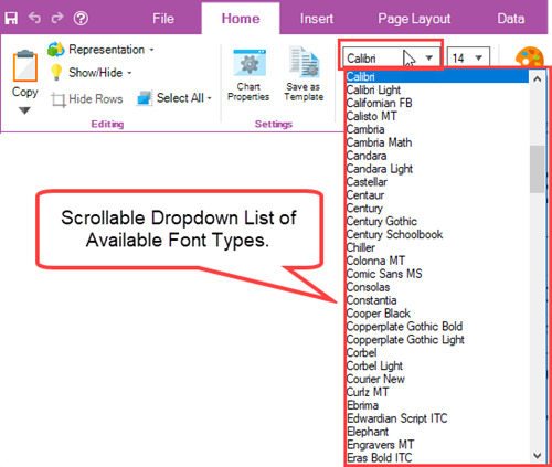
- The Font type dropdown is enabled whenever a text component is selected in the chart. When no text component selections are made, the Font type window shown above is blank.
- Font size dropdown – The Font size dropdown, like the Font type dropdown, is enabled whenever a text component is selected in the chart and shows a list of available font sizes that can be selected as shown here:
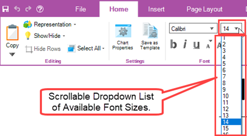
- In addition to the list of available Font sizes, the Font size window, shown above, can be itself selected and a font size value can be typed in. When no text component selections are made, the Font size window shown above is blank.
Button Controls
There are three (3) sets of button controls for editing selected text in the chart as follows:
- b, I, u Buttons – These three (3) buttons are enabled whenever a text component is selected in the chart. Clicking the “b” button changes the selected text to Bold or un-bolds Bolded text. Clicking the “i” button changes the selected text to Italics or removes italics from text that are italicized. Clicking the “u” button adds an underline to the selected text or removes underlines from text that is underlined.
- Small “a” and Capital “A” Buttons – These two (2) buttons shown below allow you to decrease or increase the font size of selected text in increments of one (1) font size:

- Font color Button – The Font color button is used to access the OnePager Standard Color Chooser form as shown below to change the color of selected text:
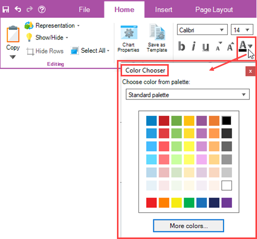
- Once the Standard Color Chooser form is access, you can use the color grid to select the desired color for the selected text with a simple click on the desired color. Once a color is selected, the Standard Color Chooser form is closed and the bar under the large A in the Font sub-section takes on the color selected in the Standard Color Chooser form.
Home Tab – Format Sub-Section
The Format sub-section contains controls for making edits to selected task bars/milestone symbols and select task bar/milestone symbol name label text components in the chart. There are two (2) button controls as shown here:

Format… Button
The Format… button is enabled whenever a task bar/milestone symbol and/or its associated name label text are selected. When enabled and you click the Format… button, OnePager accesses the selected component’s Change Task/Milestone Properties form at the form’s Format tab as shown below:
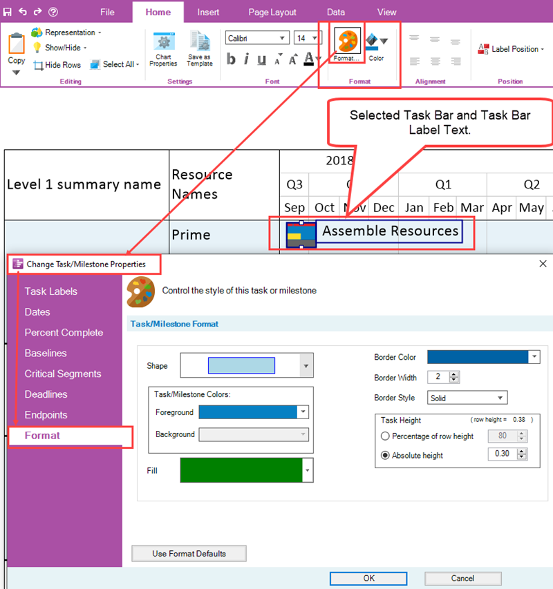
When the Change Task/Milestone Properties form is accessed you have the capability to edit the various properties of the selected task bar/milestone symbol or symbols using the controls in the form’s Task/Milestone Format control group. When you click the OK button in the form above, any changes you make to the properties of the selected task bar/milestone symbol or symbols are applied to that component only.
Background Color Button
The Background Color button is enabled whenever components with background color properties such as a task bar/milestone symbol or symbols are selected. When enabled and you click the Background Color button, OnePager accesses the Standard Color Chooser form as shown below:
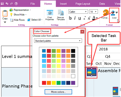
Using the Standard Color Chooser form, you can select a background color by clicking any color square in the grid. Making the background color selection closes the Standard Color Chooser form and applies the selected background color as the new background color of the selected task bar/milestone symbol or symbols as shown here where dark green is selected:
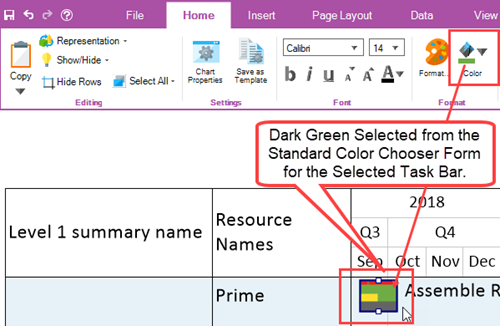
After the color selection is made, the bar under the Background Color Button in the Format sub-section displays the last selected background color.
The Color Button is also enabled whenever a component with a background color is selected such as a time axis cell, row, swimlane, corner component, comment box, free shape, or curtain.
Home Tab – Alignment Sub-Section
The Alignment buttons in the Alignment sub-section shown below provides the capability to arrange selected text components in the graph with respect to the component in which they reside.

The Alignment Buttons consist of two (2) rows of three (3) buttons each:
- The top row of Alignment buttons allows you to position selected text components vertically within the selected text component’s enclosure.
- The bottom row of Alignment buttons allows you to position the select text components horizontally within the select text component’s enclosure.
The Alignment sub-section is enabled when any of the following text component enclosures are selected:
- The Corner
- Swimlane Labels
- Row Labels
- Comment Box Text
- Free Shape Text
- Curtain
Home Tab – Position Sub-Section
The Position sub-section contains a dropdown list of thirteen (13) available task bar/milestone symbol name label text positions. When OnePager creates a chart, task bar/milestone symbol name label text positions are selected so as to minimize overlap of name label text to the best of the software’s ability. The Label Position dropdown is shown below:

The Label Position dropdown is enabled whenever a task bar/milestone symbol or symbols are selected in the chart. Once enabled, clicking the dropdown button accesses the thirteen (13) name label text position options as shown here:
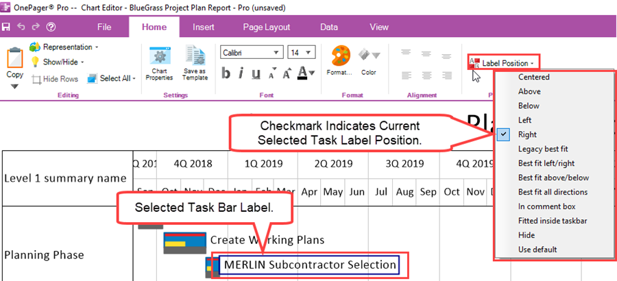
In the illustration above, the selected task bar name label text is positioned to the right of the task bar and this is indicated in the Label Position dropdown list with a checked checkbox at the “Right” position in the dropdown list. Clicking any other option in the dropdown list changes the position of the selected task bar name label text and closes the dropdown list.
Making any selection from the Label Position dropdown list overrides OnePager’s process for minimizing conflicts between task bar/milestone symbol name label texts. However, there are several selection options that do attempt to achieve clarity of task bar/milestone symbol name label text position. These are the name label text position options that begin with “Best fit…”.
The “Legacy best fit” is an option that was brought forward from previous versions of OnePager. The “Use default” option is the option established in the current Template Properties form’s Task Bars or Milestones tab’s Set Label Properties form.
Related Links
| Ribbon Tool Bar - Insert Tab | Ribbon Tool Bar - Page Layout Tab |
| Ribbon Tool Bar - Data Tab | Ribbon Tool Bar - View Tab |
| Ribbon Tool Bar - File Page | Ribbon Tool Bar - Supporting Controls |
(4.0.2.2.1-72)