Conditional Formatting Rules for Text Columns and Rows for OnePager for Version 7.2
Contents
- 1 Introduction
- 2 About Conditional Formatting Rules for Text Columns and Rows
- 3 Conditional Formatting Rules for Text Columns and Rows
- 3.1 Conditionally Formatting with Symbols, Data-Driven Text, and Custom Text
- 3.1.1 Dynamic Shapes and Emoji Symbols Available for Conditional Formatting Text Columns and Rows
- 3.1.2 Data-Driven Text Used for Conditional Formatting Rules for Text Columns
- 3.1.3 Custom Text Used for Conditional Formatting Rules for Text Columns
- 3.1.4 Coloring Text Column’s and Row’s Background Color
- 3.1.5 Manual Adjustment of Column Widths
- 3.1 Conditionally Formatting with Symbols, Data-Driven Text, and Custom Text
- 4 Creating Rule Conditions: Field, Function, Operator, and Value
- 5 Text Column and Row Conditional Formatting Rule Examples
- 5.1 Selecting the Text Column Number – Applies To: (Left#1 thru Left#5 or All Text Columns)
- 5.2 Selecting the Type of Text Column Rule –Display As: (Symbol, Text, or Nothing)
- 5.3 Which Text
- 5.4 Combining Text Column and Row Symbols with Row Background Colors
- 5.5 Combining Text Column and Row Symbols with Cell Background Colors and Row Background Colors
- 5.6 Applying Harvey Balls as an Alternative When Using %Complete in Text Columns – An Example
- 6 Conditional Formatting for Multiple Text Columns - Example
- 7 Related Links
Introduction
Illustrations used in this article are from OnePager Pro using data from Microsoft Project but the features, functions, controls, and manual edits apply equally to other OnePager editions that import from data sources like Microsoft Excel, Microsoft Project Online, Microsoft Project Server, Microsoft Project for the Web, Smartsheet, Oracle Primavera P6, Planisware Enterprise, Asana, and Wrike.
Conditional Formatting Rules and associated forms are provided in OnePager for three sets of objects:
- Task Bar/Milestone Symbol Decorations
- Text Columns and Rows
- Swimlanes
The purpose of this article is to introduce the Conditional Formatting for Text Columns and Rows form and provide some examples of how it can be used to highlight your chart.
About Conditional Formatting Rules for Text Columns and Rows
Overview
As used with OnePager, text columns and rows conditional formatting actions include:
- Function
- Applies To
- Display As
- Symbol
- Symbol color
- Symbol Border
- Which Text
- Custom Text
- Label Font
- Cell Background
- Row Background
- Priority
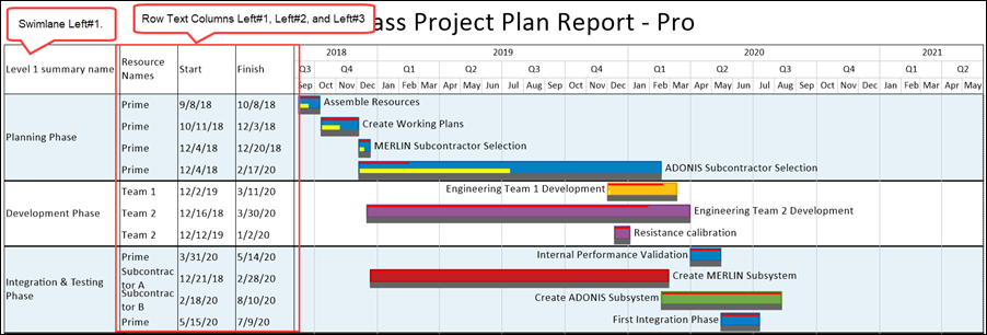
Shown below is a OnePager chart showing swimlanes and several text columns and rows that can have conditional formatting rules applied:
Accessing the Conditional Formatting for Text Columns & Rows Form
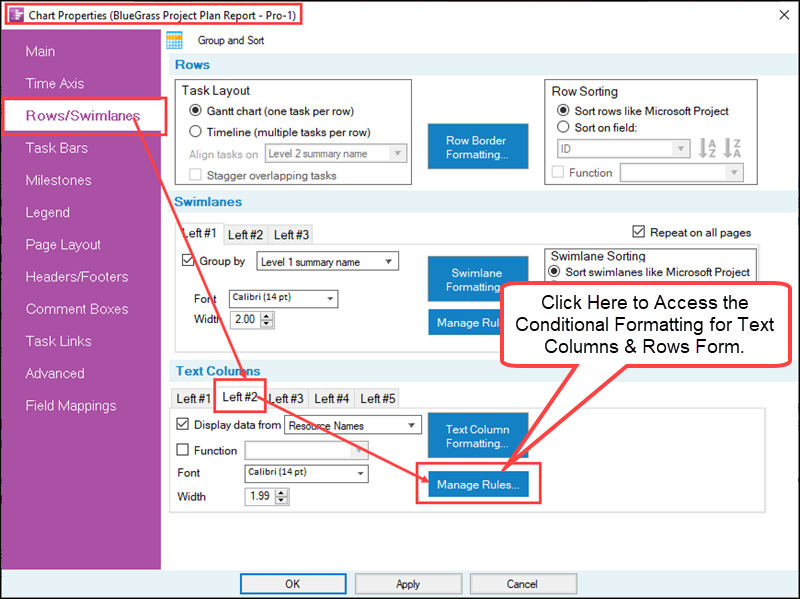
As a reminder, the Conditional Formatting for Text Columns & Rows form is accessed through the Template Properties form and the Chart Properties form’s Rows/Swimlanes tabs as shown below for the Chart Properties form:
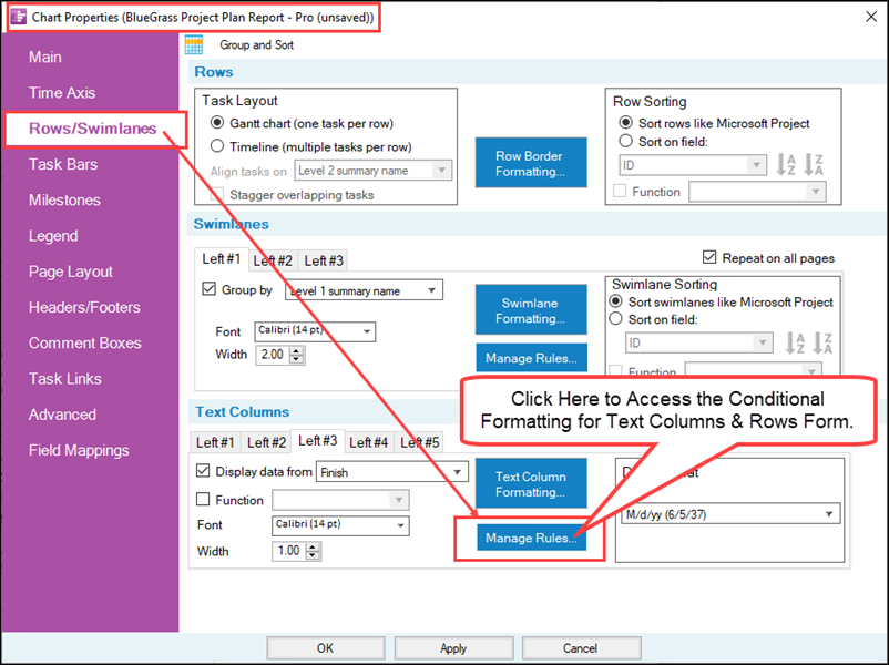
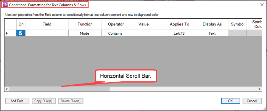
Clicking the Manage Rules… button accesses the Conditional Formatting for Text Columns & Rows form as shown here:

The form shown above is widened but the form has a horizontal scroll bar provided to allow you to scroll left and right when the form is at its normal width:
Discussion and Examples
In each of the sub-sections which follow, there are discussions and examples of how to use the available conditional formatting rules to alter the appearance of text column cell contents based upon imported data from your source plan. It is assumed that the reader has an overall acquaintance with the introductory and basic conditional formatting rule features and controls.
For more detailed introductory information on Conditional Formatting rules, please see the articles at the link below:
| Conditional Formatting (Portal) |
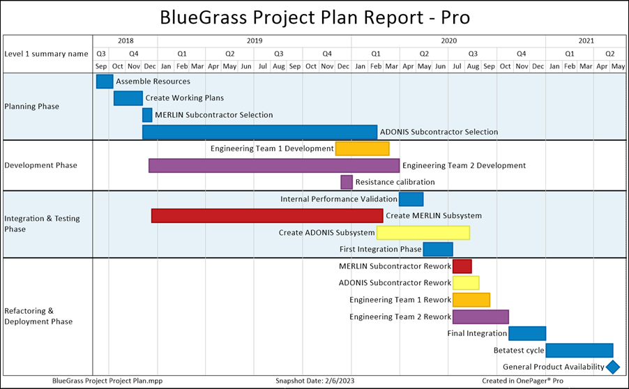
As a starting point, the chart below, using a standard OnePager Pro Template Properties form, is the basic chart for the conditional formatting rules examples provided in the following sub-sections:
Conditional Formatting Rules for Text Columns and Rows
Text columns and rows, up to five (5) text columns in the chart, can be shown or hidden and when shown are adjacent to swimlanes to the left and the graph area to the right. Conditional formatting rules for text columns and rows gives you the capability to conditionally substitute text or symbols based upon source plan data imported to OnePager. In the case of text substitutions, you have all the editing features available for text content including font type, font size, and the like.
For symbols, you have options for the supported dynamic shapes as well as emoji symbols. Symbol shapes also can be modified with different colors and border line styles. Additionally, you have the capability to modify the background color of the text column cells as well as the background color of the rows. The following sub-sections describe how to use rows and text column conditional formatting rules.
Based upon source plan data imported to OnePager, you can create conditional formatting rules specifically for text column cells and rows. This is done before the chart is created by accessing the Template Properties form’s Rows/Swimlanes tab’s Text Column control group and clicking the Manage Rules… button. After the chart is created, the chart can be edited globally by accessing the Chart Properties form’s Rows/Swimlanes tab’s Text Column control group and clicking the Manage Rules… button. The examples provided below use the Chart Properties form.
Conditionally Formatting with Symbols, Data-Driven Text, and Custom Text
Text column cells and rows can be conditionally formatted with symbols, data-driven text imported from your source plan, and custom text. Symbols available in OnePager include dynamic shapes and emoji symbols.
Dynamic Shapes and Emoji Symbols Available for Conditional Formatting Text Columns and Rows
For a visualization of the dynamic shapes and emoji symbols available, please see the article at the link below:
| Gallery of Dynamic Shapes and Emoji Symbols |
Data-Driven Text Used for Conditional Formatting Rules for Text Columns
OnePager provides the capability for you to conditionally insert data-driven text strings imported from your source plan into text column cells based upon the results of your set of conditional formatting for text columns and rows rules. Examples are provided below that shows how this is done.
Custom Text Used for Conditional Formatting Rules for Text Columns
In addition to being able to insert data-driven text into text column cells conditionally, you have the capability to insert custom text into the Conditional Formatting for Text Columns & Rows form’s grid. This is done by typing the desired text into the Custom Text cell as is demonstrated below in the example provided.
Coloring Text Column’s and Row’s Background Color
The Conditional Formatting for Text Columns & Rows form also supports conditionally formatting text column and row background colors based on the conditional formatting rules established. However, text column cells and rows whose background colors are mavericks are not subject to change by Conditional Formatting Rules for Text Columns & Rows.
Manual Adjustment of Column Widths
All Conditional Formatting Rules forms permit you to adjust the width of the columns by placing the cursor in the heading cell at its edge where the cursor turns into a double-arrow shape. Making a left-click on your mouse allows you to pull the width of the heading cell to the left or right to either make it wider or narrower. This is useful for inserting text into those columns that accept typed in text. OnePager remembers the width of these columns for future accesses to OnePager. However, it is not recommended that you make any column zero (0) width.
Creating Rule Conditions: Field, Function, Operator, and Value
Conditional formatting for text columns and rows rules are created in the form by specifying the rule conditions and the rule actions. Rule conditions and rule actions are divided in the form into a number of column with the rule conditions first and the rule actions to the right filling out the rest of the form as shown below.

As with all conditional formatting rules forms supported by OnePager, the Conditional Formatting for Text Columns & Rows form focuses on a specific graphic element of the chart where applying the rules can change the look of the chart in support of your schedule conversations. OnePager provides significant flexibility for crafting rules and actions that support this objective.
Rule Condition Columns for Text Column and Row Conditional Formatting
There are six (6) rule condition columns in the form as shown and discussed below:
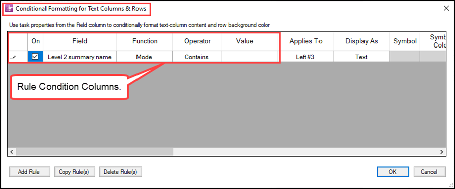
The left column is used to select the rule in the grid and works with the Add Rule, Copy Rule(s), and Delete Rule(s) buttons at the bottom of the form. The On column is a checkbox that, when checked ON, signifies that the rule is enabled and its rule action columns are applied to the graph if the rule is TRUE.
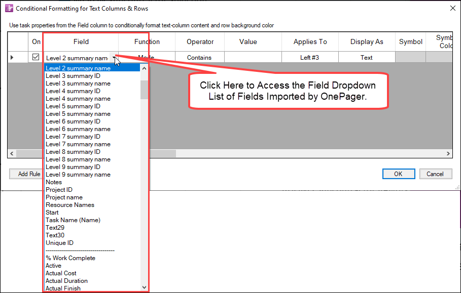
Field Column
The Field column is a dropdown which contains the field names imported from the source plan as shown below:
Function Column
The Function column is typically used when the chart is configured in the timeline orientation; however, the function column is always enabled regardless if the chart presented is either a Gantt chart of timeline oriented chart. The contents of the Function column dropdown is dependent on the field type selected. As an example, the Function column dropdown for a numeric field type is shown below:
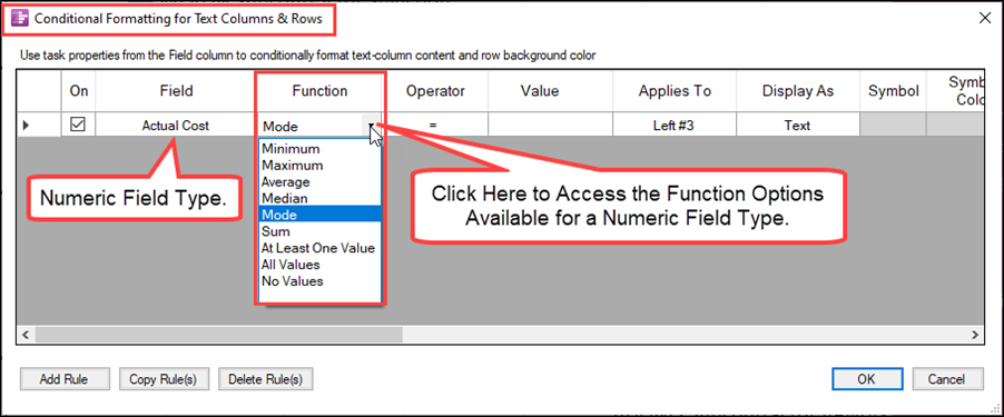
Shown above is a numeric field (Actual Cost) in the Function column dropdown list of nine (9) options. Since a OnePager chart’s rows can contain multiple task bars/milestone symbols with their individual properties and values, OnePager needs a way to determine how to aggregate these multiple property values to represent in the selected text column or row. The Function column provides you with options to aggregate to a specific value, in the case above Actual Cost, to apply against the remainder of the rule condition process to determine the disposition of the rule.
For more information on the Function column, please see the article at:
| Using Functions with Text Columns, Rows, and Swimlanes |
Operator Column
Like the Function column, the Operator column, has options that are dependent on the field type selected. Using the example of a numeric field type as shown above, the dropdown list for the Operator column looks like this:
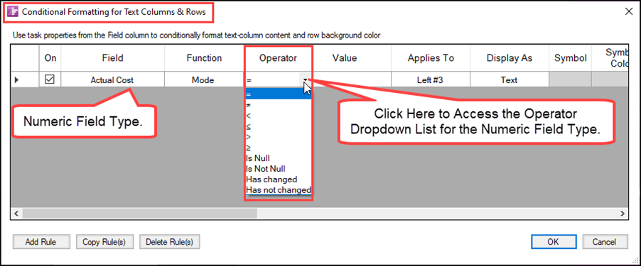
There are Operator options associated with all field types in OnePager including text strings, numeric values, dates, and Boolean fields.
Also shown above are two operators for tracking changes between snapshots: (1) Has changed and (2) Has not changed.
For more information on tracking and visualizing changes between snapshots, please see the articles at:
| Using Conditional Formatting Rules for Tracking Changes Between Snapshots |
| Visualizing Changes between Snapshots |
Value Column
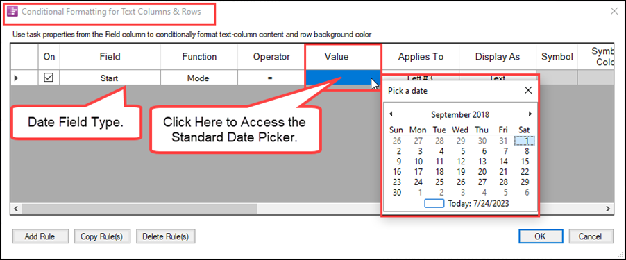
The Value column is the column where you enter the value for the rule condition that makes the rule TRUE and triggers the Rule Action columns to be applied to the chart. In most cases, you have the option to type in a value. When the field column type is for dates, the value column provides the standard OnePager Date Picker form as shown in the example below:
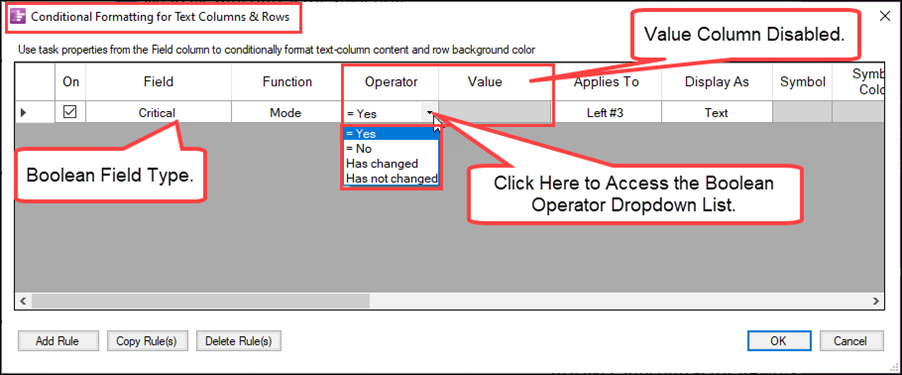
For Boolean fields, the Value column is disabled since the Operator column is used for you to specify the Boolean value desired (Yes or No) as illustrated below:
Priority Column
The last column on the far right in the Conditional Formatting for Text Columns and Rows rules grid is the Priority column. The Priority column controls the sequence in which the rules are applied. OnePager automatically assigns increasing numbers to the Priority column as rules are defined. If several rules are in competition to set a particular formatting property, the rule with the lowest Priority number has priority over all the others. You can change the values in the Priority column at any time after the rule is completely defined, and any positive numeric value is acceptable.
Text Column and Row Conditional Formatting Rule Examples
As an example of using symbols in a conditional formatting for text columns and rows rules, suppose we want to include a text column that displays a colored circle representing the percent complete status of task bars/milestone symbols shown in the chart. Suppose further, that we want the colored circle to be red if the percent complete for the task bar is less than or equal to 25%, yellow if the task bar’s percent complete value is greater than 25% but less than or equal to 50%, and green if the task bar’s percent complete value is greater than 50%. To do this we need to define a set of conditional formatting rules for text columns and rows that meet these requirements.
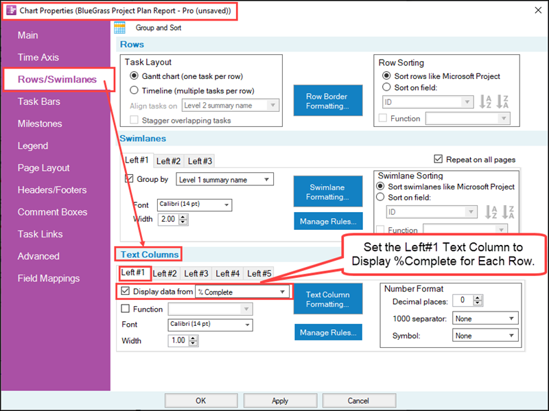
Next, click the Manage Rules… button in the Text Columns control group to access the Conditional Formatting for Text Columns & Rows form and create the rules shown below:
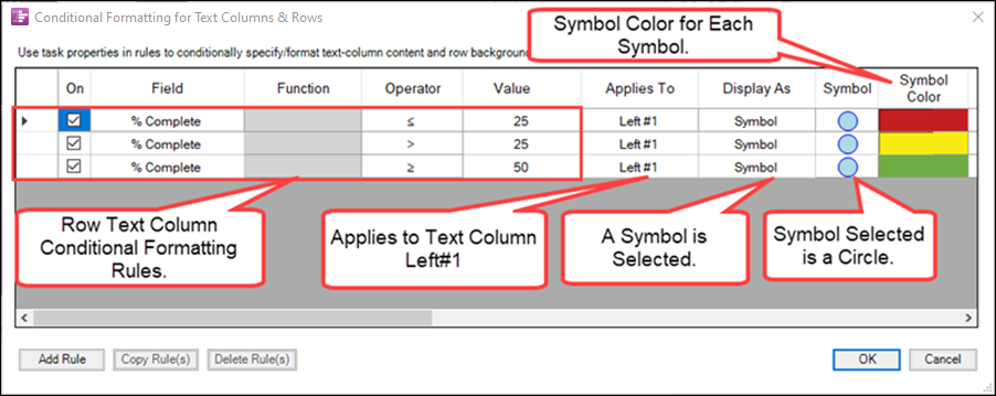
When these conditional formatting for text columns and rows rules are applied to the sample chart, the Left#1 text column looks like this:
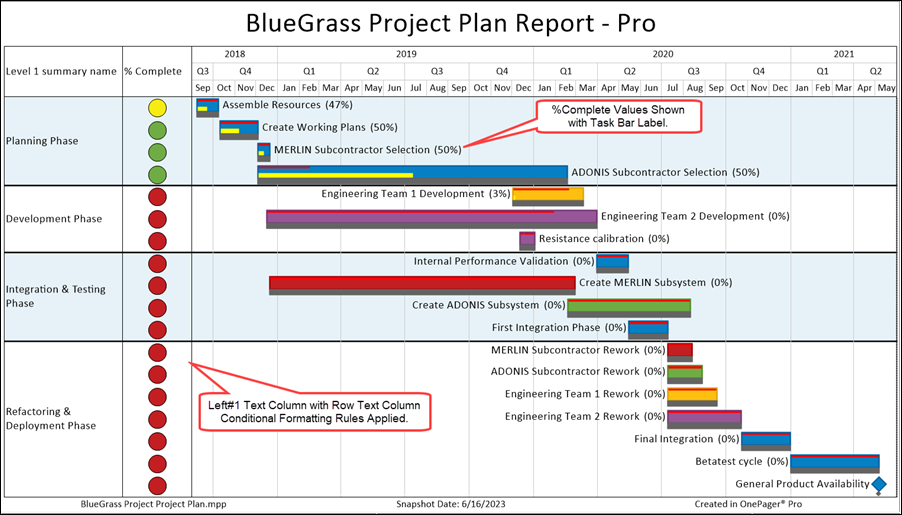
The conditional formatting of the Left#1 text column provides a clear representation of the status of the %Complete value using color coding of a circle symbol to convey the status.
Selecting the Text Column Number – Applies To: (Left#1 thru Left#5 or All Text Columns)
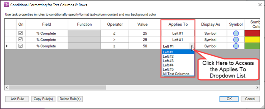
Now let’s look at the conditional formatting for text columns and rows rule action columns more closely. The Applies to column shown below allows you to select which of the five (5) text column that the rule is to be applied. The Applies to dropdown list in the form looks like this:
Selecting the Type of Text Column Rule –Display As: (Symbol, Text, or Nothing)
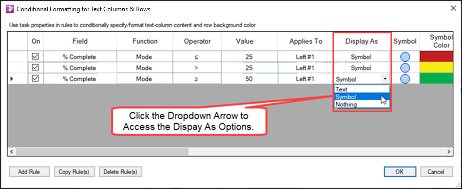
Continuing to use the example above, the Display As field is provided so that you can select between placing text in the text column cell, a symbol in the text column cell (dynamic shape, or emoji), or Nothing. The Display As dropdown looks like this using our example:
Text Option
When the Text option is selected, again using our example, several columns change in the form to shift from supporting a symbol in a text column cell and rows to supporting text in a text column cell:
- 1) The Display As dropdown is accessed and the Text option is selected.
- 2) The Symbol, Symbol Color, and Symbol Border fields are DISABLED as they are no longer needed in this mode.
- 3) The Which Text, Custom Text, and Label Font fields are ENABLED.
The Conditional Formatting for Text Columns & Rows form now looks like this:

Symbol Option
As shown in the illustration above, the Symbol option was selected. Clicking the Display As cell for the rule access the Shape Chooser form as shown in the example below:

When the Symbol option is selected, the Which Text, Custom Text, and Label Font columns are disabled.
Nothing Option
When the Nothing option is selected in the Display As column for a rule, neither text nor a symbol is displayed in the rows and text column cells and the Symbol, Symbol Color, Symbol Border, Which Text, Custom Text, and Label Font columns are DISABLED as shown below:

In the illustration above, the Cell Background and Row Background columns along with the Priority column remain ENABLED. Since no symbol or text can appear in the rows and text column cells if the rules are TRUE, this gives you the capability to specifically use the Cell Background and/or Row Background columns to color the rows and text column cells as shown in the example below based on the above set of rules:
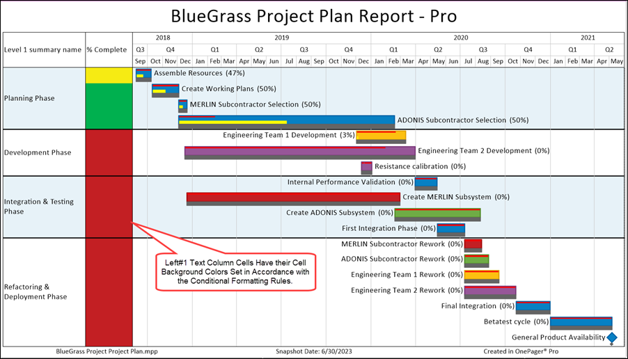
In a similar fashion you can use the sample conditional formatting for text columns and rows rules to control the background color of the row when the form is structured like this:

In the illustration above, the Cell Background and Row Background columns along with the Priority column remain ENABLED. Since no symbol or text can appear in the text column cells and rows if the rules are TRUE, this gives you the capability to specifically use the Row Background column to color the rows as shown in the example below based on the above set of rules:
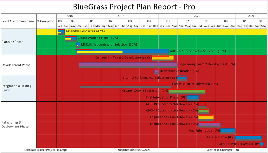
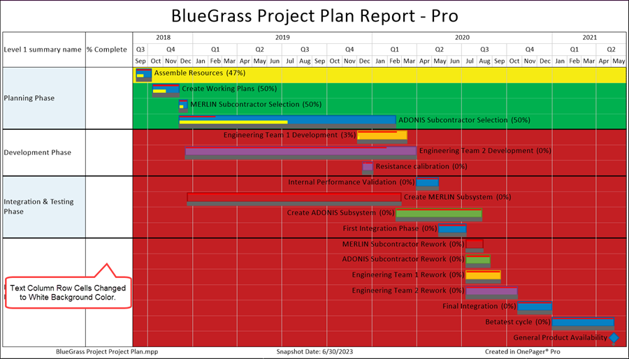
It’s important to note that when you use the Row Background color that the coloring extends into the shown text columns and rows as illustrated above. You can override this in a number of ways such as selecting to use a symbol or text in the rows and text column and making the appropriate changes to the Conditional Formatting for Text Columns & Rows form’s grid. As an example, we can simply change the rows and text column background color to white if we use the standard OnePager Color Chooser form to populate the Row Background color cells in the form to white as shown here:

When this rule change is applied to the chart, it looks like this:
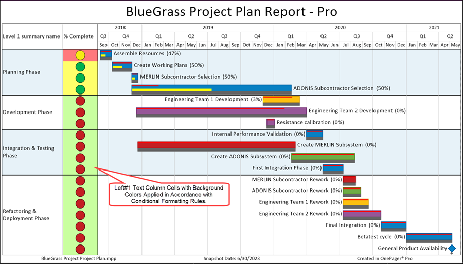
As mentioned above, you can combine Text Column and Row Cell Background colors with symbols or text as shown in the Column Conditional Formatting for Text Columns & Rows form below:

When these Cell Background color rules are applied along with the symbols, the chart looks like the illustration below:
Which Text
Looking at the Which Text field in the Conditional Formatting for Text Columns & Rows form shown above, OnePager automatically inserts the source plan field name values based on current Field shown in the third column from the left in the rule grid (Field column). OnePager includes the Custom Text option in the list so that, if selected, you can enter the text you desire to display in the text column cell. When Custom Text is selected, the adjacent Custom Text and Label Font Column are ENABLED.
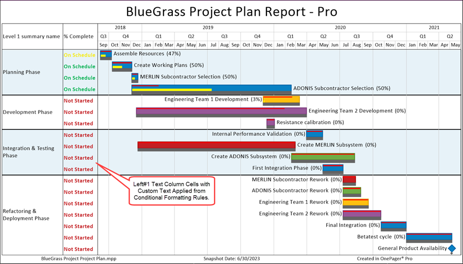
As an example, the Column Conditional Formatting for Text Columns & Rows form with Custom Text replacing the previous example which used a symbol is shown below:

When the rules in the above form are applied, the chart looks like this:
For more information on the Which text column’s use, please take the link to the section in this article:
| Using Functions with Text Columns, Rows, and Swimlanes - Columns That Control Which Text Gets Displayed |
Combining Text Column and Row Symbols with Row Background Colors
In addition to or as an alternative to highlighting with text column and row cell background colors you have the option to highlight rows conditionally with background color as shown in the example below:

When these Row Background color rules are applied along with the symbols, the chart looks like the illustration below:
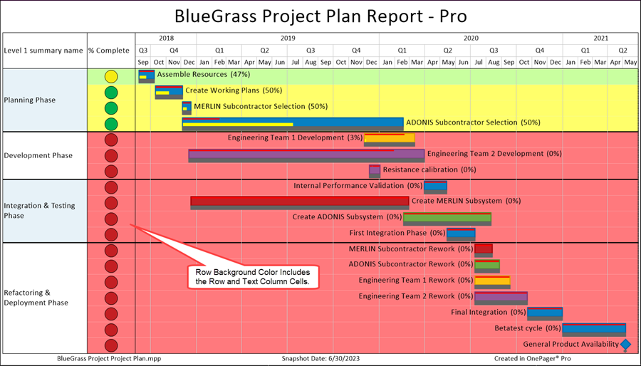
Note: Text column cells and rows whose background colors are mavericks are not subject to change by Conditional Formatting Rules for Text Columns & Rows.
Combining Text Column and Row Symbols with Cell Background Colors and Row Background Colors
As mentioned above, the Row Background color not only applies to the row but to the adjacent text column cell as well. You can use the Cell Background color to override the Row Background color as shown in the Conditional Formatting for Text Columns and Rows Rule form shown below:

Applying the rules as shown in the above form to the chart, it looks like this:
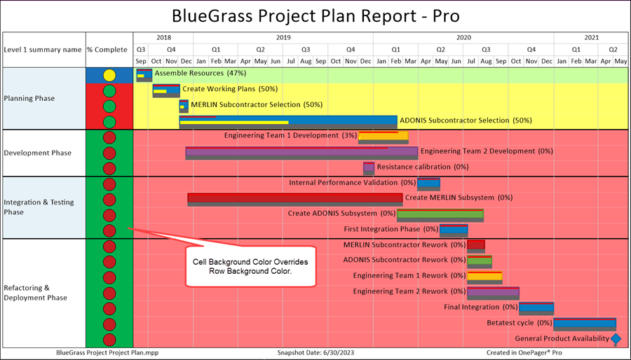
Note: Text column cells and rows whose background colors are mavericks are not subject to change by Conditional Formatting Rules for Text Columns & Rows.
Applying Harvey Balls as an Alternative When Using %Complete in Text Columns – An Example
Among the dynamic shapes available there are a set of “Harvey Balls” that can be used to show percentage values in the form of circles with pie-shaped wedges. To see the set of Harvey Balls please use the link below:

These twenty-six (26) dynamic shapes are arranged in five-percent (5%) increments starting on the top row above on the left with zero-percent (0%) and continuing for the next twenty-five (25) up to ninety-five percent (95%). The remaining six (6) on the bottom row above to the right are show increments of twenty-five percent (25%).
OnePager version 7.2 provides a distributed Template Properties form that has an embedded Conditional Formatting for Text Columns and Rows form configured to display five-percent (5%) increments of the Microsoft Project %Complete column in the chart at the Left#1 text column. The name of this distributed Template Properties form, shown below, is “Percent Complete Harvey Balls”:
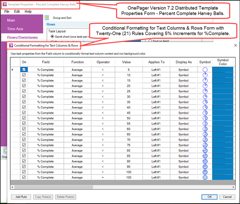
As an example, the source plan shown below is configured to demonstrate how the conditional formatting for text columns & rows rules can be applied:
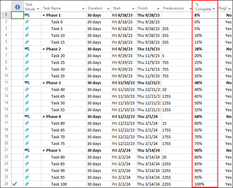
Using the above source plan with the Percent Complete Harvey Balls Template Properties form produces the OnePager chart shown below:
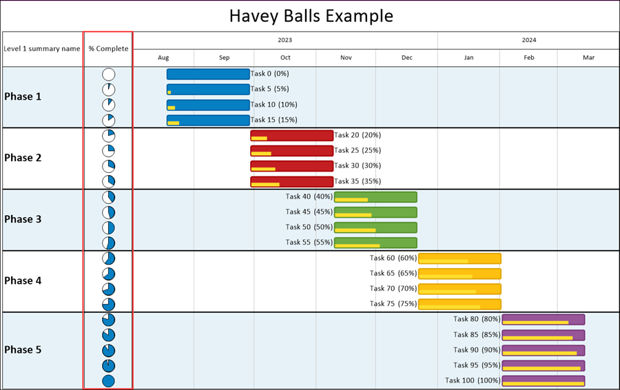
The chart above show multiple ways to graphically portray %Complete including: (1) Harvey Balls, (2) Percent complete bars, and (3) Percent complete text with the task bar name labels.
In the Conditional Formatting for Text Columns & Rows form included in the Percent Complete Harvey Balls Template Properties form, the Symbol Color column is Blue. You can use the Symbol Color column and the standard OnePager Color Chooser form to further highlight the Harvey Balls as shown in the modified Conditional Formatting for Text Columns & Rows form shown here with the resulting modification to the chart:
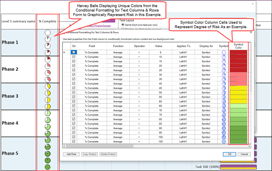
The implication from the example chart above is that risk goes from reds (high risk) to yellows (moderate risk) to greens (low risk) as the percent complete approaches 100%.
Conditional Formatting for Multiple Text Columns - Example
The previous examples showed how Conditional Formatting for Text Columns & Rows rule can be used for one text column. Suppose that you need to create conditional formatting rules that involve two or more text columns.
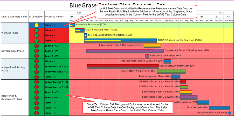
As an example, let’s suppose we want to have the Left#2 text column contain the Resource Names for the task bars in the row but we want to modify the resource name text to include an abbreviation of the State (in the USA) where the resource is located since this information is not represented in a Microsoft Project source plan column.
We can do this by selecting the Left#2 text column in the Chart Properties form’s Rows/Swimlanes tab and then click the Manage Rules… button to access the Conditional Formatting for Text Columns & Rows form as shown below:
The Conditional Formatting for Text Columns & Rows form that is accessed is exactly the same from as in the last example as shown above expanded below to show all columns:

There are four resources associated with this project and we want to add their state location into the Left#2 text column cells where the Resource Name associated with the task is presently as shown below:
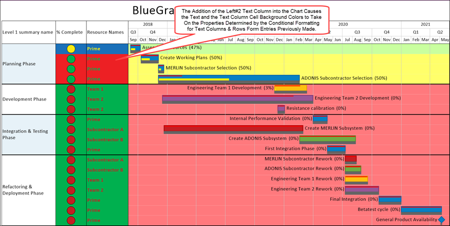
Given the Conditional Formatting for Text Column & Rows rules currently in effect for the Left#1 text column those rules apply to the Left#2 text column cells as well unless overridden by rules for the Left#2 text column which we’ll establish next.
To make the Left#2 text column cell’s content stand out, we not only want to add the state location information to the text but want to change the Left#2 text column cell’s text color to bold black. Adding the rules to do that to the Conditional Formatting for Text Columns & Rows form changes the form to look like this:

There are five (5) new rules added to the Conditional Formatting for Text Columns & Rows form, one for each resource in the project. All five rules apply to the Left#2 text column as highlighted above. In order to enter custom text, it is first necessary to select the Custom Text option in the Which Text rule cell’s dropdown list of options. Left-lick the Label Font cell for each rule to access the Font properties form to establish that we desire to have the font represented in bold black. When all five rules are entered, click OK on the form and OK/Apply on the Chart Properties form and the chart is modified to look like this:
Note: Text column cells and rows whose background colors are mavericks are not subject to change by Conditional Formatting Rules for Text Columns & Rows.
Related Links
(11.17.1-72)