Creating and Formatting Text Columns for Version 7.0
Contents
- 1 Overview
- 2 Microsoft Project and Microsoft Excel Source Plans
- 3 Text Columns Sub-Tab Controls
- 4 Formatting Text Column Headings and Text Column Cells
- 5 Using Text Columns with Timeline Layout Charts
- 6 Related Links
Overview
Text Columns are provided in OnePager Pro and Express as a means of presenting important information to stakeholders pertaining to each row in the chart based upon the imported source plan data. OnePager Pro and Express version 7.0 support five (5) text columns that can be created, edited, and hidden in the chart to suit your needs. Text Columns can be established before the creation of chart in the Template Properties form’s distributed with OnePager Pro and Express version 7.0. You are able to edit these text columns, individual text column headings, and each text column cells globally using the Chart Properties form’s Rows/Swimlanes tab.
Manual controls are also provided so you can use a combination of manual mouse actions, right-click context menu commands, and features on OnePager’s Home ribbon tool bar tab to edit selected text column headings and text column cells.
Chart Properties Form’s Rows/Swimlanes Tab’s Text Columns Control Group
The focus of this article is on the Text Columns control group of the Chart Properties form’s Rows/Swimlanes tab as shown below:
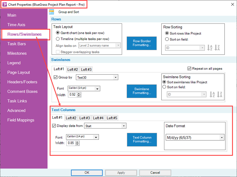
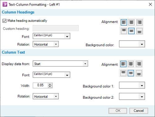
Discussed later in this article is a supporting form, the Text-Column Formatting form, available for each text column. This form is provided to specifically support global editing for text column headings and text column cells in terms of font properties, width, rotation, alignment, and background colors.
The Text-Column Formatting form is accessed by clicking the Text Column Formatting… button in the Text Columns control group of the form illustrated above. The Text-Column Formatting form for the left-most text column in a chart looks like this:
Text Column Nomenclature
In the Text Columns control group shown in the Chart Properties form’s Rows/Swimlanes tab above, there are five (5) sub-tabs marked Left#1, Left#2, Left#3, Left#4, and Left#5. This nomenclature is used to name the five text columns available in OnePager Pro and Express version 7.0. Clicking each of the five (5) sub-tabs shown Chart Properties form’s Rows/Swimlanes tab accesses an identical set of controls for the selected sub-tab. To illustrate this better, consider the portion of a Microsoft Project source plan below annotated with how the various source plan fields are intended for use to make a OnePager Pro chart with two of the five text columns:
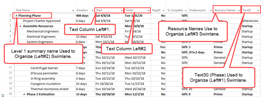
Using the source plan shown above, we can create a sample OnePager Pro version 7.0 chart with two text columns is shown in the illustration below:
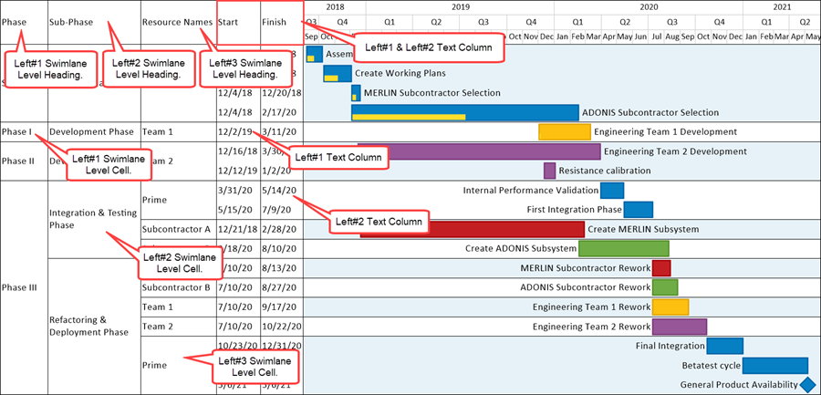
The two text columns are on the left side of the graph area where:
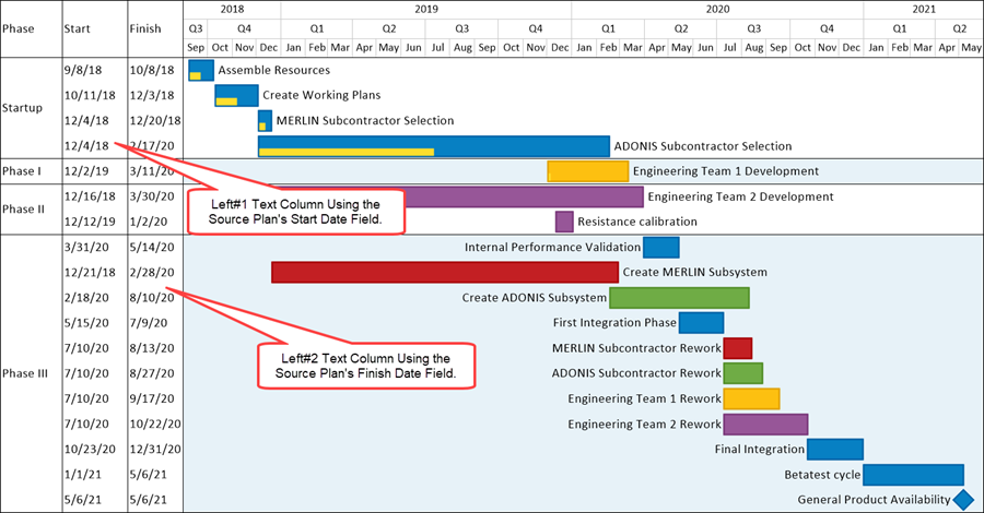
- The Left#1 text column is for task Start Dates in each row and
- The Left#2 text column is for task Finish Dates in each row.
There are three swimlane levels to the left of the two text columns which are labeled Phase for the Left#1 swimlane level; Sub-Phase for the Left#2 swimlane level’ and Resource Names for the Left#3 swimlane level. Text column cells are shown below their respective text column headings in the illustration above.
This article and related articles use this nomenclature to identify individual text columns, text column headings, and text column cells.
Microsoft Project and Microsoft Excel Source Plans
The Chart Properties form’s Rows/Swimlanes tab are essentially the same for OnePager Pro version 7.0 and OnePager Express version 7.0. The controls described in this article apply to both Microsoft Project and Excel source plan data imported into OnePager Pro and Express, respectively. Microsoft Project and Excel source plan data are handled in the same way for imported source plan data used to populate text column cells.
Text Columns Sub-Tab Controls
In this and following sub-sections, it is assumed that you are using a distributed Template or have created a Template form that supports either the Gantt chart or Timeline layout chart. Accordingly, it is assumed that an appropriate Template is selected as the starting point. Since the Gantt chart is the most typical chart organization used in general practice, this portion of the article focuses on how the text column sub-tab controls are used in Gantt Charts. The Template Properties form’s Rows/Swimlanes tab is identical to the corresponding tab in the Chart Properties form. Illustrations in this article use the Chart Properties form’s Rows/Swimlanes tab.
For a more in depth discussion on how to use the Chart Properties form’s Rows/Swimlanes tab to create and edit Timeline layout charts, please see the sub-section at: Using Multiple Swimlane Levels with Timeline Layout Charts
The article providing comprehensive information on the Rows control group can be found at: Collecting, Formatting, and Sorting Task/Milestones into Rows
For a more in depth discussion on how to use the Chart Properties form’s Rows/Swimlanes tab to create and edit Swimlane Levels, please see the article at: Creating, Formatting, and Sorting Swimlanes Levels
The Chart Properties form’s Rows/Swimlanes tab is shown above with the Text Columns control group highlighted for the discussion that follows:

Before using the above form, we strongly recommend that careful consideration be given to the number of text columns required to appear in your chart and the Microsoft Project or Microsoft Excel source plan field names that you want to associate with each text column. For the purpose of illustration in this article, the two text columns are associated with the following Microsoft Project source plan field names:
- Left#1 is associated with the Microsoft Project Start field and represents the sample task’s Start Date.
- Left#2 is associated with the Microsoft Project Finish field and represents the sample task’s Finish Date.
Display Data From Checkbox
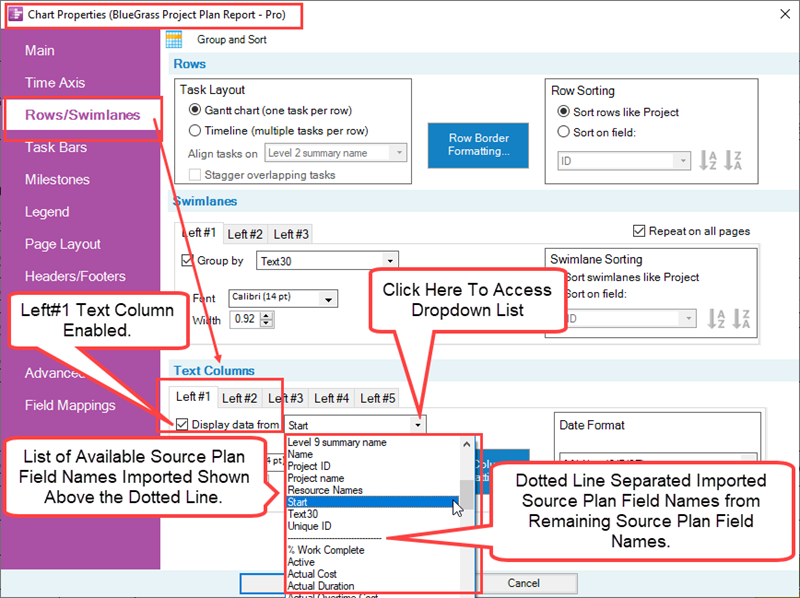
The Display data from checkbox, when checked ON, enables the controls in the sub-tab and tells OnePager that you want task data associated with the field displayed in the window to the right of the checkbox. When the Display data by checkbox is checked OFF, the remaining controls in the sub-tab are disabled and that sub-tab’s text column is not shown in the chart. The dropdown window next to the Display data from checkbox is a list of source plan fields available for use in defining a text column as shown below:
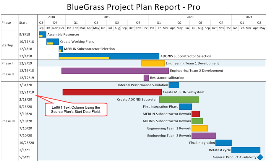
As an example, if we create a chart with just the Left#1 text column defined using the Start field with one swimlane level, the chart looks like this:
As a further example, if we retain the above Left#1 text column, and check the Display data from checkboxes ON for the Left#2 text column so that the Finish Date is displayed, the chart looks like this:
Text Column Text String Font Controls
Clicking the Font dropdown control accesses the standard Font properties form shown here:
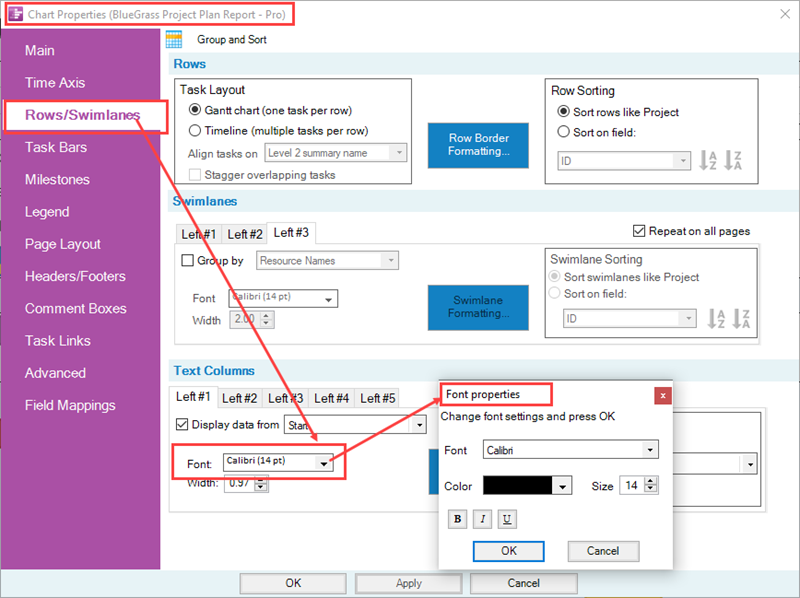
When the Font properties form is accessed for a text column, changes made to any font property in the form is applied to text column cells as shown below where the Font properties form is used to change the Left#1 text column cell’s contents to the color red:
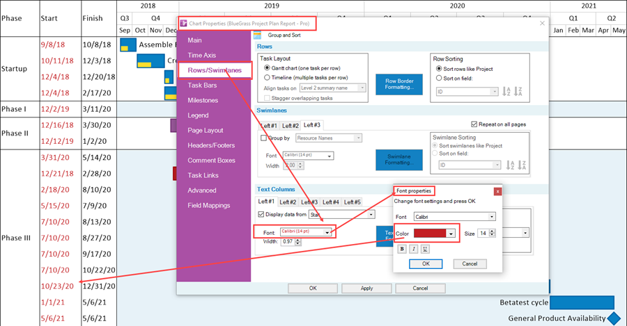
The Font properties form is provided for making global changes to the text column cells in the associated text column. The text column’s heading is not involved as shown above.
The editing controls provided in the Text Columns control group’s sub-tabs are provided for convenience.
More extensive text column heading and text column cell editing capabilities are provided in the Text-Column Formatting – Left#n forms discussed in the sub-section at: Formatting Text Column Headings and Text Column Cells
Manually editing the content of a text column heading is discussed below at: Manual Editing of Text Column Heading Cells
Using the Font properties form to change the font properties of any text column’s cells applies the change or changes to only the applicable text column. All other text column cells are unchanged.
Text Column Width Controls
The Width dial control in the text column sub-tab provides a means of changing the width of the text column in the chart. The Width dial control displays the current text column’s width in either centimeters or inches depending on the Template being used. By changing the value in the Width dial control you can make the width of the text column in the chart wider or narrower as shown below where the Width dial control’s value is significantly increased:
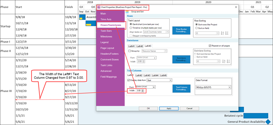
When the Width control is used to change the width of a text column, the text column heading’s width is appropriately changed as well. As with the Font controls, the Width controls apply only to the selected text column and its text column width. All other text column widths are not changed.
Format Options for Date and Numeric Text Column Cells
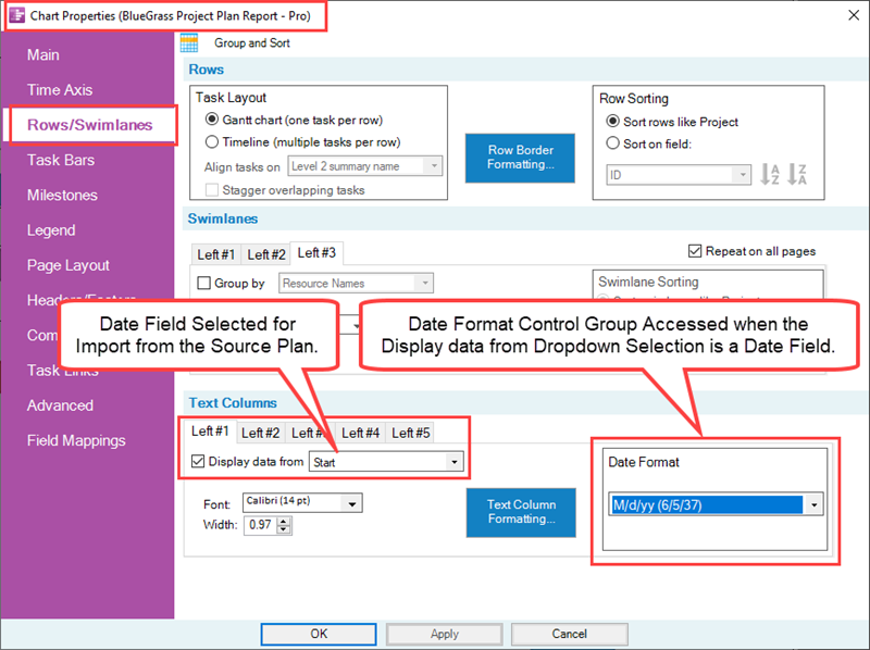
The Text Columns control group has an added sub-control group when the Display data from dropdown is used to select a source plan field that is a Date or Numeric type.
Date Type Text Column Cell Format Options
In the case where the selected source plan field is a Date, the control group looks like this:
Clicking the Date Format dropdown button accesses the list of available date formats as shown here:
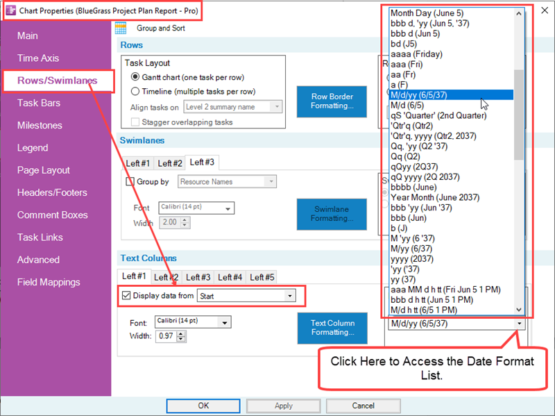
When you make a Date Format selection from the dropdown list shown above, the selected text column cells display the source plan date field data using the selected date format.
Numeric Type Text Column Cell Format Options
When the selected source plan field is a Numeric field, the Text Columns control group is modified to shown the Number Format sub-control group that is shown below:
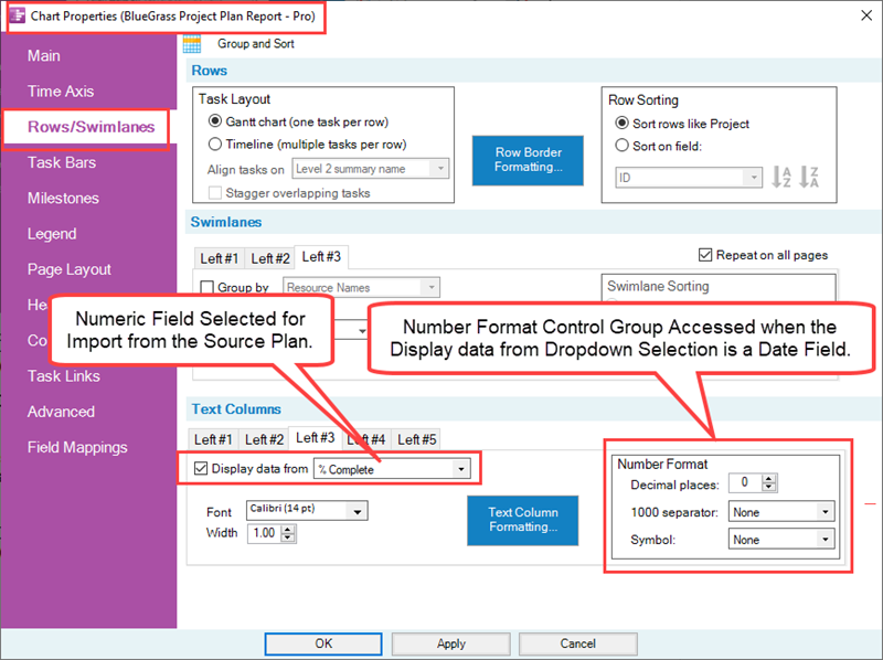
The Number Format sub-control group provides additional formatting options for Numeric type data for selecting the number of Decimal places:, the separator symbol between groups of three digits, if any, and a symbol option selection if the Numeric type represents a common currency as illustrated below:
- 1) The Decimal places: dial window accepts only positive integers from zero (0) up to three (3) decimal places.
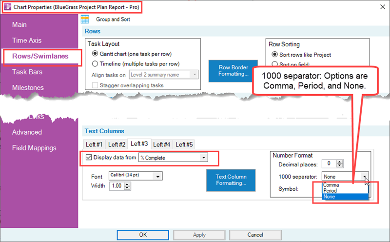
- 2) There are three (3) 1000 separator: options as shown below:
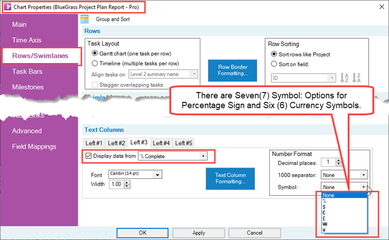
- 2) There are seven (7) Symbol: options available that include the percent sign (%), and six (6) currency symbols as shown here:
If a Boolean source plan field or text string data field is selected from the Display data from dropdown list, there is no additional sub-control group added to the form.
Formatting Text Column Headings and Text Column Cells
Text Column Formatting… Sub-Control Group
Each text column tab has a Text Column Formatting… button that accesses the text column sub-tab’s Text-Column Formatting form as shown below:
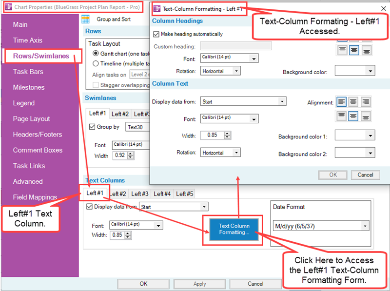
The Text Column Formatting… button is enabled when the Display data by checkbox for the text column is checked ON. Each Text-Column Formatting form has the text column number as part of the title of the form as shown above for the Left#1 text column. The purpose of the five (5) Text-Column Formatting forms is to provide global formatting for all five (5) text column headings and text column cells showing in the chart. Text column borders are not managed in this form. Rather, text column are considered to be part of rows in the chart whose borders are managed in the Rows control group of the Chart Properties form’s Rows/Swimlanes tab.
For more information on the management of row borders, please see the Rows Border Formatting section in the article at: Row Border Formatting
For more information on the Management of Row and Swimlane Borders, please see the article at: Row and Swimlane Borders
Column Headings Control Group of the Text-Column Formatting Form
The Column Headings control group in the Text-Column Formatting – Left#n form controls:
- The text column heading’s contents
- The alignment of the text column heading’s contents in the Corner cell for the text column
- The Font properties of the text column heading’s contents
- The rotational position of the text column heading’s contents
- The Background color of the Corner cell for the text column heading
Using the Make Heading Automatically Checkbox
OnePager Pro and Express assume that you want type in the text column heading’s content for the specific text column heading as opposed to using the Display data from source plan field value specified in the Chart Properties form’s Rows/Swimlanes tab’s Text Columns control group. Accordingly, the Make headings automatically checkbox is checked OFF as the default and the Custom heading window found below the checkbox is enabled so you can fill in the desired text string you want to appear in the designated text column heading position as illustrated in the example below:
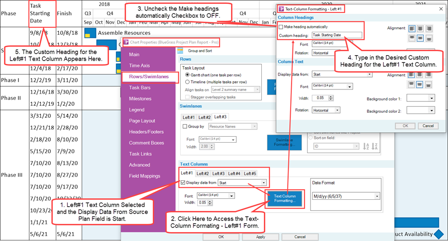
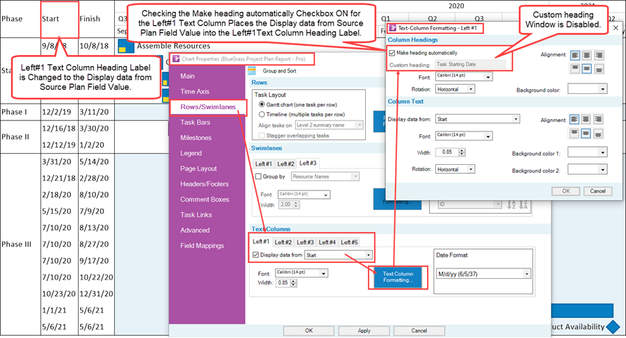
By checking the Make heading automatically checkbox to ON in the Text-Column Formatting form, the Custom heading window is disabled and the Display data from source plan field value shown in the Chart Properties form’s Rows/Swimlanes tab’s Text Columns controls group appears as the text column heading as shown below:
Text Column Heading Font, Rotation, Alignment, and Background Color Controls
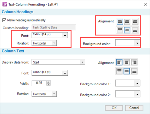
The remaining controls in the Column Headings control group of the Text-Column Formatting form control global text column heading properties as shown in the section of the form below:
Clicking the Font dropdown button accesses the OnePager standard Font properties form shown here:
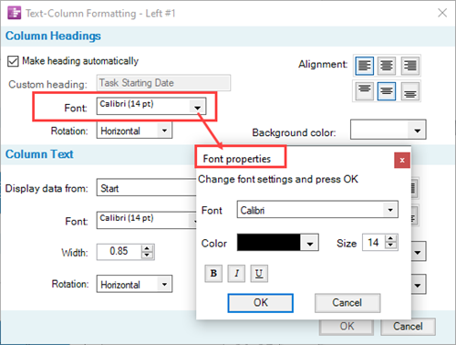
In the Font properties form, clicking the Font dropdown accesses the list of Font styles available on your computer. Clicking the Color dropdown button accesses the OnePager standard Color Chooser form that can be used to change the color of the text column heading. The Size dial selector sets the point size for the text column heading. The three buttons below the Color control allow you to change the text column heading to Bold, Italics, or Underline.
The Rotation: control provides a dropdown with three options for rotating the text column heading within its cell. These options include Horizontal, Rotate 90 degrees, and Rotate 270 degrees as shown in the dropdown list below:
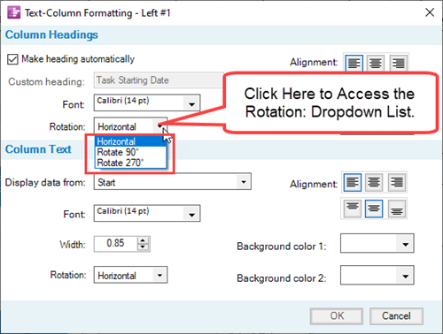
There are six (6) Alignment buttons, three (3) to position the text column heading horizontally in the cell and three (3) to position the text column heading vertically in the cell. The Background color: control dropdown button accesses the OnePager standard Color Chooser form that can be used to change the background color of the selected text column heading cell.
The OnePager standard Color Chooser form accessed in this manner looks like this:
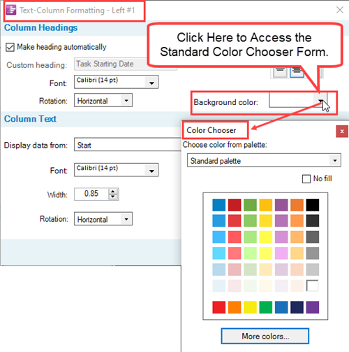
Column Text Control Group of the Text-Column Formatting Form
The Column Text control group in a Text-Column Formatting form provides global formatting controls over the content of the selected text column cells in the selected text column.
Display Data From: Window
The control of displaying or not displaying text columns is controlled in the Text Columns control group of the Chart Properties forms Rows/Swimlanes tab. The Display data from: window in the Column Text control group of the Text-Columns Formatting – Left#n form provides a quick means to change the source plan field name used by OnePager to import text column data from the source plan. More important, the Column Text control group provides the global controls for editing the properties of selected text column cells.
Column Text Font, Width, Rotation, Alignment, and Background Colors Controls
All the enabled controls in Column Text control group operate exactly the same as the corresponding controls found in the form’s Column Headings control group.
The exception is that the Column Text control group has two (2) Background color controls as shown below as Background color 1: and Background color 2:
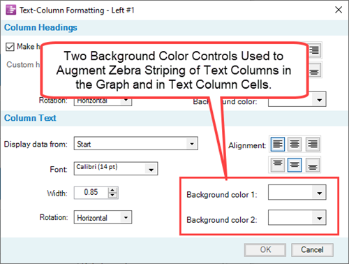
To show the use of the two Background color controls in the Text-Column Formatting form, suppose we start with a chart that has Zebra Striping of rows as shown below:
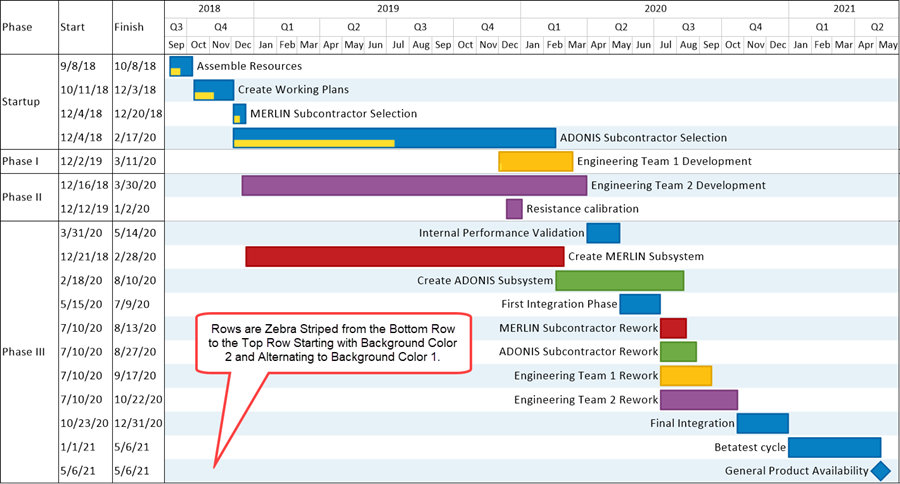
It may be desirable to extend the zebra striping out of the graph to the left and through the two text columns shown in the chart above. To do this access the Text-Column Formatting forms for the Left#1 and Left#1 text columns and set the two Background color controls in the Column Text control group of the form as shown here for the Left#2 text column:
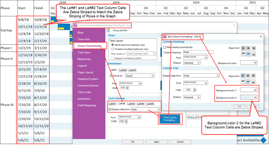
Of course you can set text column cells to any background color available in order to highlight a text column.
For more detailed information on Zebra Striping in the graph, please see these articles for OnePager Pro and Express, respectively, at:
Manual Editing of Text Column Heading Cells
Text column headings and text column heading cells take their text string contents from the source plan field selected in the Display data from window in the Text Columns control group of the Chart Properties form’s Rows/Swimlanes tab.
If it is necessary to change the text string content of any text column, the procedure must be done manually by right-clicking on the desired text column heading cell in the Corner to access the Edit corner properties form, and manually changing the contents of the Text window as shown below:

As shown in the illustration above, the Edit corner properties form contains the Font, Alignments, Background color, and Rotation controls that are useful for editing the text column heading’s content. The controls just mentioned in the Edit corner properties form operate the same way that corresponding controls operate in each of the Text-Column Formatting forms discussed previously. Since making any manual edit to a text column heading cell causes the cell to become a maverick, the above form has a Use default properties checkbox that, when checked ON, restores the default format properties of the selected text column heading’s content.
For more information on manually editing text column cells, please see the article at: Editing Text Columns or Swimlane Labels
Using Text Columns with Timeline Layout Charts
The preceding sections and sub-sections of this article used the Gantt Chart layout as examples related to the use of text columns in OnePager version 7.0. Multiple text columns can also be applied to the Timeline layout chart when carefully considered in terms of your goals and objectives for supporting schedule presentations. The key to creating Timeline layout charts using multiple text columns is the organization of the tasks in the source plan and the incorporation of useful source plan fields with each task.
Before getting started on the discussion of text columns used in Timeline layout charts, please see the section on creating Timeline layout charts which can be found in the article and section at: Creating Timeline Layout Charts
We’ll use the sample Microsoft Project source plan from the above reference to show how text columns are used in Timeline layout charts.
Sample Timeline Layout Source Plan
As an illustration, we created a hypothetical portfolio of programs with embedded projects and tasks associated with each of these embedded projects. We can construct this hypothetical portfolio by structuring the Microsoft Project source plan such that we use the Work Breakdown Structure to create a chart with three (3) swimlane levels to represent the highest levels of interest in the Work Breakdown Structure.
Such a Microsoft Project source plan is shown below:
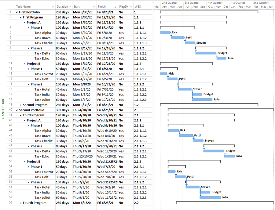
The source plan in the above illustration consists of two Portfolios of two Programs each (not all of which are shown in the source plan to conserve vertical space), two Phases to each Program, and, finally, two or three tasks per Phase. The Flag20 source plan field is used to instruct OnePager Pro on which tasks to import. The source plan’s Work Breakdown Structure (WBS) field is shown in the right-most column consisting from one to five levels. The Microsoft Project timeline is shown on the far right of the illustration above with the task bars and summary level task bars above them.
When OnePager Pro version 7.0 is launched and used to create a Timeline layout chart from the source plan shown above and with a few editing steps, we get the Timeline layout chart shown below:
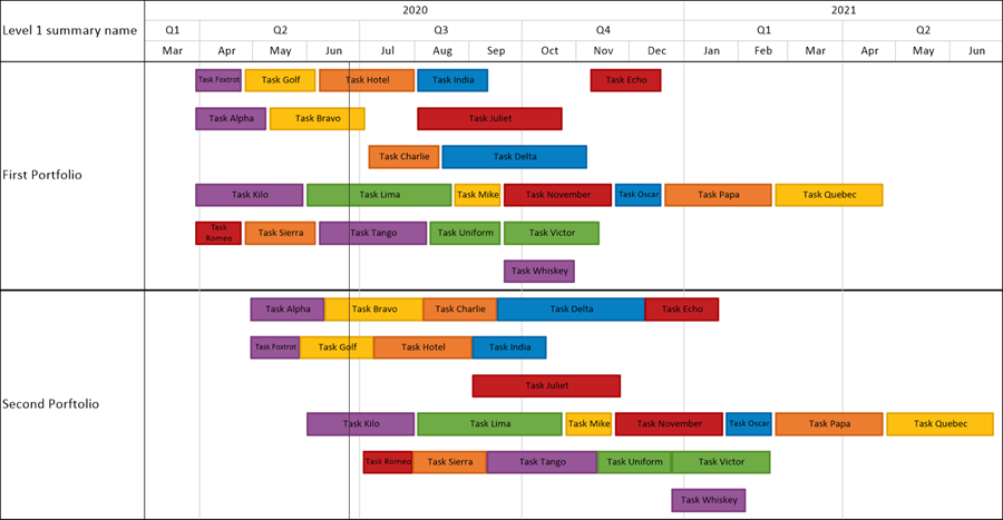
The Timeline layout chart above has only one swimlane level, no text columns, and the task bars are staggered to avoid overlapping task bars. The following discussion is intended to demonstrate the behavior of text columns and text column cells in the multiple task bars/milestone symbols per row Timeline layout chart.
The Median Rule - OnePager Rule for Setting Values in Timeline Layout Chart Text Column Cells
Since text column cells can only display one source plan field value, when multiple task bars/milestone symbols occupy a row in a Timeline layout chart, there needs to be a rule governing what value OnePager Pro or Express places into the single text column cell for the row. The Median Rule: When there are multiple task bars/milestone symbols in a row and a text column cell is set up to display a field value possessed by each of the multiple task bars/milestones in that row, OnePager selects the MEDIAN value to represent the set of field values in the row.
Numeric Fields - Example
As an example using the above chart to which we’ve added three swimlane levels to show the hierarchy of Portfolio, Program, and Project, we added the Left#1 text column and set it up to display Duration from the Microsoft Project source plan to get the chart shown here:
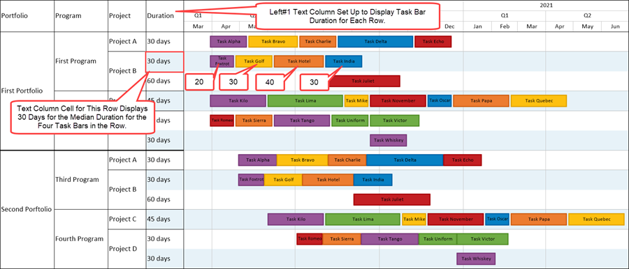
Focusing in on the First Portfolio, First Program, and Project B in the above chart, we see four task bars in the top row of Project B with Durations of 20, 30, 40, and 30 days. The Left#1 text column cell corresponding to these four task bars has a value of 30 days which is the median value for the set of durations arrayed in ascending order of 20, 30, 30, and 40 days. OnePager Pro and Express version 7.0 attempts to get to the closes median value for most source plan data types such as for dates and numeric values.
Text String Field - Example
For text strings taken from source plan field values, when there are multiple task bars/milestone symbols in a row, OnePager attempts to use the text string associated with the middle task bar/milestone symbol for the set of task bars occupying the row as shown below:
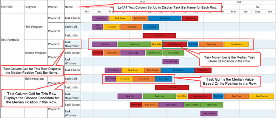
In the illustration above, the Task November is the MEDIAN task bar since it occupies the middle position in the set of seven (7) task bars in the row for Project C of the Second Program in the First Portfolio. In the row for Project B highlighted above, there are four task bars so OnePager does not have a middle task bar to select for the Left#1 text column cell for that row. To account for this situation, OnePager selects the task bar closest to the left side of the graph area as the MEDIAN value for the Left#1 text column cell.
Using Additional Text Columns in the Timeline Layout Chart - Example
Additional text columns can be added to the chart using various source plan field values for the text column cells. When you have multiple text columns in the chart, all text columns follow the same MEDIAN setting selection rule.
Adding the Left#2 text column to the chart such that the Left#2 text column displays the Unique ID from the Microsoft Project source plan for each task bar produces a chart that looks like this:
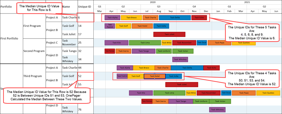
In the illustration above for the top row in the chart, there are five (5) task bars in the row with the Unique ID field values of 4, 5, 6, and 9. Since there is an odd number of task bars in the row, OnePager selects the middle task bar’s value of 6 as the MEDIAN value for the Left#2 text column for this row. OnePager, using the MEDIAN rule, may calculate a value for the text column cell that does not match any task bar source plan field value in the row.
This is illustrated in the row for top row for Project C in the Third Program of the Second Portfolio where the Unique ID set for this set of four (4) task bars is 50, 51, 53, and 54. In this case, where there are an even number of task bars in the set, OnePager calculates the MEDIAN value of 52 and places that value in the Left#2 text column cell for the row.
Related Links
Manual Editing Task/Milestone Shapes and Text Labels (Portal)
Creating and Editing Rows and Swimlanes (Portal)
Collecting, Formatting, and Sorting Task/Milestones into Rows
Creating, Formatting, and Sorting Swimlanes Levels
Zebra Striping for Rows and Swimlanes for OnePager Pro
Zebra Striping for Rows and Swimlanes for OnePager Express
Editing with the Chart Properties form (Portal)
Microsoft Project Fields Available to OnePager Pro
(12.03.1-70)
- Version 7.0
- Charts
- Templates
- Chart Properties Form
- Ribbon
- Editing a Chart
- OnePager - Tool Bar
- Task/Milestone Editing
- Rows and Swimlanes
- Multiple Swimlane Levels
- Text Columns
- Swimlane Labels
- Row/Swimlane Borders
- Labels
- Name Label Collision Avoidance
- Snapshots
- Snapshot Dependent/Independent
- Row Stripes
- Swimlane Stripes
- OnePager Pro
- OnePager Express