Managing the Time Cursor for Version 7.2
Contents
Introduction
This article describes in detail the options available and the controls for the display and management of the time cursor line, time cursor pointer, and time cursor shading areas.
Illustrations used in this article are from OnePager Pro using data from Microsoft Project but the features, function, controls, and manual edits apply equally to other OnePager editions that import from data sources like Microsoft Excel, Microsoft Project for the Web, Smartsheet, Oracle Primavera P6, Planisware Enterprise, Asana, and Wrike.
The Time cursor is a vertical line in the chart that indicates the date (and time) that the chart was created (i.e., the snapshot dates). You have control over the appearance of the time cursor line in the chart, in the time axis, or both. You also have the capability to control the formatting of the time cursor, a new pointer feature, and a date as described in this article.
Time Cursor ON/OFF Controls
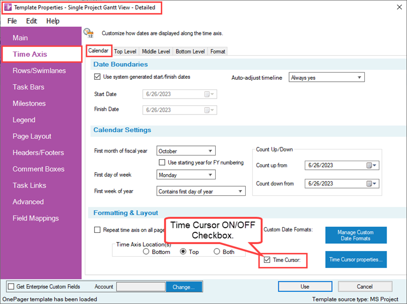
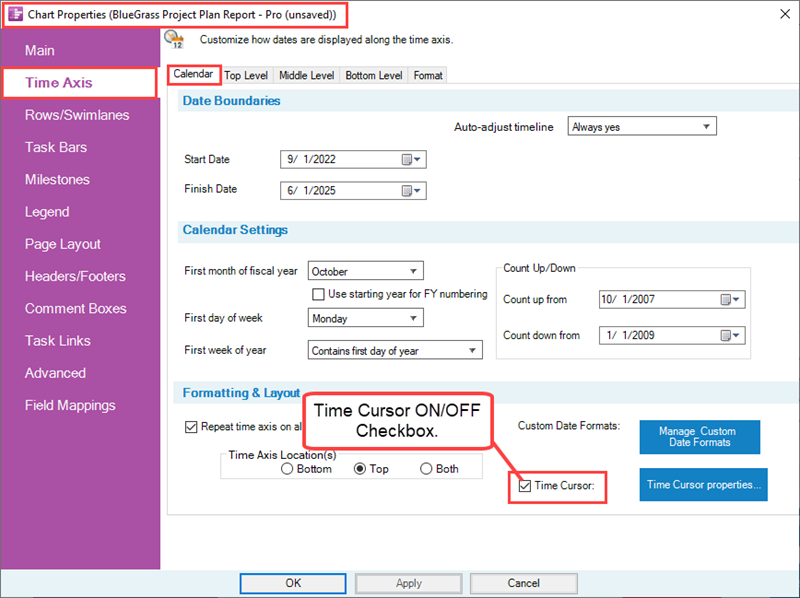
The time cursor can be turned ON or OFF in three (3) places: (1) globally in the Template Properties form’s Time Axis tab’s Calendar sub-tab, (2) the Chart Properties form’s Time Axis tab’s Calendar sub-tab, (3) the OnePager Chart Editor’s ribbon tool bar View tab’s Graphic elements section. These forms and the tool bar tab are shown below:

Time Cursor Line and Pointer Formatting Controls
You have the option to configure the time cursor line to highlight it in the chart to meet the needs of any schedule conversation. You have the options to:
- Display the time cursor line in the chart, in the time axis, or in both the chart and the time axis
- Manage the time cursor’s line color, width, and dash type
- Configure a cursor pointer shape in the chart or above the time axis with management controls over the pointer’s shape, color, height, and date properties
- Configure a date with the time cursor's pointer shape
- Configure shaded areas in the chart to the left and/or right of the time cursor line
Overview
As an illustrative example, you can configure the time cursor line in the chart, in the time axis, and insert a pointer shape with the snapshot date that resembles the sample chart shown below:
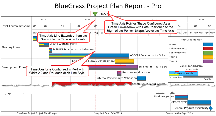
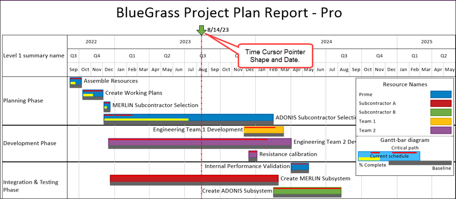
In the illustration above, the time cursor line is configured as a dash-dot-dot line of width 3.0 in red. The time cursor line is extended from the graph area upward into the time axis area. A pointer shape is added above the top time axis level configured as a down arrow shape with green color fill. The pointer date label is also shown above the top time axis level positioned to the right of the down arrow shape.
Additionally, you have the capability to add shading to the left and right of the time cursor line whose width is measured from the left side of the time cursor line and the right side of the time cursor line as illustrated below where the sharing extends from the time cursor line to the left and right edges of the chart:
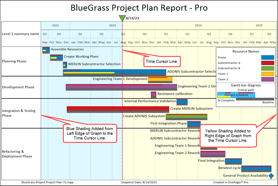
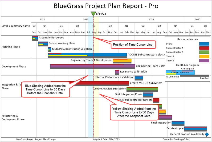
The illustration above shows time cursor shading from the left edge of the graph to the time cursor line in blue and time cursor shading from the right of the time cursor line to the right edge of the graph in yellow. You also have the option to specify other left shading and right shading positions as shown in the example below where the shading is 30 day to the left and right of the time cursor line:
Time Cursor Controls
As mentioned above, the controls for turning the time cursor ON and OFF are located in the Template Properties form’s Time Axis tab’s Calendar sub-tab, the Chart Properties form’s Time Axis tab’s Calendar sub-tab, and the OnePager Chart Editor’s tool bar View tab’s Graphic elements section.
The enhanced time cursor controls are found in the Template Properties form’s Time Axis tab and the Chart Properties form’s Time Axis tab in each form’s Calendar sub-tab within its Formatting & Layout control group as shown below for the Chart Properties form:
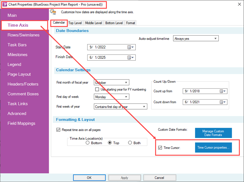
To enable the Time Cursor properties… button, it is necessary to check the Time Cursor: checkbox ON. This can be done, for example, in the OnePager Chart Editor’s ribbon tool bar View tab’s Graphic elements section using the Time Cursor checkbox as described at the beginning of this article. Alternatively, you can check the Time Cursor checkbox ON in either the Template Properties or Chart Properties form’s Time Axis tab’s Calendar sub-tab’s Formatting & Layout control group as shown immediately above. Then, clicking the Time Cursor properties… button accesses the Set time cursor and pointer properties form at the Time cursor tab shown below:
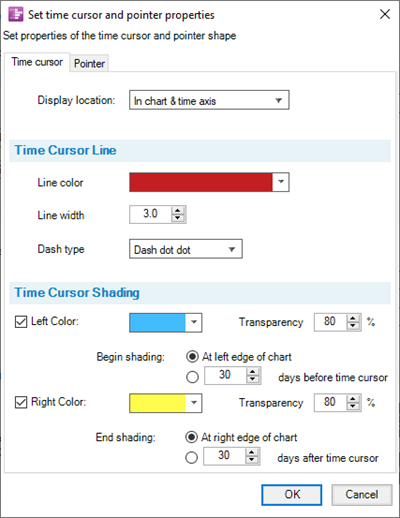
The form shown above has two sub-tabs: (1) Time cursor and (2) Pointer. These two sub-tabs are discussed in the sub-sections that follow.
Time Cursor Sub-Tab
Time Cursor Display Location
At the top of the Time Cursor sub-tab is the Display location: dropdown which consists of three (3) options shown below:
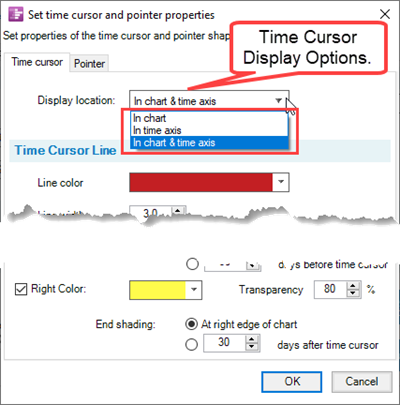
You have the option to display the time cursor line just (1) In the chart, (2) In the time axis, or (3) In chart & time axis. The option for In chart & time axis is shown above in a previous chart illustration.
Time Cursor Line Control Group
The Time Cursor Line control group contains controls for selecting the Line color, Line width, and Dash type as shown here:
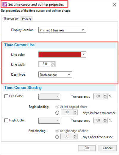
Clicking the Line color dropdown accesses the standard OnePager Color chooser form used throughout the application to manage color changes for graphic elements. The Line width control is a roller control where you can select a line width or type-in the desired width. The Dash type dropdown allows you to select one of the five (5) available line dash types as shown below:
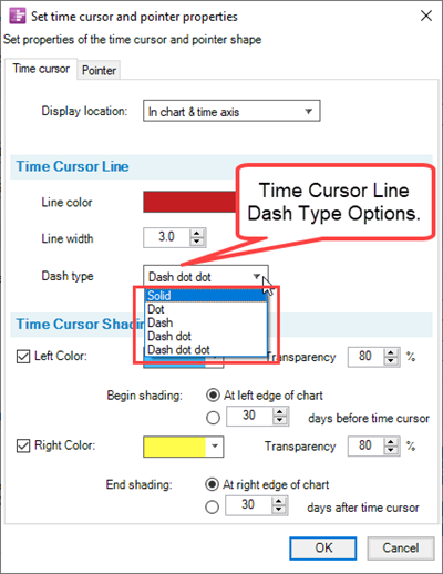
These are the same dash type options available for line connectors, task links, and various borders.
Time Cursor Shading Control Group
Adding time cursor shading to your chart is a way of highlighting a time zone around the time cursor line that focuses attention to that area as shown in the illustration at the beginning of this article.
The time cursor shading feature is provided to assist in enhancing the position of the time cursor line for the purpose of highlighting the past from the future in the project time line. The Left Color: and Right Color: options are enabled by first checking the desired Left Color: and/or Right Color: checkboxes ON to enable the remaining controls in each set.
The Time Cursor Shading control group contains controls for introducing shaded areas to the left and/or right of the time cursor line in the chart as shown here:
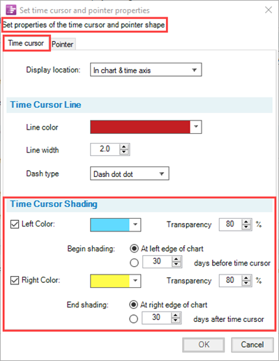
You have the options to select the shaded area’s color by clicking the associated dropdown to access standard OnePager Color chooser form. Controls are also provided for each shaded area to specify the Transparency level for the shaded area created. Transparency levels operate the same way as transparency levels operate for Curtains and Inserted Images (pictures), for example.
As discussed above, you have the option to specify individual shading area on the left side and/or right side of the time cursor’s vertical line. For the left and/or right side shading, you specify where the shading begins by either specifying that shading begins At the left and/or right edge of the chart or on a number of days to the left and/or right edge of the time cursor line as shown below where shading begins at the left and right sides of the chart:

Note that on the left side of the time cursor, the shading does not include the row and/or swimlane labels and columns. Shading includes the time axis if the selection is made to have the time cursor line extend into the time axis levels.
The alternative is to specify the number of days before and after the date of the time cursor as shown below where the default value is thirty (30) days to the left and right edge of the time cursor line:
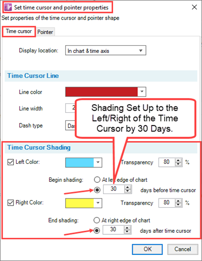
When you click OK on the Set time cursor and pointer properties form and OK/Apply on the Chart Properties form the chart is updated to look like this:

Shaded area to the left and right of the time cursor line are not considered curtains and are not recorded in the Curtains and Timespans grid in the Template Properties or Chart Properties form’s Time Axis tab’s Format sub-tab. Further, shaded areas are snapshot independent meaning that once defined they appear in all snapshots where the time cursor line is visible. Time Cursor shading can be turned OFF by unchecking the Left Color: and/or Right Color: checkboxes.
Pointer Sub-Tab
The Pointer sub-tab provides the capability to highlight the position of the time cursor line above the time axis or the chart either with or without the time cursor line being displayed. Additionally, you have the capability to insert the time cursor line date at a selected position when the pointer is being displayed.
Pointer Shape Format Control Group
The Pointer tab’s Pointer Shape Format control group contains controls for selecting the Pointer Shape color, the Pointer Shape, and the Pointer Height as shown here:
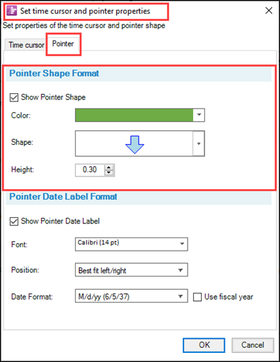
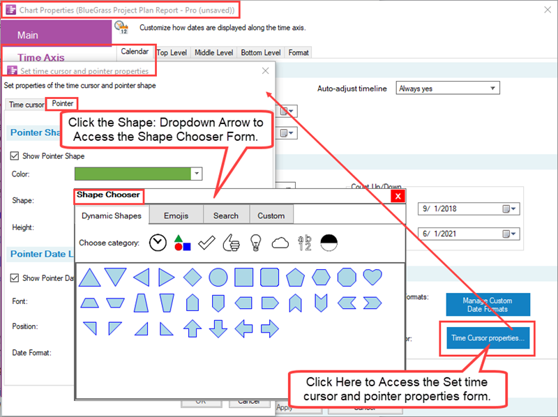
When the Show Pointer Shape checkbox is checked ON, the Color, Shape, and Height controls are enabled and operate the same as the corresponding controls found for task bars/milestone symbols. That is, for color, clicking the dropdown accesses the standard OnePager Color chooser form. Clicking the Shape: dropdown gives you access to the standard OnePager Shape chooser form where you can chose dynamic shapes or an emoji as shown below:
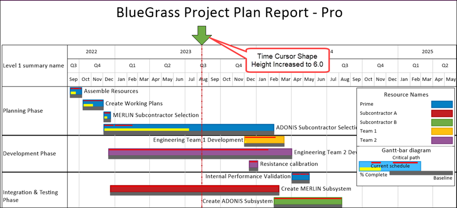
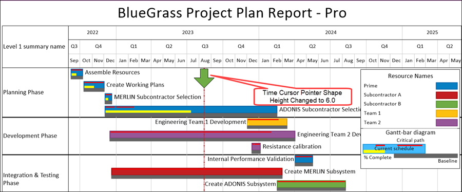
Finally, the Height: control gives you the option to change the vertical height of the pointer shape in the graph and/or above the time axis level as shown below where the pointer height is doubled from the default value of 0.30:
Pointer Date Label Format Control Group
The Pointer Date Label Format control group provides controls for addition of the time cursor date to a position next to the pointer shape. When the Show Pointer Date Label checkbox is checked ON, the Font:, Position:, and Date Format: controls are enabled as shown here:
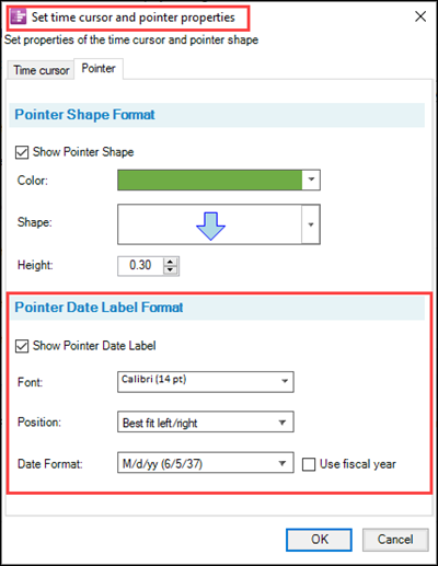
Time Cursor Date Label Font
Clicking the Font: windows dropdown accesses the standard OnePager Font properties form where you have controls for the Font type; Font size; Font color; and for establishing Bold, Italics, and Underline.
Time Cursor Date Label Position
Clicking the Position: window dropdown accesses the three position options available for the time cursor date in the chart or above the time axis as shown here:
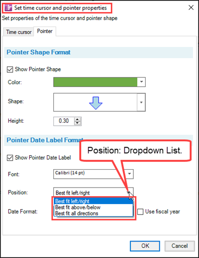
There are three (3) options for the time cursor date because of the constrained location where the time cursor line and its associated date can be placed. Each option is a “Best fit…” option where OnePager determines the final position of the time cursor date based on where there are fewer collisions with other graphic elements in the chart.
Time Cursor Date Label Date Format
Clicking the Date Format: dropdown accesses the standard OnePager list of available date formats as shown below:
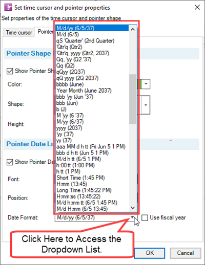
Date formats for the time cursor pointer can be selected separately from the date formats available for time axis cells at any level.
If we assume that the time cursor line is being displayed above the time axis with the date, then the chart looks like this:
When the Show Pointer Shape checkbox is checked ON, the Color, Shape, and Height controls are the same as found for task bars/milestone symbols. That is, for color, clicking the dropdown accesses the standard OnePager Color chooser form. Clicking the Shape dropdown gives you access to the standard OnePager Shape chooser form where you can chose dynamic shapes or an emoji.
If the time cursor line is set to display only in the chart, then the chart shown above looks like the illustration below:

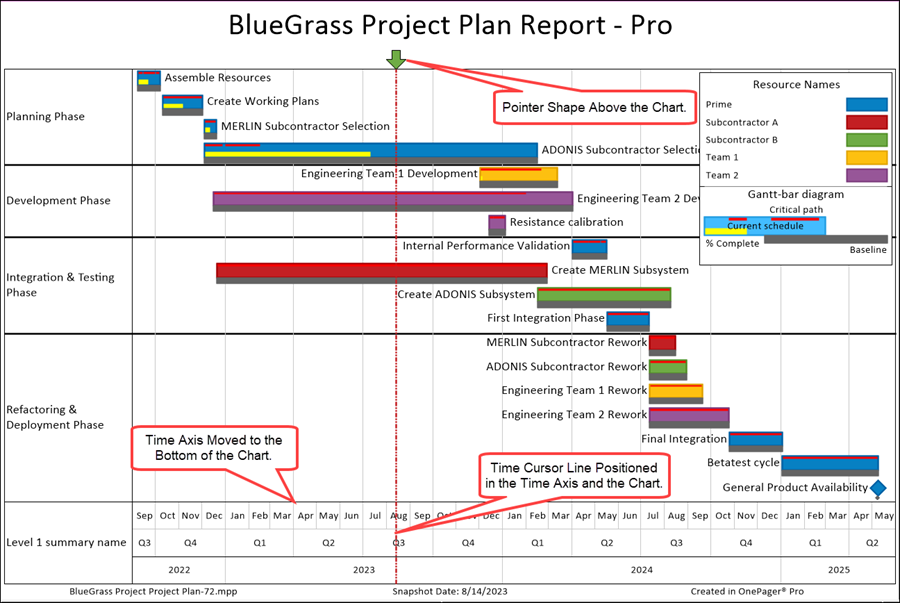
The Pointer shape can be used when the time axis is not present at the top of the chart and can be used to denote the time cursor’s date as shown here where the time axis is displayed at the bottom of the chart:
Use Fiscal Year Checkbox
The Use fiscal year checkbox, when checked ON, changes the contents of the Date format: dropdown list to now contain Fiscal Year formatted dates as shown below:
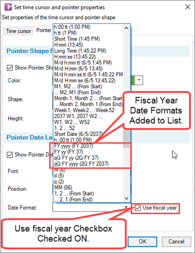
When a fiscal year formatted date is selected for the pointer date, the fiscal year representation is shown in the chart regardless of the Label formats selected for the time axis levels. It is recommended, however, that when using fiscal year date formats for the pointer date, that you also use fiscal year formats for the time axis level’s Label formats.
Related Links
| Time Cursor Upgrades |
(22.7.1-72)