Difference between revisions of "TEMPzz4"
(Created page with "=OnePager's Ribbon Tool Bar Tabs for Version 7.2 (P72-4_0_2_2-72-09062022.docx)= ==About the OnePager Editor’s Ribbon Tool Bar Tab== Every Windows application has a tool b...") |
|||
| Line 30: | Line 30: | ||
{| class="wikitable" | {| class="wikitable" | ||
| [[OnePager's Ribbon Tool Bar Home Tab for Version 7.2 | OnePager's Ribbon Tool Bar Home Tab]] 4.0.2.2.1-72 | | [[OnePager's Ribbon Tool Bar Home Tab for Version 7.2 | OnePager's Ribbon Tool Bar Home Tab]] 4.0.2.2.1-72 | ||
| + | |- | ||
| [[OnePager's Ribbon Tool Bar Insert Tab for Version 7.2 | OnePager's Ribbon Tool Bar Insert Tab]] 4.0.2.2.3-72 | | [[OnePager's Ribbon Tool Bar Insert Tab for Version 7.2 | OnePager's Ribbon Tool Bar Insert Tab]] 4.0.2.2.3-72 | ||
| + | |- | ||
| [[OnePager's Ribbon Tool Bar Page Layout Tab for Version 7.2 | OnePager's Ribbon Tool Bar Page Layout Tab]] 4.0.2.2.5-72 | | [[OnePager's Ribbon Tool Bar Page Layout Tab for Version 7.2 | OnePager's Ribbon Tool Bar Page Layout Tab]] 4.0.2.2.5-72 | ||
| + | |- | ||
| [[OnePager's Ribbon Tool Bar Data Tab for Version 7.2 | OnePager's Ribbon Tool Bar Data Tab]] 4.0.2.2.7-72 | | [[OnePager's Ribbon Tool Bar Data Tab for Version 7.2 | OnePager's Ribbon Tool Bar Data Tab]] 4.0.2.2.7-72 | ||
| + | |- | ||
| [[OnePager's Ribbon Tool Bar View Tab for Version 7.2 | OnePager's Ribbon Tool Bar View Tab]] 4.0.2.2.9-72 | | [[OnePager's Ribbon Tool Bar View Tab for Version 7.2 | OnePager's Ribbon Tool Bar View Tab]] 4.0.2.2.9-72 | ||
| + | |- | ||
| [[OnePager's Ribbon Tool Bar File Page for Version 7.2 | OnePager's Ribbon Tool Bar File Page]] 4.0.2.2.11-72 | | [[OnePager's Ribbon Tool Bar File Page for Version 7.2 | OnePager's Ribbon Tool Bar File Page]] 4.0.2.2.11-72 | ||
| + | |- | ||
| [[OnePager's Ribbon Tool Bar Supporting Controls for Version 7.2 | OnePager's Ribbon Tool Bar Supporting Controls]] 4.0.2.2.13-72 | | [[OnePager's Ribbon Tool Bar Supporting Controls for Version 7.2 | OnePager's Ribbon Tool Bar Supporting Controls]] 4.0.2.2.13-72 | ||
|} | |} | ||
| Line 370: | Line 376: | ||
[[Category:OnePager Express]] | [[Category:OnePager Express]] | ||
[[Category:OnePager Bundle]] | [[Category:OnePager Bundle]] | ||
| − | |||
| − | |||
==OnePager's Ribbon Tool Bar Insert Tab== | ==OnePager's Ribbon Tool Bar Insert Tab== | ||
Revision as of 12:35, 7 September 2022
Contents
- 1 OnePager's Ribbon Tool Bar Tabs for Version 7.2 (P72-4_0_2_2-72-09062022.docx)
- 1.1 About the OnePager Editor’s Ribbon Tool Bar Tab
- 1.2 Overview
- 1.3 OnePager's Ribbon Tool Bar Home Tab
- 1.4 OnePager's Ribbon Tool Bar Insert Tab
- 1.5 OnePager's Ribbon Tool Bar Page Layout Tab
- 1.6 OnePager's Ribbon Tool Bar Data Tab
- 1.7 OnePager's Ribbon Tool Bar View Tab
- 1.7.1 View Tab – Snapshots Sub-Section
- 1.7.2 View Tab – Layout Sub-Section
- 1.7.3 View Tab – Graphic Elements Sub-Section
- 1.7.3.1 View Tab – Graphic Elements Sub-Section – Time Cursor Checkbox
- 1.7.3.2 View Tab – Graphic Elements Sub-Section – Hover Boxes Checkbox
- 1.7.3.3 View Tab – Graphic Elements Sub-Section – Timestamps Checkbox
- 1.7.3.4 View Tab – Graphic Elements Sub-Section – Legend Checkbox
- 1.7.3.5 View Tab – Graphic Elements Sub-Section – Links Checkbox
- 1.7.4 View Tab – Refresh Sub-Section
- 1.7.5 View Tab – Dates Sub-Section
- 1.8 OnePager's Ribbon Tool Bar File Page
- 1.8.1 File Page – New… Tab
- 1.8.2 File Page – Open… Tab
- 1.8.3 File Page – Save Tab
- 1.8.4 File Page – Save As… Tab
- 1.8.5 File Page – Update… Tab
- 1.8.6 File Page – Close Tab
- 1.8.7 File Page – Options Tab
- 1.8.8 File Page – Help Tab
- 1.8.8.1 File Page – Help Tab – Show Videos Button
- 1.8.8.2 File Page – Help Tab – Tutorial Button
- 1.8.8.3 File Page – Help Tab – Quick Start Guide Button
- 1.8.8.4 File Page – Help Tab – User Guide Button
- 1.8.8.5 File Page – Help Tab – Wiki Button
- 1.8.8.6 File Page – Help Tab – Blog Button
- 1.8.8.7 File Page– Help Tab – Send Application Log Button
- 1.8.9 File Page – About Tab
- 1.8.10 File Page – License Tab
- 1.8.11 File Page – Export Tab
- 1.8.12 File Page – Print Tab
- 1.8.13 File Page – Exit Tab
- 1.9 OnePager's Ribbon Tool Bar Other Ribbon Controls
OnePager's Ribbon Tool Bar Tabs for Version 7.2 (P72-4_0_2_2-72-09062022.docx)
About the OnePager Editor’s Ribbon Tool Bar Tab
Every Windows application has a tool bar at the top of the screen and OnePager is no exception. The purpose of this article is to describe the OnePager Ribbon Tool Bar tab, each tab’s sub-sections, and the functions available to you on each.
Illustrations used or referenced in this article are from OnePager Pro using data from Microsoft Project but the feature's function, controls, and manual edits apply equally to other OnePager editions that import from data sources like Microsoft Excel, Oracle Primavera P6, Smartsheet, and Planisware.
Overview
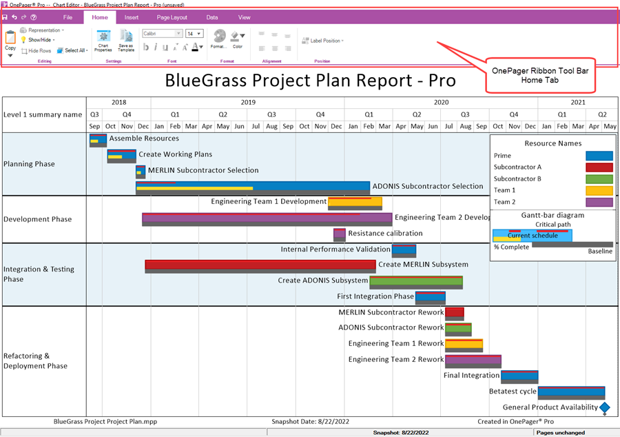
When OnePager open’s with a chart made from a source plan, the screen looks like this:
For a complete description of the components of a OnePager chart, please see the article at:
| Anatomy of a OnePager Chart 6.0.1-72 |
As shown in the illustration above, the OnePager Ribbon Tool Bar has six (6) tabs to the right of four controls for Save, UNDO, REDO, Help. When the chart is created, the Home tab is displayed initially as this tab is the most often used to perform editing operations in the chart. These six (6) tabs and the four (4) other controls are described in detail in the articles at the links provided below starting with the Home tab then going from left to right ending with the View tab followed by the File page:
| OnePager's Ribbon Tool Bar Home Tab 4.0.2.2.1-72 |
| OnePager's Ribbon Tool Bar Insert Tab 4.0.2.2.3-72 |
| OnePager's Ribbon Tool Bar Page Layout Tab 4.0.2.2.5-72 |
| OnePager's Ribbon Tool Bar Data Tab 4.0.2.2.7-72 |
| OnePager's Ribbon Tool Bar View Tab 4.0.2.2.9-72 |
| OnePager's Ribbon Tool Bar File Page 4.0.2.2.11-72 |
| OnePager's Ribbon Tool Bar Supporting Controls 4.0.2.2.13-72 |
(4.0.2.2 -72)
OnePager's Ribbon Tool Bar Home Tab
The OnePager Ribbon Tool Bar Home tab is shown in detail below:

The Home tab has six (6) sub-sections as shown above. The first two sub-sections, Editing and Settings, for the most part contain controls that apply to the entire chart while the remaining four (4) sub-sections are enabled whenever a task bar/milestone symbol or text component is selected in the graph. Each sub-section is discussed below.
Home Tab – Editing Sub-Section
There are five (5) controls in this sub-section. Three (3) are always enabled (i.e., Copy, Show/Hide, and Select All). The Representation control is enabled whenever a task bar/milestone symbol is selected in the graph. The Hide Rows control is enabled whenever at least one row is empty of task bars or milestone symbols.
Home Tab – Editing Sub-Section – Copy Dropdown
The Copy dropdown control applies to the copying the graph to the Windows clipboard from which the chart may be pasted into other applications as desired. The Copy dropdown has three (3) options as shown here:
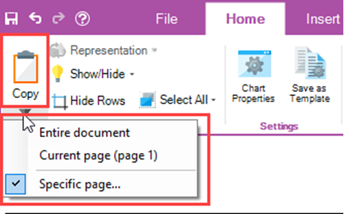
Clicking the Copy dropdown accesses the dropdown menu shown above which has three (3) option controls:
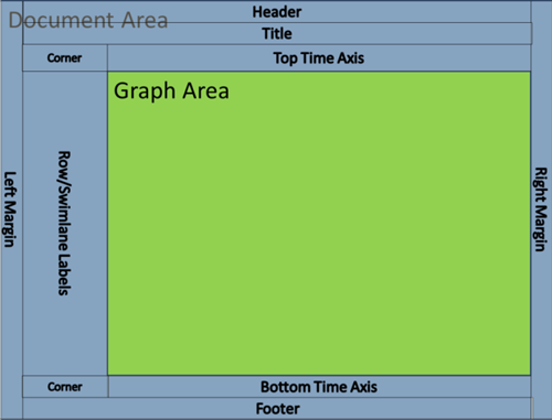
- Entire document – Copy the entire document area to the Windows clipboard. The document area is defined in the Glossary and is illustrated below:
- If the chart is multi-page, all pages are copied to the Windows clipboard.
- Current Page (page n) – The copy current page option places the page currently displayed in the Chart editor into the Windows clipboard. The page number shown in parentheses shows which page of the multi-page chart is showing and is about to be placed in the Windows clipboard.
- Specific page … - Clicking on the Specific page… option accesses the Choose page form where there is roller control available for you to select the specific page you wish to place in the Windows clipboard as shown below:
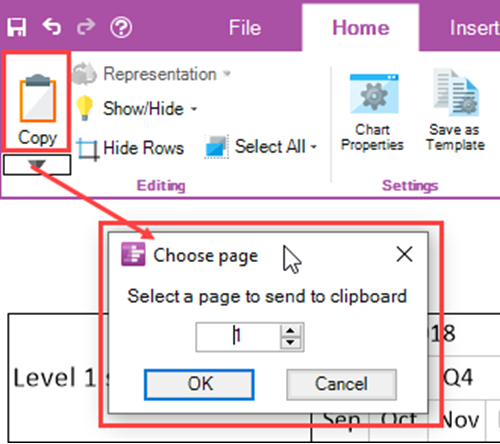
The default page number displayed is “1” and the maximum number available is the highest numbered page available from the multi-page chart. Upon making your selection, click OK to complete the action which closes the form.
Home Tab – Editing Sub-Section – Representation Dropdown
For the Representation dropdown to be enabled you must select one or more task bar/milestone symbols and/or one or more task bar/milestone symbol names. When enabled the Representation dropdown has four (4) options as shown below:
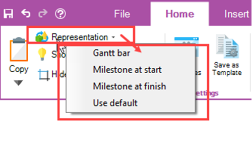
- Gantt bar – Selecting the Gantt bar option, changes the selected task bar/milestone symbol into a Gantt bar configuration. This option selection is effective only in the case where the selected milestone symbol is associated with a start-finish date duration of greater than one day. Attempting to change a milestone symbol where the start and finish dates are the same is a null operation.
- Milestone at start – When the Milestone at start option is selected for a task bar; the task bar is changed to a milestone symbol positioned in the chart at the original task bar’s start date.
- Milestone at finish - When the Milestone at finish option is selected for a task bar; the task bar is changed to a milestone symbol positioned in the chart at the original task bar’s finish date.
- Use default – Selecting the Use default option has an effect dependent on the setting established in the Template Properties form’s Advanced tab’s Task representation sub-control group. For most Template Properties form’s distributed with OnePager, the default setting is the Gantt bar.
Home Tab – Editing Sub-Section – Show/Hide Dropdown
The Show/Hide dropdown contains seven (7) commands of which the first five (5) are disabled until an action is taken in the chart to enable them. The bottom two (2) commands can be clicked when you need access to either of the two (2) forms for which the commands are named. The Show/Hide dropdown list is shown below:
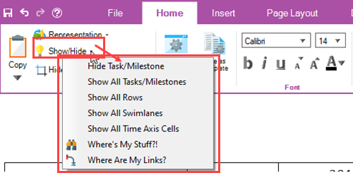
The actions needed to enable the top five commands and the forms accessed using the bottom two commands are discussed below:
- Hide Task/Milestone – This command is used to hide a selected task bar/milestone symbol in the chart. The command is enabled whenever a task bar or bars are selected. Clicking the Hide Tasks/Milestone command when enabled hides the selected a task bar/milestone symbol or symbols.
- Show All Tasks/Milestones – The Show All Tasks/Milestones is enabled only when one (1) or more task bars or milestone symbols are hidden in the chart. Clicking the command unhides all hidden task bars and milestone symbols except where rows are hidden.
- Show All Rows – This command is enabled when one (1) or more rows are hidden in the chart. Clicking this command unhides all hidden rows and any task bars or milestone symbols in the unhidden row or rows.
- Show All Swimlanes – The Show All Swimlanes command is enabled whenever one (1) or more swimlanes are hidden. Clicking this command unhides all hidden swimlanes, their component rows, and any task bars or milestone symbols.
- Show All Time Axis Cells – This command is enabled whenever a time axis cell at any level or levels is hidden in the time axis component of the chart. Clicking the Show All Time Axis Cells unhides these hidden cells and restores them to their last unhidden configuration.
- Where’s My Stuff?! – This command accesses the Where’s My Stuff?! form and places it on top of the Chart Editor. The Where’s My Stuff?! form is useful for determining why a task bar or milestone symbol is hidden in the chart. Clicking the Where’s My Stuff?! command accesses the form and each grid row in the form identifies a hidden task bar or milestone symbol and shows why the component is hidden. The Where’s My Stuff?! form is always accessible even when no components of the chart are hidden.
- Where Are My Links? – The Where Are My Links? command access the Where Are My Links? form which keeps track of manual and Data-Driven task links that are hidden. When accessed, each grid row in the form identifies task links between two (2) task bars or milestone symbols that are hidden. The form can be accessed when manual and/or Data-Driven task links are not imported or when none are hidden.
Home Tab – Editing Sub-Section – Hide Rows Button
The Hide Rows Button is enabled whenever a row has hidden task bar/milestone symbols. The purpose of the Hide Rows Button is to provide you with options to select on how rows with hidden task bar/milestone symbols should be handled. When there is at least one (1) empty row and you click the Hide Rows button, the Row hiding choices form is accessed as shown here:
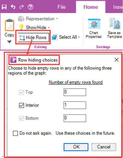
The Row hiding choices form provides information on the number of rows hidden in each of the three (3) chart regions shown with the checkboxes and, using the checkboxes, you can specify where empty rows should be hidden.
Home Tab – Editing Sub-Section – Select All Dropdown
The Select All dropdown is always enabled and is used to make chart-wide selections of chart components including task bars/milestone symbols, comment boxes, task links, free shapes, curtains, and images. The Select All dropdown is useful for setting up editing of all of a type of component in the entire chart. The Select All dropdown list is shown here:
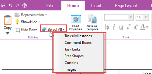
Each of the six (6) commands in the Select All dropdown list is discussed below:
- Task/Milestones – The Tasks/Milestones command selects all task bars/milestone symbols in the chart. When the Select associated text checkbox is checked ON, clicking the Tasks/Milestones command also selects all task bar/milestone symbol name labels as well. The Select associated text checkbox is located in the Advanced tab of the Template Properties and Chart Properties form in the Display options sub-control group.
- Comment Boxes – This command selects all Comment boxes shown in the chart. If there are no Comment boxes in the chart, the command is ignored.
- Task Links – The Task Links command, when clicked, selects all showing manual and Data-Driven task links. Hidden task links are ignored. If there are no manual or Data-Driven task links defined or imported in the chart, the command is ignored.
- Free Shapes - This command selects all Free Shapes shown in the chart. If there are no Free Shapes in the chart, the command is ignored.
- Curtains - This command selects all Curtains shown in the chart. If there are no Curtains in the chart, the command is ignored.
- Images - This command selects all Inserted Images shown in the chart. If there are no Inserted Images in the chart, the command is ignored.
Home Tab – Settings Sub-Section
There are two (2) buttons in this sub-section. The Chart Properties and Save as Template buttons are always enabled. The Home tab – Settings Sub-Section is shown below:
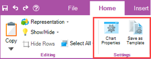
The two (2) buttons are discussed below:
- Chart Properties – Clicking the Chart Properties button accesses the Chart Properties form either at the Main tab of the form if the access is the first access after the chart is created or opened or at the last tab accessed if the form was accessed previously. The Chart Properties form consists of twelve (12) tabs and is used for making global edits to the chart and its components.
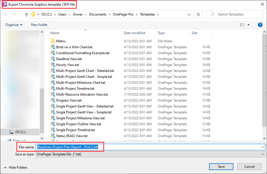
- Save as Template – This button can be used to create a Template Properties form from the current Chart Properties form. This created Template Properties form can be used to configure other charts or to share with other colleagues. When clicked, OnePager opens an Export Chronicle Graphics template (.tat) file form which is used to specify the file name of the Template Properties form you are creating. The initial file name for the saved created Template Properties form is the same as the file name of the chart as shown here:
Home Tab – Font Sub-Section
The Font sub-section contains controls for making global edits to text components in the chart. There are three (3) dropdown controls and five (5) button controls as shown here:

Home Tab – Font Sub-Section – Dropdown Controls
The two (2) dropdown controls are discussed below:
- Font type dropdown – The Font type dropdown contains a list of font types available on your computer as shown below:
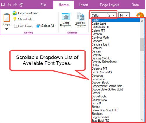
- The Font type dropdown is enabled whenever a text component is selected in the chart. When no text component selections are made, the Font type window shown above is blank.
- Font size dropdown – The Font size dropdown, like the Font type dropdown, is enabled whenever a text component is selected in the chart and shows a list of available font sizes that can be selected as shown here:
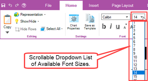
- In addition to the list of available Font sizes, the Font size window, shown above, can be itself selected and a font size value can be typed in. When no text component selections are made, the Font size window shown above is blank.
Home Tab – Font Sub-Section – Button Controls
There are three (3) sets of button controls for editing selected text in the chart as follows:
- b, I, u Buttons – These three (3) buttons are enabled whenever a text component is selected in the chart. Clicking the “b” button changes the selected text to Bold or un-bolds Bolded text. Clicking the “i” button changes the selected text to Italics or removes italics from text that are italicized. Clicking the “u” button adds an underline to the selected text or removes underlines from text that is underlined.
- Small “a” and Capital “A” Buttons – These two (2) buttons shown below allow you to decrease or increase the font size of selected text in increments of one (1) font size:

- Font color Button – The Font color button is used to access the OnePager Standard Color Chooser form as shown below to change the color of selected text:
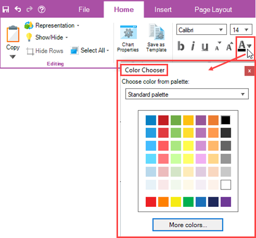
- Once the Standard Color Chooser form is access, you can use the color grid to select the desired color for the selected text with a simple click on the desired color. Once a color is selected, the Standard Color Chooser form is closed and the bar under the large A in the Font sub-section takes on the color selected in the Standard Color Chooser form.
Home Tab – Format Sub-Section
The Format sub-section contains controls for making edits to selected task bars/milestone symbols and select task bar/milestone symbol name label text components in the chart. There are two (2) button controls as shown here:

Home Tab – Format Sub-Section – Format… Button
The Format… button is enabled whenever a task bar/milestone symbol and/or its associated name label text are selected. When enabled and you click the Format… button, OnePager accesses the selected component’s Change Task/Milestone Properties form at the form’s Format tab as shown below:
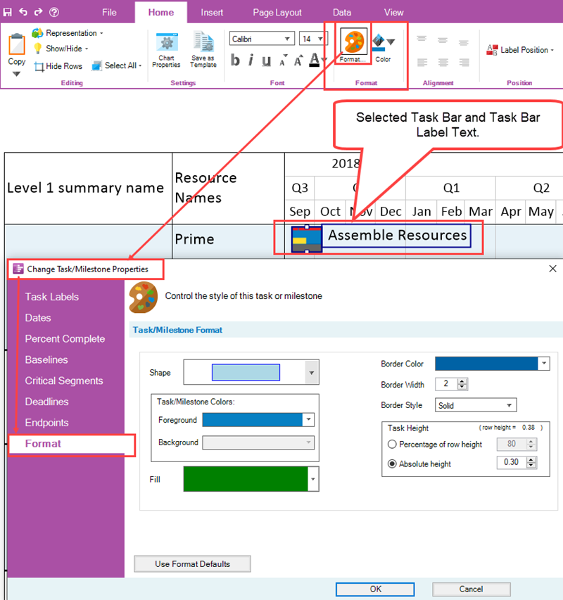
When the Change Task/Milestone Properties form is accessed you have the capability to edit the various properties of the selected task bar/milestone symbol or symbols using the controls in the form’s Task/Milestone Format control group. When you click the OK button in the form above, any changes you make to the properties of the selected task bar/milestone symbol or symbols are applied to that component only.
Home Tab – Format Sub-Section – Background Color Button
The Background Color button is enabled whenever components with background color properties such as a task bar/milestone symbol or symbols are selected. When enabled and you click the Background Color button, OnePager accesses the Standard Color Chooser form as shown below:
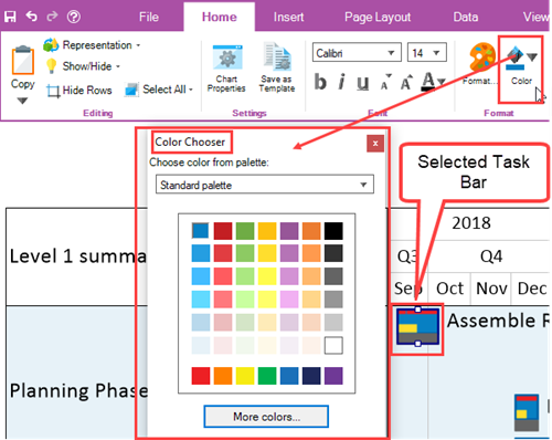
Using the Standard Color Chooser form, you can select a background color by clicking any color square in the grid. Making the background color selection closes the Standard Color Chooser form and applies the selected background color as the new background color of the selected task bar/milestone symbol or symbols as shown here where dark green is selected:
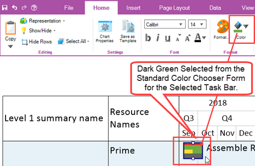
After the color selection is made, the bar under the Background Color Button in the Format sub-section displays the last selected background color.
The Color Button is also enabled whenever a component with a background color is selected such as a time axis cell, row, swimlane, corner component, comment box, free shape, or curtain.
Home Tab – Alignment Sub-Section
The Alignment buttons in the Alignment sub-section shown below provides the capability to arrange selected text components in the graph with respect to the component in which they reside.

The Alignment Buttons consist of two (2) rows of three (3) buttons each:
- The top row of Alignment buttons allows you to position selected text components vertically within the selected text component’s enclosure.
- The bottom row of Alignment buttons allows you to position the select text components horizontally within the select text component’s enclosure.
The Alignment sub-section is enabled when any of the following text component enclosures are selected:
- The Corner
- Swimlane Labels
- Row Labels
- Comment Box Text
- Free Shape Text
- Curtain
Home Tab –Position Sub-Section
The Position sub-section contains a dropdown list of thirteen (13) available task bar/milestone symbol name label text positions. When OnePager creates a chart, task bar/milestone symbol name label text positions are selected so as to minimize overlap of name label text to the best of the software’s ability. The Label Position dropdown is shown below:

The Label Position dropdown is enabled whenever a task bar/milestone symbol or symbols are selected in the chart. Once enabled, clicking the dropdown button accesses the thirteen (13) name label text position options as shown here:
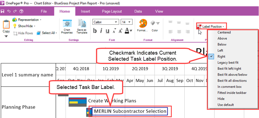
In the illustration above, the selected task bar name label text is positioned to the right of the task bar and this is indicated in the Label Position dropdown list with a checked checkbox at the “Right” position in the dropdown list. Clicking any other option in the dropdown list changes the position of the selected task bar name label text and closes the dropdown list.
Making any selection from the Label Position dropdown list overrides OnePager’s process for minimizing conflicts between task bar/milestone symbol name label texts. However, there are several selection options that do attempt to achieve clarity of task bar/milestone symbol name label text position. These are the name label text position options that begin with “Best fit…”.
The “Legacy best fit” is an option that was brought forward from previous versions of OnePager. The “Use default” option is the option established in the current Template Properties form’s Task Bars or Milestones tab’s Set Label Properties form.
(4.0.2.2.1-72)
OnePager's Ribbon Tool Bar Insert Tab
The OnePager Ribbon Tool Bar Insert tab is shown in detail below:

The Insert tab has three (3) sub-sections and a total of five (3) buttons that are discussed below:
Insert Tab – Annotations Sub-Section
The Annotations sub-section contains three (3) buttons for adding features to the created, opened, or updated OnePager chart. These three (3) Annotation buttons are discussed below:
Insert Tab – Annotations Sub-Section – Comment Box Button
The Comment Box button is enabled whenever a single task bar/milestone symbol is selected as Comment Boxes are only attached to task bars and/or milestone symbols. When enabled and the Comment Box button is clicked, OnePager accesses the Create or edit comment box form as shown below:
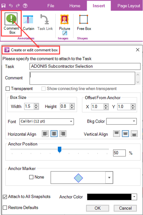
The form shows settings that are established by the current Template Properties form within its Comment Boxes tab. Using the controls in the Create or edit comment box form you can establish the properties of the Comment Box and when you click the OK button, the Comment Box is attached to the selected task bar or milestone symbol.
Insert Tab – Annotations Sub-Section – Curtain Button
The Curtain Button is always enabled and when clicked accesses the Curtain properties form as shown below:
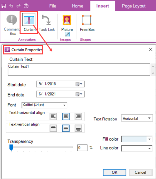
Using the controls in the Curtain Properties form you can establish the extent and other properties of the desired Curtain. When you click the OK button, the Curtain with its defined properties is placed in the graph.
Insert Tab – Annotations Sub-Section – Task Link Button
The Task Link Button is used to insert manual Task Links between any two (2) task bar/milestone symbols in the chart. At least two (2) task bars or milestone symbols must first be selected in order for the Task Link button to be enabled as shown here:
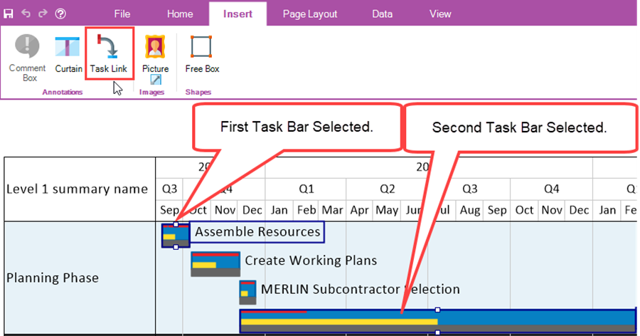
When the enabled Task Link button is clicked, a manual Finish-to-Start (FS) Task Link is placed in the chart between the two (2) selected task bars as shown below:
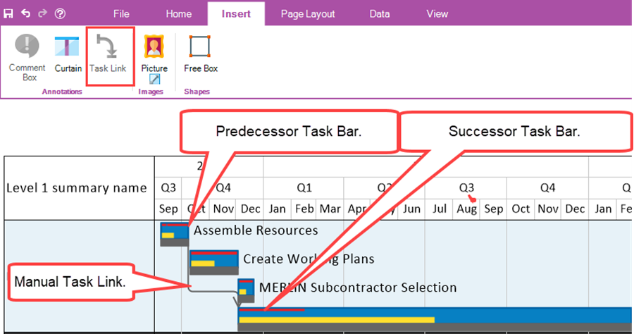
Selecting more than two(2) task bars or milestone symbols and then clicking the enabled Task Link button creates a series of Finish-to-Start Task Links from the upper left of the chart to the lower right of the chart connecting the selected task bars and/or milestone symbols into a Daisy Chain of manual Task Links.
Insert Tab – Images Sub-Section
The Images sub-section contains only one (1) button – the Picture Button as shown here:

Insert Tab – Images Sub-Section – Picture Button
The Picture Button is always enabled and when clicked, OnePager accesses an Open picture file window where you have designated your pictures are stored as shown below:
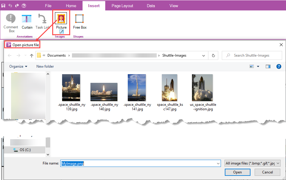
Using the Open picture file window, select the desired image/picture and click Open. OnePager then places the select image/picture into the middle of the graph. At this point in the process you can select the image or picture by clicking on it and use available editing tools to move it around in the graph or resize it.
Insert Tab – Shapes Sub-Section
The Shapes sub-section contains only the Free Box Button as shown below:

Insert Tab – Shapes Sub-Section – Free Box Button
The Free Box Button is always enabled and when clicked OnePager changes the mouse cursor to a “Plus” sign in the graph as shown below:
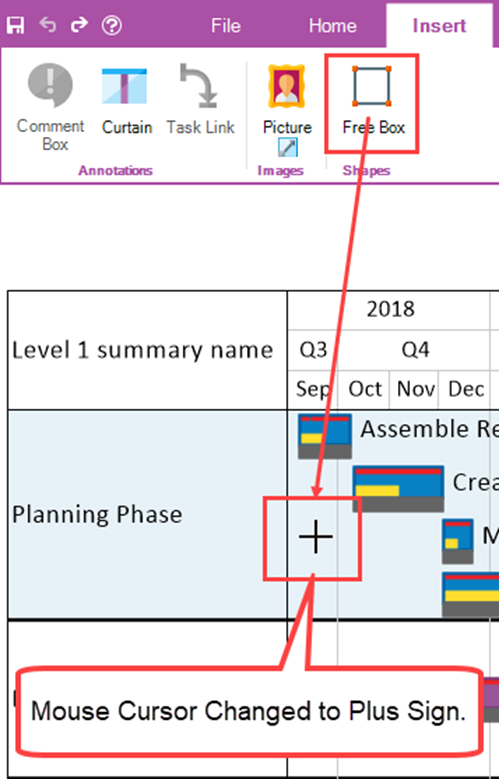
With the mouse cursor in the “Plus” sign mode, position the cursor to where you want the upper left corner of the Free Box to be and hold down the left-click mouse button. Then drag the mouse to expand the point position of the mouse cursor into a square or rectangle as shown here:
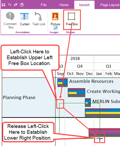
When you release the left-click mouse button the Free Box’s position and size in the graph is established as shown below:
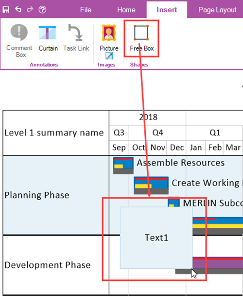
From this position, the Free Box can be selected, moved to any position in the chart, resized, or have its properties changed as required. Changing the properties of a selected Free Box is done by accessing its right-click context menu and clicking the Properties … command to access the Shape Properties form for the select Free Box.
(4.0.2.2.3-72)
OnePager's Ribbon Tool Bar Page Layout Tab
The OnePager Ribbon Tool Bar Page Layout tab is shown in detail below:

The Page Layout tab contains four (4) sub-sections and is used to provide control over output media produced by OnePager. These four (4) sub-sections are described below:
Page Layout Tab – View Modes Sub-Section
There are four (4) button controls in the View Modes sub-section that control the viewing modes available in the OnePager Chart Editor. The default mode is Normal as shown in the illustration above which is the viewing mode established when the Chart Editor is opened. Each of the three (3) remaining View Modes is discussed below.
Page Layout Tab – View Modes – Page Break Button
When in the Page Break button is clicked, the Chart Editor displays the location of horizontal and vertical page breaks currently inserted into the chart. If no page breaks are presently inserted into the chart, the chart is updated with a water mark indicating that the entire chart is Page 1.
For illustration, suppose the chart has a vertical and horizontal page break inserted making the chart in output media contain four (4) pages. When the Page Break button is clicked, the Chart Editor displays the locations of the page breaks and the water marks indicating the page number in the appropriate quadrants as shown here:
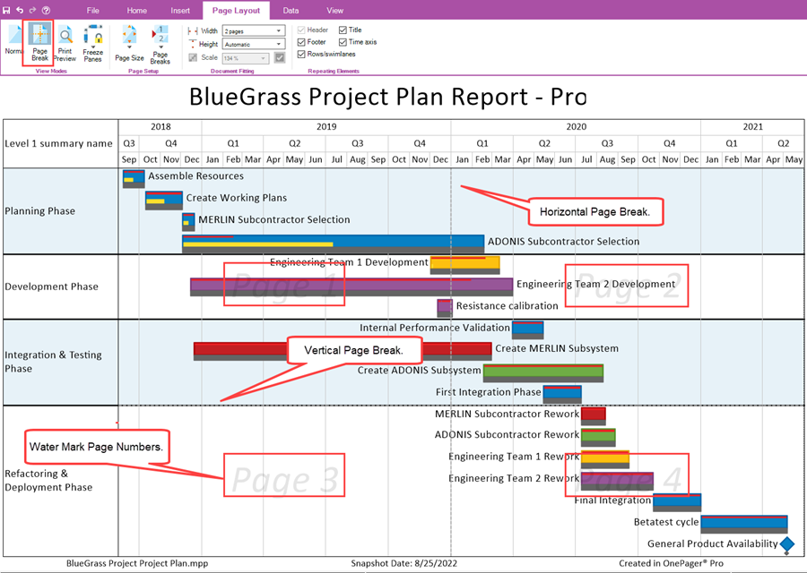
Making any changes in the Document Fitting sub-section updates the Page Break View Mode in the Chart Editor.
Page Layout Tab – View Modes – Print Preview Button
The Print Preview Button, when clicked, changes the Chart Editor’s View Mode, which may be the Normal View Mode or the Page Break View Mode, to that of the Print Preview View Mode as shown below in a transition from the Page Break View Mode with four (4) pages:
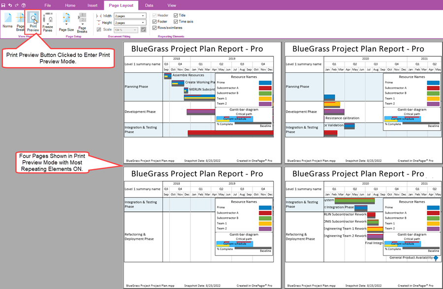
In the Print Preview View Mode making any changes using any of the controls in the Page Layout tab may change the chart in the Print Preview View Mode and potentially in the Chart Editor.
To return to the Chart Editor’s Normal View Mode, click the Home tab on the OnePager Ribbon Tool Bar.
Page Layout Tab – View Modes – Freeze Pages Dropdown
The Freeze Pages Dropdown is enabled in the Normal View Mode and the Print Preview View Mode. Clicking the Freeze Pages dropdown accesses the dropdown list of five (5) commands shown here:

The purpose of the Freeze Pages View Mode is to give you the capability for charts that are large in terms of horizontal and/or vertical extent to keep either or both the row and swimlane labels and/or the top/bottom time axis level cells in the Chart Editor’s viewing area when scrolling left and right or up and down. The Freeze Pages settings are carried forward to any output media produced.
The following commands are available in the Freeze Pages View Mode dropdown list:
- Freeze none – The Freeze none command is enabled whenever either the time axis or rows and swimlane labels Freeze commends are displayed in the Chart Editor. Clicking the Freeze none command essentially removes all Freeze options currently shown in the Chart Editor.
- Freeze all – This command turns ON both the Freeze top/bottom time axis and Freeze row and swimlane labels commands and makes them always shown in the Chart Editor.
- Freeze top time axis – The Freeze top time axis command freezes the top time axis level cells in the Chart Editor such that the top time axis is always visible at the top of the chart when vertical scrolling is done. If the bottom time axis is present in the Chart Editor it is not frozen.
- Freeze row and swimlane labels – The Freeze row and swimlane labels freezes any showing row and/or swimlane labels in the Chart Editor such that the row and/or swimlane labels are always visible on the left side of the chart when horizontal scrolling is done.
- Freeze bottom time axis - The Freeze bottom time axis command freezes the bottom time axis level cells in the Chart Editor such that the bottom time axis is always visible at the bottom of the chart when vertical scrolling is done. If the top time axis is present in the Chart Editor it is not frozen.
The Freeze Page View Mode dropdown commands are enabled only when the corresponding component is showing in the Chart Editor in Normal View Mode.
Page Layout Tab – Page Setup Sub-Section
The Page Setup sub-section contains two (2) dropdown lists of command for establishing the page size on output media and for inserting manual horizontal and vertical page breaks into the Chart Editor in Page Break View Mode to establish the number of pages for output media. The Page Setup sub-section and its dropdown commands are shown below:

Page Layout Tab – Page Setup Sub-Section – Page Size Dropdown
The Page Size dropdown is a list of available page sizes based upon the printer capabilities connected to your computer. A typical Page Size dropdown list looks like this:
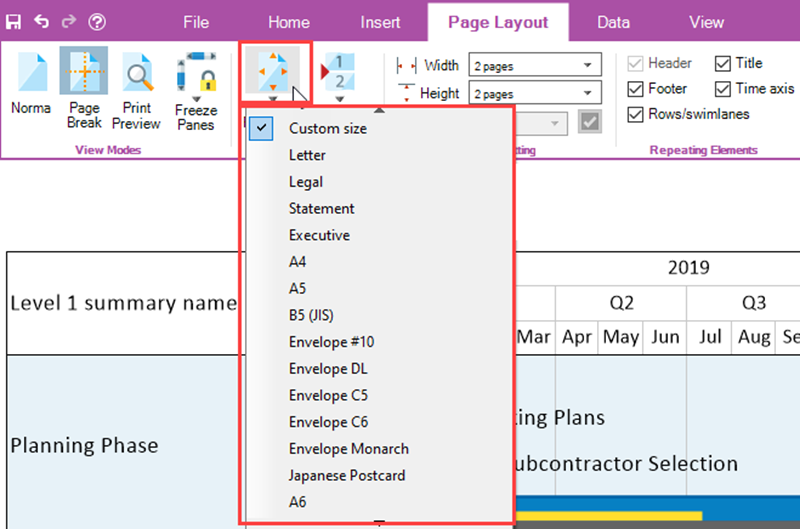
The option in the Page Size dropdown list with the checkbox checked is the current page size being used. Changing the page size causes OnePager to adjust the number of pages based upon the current output media being used.
Page Layout Tab – Page Setup Sub-Section – Page Breaks Dropdown
The Page Breaks Dropdown is a list of four (4) commands that provide you with the capability to manually insert horizontal and/or vertical page breaks into the graph. The Page Breaks dropdown list is enabled in the Normal and Page Break View Modes.
Clicking the Page Breaks dropdown list accesses the commands shown in the illustration below:

Inserting a manual page break requires three (3) steps.
- First, access the Page Breaks dropdown list and select either the Insert vertical page break option or Insert horizontal page break option.
- Next, the dropdown list closes and you can move the mouse cursor into the graph area where the cursor becomes a plus sign and a dotted line appears in the graph.
- If the Insert vertical page break option is selected, the dotted line is horizontal.
- If the Insert horizontal page break option is selected, the dotted line is vertical.
- For the last step, position the mouse cursor where you want the page break placed and left-click the mouse. When you do this the inserted manual page break snaps into a position depending on its type.
- Vertical page breaks snap between the closes two rows.
- Horizontal page breaks snap between the two closest lower level time axis cells.
The Page Breaks dropdown list contains five (5) commands as follow:
- Insert vertical page break – Inserts a vertical page break that divides the chart into multiple horizontal sections.
- Insert horizontal page break - Inserts a horizontal page break that divides the chart into multiple vertical sections.
- Remove all inserted page breaks – This option removes all manually inserted vertical and/or horizontal page breaks. Automatic page breaks inserted by OnePager remain.
- Remove all page breaks – This option removes all manually inserted and automatically inserted page breaks from the graph.
Page Layout Tab – Document Fitting Sub-Section
The Document Fitting sub-section contains two (2) dropdown lists and a window for showing the scale factor for the chart in output media. The Document Fitting sub-section is shown here:

Page Layout Tab – Document Fitting Sub-Section – Width Dropdown
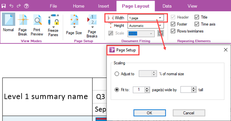
The Width dropdown list provides you with the capability to let OnePager determine where the vertical page breaks are inserted to meet the page number setting selected. The Width dropdown list is shown below:

The Automatic option tells OnePager to determine the number of pages in width based on the size of the chart and the selected output media. There are additional selections that can be used from one (1) page through nine (9) pages. Clicking the More choices options accesses the Page Setup form which provides additional controls over the way the chart looks in output media. The Page Setup form is shown below:
Page Layout Tab – Document Fitting Sub-Section – Height Dropdown
The Height dropdown list provides you with the capability to let OnePager determine where the horizontal page breaks are inserted to meet the page number setting selected. The Height dropdown list is shown below:

The Automatic option tells OnePager to determine the number of pages in width based on the size of the chart and the selected output media. There are additional selections that can be used from one page through nine pages. Clicking the More choices options accesses the Page Setup form which provides additional controls over the way the chart looks in selected output media. The Page Setup form is shown in the previous illustration above.
Page Layout Tab – Document Fitting Sub-Section – Scale Window
When you select Automatic for both the width and height settings, the Scale window is enabled giving you choices for scale factors as shown below:

Increasing the Scale factor enlarges the size of the chart on the output media while decreasing the Scale factor decreases the size of the chart on the output media. Using these controls you can tailor the presentation of the chart on the output media to include printed pages and copied pages suitable for pasting into a Microsoft PowerPoint presentation. You also have the option to enter a value into the window. When this is done, the checkbox to the right of the window is enabled. When the final value is set, click on the checkbox and that typed value becomes the scale factor.
Page Layout Tab – Repeating Elements Sub-Section
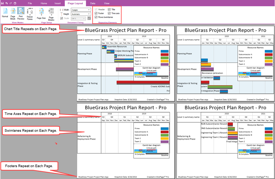
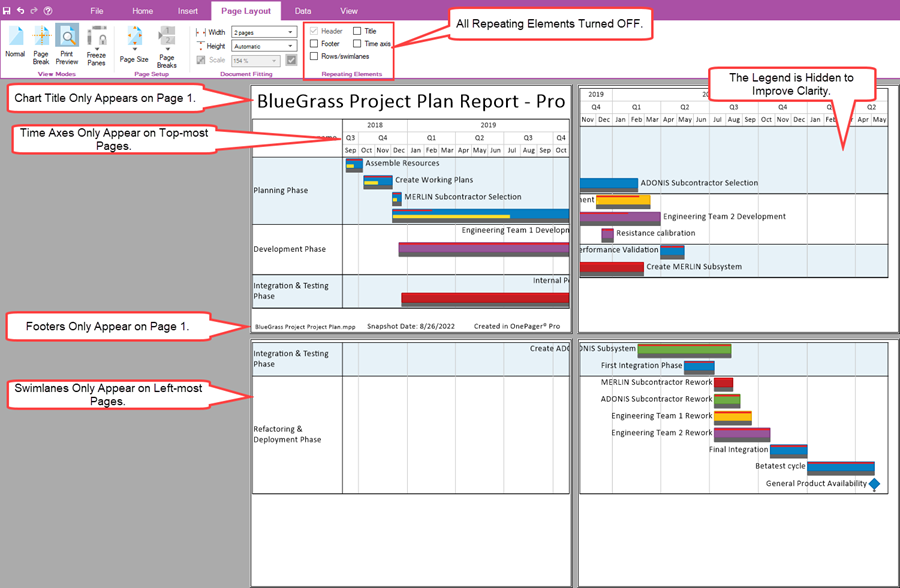
The Repeating Elements sub-section consists of five (5) checkboxes each turning ON or OFF elements of the chart that appear or are hidden on every page of multi-page output media. The Repeating Elements sub-section is shown below:

The five (5) checkboxes shown in the illustration above are enabled when the corresponding chart element is present in the chart. For example, the Header checkbox is disabled because in the chart shown below does not have Headers defined in either the Template Properties or Chart Properties form’s Headers/Footers tab. A four (4) page chart with the above four (4) Repeating Elements turned ON looks like this:
As a contrast, turning all the Repeating Elements OFF produces a Print Preview Mode that looks like this:
(4.0.2.2.5-72)
OnePager's Ribbon Tool Bar Data Tab
The OnePager Ribbon Tool Bar Data tab is shown in detail below:

The Data tab contains two (2) sub-sections and is used to control chart updates for Replacing a snapshot, Adding a snapshot to the chart, performing a Custom Update of a snapshot, or changing source plan files. These two (2) sub-sections are described below:
Data Tab – Update Sub-Section
The Data tab’s Update sub-section contains three (3) buttons for managing snapshot updates to the chart. The sub-section is shown below:

Data Tab – Update Sub-Section – Replace Snapshot Button
Clicking the Replace Snapshot button tells OnePager to immediately access the current source plan packet and update the current chart with the data imported. When this is done, the current chart reflects any changes that were made in the current source plan packet. This technique allows you to make changes to your current source plan or plans and see the results in the current OnePager chart. The snapshot date is not changed using this operation.
Data Tab – Update Sub-Section – Add Snapshot Button
The Add Snapshot button is used to add a snapshot to the current chart with a new date established as the new snapshot date. This operation is used after the current chart is OPENED, when the source plan packet is updated, and you need to add a snapshot to reflect the current source plan packet’s new status or date change information. Clicking the Add Snapshot button accessed the OnePager Standard Date Picker form shown below:
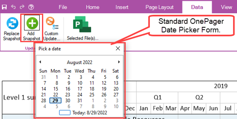
Use the Standard Date Picker form to establish the date for the new added snapshot. This operation pulls in the source plan packet’s data and creates a new snapshot with a new snapshot date. At the end of the operation, the Chart Editor displays a chart that reflects the changes made in the source plan packet.
Data Tab – Update Sub-Section – Custom Update… Button
The Custom Update… button is used to perform a more complex snapshot update. Clicking the Custom Update… button causes OnePager to re-access the current source plan packet and access a modified version of the OnePager choices form as shown here:
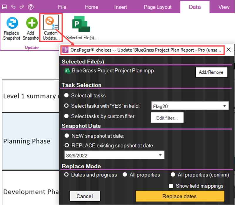
You can use the Custom Update… to perform more complex updates to the chart because the OnePager choices form provides the controls for adding, changing, or removing source plans from a packet, changing the method of Task Selection, opting to create a new snapshot at a specific date (not shown above), or replacing a snapshot at a date with a choice of one (1) of three (3) replacement modes.
Data Tab – Selected File(s)… Button
The Select File(s)… button access the Data source selection form shown below which displays the current source plan or plans that were used to create the current chart:
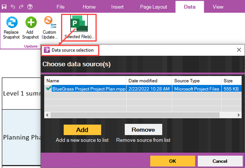
You can used the Data source selection form to change the current source plan file in the packet via the Remove and Add buttons in the form or choose to add a new source plan to the packet. Once the update to the source plans is completed, you can use the features in the Update sub-section to update your chart in the manner desired. At least one (1) source plan file must appear in the Data source select form’s grid.
(4.0.2.2.7-72)
OnePager's Ribbon Tool Bar View Tab
The OnePager Ribbon Tool Bar View tab is shown in detail below:

The View tab is useful for managing the contents of the Chart Editor with respect to which snapshots are shown, for Zooming in and out on specific sections of the chart, for controlling the display of graphic elements, refreshing the chart, and altering the chart’s extent by changing its Start/Finish dates. The five (5) sub-sections of the View tab are discussed below:
View Tab – Snapshots Sub-Section
The three (3) controls in the Snapshots sub-section are enabled only when the chart contains two ( 2) or more snapshots.
View Tab – Snapshots Sub-Section – Previous/Next Buttons
The left and right pointing arrows are enabled only when, from the current Chart Editor snapshot being displayed, there is a Previous snapshot or a Next snapshot from the perspective of the current snapshot being displayed in the Chart Editor. Clicking the Previous or left point arrow when it is enabled causes the Chart Editor to display the previous snapshot in the sequence of snapshot dates. Clicking the Next or right pointing arrow when it is enabled takes you to the next or further dated snapshot available in the chart.
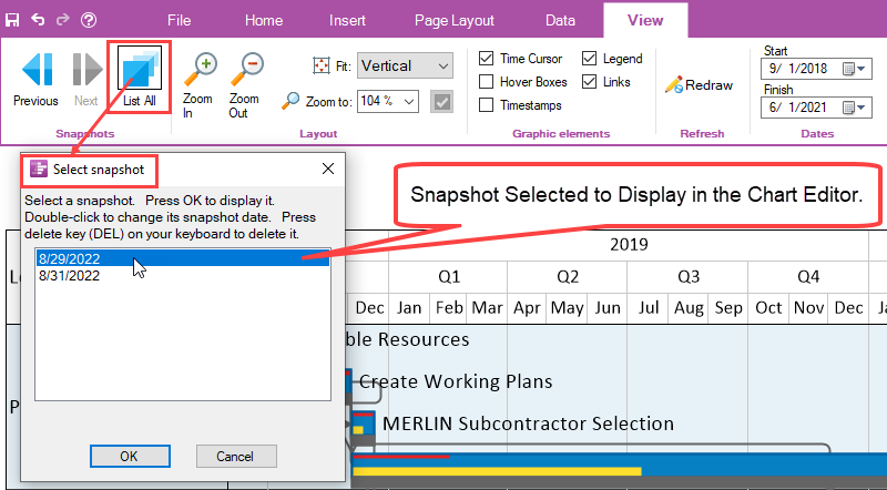
View Tab – Snapshots Sub-Section – List All Button
When you click the List All button, OnePager accesses the Select snapshot form which lists all the snapshots by date in the chart. Selecting a snapshot date in the grid displays that selected snapshot in the Chart Editor when you click the OK button on the Select snapshot form as shown below:
View Tab – Layout Sub-Section
There are four (4) controls in the Layout sub-section, shown below, used for controlling the “look” in the Chart Editor with respect to magnification and orientation on your screen. These four (4) controls are discussed in detail below:

View Tab – Layout Sub-Section – Zoom In/Zoom Out Buttons
The Zoom In/Zoom Out buttons change the magnification (Zoom factor) within the graph and allow you to focus in or away from portions of the chart as demonstrated below:
Suppose the chart’s Zoom factor is set to 100% as shown here:
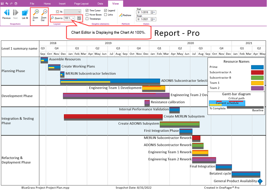
In the illustration above, the Zoom to: window show 100%. If the Zoom In button is clicked once, the Zoom factor changes to 110% and, as shown in the illustration below, the swimlanes and task bars appear larger and less of the chart appears on your screen.
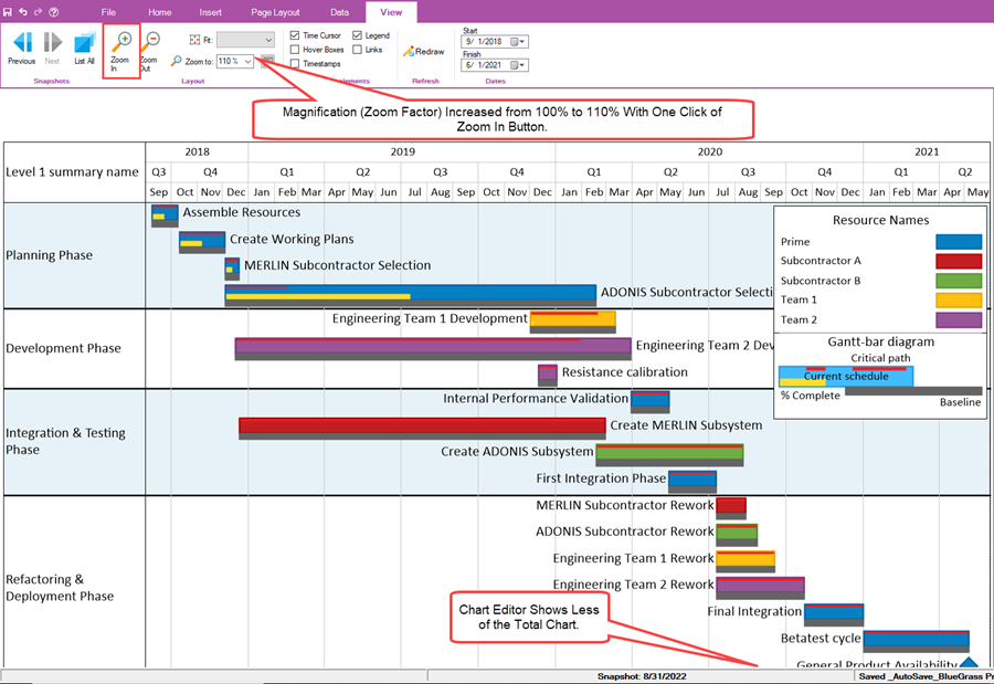
Additional clicks on the Zoom In button increases the Zoom factor and ultimately OnePager provides horizontal and vertical scroll bars for navigation in the Chart Editor.
Clicking the Zoom Out button reduces the magnification making the graph look smaller in the Chart Editor.
Each time either the Zoom In or Zoom Out button is clicked, the value in the Zoom to: window is changed to reflect the change in Zoom factor.
View Tab – Layout Sub-Section – Zoom To: Dropdown and Window
The Zoom to: window has a dropdown list of most use Zoom factors as shown below:

Clicking the Zoom to: dropdown accesses the dropdown list shown above. Select the desired Zoom factor with a left click and the selected value is entered into the Zoom to: window.
You also have the option to set the Zoom factor to by clicking in the Zoom to: window and typing the desired value. After typing in the value, the checkbox to the left of the Zoom to: window is enabled and clicking this checkbox sets the new Zoom factor value into the Chart Editor. The values accepted range from 5% to 500%.
View Tab – Layout Sub-Section – Fit: Dropdown
The Fit: dropdown lets you set the orientation of the graph in the Chart Editor to either Vertical or Horizontal as shown in the dropdown below:

The Vertical Fit option assures that the single page in the Chart Editor shows all the rows and swimlanes vertically even if the screen is not filled to the right as shown below:
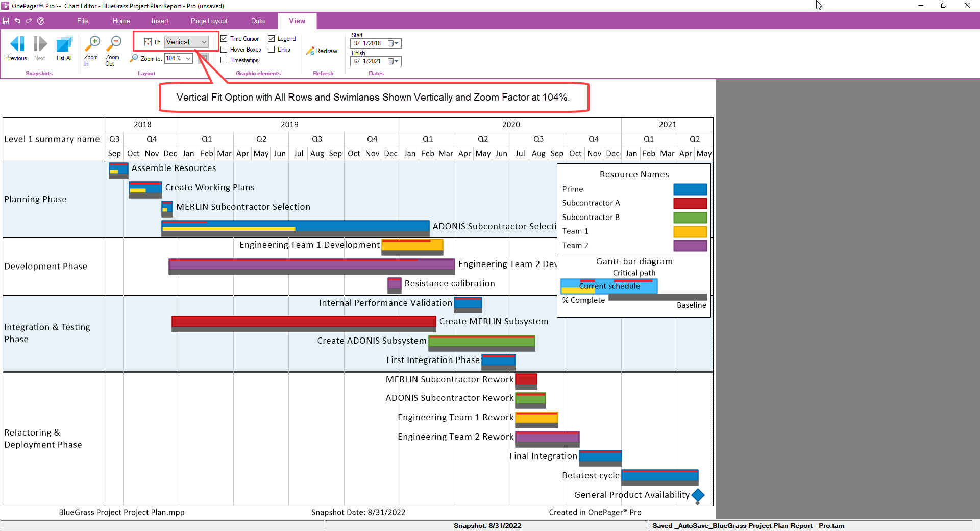
The Vertical Fit: option shows the entire chart vertically in the Chart Editor’s viewing area. If the extent is large in terms of the charts Start/Finish dates. A horizontal scroll bar is provided on the bottom of the chart.
Selecting the Horizontal Fit option produces the screen view of the Chart Editor shown below:
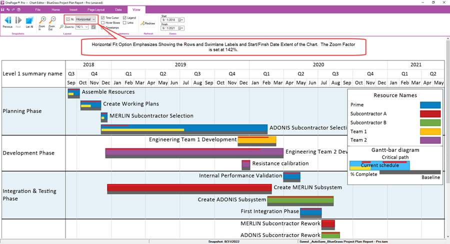
In this Fit: option the chart fills the width of the Chart Editor’s viewing area but the vertical portion is cut off and available using the scroll bar on the right.
View Tab – Graphic Elements Sub-Section
There are five (5) checkbox controls in the Graphic Elements sub-section used for controlling which graphic elements such as the time cursor, Hover Boxes, Timestamps, The Legend, or Task Links are shown in the chart. These five (5) checkbox controls are discussed in detail below:

View Tab – Graphic Elements Sub-Section – Time Cursor Checkbox
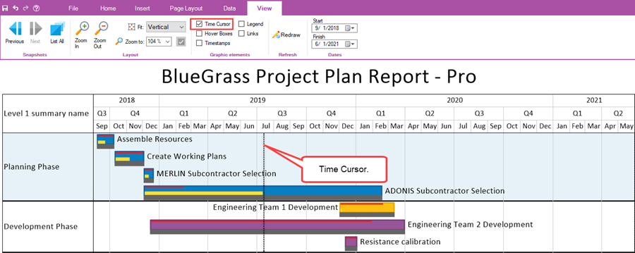
When the Time Cursor checkbox is checked ON, the time cursor is shown in the graph if the snapshot date is within the Start/Finish date extent of the chart as shown below:
View Tab – Graphic Elements Sub-Section – Hover Boxes Checkbox
Checking the Hover Boxes checkbox ON turns on the Hover Box feature allowing you to use the Hover Box to examine task bars and milestone symbols and obtain additional information as shown below:
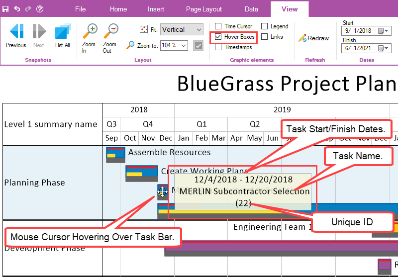
The Hover Box as shown above provides the task bar/milestone symbol’s start/finish dates, task name, and Unique ID.
View Tab – Graphic Elements Sub-Section – Timestamps Checkbox
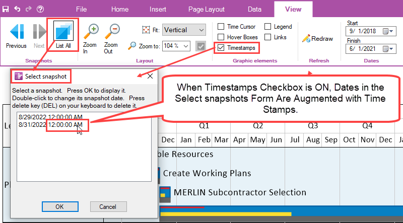
When the Timestamps checkbox is turned ON, some dates in the chart are augmented with the time of day data taken from the source plan, if provided. For example, with the Timestamps checkbox checked ON, dates in the Select snapshot form are augmented with time of day information as shown below:
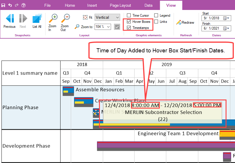
As another example, if the Hover Boxes checkbox is also turned ON, the task Start/Finish dates in the Hover Box are also augmented with time of day values from the source plan as shown here:
View Tab – Graphic Elements Sub-Section – Legend Checkbox
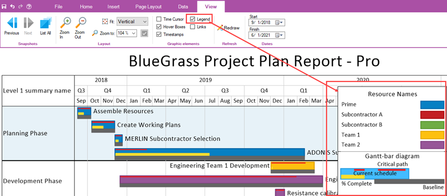
Turning ON the Legend checkbox immediately causes the display of the Legend in the chart at the location determined by the Template Properties or Chart Properties form’s Legend tab. An example is shown here:
View Tab – Graphic Elements Sub-Section – Links Checkbox
When the Links checkbox is checked ON and manual or Data-Driven Task Links are imported from the source plan, the Chart Editor displays the task links in the graph as shown here:
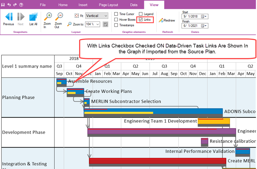
In order to insert manual Task Links into the graph as discussed in the Insert sub-section above, the Links checkbox in the Graphic elements sub-section of the View tab must be checked ON.
View Tab – Refresh Sub-Section
The Refresh sub-section contains the Redraw button discussed below.
View Tab – Refresh Sub-Section – Redraw Button
The Redraw button forces the Chart Editor to redraw all graphics in the chart. This function is useful when occasionally you may find an artifact in the graph or are unsure that the chart is perfectly up-to-date. The Redraw button is shown below:

View Tab – Dates Sub-Section
The Dates sub-section contains two (2) Date Picker dropdowns for the chart’s Start date and Finish date, respectively as shown below:

The Dates sub-section is discussed in detail below:
View Tab – Dates Sub-Section – Start Date Picker Dropdown
Clicking on the Start date picker dropdown accesses the OnePager standard Date Picker form as shown below:

With the Start date picker form accessed, you can use the form to set the Start date that is used to define the left side of the graph. This Start date is separate and apart from the start date provided by the source plan. The chart’s start date is for the purpose only of establishing the visible left or earliest date for the chart. Based on the Start date selected, the chart may have empty space to the left of the first task bar/milestone symbol or some task bar/milestone symbols may be cut off on the left side of the chart with consideration of the display or swimlane and/or row label cells.
View Tab – Dates Sub-Section – Finish Date Picker Dropdown
Clicking on the Finish date picker dropdown accesses the OnePager standard Date Picker form as shown below:

With the Finish date picker form accessed, you can use the form to set the Finish date that is used to define the right side of the graph. This Finish date is separate and apart from the finish date provided by the source plan. The chart’s finish date is for the purpose only of establishing the visible right or latest date for the chart. Based on the Finish date selected, the chart may have empty space to the right of the latest task bar/milestone symbol or some task bar/milestone symbols may be cut off on the right side of the chart.
(4.0.2.2.9-72)
OnePager's Ribbon Tool Bar File Page
Clicking the File tab on the OnePager Ribbon Tool Bar takes you away from the Chart Editor and to the File page with its thirteen (13) tabs as shown below at the Help tab:
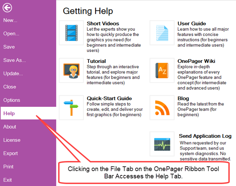
All File Page tabs are discussed in detail below.
File Page – New… Tab
Clicking the New… tab on the File page accesses the abbreviated OnePager choices form with the Please select a source file sub-section as shown below:

This action takes you back to the OnePager Home Ribbon Tool Bar tab where you can use the abbreviated OnePager choices form to load a different source plan or plans and thereby create a new chart from it.
File Page – Open… Tab
Clicking the Open… tab on the File page accesses a dropdown list with the most recent chart file names created. These chart file names are .tam files and selecting one of them launches another OnePager Chart Editor that displays the selected .tam file. This is illustrated below:
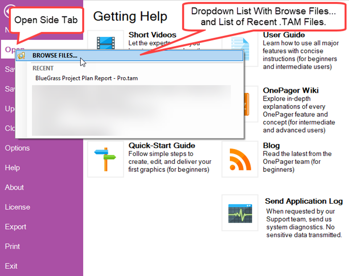
Clicking on the RECENT .tam file shown above accesses another instance of the Chart Editor from which you have access to the previously prepared chart for editing or other purposes as shown below:
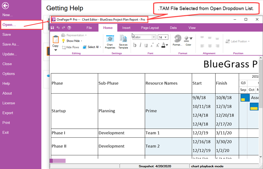
Note that the Get Help options remain visible after the Open tab is accessed.
The Open tab remains disabled until the newly opened .tam file is closed and you return to the original Chart Editor.
File Page – Save Tab
You can use the Save tab to save the current chart. Clicking the Save tab immediately takes you back to the OnePager Home Ribbon Tool Bar tab which is the Chart Editor and displays the Save as Chart (TAM) file form with the chart name inserted in the File name: window as shown below:
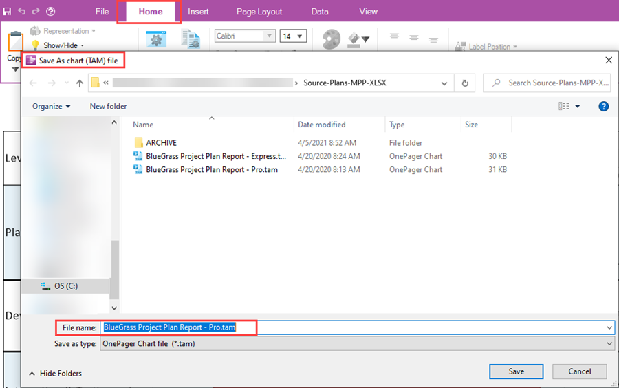
This form accesses the last location or folder where OnePager .tam files were last saved. At this point you can change the name of the file or the folder location where the file should be saved. Clicking the Save button saves the .tam file in the desired location and returns you to the Chart Editor at the OnePager Home Ribbon Tool Bar tab.
File Page – Save As… Tab
You can use the Save As… tab to save the current chart in a folder of your selection. Clicking the Save As… tab immediately accesses the Save as chart form shown below. The initial folder location is determined by the settings on the Options tab discussed in a subsequent sub-section below. For clarity, the Save as chart form is shown with the Options tab’s content in the background:

The intent above is to show that the initial folder accessed in the Save as chart form is determined by the setting in the Chart window shown above. At this point you can change the name of the file or the location where the .tam file should be saved. Clicking the Save button saves the .tam file in the desired location and returns you to original page where you clicked the Save As… tab.
File Page – Update… Tab
You can use the Update… tab to perform an update of the current chart. Clicking the Update… tab accesses the update configuration of the OnePager choices form shown below where you can use the controls to perform an update of your current chart either to add a new snapshot or replace an existing snapshot:
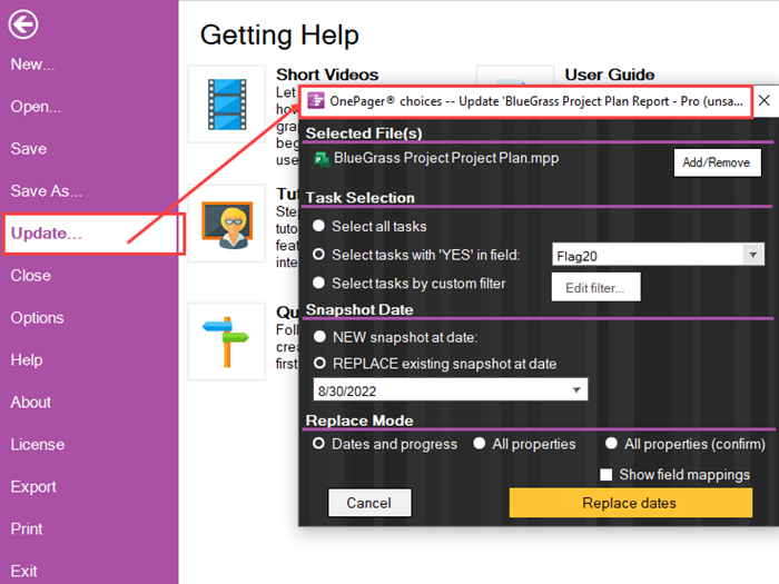
After performing the update, OnePager returns you to the OnePager Home Ribbon Tool Bar tab and the Chart Editor where the updated chart is displayed.
File Page – Close Tab
You can close the current chart in the Chart Editor by clicking the Close tab. Clicking the Close tab immediately displays a OnePager message form as shown below:
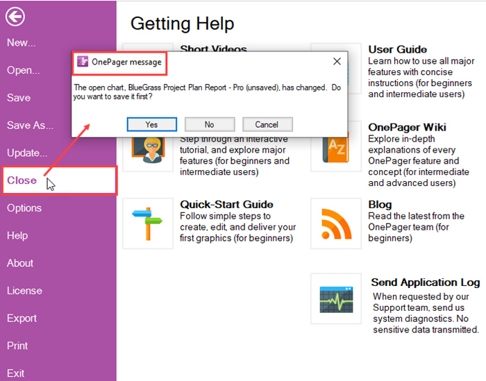
From the OnePager message form you have the option to click Yes, No, or Cancel.
- Clicking the Cancel button closes the OnePager message form and no further action by OnePager is taken.
- Clicking the No button also closes the OnePager message form and no further action is taken.
- When you click the Yes button in the OnePager Message form, OnePager access the Save As chart (TAM) file form as shown below:
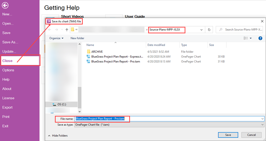
At this point you can change the name of the .tam file or the location where the .tam file is saved. Clicking the Save button on the form saves the .tam file in the desired location and returns you to original page where you clicked the Close tab. The action also closes the chart in the Chart Editor. When you return to the OnePager Home Ribbon Tool Bar tab, the Chart Editor screen looks like this minimized:
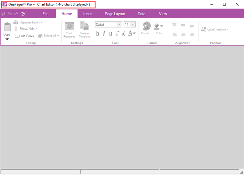
At this point you have the option to exit OnePager or to access another OnePager chart.
File Page – Options Tab
The Options Tab has three (3) purposes.
- First, it provides information on where OnePager stores and retrieves charts (i.e., .TAM files) and where OnePager stores and retrieves Template Properties forms, Color palettes, and Milestone symbols.
- Second, the Options tab provides the capability for you to change the locations of the four (4) elements previously described.
- And, third, the Template… button provides a way to access the current Template Properties form for the purpose of editing it or changing to a different Template Properties form. The Options tab is shown below:
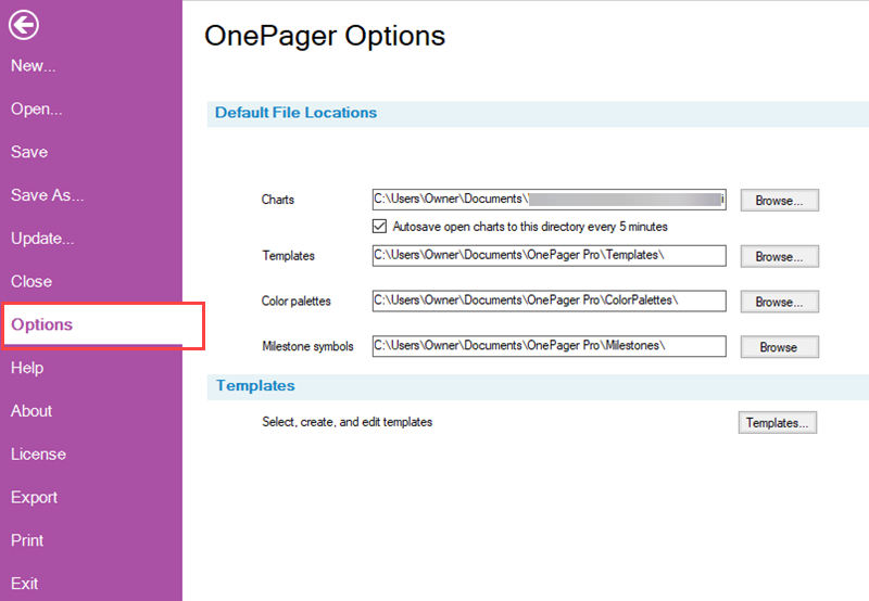
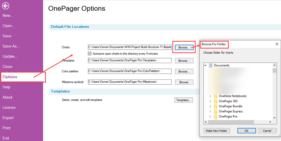
Clicking any of the four (4) Browse… buttons accesses the Browse for folder form where you can change where you access your .TAM files, Templates Properties forms, Color palettes, or Milestone symbols as shown below:
The Templates… button can be clicked to access the current Template Properties form for the purpose of making edits, creating a new Template Properties form, or changing to a different Template Properties form as shown here:
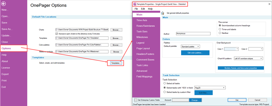
If OnePager already has a chart showing on the Chart Editor, changes made to the current Template Properties form have no impact on the chart. However, if the current Template Properties form is edited or change and saved, that edit or change Template Properties form may have an impact on the current chart if the chart is updated in the same session of the Chart Editor.
File Page – Help Tab
The Help Tab is the default tab OnePager presents when the OnePager Ribbon File Tool Bar tab is clicked. The Help tab has seven (7) buttons that provide access to different kinds of help tool available in OnePager as shown below:
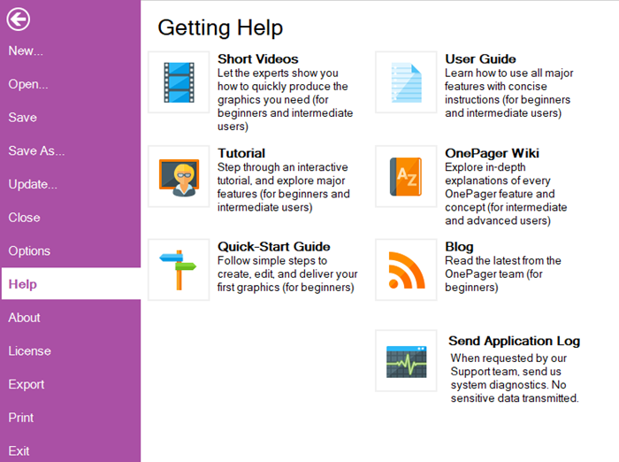
Each of these buttons is discussed below:
File Page – Help Tab – Show Videos Button
Clicking the Short Videos button launches a browser and takes you to the OnePager.com Video Tutorials page at:
| OnePager Video Tutorials |
The Show Video page has a list of available OnePager Videos you can use to introduce yourself to the features, functions, and capabilities of OnePager at the Basic, Intermediate, or Advanced levels.
File Page – Help Tab – Tutorial Button
Clicking the Tutorial button accesses OnePager’s built in Tutorial form which provides you access to the Tutorial for the specific product edition you are working with as shown below:
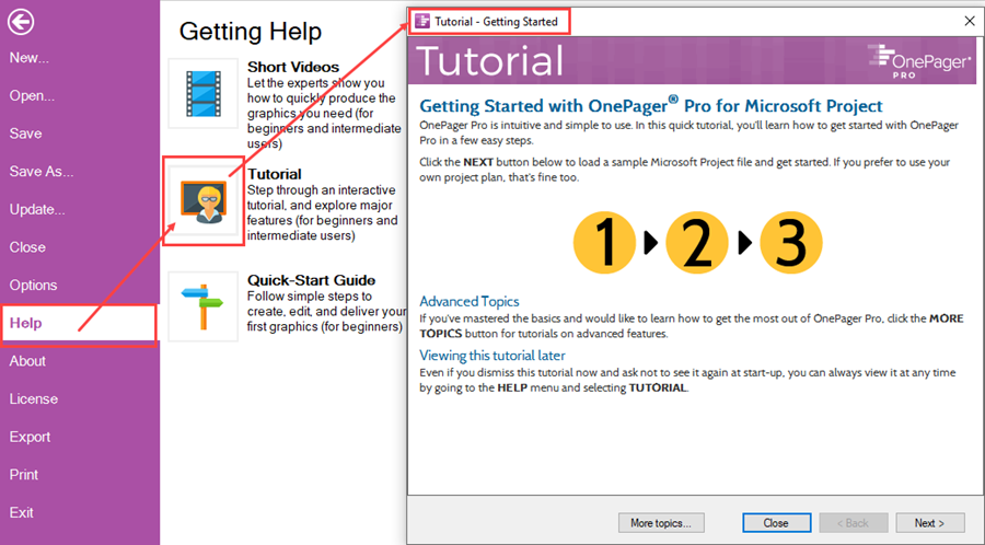
With the Tutorial form accessed, you can click on the Next > button to start the tutorial.
File Page – Help Tab – Quick Start Guide Button
Clicking the Quick Start Guide button launches an embedded browser PDF Reader with a short OnePager Quick Start Guide that is provided when you installed your edition of OnePager as shown below:
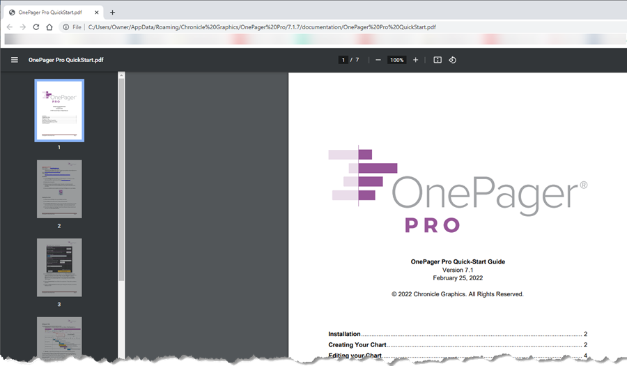
The OnePager Quick Start Guide document is typically sufficient to help you operate OnePager and create your first chart.
File Page – Help Tab – User Guide Button
Clicking the User Guide button launches an embedded browser PDF Reader with the longer OnePager User Guide that is provided when you installed your edition of OnePager as shown below:
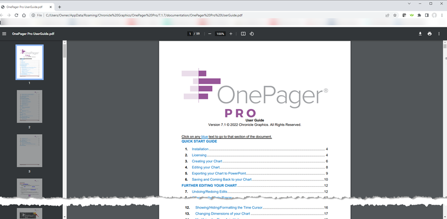
The OnePager User Guide document is a more detailed version of the OnePager Quick Start Guide document containing more detailed descriptions of available OnePager features, functions, and capabilities.
File Page – Help Tab – Wiki Button
Clicking the OnePager Wiki button launches a browser and takes you to the OnePager.com Wiki Title page at:
| OnePager Wiki |
The OnePager Wiki contains in depth detailed information on the use of all available versions and editions of OnePager. The Main Page of the OnePager Wiki looks like this:
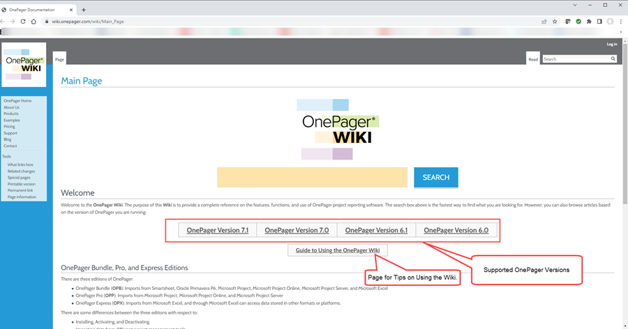
The OnePager Wiki provides in depth detailed information on using OnePager to its fullest capabilities back to Version Release 6.0. The Wiki contains detailed documentation for all supported source plan inputs to OnePager including Microsoft Project, Microsoft Project Online, Microsoft Project Server, Microsoft Excel, Smartsheet, and Oracle Primavera P6. The OnePager Wiki Main Page also has a button that provides access to an an article titled Guide to Using the OnePager Wiki which is recommended reading.
File Page – Help Tab – Blog Button
Clicking the Blog button launches a browser and takes you to the OnePager.com Blog page at:
| OnePager Blog |
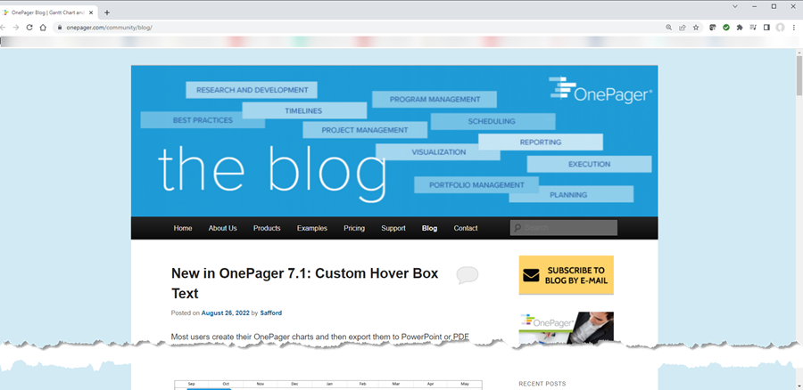
The OnePager Blog contains informative articles on topics of interest to OnePager users including tips and tricks for getting the most out of OnePager to support your schedule conversations. The OnePager Bog Page looks like this:
File Page– Help Tab – Send Application Log Button
The Send Application Log button is used when you have an issue with OnePager’s operation and you wish to pass the issue and your OnePager log file along to the OnePager Support Department. Additionally, the Support Department may ask you to email them your OnePager log file. Clicking the Send Application Log button accesses the Send Log Files form shown below:
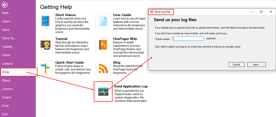
Follow the instructions in the Send Log Files form including entering a Ticket number, if applicable, and then click the Next > button. Clicking the Next > button launches your email application and attaches the current OnePager log file as shown in the illustration below where Microsoft Outlook is used as the email application:

After clicking the Next > button in the Send Log Files form, your email application creates a message addressed to support@onepager.com. Also, OnePager attaches the log file continuously created by OnePager on your computer. Please enter any further explanatory information in the body of the message to explain the issue and click the Send button. When OnePager’s Support Department receives the message they will analyze it and get corrective action or information back to you by return email.
File Page – About Tab
The About Tab is an informational tab that provides information about your OnePager installation and provides an option to provide Feedback to OnePager’s Support Department. The About tab page looks like this:
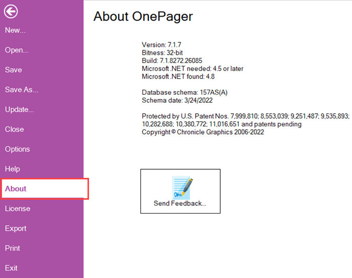
The Send Feedback… button, when clicked, takes you to the OnePager.com website at:
| OnePager Submit a Support Ticket |
The Submit Support Ticket page looks like this:
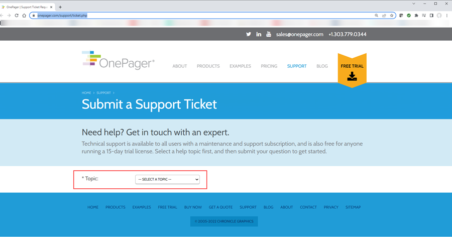
By selecting a Topic using the SELECT A TOPIC dropdown shown in the above illustration you are able to get access to suggested Frequently Asked Questions and communicate with OnePager’s Support Department to ask a specific question.
File Page – License Tab
The License Tab provides visibility of your License Key and a Get License Key button for you to obtain your License Key if you don’t have one. The License tab page looks like this:
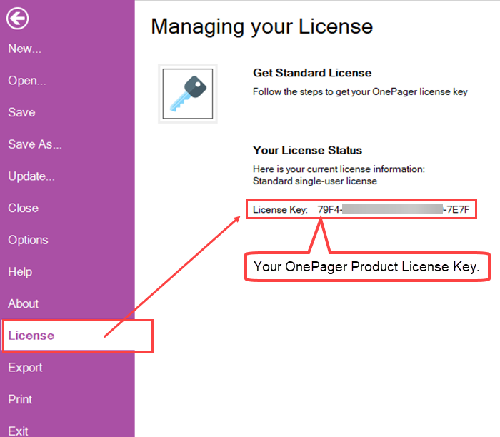
When you click the Get Standard License button, OnePager accesses the OnePager License form which can be used to request a OnePager License from the OnePager Support Department as shown below:
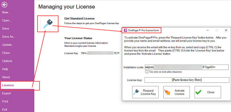
The Installation code: value is generated by your installation of the OnePager version on your computer. This Installation code, unique to you and your computer and is used by the OnePager Support Department to provide your paid License Key. The OnePager Support Department provides you paid License Key by return ''''email where you paste it into the License key: window and click the Activate License button to complete the transaction.
File Page – Export Tab
The Export Tab provides the capability to export OnePager charts (either single or multi-page) to four (4) types of output media. In OnePager, the term ”Export” refers to saving the chart for output media versus Copying the output media to the Windows Clipboard. The Export tab is shown here:
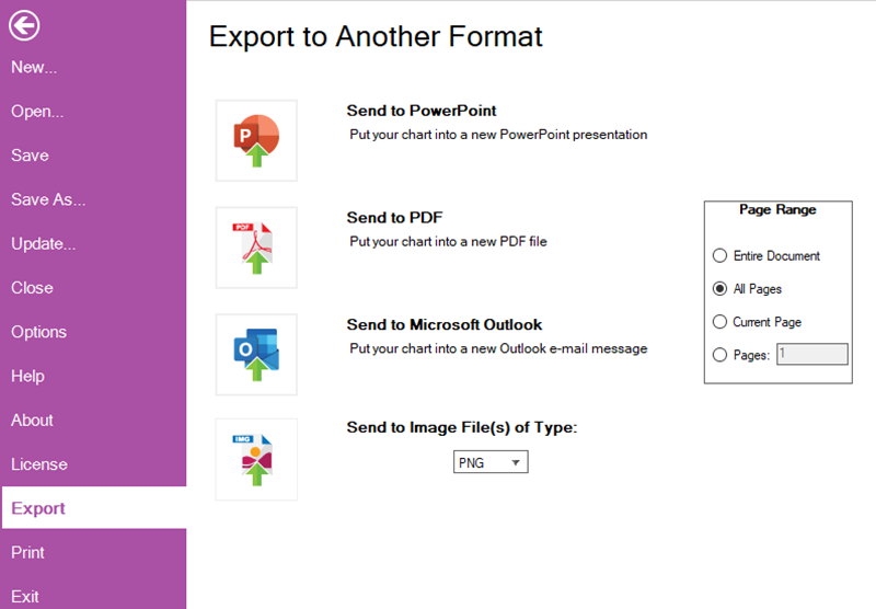
Before describing the four (4) buttons shown in the above form, please note that the Page Range option selection radio buttons on the right side of the illustration above are enabled for all four (4) buttons on the page. These radio buttons let you select to export the Entire Document, All Pages, the Current Page showing in the Chart Editor, or a specific Page Number.
File Page – Export Tab – Send to PowerPoint Button
When you click the Send to Power Point button, OnePager creates a Microsoft PowerPoint formatted output in the requested number of pages and accesses a Windows Save As form where the Microsoft PowerPoint formatted output can be saved as shown in the illustration that follows:

Once the chart or chart portion is exported (saved) a Microsoft PowerPoint presentation can be prepared with the data.
File Page – Export Tab – Send to PDF Button
When you click the Send to PDF button, OnePager creates a PDF formatted output in the requested number of pages and accesses a Windows Save As form where the PDF formatted output can be saved as shown in the illustration that follows:

Once the chart or chart portion is exported (saved) the PDF can be used as necessary as part of a PDF document.
File Page – Export Tab – Send to Microsoft Outlook Button
When you click the Send to Microsoft Outlook button, OnePager creates a PNG formatted output of the chart in the requested number of pages and accesses your Microsoft Outlook application and attaches the PNG formatted output as an attachment to the Microsoft Outlook message form shown below:

Once the exported PNG formatted output is attached to the Microsoft Outlook message form, any accompanying text can be added to the message, it can be addressed, and sent.
File Page – Export Tab – Send to Image File(s) of Type: Button
The Send to Image File(s) of Type: button creates an image file of the current chart in the format determined by the selection of an image type format in the dropdown list immediately below the button title as shown here:
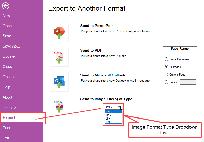
Before clicking the Send to Image File(s) of Type: button it is strongly recommended that you assure that the format type selection meets your needs.
Clicking the Send to Image File(s) of Type: button accesses a Save As form. This form, shown below, provides you the capability to determine where the created image in the format type selected is saved:

Once the chart or chart portion is exported (saved) the selected image format can be used as necessary as part of any document or presentation.
File Page – Print Tab
Clicking the Print Tab accesses a print preview page where the current chart is shown either in its one (1) page format or in a multi-page format as shown below:
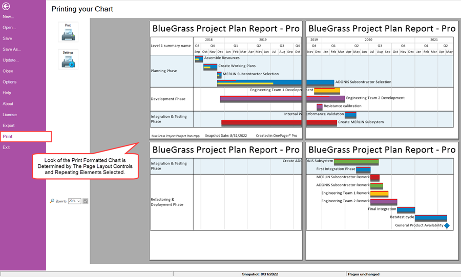
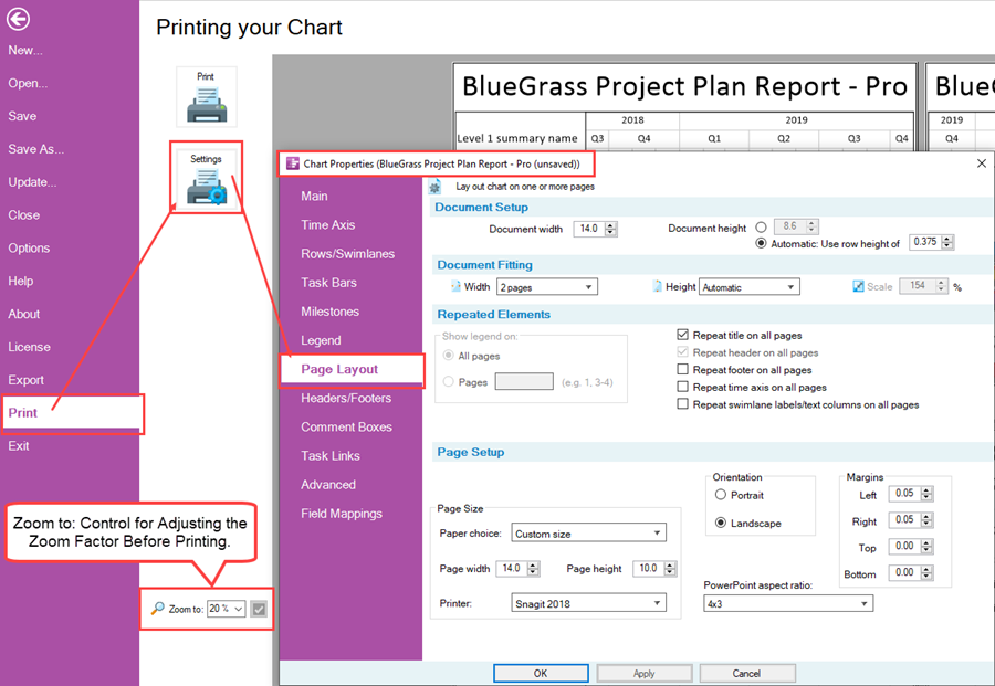
With the print version of the chart displayed, you have the option to adjust the printer settings by clicking the Settings button. Doing so assesses the current Chart Properties form’s Page Layout tab where you can make printer setting changes. You can also adjust the Zoom factor before printing by making a selection change using the Zoom to: control as shown below:
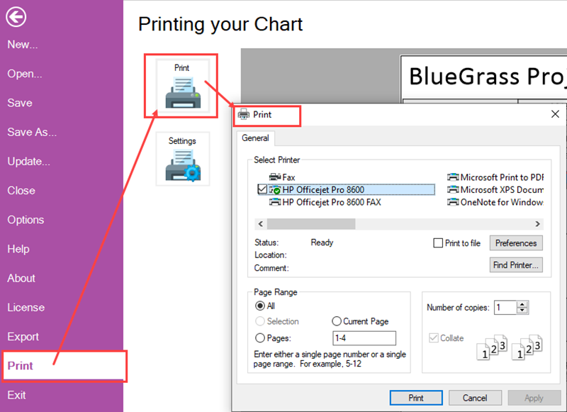
Clicking the Print button accesses your computer’s Windows Print form where final print controls can be adjusted and the document printed on the selected printer as shown here:
File Page – Exit Tab
The Exit Tab is used to exit the OnePager application. If there is a chart open in the Chart Editor, clicking the Exit tab accesses the OnePager message form shown below:
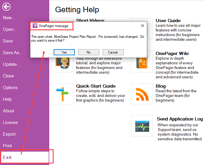
The displayed OnePager message form provides you with three (3) save options before the OnePager application is exited as discussed below:
- No – Clicking the No option immediately closes the OnePager application without saving the current chart.
- Cancel – Clicking the Cancel option closes the OnePager message from and returns you to the File Page.
- Yes – Clicking the Yes option accesses the OnePager Save As chart (TAM) file form where you can use these controls to save the current chart before exiting the OnePager application as shown here:
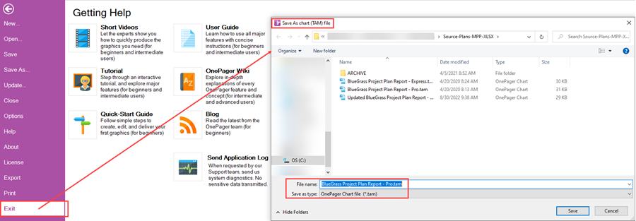
(4.0.2.2.11-72)
OnePager's Ribbon Tool Bar Other Ribbon Controls
There are four (4) controls on the left side of the OnePager Ribbon Tool Bar that are independent of the six (6) OnePager Ribbon Tool Bar tabs discussed previously. These four (4) controls are shown below and briefly described below:

Save Button
Clicking the Save button immediately saves the contents of the Chart Editor in the location specified for Charts on the File Page’s Options tab. Once the save operation is completed, control is returned to the operation prior to invoking the Save button.
UNDO Button
Clicking the UNDO button causes the last edit or operation performed by OnePager in the Chart Editor to be undone. In some cases, an UNDO operation can undo several operations.
REDO Button
Clicking the REDO button reverses the effect of the previous UNDO button click.
Help Button
Clicking the Help button immediately takes you to the File Page’s - Help tab as shown here:

(4.0.2.2.13-72)