Difference between revisions of "Testing Article1"
| Line 1: | Line 1: | ||
==Overview== | ==Overview== | ||
| − | ''' | + | The '''creation''', '''formatting''', '''sorting''', and '''editing''' of '''rows''', '''swimlane levels''', and '''text columns''' was covered in the three articles in this series shown below: |
| − | + | :* [[Collecting, Formatting, and Sorting Task/Milestones into Rows for Version 7.0 | Collecting, Formatting, and Sorting Task/Milestones into Rows]] <!--12.01.1-70--> | |
| − | + | :* [[Creating, Formatting, and Sorting Swimlanes Levels for Version 7.0 | Creating, Formatting, and Sorting Swimlanes Levels]] <!--12.02.1-70--> | |
| − | + | :* [[Creating and Formatting Text Columns for Version 7.0 | Creating and Formatting Text Columns]] <!--12.03.1-70--> | |
| − | + | While these articles mentioned the topic of '''borders '''for '''rows '''and '''swimlanes''', they do not go into any depth while referring to this article. The purpose here is to cover the set of controls you have at your disposal to '''manage row and swimlane borders''' in the chart to include '''showing and hiding''' them, changing their '''visual properties''', and avoiding certain complications arising from the sharing of '''borders '''between '''adjacent rows and swimlanes'''. | |
| − | + | ||
| − | + | Unlike other control subjects in OnePager, '''borders''' for '''rows''' and '''swimlanes''' are not all located in one form but are positioned as close as possible to the '''graphic elements''' they support. | |
| − | + | This article describes '''row '''and '''swimlane border''' controls for '''global creation''', '''showing/hiding''', and '''editing '''and the techniques for manually '''editing row '''and '''swimlane borders '''in the chart. Topics related to the '''management of row borders''' are addressed first followed by the topics related to the '''management of swimlane borders'''. Lastly, a brief discussion on '''manual editing row''' and '''swimlane borders''' in the '''Chart Editor''' is provided. | |
| − | + | ==Managing Row Borders in the Chart Properties Form== | |
| − | + | ||
| − | + | '''Global row border '''controls are found in the '''Template Properties '''and '''Chart Properties '''form’s '''Rows/Swimlanes '''tab in the top most '''Rows '''control group. The controls for '''managing row borders''' in these forms are identical so this article uses the '''Chart Properties '''form for the discussion and examples assuming that the charts used in the examples were created with the '''Template ''' oriented toward Gantt chart layouts. The controls that apply to Gantt chart layouts apply equally well to '''Timeline '''layout charts containing '''rows''' and '''swimlanes''' either at a '''single swimlane level''' or '''multiple swimlane levels'''. | |
| − | + | ===The Row Formatting Form in the Chart Properties Form’s Rows/Swimlanes Tab’s Rows Control Group=== | |
| − | + | Accessing the '''Chart Properties '''form from the OnePager’s '''Home '''ribbon tool bar tab and navigating to the '''Rows/Swimlanes '''tab and its '''Rows '''control group there is a '''Row Border Formatting…''' button in the middle of the control group. Clicking the '''Row Border Formatting… '''button accesses the '''Row Formatting '''form shown below: | |
| − | + | ||
| − | + | <center>[[File:P70-12_04_1-(1)-07022020.png]]</center> | |
| + | <!--<center>P70-12_04_1-(1)-07022020.png</center>--> | ||
| − | + | For most OnePager distributed '''Templates''', the '''default setting for row borders '''are that they are '''hidden'''. As shown in the illustration above, the '''Show Row Borders''' checkbox in the '''Row Formatting '''form is checked '''OFF '''for this '''default setting'''. To '''show all row borders''', the '''Show Row Borders '''checkbox must be checked '''ON''' which also '''enables''' the remaining controls in the form as shown below: | |
| − | + | ||
| − | + | <center>[[File:P70-12_04_1-(2)-07022020.png]]</center> | |
| + | <!--<center>P70-12_04_1-(2)-07022020.png</center>--> | ||
| − | + | There are three '''enabled '''controls in the above form for setting the '''line color '''of the '''row borders '''in the chart, setting the '''width '''of the '''row border lines''', and specifying the '''dash type''' for the '''row border lines'''. | |
| − | : | + | Clicking the '''Color:''' dropdown window’s button accesses the OnePager standard '''Color Chooser''' form for selected the desired '''color '''for all '''row borders''' as shown here: |
| − | + | <center>[[File:P70-12_04_1-(3)-07022020.png]]</center> | |
| + | <!--<center>P70-12_04_1-(3)-07022020.png</center>--> | ||
| − | + | The '''Width:''' dial operates the same way other '''width '''dials operate in OnePager where '''valid values''' must be '''positive''' and range between '''1.0 and 20.0'''. | |
| − | + | Recall that the '''Width: '''setting applies to '''all row borders''' in the chart such that excessively '''wide row border settings''' may not have the desired visual effect. Since '''row borders '''are used to separate '''rows''' in the chart, their '''width''' can be used to highlight separation between '''rows''' of interest. | |
| − | The ''' | + | The '''Dash:''' dropdown provides four options for configuring all '''row borders '''in the chart including the '''solid line''', '''dash line''', a '''dash-dot''', and a '''dash-dot-dot''' as shown below: |
| − | + | <center>[[File:P70-12_04_1-(4)-07022020.png]]</center> | |
| + | <!--<center>P70-12_04_1-(4)-07022020.png</center>--> | ||
| − | + | ===Row Border Formatting - Examples=== | |
| − | For a | + | For some examples, we can look at a series of '''row border edits''' starting from the chart below with no '''row or swimlane borders''' but with the '''rows '''in the '''graph''' is '''zebra striped''': |
| − | + | <center>[[File:P70-12_04_1-(5)-07022020.png]]</center> | |
| + | <!--<center>P70-12_04_1-(5)-07022020.png</center>--> | ||
| − | + | If we update the '''Row Border Formatting''' form to '''show row borders '''and show them in green with a '''width '''of '''2.0''' using the '''dash-dot-dot dash type''', the chart looks like this: | |
| − | + | <center>[[File:P70-12_04_1-(6)-07062020.png]]</center> | |
| + | <!--<center>P70-12_04_1-(6)-07062020.png</center>--> | ||
| − | + | The illustration above shows the '''row borders '''as intended: (1) green '''color''', (2) '''width 2.0''', and (3) '''dash-dot-dot dash type'''. The '''row borders '''extend out of the '''graph area '''to the left and include top and bottom '''row borders '''for all '''showing text columns''' in the chart. Finally, '''row borders '''do not include the top or bottom '''lines''' that make up the '''Inner Frame''' of the chart. | |
| − | + | Hiding the two '''text column '''modifies the chart as shown below: | |
| − | + | <center>[[File:P70-12_04_1-(7)-07022020.png]]</center> | |
| + | <!--<center>P70-12_04_1-(7)-07022020.png</center>--> | ||
| − | + | The '''Row Borders Formatting''' form can be used at any time to '''edit all row borders '''in the chart. '''Row borders '''are '''snapshot-independent''' meaning that the last '''row border '''configuration established for the chart appears in all snapshots. That is, the '''row borders '''do not change from snapshot to snapshot. | |
| − | + | ||
| − | == | + | ==Managing Swimlane Level Borders in the Chart Properties Form== |
| − | + | Like '''global row border '''controls, '''global swimlane level '''controls are found in the '''Template Properties '''and '''Chart Properties '''form’s '''Rows/Swimlanes '''tab in the middle '''Swimlanes '''control group. The controls for '''managing swimlane borders''' in these forms are identical so this article uses the '''Chart Properties '''form for the discussion and examples assuming that the charts used in the examples were created with the '''Template ''' oriented toward Gantt chart layouts. The controls that apply to Gantt chart layouts apply equally well to '''Timeline '''layout charts containing '''rows''' and '''swimlanes''' either at a '''single swimlane level''' or '''multiple swimlane levels'''. | |
| − | + | ===The Swimlane Formatting – Left#n Form in the Chart Properties Form’s Rows/Swimlanes Tab’s Swimlanes Control Group=== | |
| − | + | ||
| − | + | Because there are '''three swimlane levels''' available, '''borders''' for each '''swimlane level''' can be managed separately for each '''swimlane level'''. Like '''row borders''' in the '''graph area''', the controls for '''managing each swimlane level’s borders '''are found in the '''Swimlane Formatting – Left#n '''form accessed by clicking the '''Swimlane Formatting… '''button in the '''Swimlanes '''control group of the '''Chart Properties '''form’s '''Rows/Swimlanes '''tab. Accessing the '''Chart Properties '''form from the OnePager’s '''Home '''ribbon tool bar tab and navigating to the '''Rows/Swimlanes '''tab and its '''Swimlanes '''control group there is a '''Swimlane Formatting…''' button. | |
| − | + | Clicking the '''Swimlane Formatting… '''button accesses the '''Swimlane Formatting – Left#1 '''form as shown in the example below for the '''Left#1 swimlane level''': | |
| − | + | ||
| − | + | <center>[[File:P70-12_04_1-(8)-07022020.png]]</center> | |
| + | <!--<center>P70-12_04_1-(8)-07022020.png</center>--> | ||
| − | + | For most OnePager distributed '''Templates''', the '''default setting for all swimlane level borders '''are that they are '''hidden'''. As shown in the illustration above, the '''Show Borders''' checkbox in the '''Row Formatting '''form is checked '''OFF '''for this '''default setting'''. | |
| − | + | ||
| − | + | To '''show swimlane borders '''for a specific '''swimlane level''', the '''Show Borders '''checkbox in the corresponding '''Swimlane Formatting – Left#n '''form must be checked '''ON''' which also '''enables''' the remaining controls in the form as shown below: | |
| − | + | <center>[[File:P70-12_04_1-(9)-07022020.png]]</center> | |
| + | <!--<center>P70-12_04_1-(9)-07022020.png</center>--> | ||
| − | + | There are three '''enabled '''controls in the above form for setting the '''line color '''of the '''row borders '''in the chart, setting the '''width '''of the '''row border lines''', and specifying the '''dash type''' for the '''row border lines'''. | |
| − | + | ||
| − | + | For more information on these controls, please see the previous sub-section at: [[Row and Swimlane Borders for Version 7.0#The Row Formatting Form in the Chart Properties Form’s Rows/Swimlanes Tab’s Rows Control Group | The Row Formatting Form in the Chart Properties Form’s Rows/Swimlanes Tab’s Rows Control Group]] <!--12.04.1-70--> | |
| − | + | ===Swimlane Level Border Formatting - Examples=== | |
| − | + | ||
| − | + | We can look at a series of illustrations for '''swimlane level border edits''' starting from the chart below with no '''row or swimlane borders''' but with the '''Left#1 swimlane level '''in the '''graph''' is '''zebra striped''': | |
| − | + | <center>[[File:P70-12_04_1-(10)-07022020.png]]</center> | |
| + | <!--<center>P70-12_04_1-(10)-07022020.png</center>--> | ||
| − | + | The above illustration shows that the '''zebra striping '''of the '''Left#1 swimlane level ''' is helpful but to highlight the chart better we can first place '''swimlane level borders''' for the '''Left#1 swimlane level''' in the chart by resetting the appropriate controls in the '''Swimlane Formatting – Left#1 '''form to have '''Left#1 swimlane borders '''that are '''colored''' red, with a '''width''' of '''2.0''', and a '''dash type ''' of '''dashed''' as shown below: | |
| − | + | <center>[[File:P70-12_04_1-(11-1)-07072020.png]]</center> | |
| + | <!--<center>P70-12_04_1-(11-1)-07072020.png</center>--> | ||
| − | + | For the purpose of keeping the series of examples simple, and avoiding the matter of '''shared swimlane level borders''', the next example show the chart with '''Left#2 zebra striping '''and with only '''swimlane level borders '''for the '''Left#2 swimlane level '''where the '''colored''' green, with a line '''width 2.0''', and a '''dash type '''of '''dash-dot''': | |
| − | + | <center>[[File:P70-12_04_1-(12-1)-07072020.png]]</center> | |
| + | <!--<center>P70-12_04_1-(12-1)-07072020.png</center>--> | ||
| − | + | And finally for the '''Left#3 swimlane level''', the illustration below is configured with '''Left#3 zebra striping''', the '''Left#3 swimlane level borders '''are '''colored '''blue,''' '''with a line '''width''' of '''2.0''', and a '''dash type '''of '''solid''': | |
| − | <center>[[File:P70- | + | <center>[[File:P70-12_04_1-(13)-07022020.png]]</center> |
| − | <!--<center>P70- | + | <!--<center>P70-12_04_1-(13)-07022020.png</center>--> |
| − | + | The examples and illustrations above show how '''swimlane level borders '''appear when shown in the chart individually and without any '''row borders''' showing. As mentioned earlier and seen in the above examples, there is a potential for '''overlapping swimlane level borders''' when more than one '''swimlane level '''has its '''Show borders '''checkbox checked '''ON''' and its '''swimlane level borders''' configured with distinct '''colors''', line '''widths''', and '''dash types'''. | |
| − | == | + | ==Managing Row and Multiple Swimlane Level Borders in the Chart == |
| − | + | With multiple '''swimlane levels''' potentially showing in the chart, there is the potential for '''row '''and '''swimlane level borders '''to share the same space in the '''graph''', that is, to '''overlap'''. Displaying '''row''' and '''multiple swimlane level borders''', therefore, may not result in a '''pleasing visual experience''' for your audience. Accordingly, we recommend that employing different '''colors''', line '''widths''', and '''dash types''' with '''rows''' and '''multiple swimlane levels''' in the chart be approached with some thought, care, and experimentation to assure you achieve the '''desired visual effects'''. | |
| − | == | + | ==Manual Editing Row and Swimlane Borders== |
| − | + | 1) The previous sub-sections covered the controls for '''managing row''' and '''swimlane borders''' that are available in the '''Template Properties''' and '''Chart Properties''' forms. | |
| − | + | 2) From the '''Chart Editor''' you also have access to '''context menus''' that access forms and controls for '''managing row''' and '''swimlane borders'''. | |
| − | + | ||
| − | + | ===Manual Editing Row and Text Column Cell Borders=== | |
| − | + | Right-clicking in a '''text column cell''' accesses the '''text column '''right-click '''context menu''' shown below with its '''Properties…''' command where you can '''manage individual row borders''': | |
| − | + | ||
| − | + | <center>[[File:P70-12_04_1-(14-1)-07062020.png]]</center> | |
| + | <!--<center>P70-12_04_1-(14-1)-07062020.png</center>--> | ||
| − | + | When you click the '''Properties … '''command in the above right-click '''context menu''', you access the '''Row/Column Properties '''form at the '''Row ''' tab as shown here: | |
| − | + | <center>[[File:P70-12_04_1-(15-2)-07072020.png]]</center> | |
| + | <!--<center>P70-12_04_1-(15-2)-07072020.png</center>--> | ||
| − | + | The '''Row''' tab of the '''Row/Column Properties''' form has the controls '''managing the top and bottom borders''' of the selected '''row''' as well as controls for '''editing''' the '''background color '''of the selected '''row'''. The '''Cell '''tab contains the controls available for '''formatting''' the selected '''text column cell’s text string''', '''Font properties''', '''Alignment''', '''Cell Background Color''', and '''Text Rotation''' as shown below: | |
| − | + | ||
| − | + | <center>[[File:P70-12_04_1-(16-2)-07072020.png]]</center> | |
| + | <!--<center>P70-12_04_1-(16-2)-07072020.png</center>--> | ||
| − | + | These two '''Row/Column Properties '''form’s tabs have the same controls available for '''row''' and '''text column cell''' '''editing''' on a selected '''row''' or '''text column cell''' basis as those controls available in the '''Template Properties''' and '''Chart Properties''' form’s '''Rows/Swimlanes '''tab. | |
| − | + | For a more information on the '''text column '''right-click '''context menu''' commands available, please see the article at: [[Editing Row Properties for Version 7.0 | Editing Row Properties]] <!--12.22.1-70--> | |
| − | + | ===Manual Editing Swimlanes and Swimlane Level Cell Borders=== | |
| − | + | ||
| − | + | Right-clicking in a '''swimlane level cell''' accesses the '''swimlane level '''right-click '''context menu''' shown below with its '''Properties…''' command where you can '''manage individual swimlane level borders''': | |
| − | <center>[[File:P70- | + | <center>[[File:P70-12_04_1-(17-1)-07062020.png]]</center> |
| − | <!--<center>P70- | + | <!--<center>P70-12_04_1-(17-1)-07062020.png</center>--> |
| − | + | When you click the '''Properties … '''command in the above right-click '''context menu''' you access the '''Swimlane/Cell Properties '''form at the '''Swimlane '''tab as shown here: | |
| − | + | <center>[[File:P70-12_04_1-(18-1)-07062020.png]]</center> | |
| + | <!--<center>P70-12_04_1-(18-1)-07062020.png</center>--> | ||
| − | + | The '''Swimlane''' tab of the '''Swimlane/Cell Properties''' form has the controls '''managing the top and bottom borders''' of the selected '''swimlane''' as well as controls for '''editing''' the '''background color '''of the selected '''swimlane'''. | |
| − | + | The '''Cell '''tab contains the controls available for '''formatting''' the selected '''swimlane level cell’s text string''', '''Font properties''', '''Alignment''', '''Cell Background Color''', and '''Text Rotation''' as shown below: | |
| − | <center>[[File:P70- | + | <center>[[File:P70-12_04_1-(19-1)-07062020.png]]</center> |
| − | <!--<center>P70- | + | <!--<center>P70-12_04_1-(19-1)-07062020.png</center>--> |
| − | + | These two '''Swimlane/Cell Properties '''form’s tabs have the same controls available for '''swimlane''' and '''swimlane level cell''' '''editing''' on a selected '''swimlane''' or '''swimlane level cell''' basis as those controls available in the '''Template Properties''' and '''Chart Properties''' form’s '''Rows/Swimlanes '''tab. | |
| − | For more information on the ''' | + | For a more information on the '''swimlane level cell '''right-click '''context menu''' commands available, please see the article at: [[Editing Swimlane Properties for Version 7.0 | Editing Swimlane Properties]] <!--12.23.1-70--> |
| − | + | ||
| − | + | ||
| − | + | ||
| − | + | ||
| − | + | ||
| − | + | ||
| − | + | ||
| − | + | ||
| − | + | ||
| − | + | ||
| − | + | ||
| − | + | ||
| − | + | ||
| − | + | ||
| − | + | ||
| − | + | ||
| − | + | ||
| − | + | ||
| − | + | ||
| − | + | ||
| − | + | ||
| − | + | ||
| − | + | ||
| − | + | ||
| − | + | ||
| − | + | ||
| − | + | ||
| − | + | ||
| − | + | ||
| − | + | ||
| − | + | ||
| − | + | ||
| − | + | ||
| − | + | ||
| − | + | ||
| − | + | ||
| − | + | ||
| − | + | ||
| − | + | ||
| − | + | ||
| − | + | ||
| − | + | ||
| − | + | ||
| − | + | ||
| − | + | ||
| − | + | ||
| − | + | ||
| − | + | ||
| − | + | ||
| − | + | ||
| − | + | ||
| − | + | ||
| − | + | ||
| − | + | ||
| − | + | ||
| − | + | ||
| − | + | ||
| − | + | ||
| − | + | ||
| − | + | ||
| − | + | ||
| − | + | ||
| − | + | ||
| − | + | ||
| − | + | ||
| − | + | ||
| − | + | ||
| − | + | ||
| − | + | ||
| − | + | ||
| − | + | ||
| − | + | ||
| − | + | ||
| − | + | ||
| − | + | ||
| − | + | ||
| − | + | ||
| − | + | ||
| − | + | ||
| − | + | ||
| − | + | ||
| − | + | ||
| − | + | ||
| − | + | ||
| − | + | ||
| − | + | ||
| − | + | ||
| − | + | ||
| − | + | ||
| − | + | ||
| − | + | ||
| − | + | ||
| − | + | ||
| − | + | ||
| − | + | ||
| − | + | ||
| − | + | ||
| − | + | ||
| − | + | ||
| − | + | ||
| − | + | ||
| − | + | ||
| − | + | ||
| − | + | ||
| − | + | ||
| − | + | ||
| − | + | ||
| − | + | ||
| − | + | ||
| − | + | ||
| − | + | ||
| − | + | ||
| − | + | ||
| − | + | ||
| − | + | ||
| − | + | ||
| − | + | ||
| − | + | ||
| − | + | ||
| − | + | ||
| − | + | ||
| − | + | ||
| − | + | ||
| − | + | ||
| − | + | ||
| − | + | ||
| − | + | ||
| − | + | ||
| − | + | ||
| − | + | ||
| − | + | ||
| − | + | ||
| − | + | ||
| − | + | ||
| − | + | ||
| − | + | ||
| − | + | ||
| − | + | ||
| − | + | ||
| − | + | ||
| − | + | ||
| − | + | ||
| − | + | ||
| − | + | ||
| − | + | ||
| − | + | ||
| − | + | ||
| − | + | ||
| − | + | ||
| − | + | ||
| − | + | ||
| − | + | ||
| − | + | ||
| − | + | ||
| − | + | ||
| − | + | ||
| − | + | ||
| − | + | ||
| − | + | ||
| − | + | ||
| − | + | ||
| − | + | ||
==Related Links== | ==Related Links== | ||
| Line 341: | Line 181: | ||
[[Creating, Formatting, and Sorting Swimlanes Levels for Version 7.0 | Creating, Formatting, and Sorting Swimlanes Levels]] <!--12.02.1-70--> | [[Creating, Formatting, and Sorting Swimlanes Levels for Version 7.0 | Creating, Formatting, and Sorting Swimlanes Levels]] <!--12.02.1-70--> | ||
| − | [[ | + | [[Creating and Formatting Text Columns for Version 7.0 | Creating and Formatting Text Columns]] <!--12.03.1-70--> |
[[Editing Text Columns or Swimlane Labels for Version 7.0 | Editing Text Columns or Swimlane Labels]] <!--12.3.1-70--> | [[Editing Text Columns or Swimlane Labels for Version 7.0 | Editing Text Columns or Swimlane Labels]] <!--12.3.1-70--> | ||
| + | |||
| + | [[Editing Row Properties for Version 7.0 | Editing Row Properties]] <!--12.22.1-70--> | ||
| + | |||
| + | [[Editing Swimlane Properties for Version 7.0 | Editing Swimlane Properties]] <!--12.23.1-70--> | ||
[[Zebra Striping for Rows and Swimlanes for OnePager Pro for Version 7.0 | Zebra Striping for Rows and Swimlanes for OnePager Pro]] <!--12.24.1-70--> | [[Zebra Striping for Rows and Swimlanes for OnePager Pro for Version 7.0 | Zebra Striping for Rows and Swimlanes for OnePager Pro]] <!--12.24.1-70--> | ||
| Line 355: | Line 199: | ||
[[Microsoft Project Fields Available to OnePager Pro for Version 7.0 | Microsoft Project Fields Available to OnePager Pro]] <!--29.0.1-70--> | [[Microsoft Project Fields Available to OnePager Pro for Version 7.0 | Microsoft Project Fields Available to OnePager Pro]] <!--29.0.1-70--> | ||
| − | (12. | + | (12.04.1-70) |
[[Category:Version 7.0]] | [[Category:Version 7.0]] | ||
Revision as of 17:01, 14 January 2021
Contents
Overview
The creation, formatting, sorting, and editing of rows, swimlane levels, and text columns was covered in the three articles in this series shown below:
While these articles mentioned the topic of borders for rows and swimlanes, they do not go into any depth while referring to this article. The purpose here is to cover the set of controls you have at your disposal to manage row and swimlane borders in the chart to include showing and hiding them, changing their visual properties, and avoiding certain complications arising from the sharing of borders between adjacent rows and swimlanes.
Unlike other control subjects in OnePager, borders for rows and swimlanes are not all located in one form but are positioned as close as possible to the graphic elements they support.
This article describes row and swimlane border controls for global creation, showing/hiding, and editing and the techniques for manually editing row and swimlane borders in the chart. Topics related to the management of row borders are addressed first followed by the topics related to the management of swimlane borders. Lastly, a brief discussion on manual editing row and swimlane borders in the Chart Editor is provided.
Managing Row Borders in the Chart Properties Form
Global row border controls are found in the Template Properties and Chart Properties form’s Rows/Swimlanes tab in the top most Rows control group. The controls for managing row borders in these forms are identical so this article uses the Chart Properties form for the discussion and examples assuming that the charts used in the examples were created with the Template oriented toward Gantt chart layouts. The controls that apply to Gantt chart layouts apply equally well to Timeline layout charts containing rows and swimlanes either at a single swimlane level or multiple swimlane levels.
The Row Formatting Form in the Chart Properties Form’s Rows/Swimlanes Tab’s Rows Control Group
Accessing the Chart Properties form from the OnePager’s Home ribbon tool bar tab and navigating to the Rows/Swimlanes tab and its Rows control group there is a Row Border Formatting… button in the middle of the control group. Clicking the Row Border Formatting… button accesses the Row Formatting form shown below:
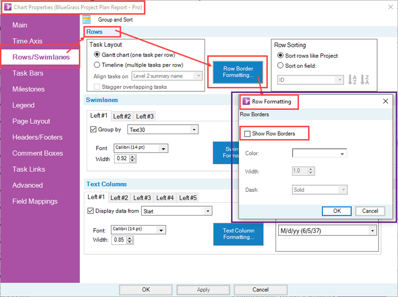
For most OnePager distributed Templates, the default setting for row borders are that they are hidden. As shown in the illustration above, the Show Row Borders checkbox in the Row Formatting form is checked OFF for this default setting. To show all row borders, the Show Row Borders checkbox must be checked ON which also enables the remaining controls in the form as shown below:
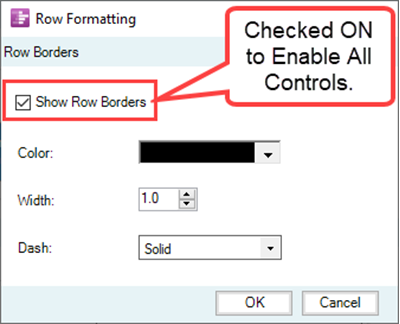
There are three enabled controls in the above form for setting the line color of the row borders in the chart, setting the width of the row border lines, and specifying the dash type for the row border lines.
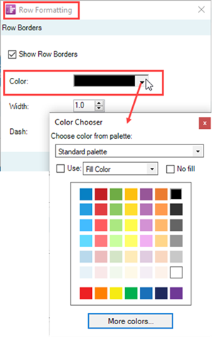
Clicking the Color: dropdown window’s button accesses the OnePager standard Color Chooser form for selected the desired color for all row borders as shown here:
The Width: dial operates the same way other width dials operate in OnePager where valid values must be positive and range between 1.0 and 20.0.
Recall that the Width: setting applies to all row borders in the chart such that excessively wide row border settings may not have the desired visual effect. Since row borders are used to separate rows in the chart, their width can be used to highlight separation between rows of interest.
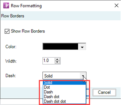
The Dash: dropdown provides four options for configuring all row borders in the chart including the solid line, dash line, a dash-dot, and a dash-dot-dot as shown below:
Row Border Formatting - Examples
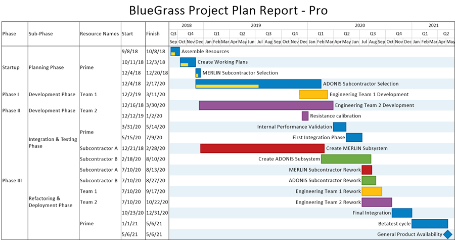
For some examples, we can look at a series of row border edits starting from the chart below with no row or swimlane borders but with the rows in the graph is zebra striped:
If we update the Row Border Formatting form to show row borders and show them in green with a width of 2.0 using the dash-dot-dot dash type, the chart looks like this:
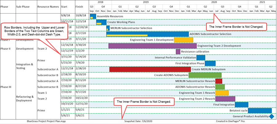
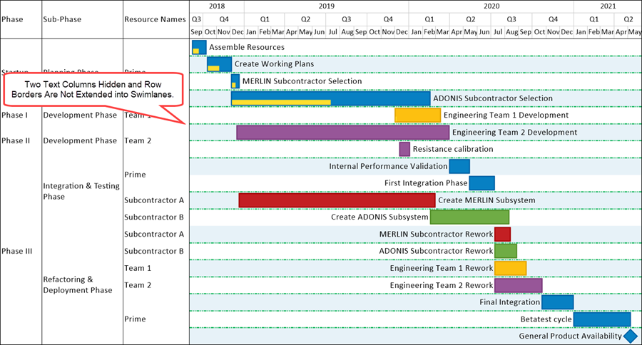
The illustration above shows the row borders as intended: (1) green color, (2) width 2.0, and (3) dash-dot-dot dash type. The row borders extend out of the graph area to the left and include top and bottom row borders for all showing text columns in the chart. Finally, row borders do not include the top or bottom lines that make up the Inner Frame of the chart. Hiding the two text column modifies the chart as shown below:
The Row Borders Formatting form can be used at any time to edit all row borders in the chart. Row borders are snapshot-independent meaning that the last row border configuration established for the chart appears in all snapshots. That is, the row borders do not change from snapshot to snapshot.
Managing Swimlane Level Borders in the Chart Properties Form
Like global row border controls, global swimlane level controls are found in the Template Properties and Chart Properties form’s Rows/Swimlanes tab in the middle Swimlanes control group. The controls for managing swimlane borders in these forms are identical so this article uses the Chart Properties form for the discussion and examples assuming that the charts used in the examples were created with the Template oriented toward Gantt chart layouts. The controls that apply to Gantt chart layouts apply equally well to Timeline layout charts containing rows and swimlanes either at a single swimlane level or multiple swimlane levels.
The Swimlane Formatting – Left#n Form in the Chart Properties Form’s Rows/Swimlanes Tab’s Swimlanes Control Group
Because there are three swimlane levels available, borders for each swimlane level can be managed separately for each swimlane level. Like row borders in the graph area, the controls for managing each swimlane level’s borders are found in the Swimlane Formatting – Left#n form accessed by clicking the Swimlane Formatting… button in the Swimlanes control group of the Chart Properties form’s Rows/Swimlanes tab. Accessing the Chart Properties form from the OnePager’s Home ribbon tool bar tab and navigating to the Rows/Swimlanes tab and its Swimlanes control group there is a Swimlane Formatting… button.
Clicking the Swimlane Formatting… button accesses the Swimlane Formatting – Left#1 form as shown in the example below for the Left#1 swimlane level:
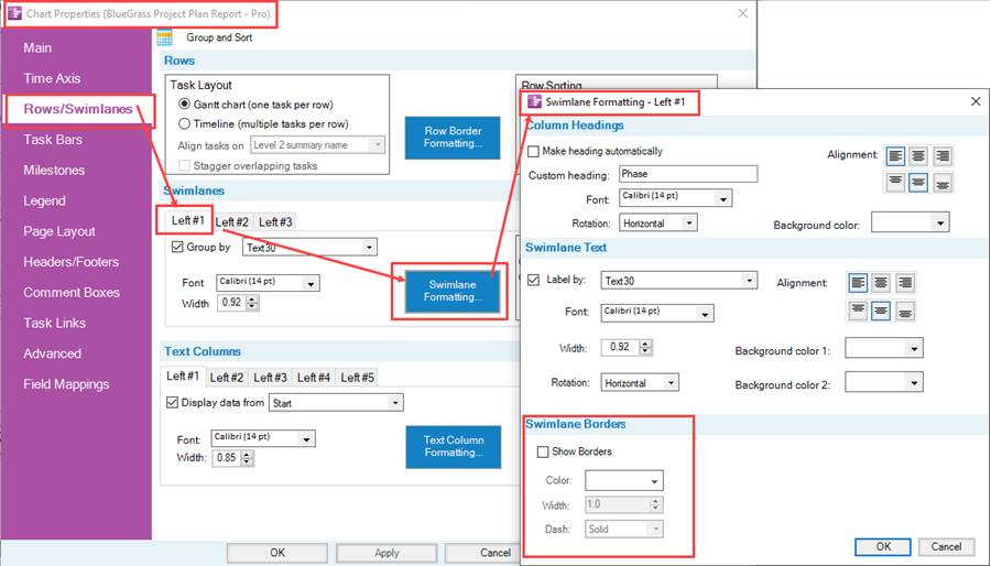
For most OnePager distributed Templates, the default setting for all swimlane level borders are that they are hidden. As shown in the illustration above, the Show Borders checkbox in the Row Formatting form is checked OFF for this default setting.
To show swimlane borders for a specific swimlane level, the Show Borders checkbox in the corresponding Swimlane Formatting – Left#n form must be checked ON which also enables the remaining controls in the form as shown below:
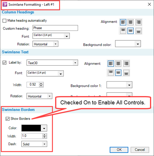
There are three enabled controls in the above form for setting the line color of the row borders in the chart, setting the width of the row border lines, and specifying the dash type for the row border lines.
For more information on these controls, please see the previous sub-section at: The Row Formatting Form in the Chart Properties Form’s Rows/Swimlanes Tab’s Rows Control Group
Swimlane Level Border Formatting - Examples
We can look at a series of illustrations for swimlane level border edits starting from the chart below with no row or swimlane borders but with the Left#1 swimlane level in the graph is zebra striped:
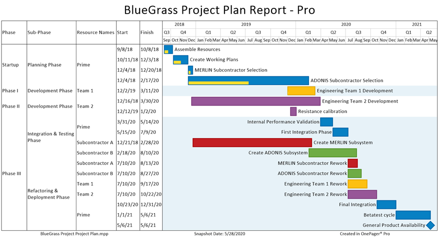
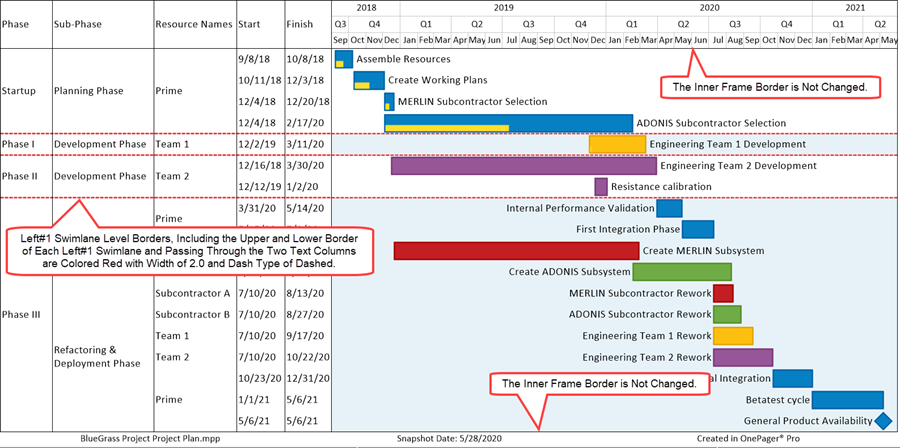
The above illustration shows that the zebra striping of the Left#1 swimlane level is helpful but to highlight the chart better we can first place swimlane level borders for the Left#1 swimlane level in the chart by resetting the appropriate controls in the Swimlane Formatting – Left#1 form to have Left#1 swimlane borders that are colored red, with a width of 2.0, and a dash type of dashed as shown below:
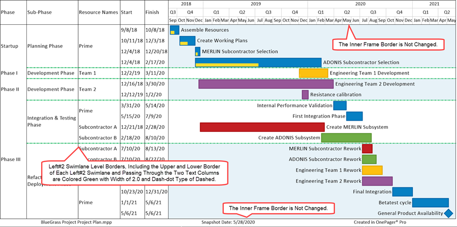
For the purpose of keeping the series of examples simple, and avoiding the matter of shared swimlane level borders, the next example show the chart with Left#2 zebra striping and with only swimlane level borders for the Left#2 swimlane level where the colored green, with a line width 2.0, and a dash type of dash-dot:
And finally for the Left#3 swimlane level, the illustration below is configured with Left#3 zebra striping, the Left#3 swimlane level borders are colored blue, with a line width of 2.0, and a dash type of solid:
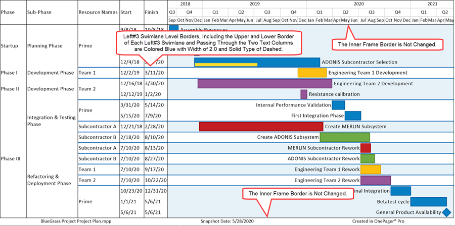
The examples and illustrations above show how swimlane level borders appear when shown in the chart individually and without any row borders showing. As mentioned earlier and seen in the above examples, there is a potential for overlapping swimlane level borders when more than one swimlane level has its Show borders checkbox checked ON and its swimlane level borders configured with distinct colors, line widths, and dash types.
Managing Row and Multiple Swimlane Level Borders in the Chart
With multiple swimlane levels potentially showing in the chart, there is the potential for row and swimlane level borders to share the same space in the graph, that is, to overlap. Displaying row and multiple swimlane level borders, therefore, may not result in a pleasing visual experience for your audience. Accordingly, we recommend that employing different colors, line widths, and dash types with rows and multiple swimlane levels in the chart be approached with some thought, care, and experimentation to assure you achieve the desired visual effects.
Manual Editing Row and Swimlane Borders
1) The previous sub-sections covered the controls for managing row and swimlane borders that are available in the Template Properties and Chart Properties forms.
2) From the Chart Editor you also have access to context menus that access forms and controls for managing row and swimlane borders.
Manual Editing Row and Text Column Cell Borders
Right-clicking in a text column cell accesses the text column right-click context menu shown below with its Properties… command where you can manage individual row borders:

When you click the Properties … command in the above right-click context menu, you access the Row/Column Properties form at the Row tab as shown here:
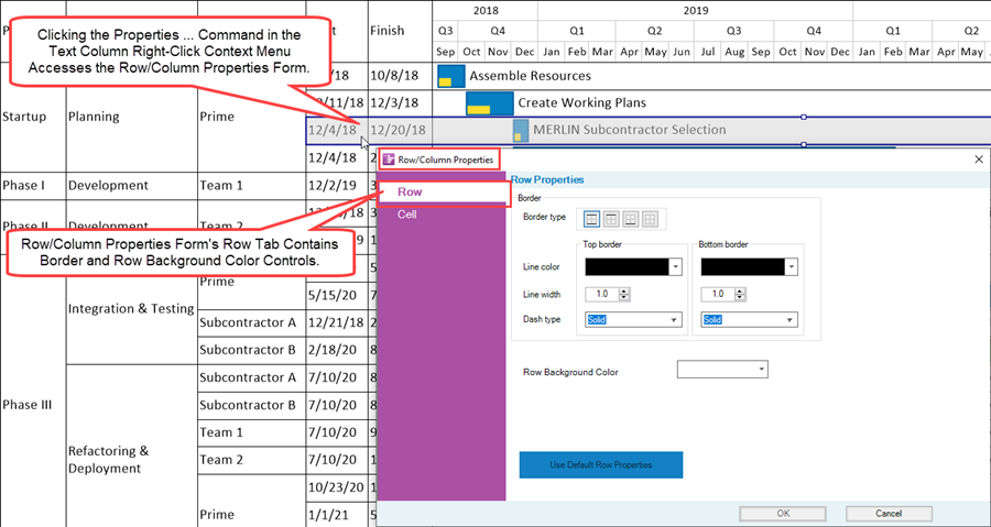
The Row tab of the Row/Column Properties form has the controls managing the top and bottom borders of the selected row as well as controls for editing the background color of the selected row. The Cell tab contains the controls available for formatting the selected text column cell’s text string, Font properties, Alignment, Cell Background Color, and Text Rotation as shown below:
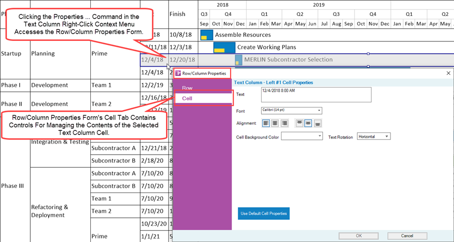
These two Row/Column Properties form’s tabs have the same controls available for row and text column cell editing on a selected row or text column cell basis as those controls available in the Template Properties and Chart Properties form’s Rows/Swimlanes tab.
For a more information on the text column right-click context menu commands available, please see the article at: Editing Row Properties
Manual Editing Swimlanes and Swimlane Level Cell Borders
Right-clicking in a swimlane level cell accesses the swimlane level right-click context menu shown below with its Properties… command where you can manage individual swimlane level borders:

When you click the Properties … command in the above right-click context menu you access the Swimlane/Cell Properties form at the Swimlane tab as shown here:
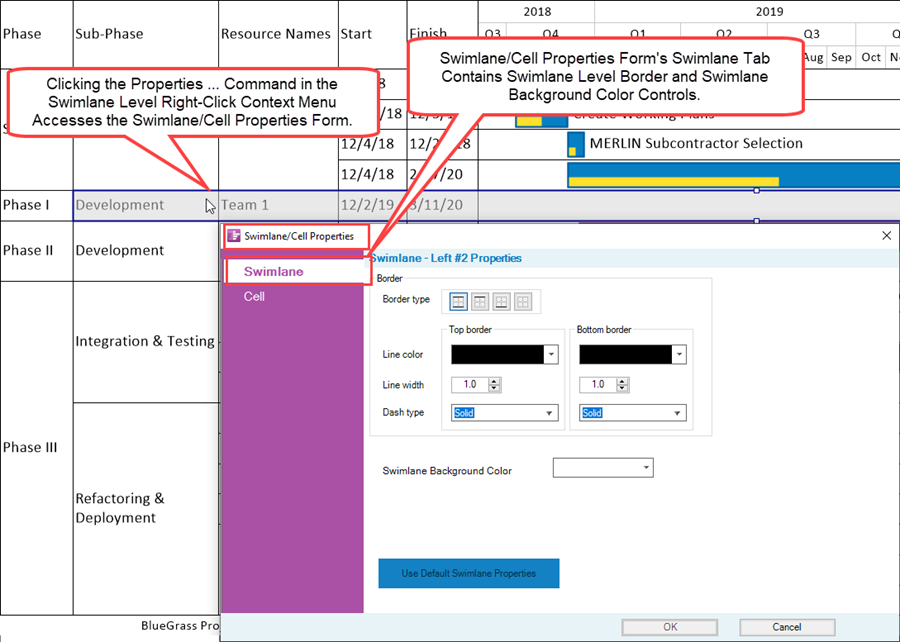
The Swimlane tab of the Swimlane/Cell Properties form has the controls managing the top and bottom borders of the selected swimlane as well as controls for editing the background color of the selected swimlane.
The Cell tab contains the controls available for formatting the selected swimlane level cell’s text string, Font properties, Alignment, Cell Background Color, and Text Rotation as shown below:
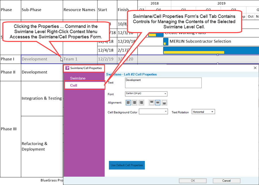
These two Swimlane/Cell Properties form’s tabs have the same controls available for swimlane and swimlane level cell editing on a selected swimlane or swimlane level cell basis as those controls available in the Template Properties and Chart Properties form’s Rows/Swimlanes tab.
For a more information on the swimlane level cell right-click context menu commands available, please see the article at: Editing Swimlane Properties
Related Links
Manual Editing Task/Milestone Shapes and Text Labels (Portal)
Creating and Editing Rows and Swimlanes (Portal)
Collecting, Formatting, and Sorting Task/Milestones into Rows
Creating, Formatting, and Sorting Swimlanes Levels
Creating and Formatting Text Columns
Editing Text Columns or Swimlane Labels
Zebra Striping for Rows and Swimlanes for OnePager Pro
Zebra Striping for Rows and Swimlanes for OnePager Express
Editing with the Chart Properties form (Portal)
Microsoft Project Fields Available to OnePager Pro
(12.04.1-70)
- Version 7.0
- Charts
- Templates
- Chart Properties Form
- Ribbon
- Editing a Chart
- OnePager - Tool Bar
- Task/Milestone Editing
- Rows and Swimlanes
- Multiple Swimlane Levels
- Text Columns
- Swimlane Labels
- Row/Swimlane Borders
- Labels
- Name Label Collision Avoidance
- Snapshots
- Snapshot Dependent/Independent
- Row Stripes
- Swimlane Stripes
- OnePager Pro
- OnePager Express