Editing Row Properties for Version 7.0
Contents
- 1 Overview
- 2 Accessing Rows for Editing Rows and Text Column Cells
- 2.1 Accessing the Row/Column Properties Form – Single Row and Single Text Column Cell Selection
- 2.2 Accessing the Row/Column Properties Form – Multiple Row and Text Column Cell Selection
- 2.2.1 CTL+Left-Click Method Used to Select Multiple Individual Rows
- 2.2.2 SHIFT+Left-Click Method Used to Select Multiple Sequential Rows
- 2.2.3 Using Slow Left-Click and CTL+Left-Click Methods to Select Multiple Individual Text Column Cells
- 2.2.4 Using Slow Left-Click and SHIFT+Left-Click Methods to Select a Sequence of Text Column Cells
- 3 Editing Row Properties with the Row/Column Properties Form’s Row Tab
- 3.1 Requirements for Editing Row Borders
- 3.2 Manually Editing Row Properties with the Row/Column Properties form’s Row Tab
- 3.3 Manually Editing Row Background Colors with the Row/Column Properties form’s Rows Tab
- 3.4 Manually Editing Text Column’s Background Colors with the Row/Column Properties form’s Cell Tab
- 3.5 The Use Default Row Properties Button in the Row/Column Properties form’s Row Tab
- 4 Editing Text Column Cell Properties with the Row/Column Properties Form’s Cell Tab
- 5 Related Links
Overview
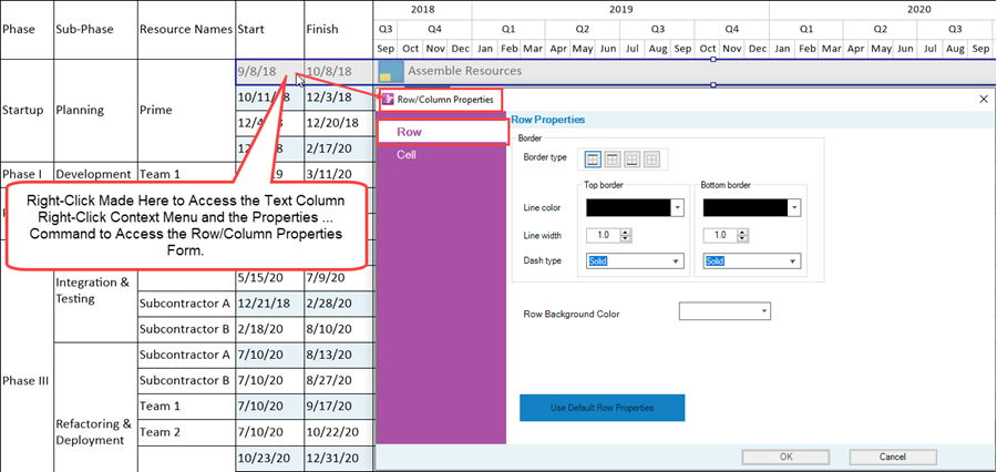
In addition to defining row and text column properties in the Template and in the Chart Properties form, you can select a specific row or text column cell and individually edit its properties. To do this, use your mouse to select a row or a text column cell with a right-click to access the text column right-click context menu as shown below:

In the illustration above, the Left#1 text column cell is right-clicked to select the row and the Left#1 text column cell and to access the text column right-click context menu. Clicking the Properties … command accesses the Row/Column Properties form’s Row tab shown below:
As an alternative, use the slow left-click selection method to select just the Left#1 text column cell, right-click to access the text column right-click context menu, and click the Properties … command where the Row/Column Properties form is accessed at the Cell tab as shown here:
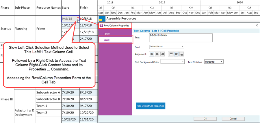
Either method in the above two illustrations allows you to access either tab of the Row/Column Properties form. The access methods described above in general terms for OnePager Pro applies to OnePager Express as well. Any edits made to a row or a text column cell using the Row/Column Properties form’s controls makes the row and/or text column cell a maverick.
In the Row/Column Properties form’s Row tab you can edit the border properties of the selected row, edit the selected text column cell’s background color (as described later on), and use the Use Default Row Properties button to revert any maverick rows back to their default settings. Multiple rows and text column cells can be selected and edited using the controls in the Row/Column Properties form.
When selecting multiple rows or text column cells, OnePager does allow selections in different text columns. This is different from attempting to make multiple selections swimlanes or swimlane level cells in different swimlane levels. Multiple row and text column cell selections can be made using the CTL+Left-Click method to select any text column cell defined and showing in the chart. Attempting to use the SHIFT+Left-Click method to select a sequence of text column cells in different text columns is not supported. Once you start a SHIFT+Left-Click selection in a text column you must continue the sequence of selections in that same text column.
This article describes the use of the Row/Column Properties form for the situations where one or multiple rows or text column cells are selected.
The next section covers the various methods for selecting rows for editing.
If you are comfortable with these selection techniques, you can jump to the article sections at the link where the controls in the Row/Column Properties form’s tabs are discussed: Editing Row Properties with the Row/Column Properties Form’s Row Tab
Accessing Rows for Editing Rows and Text Column Cells
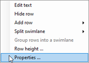
It may be necessary to edit the properties of a text column cell or set of text column cells for the purpose of highlighting them for your schedule discussion presentation. This can be done by selecting the desired text column cell or cells using the appropriate mouse left-click and/or right-click combination selection methods to access the text column right-click context menu and its Properties … command shown here:
This sub-section covers accessing the Row/Column Properties form using the available selection methods for rows and text column cells.
For more information on the selection methods available for rows and text column cells, please see the article and sub-section at: Selection Methods Available for Multiple Text Columns
Accessing the Row/Column Properties Form – Single Row and Single Text Column Cell Selection
Clicking the Properties … command when a row is selected accesses the Row/Column Properties form at the Row tab shown here:
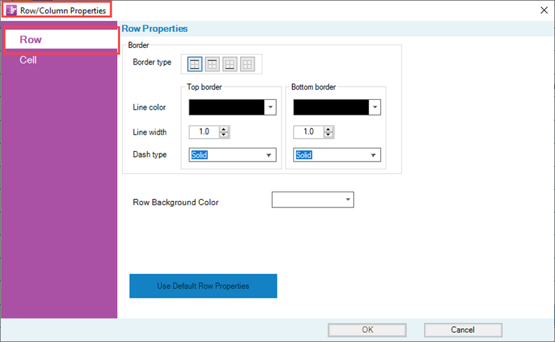
The editing controls available in the Row/Column Properties form’s Row tab are applied to all selected rows when the form’s OK button is clicked.
Accessing a Single Row
Using the above illustration as an example, the single row can be accessed as shown below:
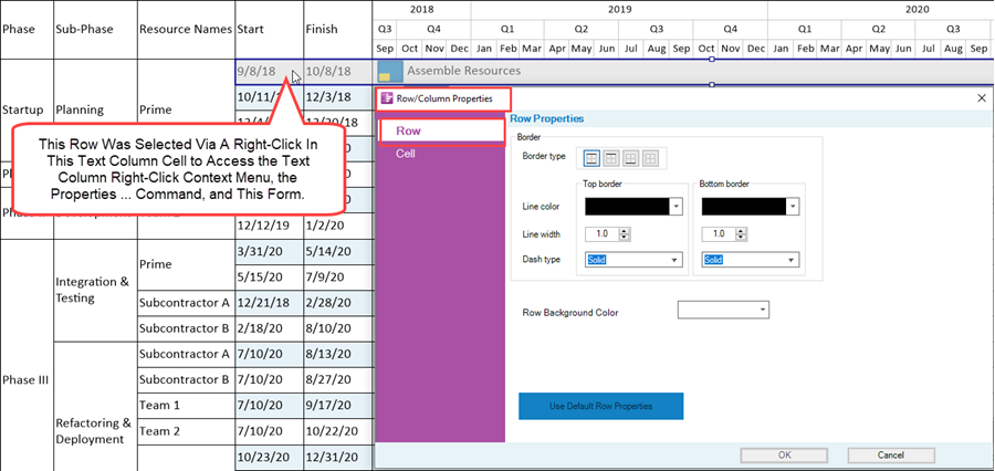
Once accessed, any edits applied to the Row may be applied to all text column cells defined and showing and the row portion extending into the graph. For example, if the Left#1 text column cell is used to access the Row/Column Properties form, changing the Row Background Color applies to the Left#1 and Left#2 text column cells as these text column cells are in the same row from the form’s perspective. The portion of the row in the graph area also takes on the selected row background color.
Making such an edit to change the Row Background Color to red changes the configuration of the chart to look like this:
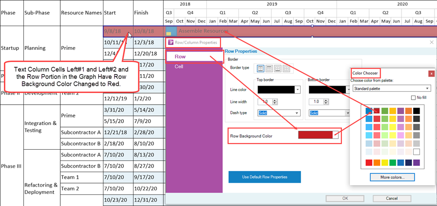
Regardless of which of the two text column cells is initially selected in the above illustration, the result shown above is the same. This is because text columns are not organized into levels as are swimlanes but remain a component of the row.
Accessing a Single Text Column Cell
Clicking the Properties … command when a single text column cell is selected accesses the Row/Column Properties form at the Cell tab shown here:
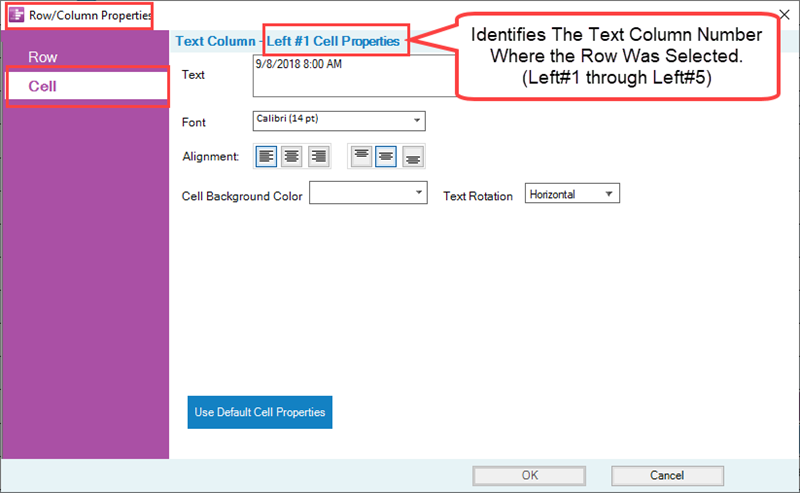
Use the slow left-click selection method to select an individual text column cell and follow the selection action with the method described above to access the Row/Column Properties form at the Cell tab as shown here:
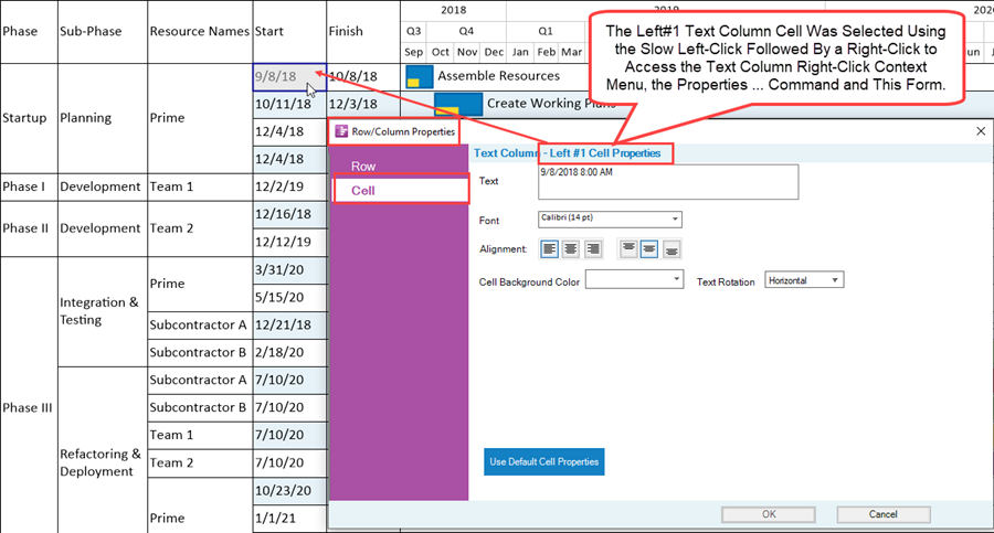
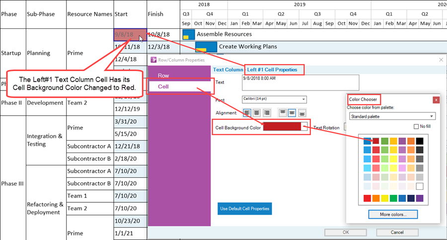
When a single text column cell is selected with the slow left-click method and the Row/Column Properties form is accessed at the Cell tab and the same edit as shown above is applied, only the Left#1 text column cell has its Cell Background Color changed to red as shown below:
Accessing the Row/Column Properties Form – Multiple Row and Text Column Cell Selection
You can select multiple swimlanes or multiple swimlane level cells as long as they are at the same swimlane level. However, no such restriction applies for selecting multiple text column cells in different text columns. The CTL+Left-Click or SHIFT+Left-Click selection techniques can be used to select multiple rows or multiple text column cells for editing using the Row/Column Properties form’s Row or Cell tabs.
For more information on the selection methods available for selecting multiple rows or multiple text column cells, please see the article and sub-section at: Selection Methods Available for Multiple Text Columns
CTL+Left-Click Method Used to Select Multiple Individual Rows
Multiple rows can be edited with the Row/Column Properties form’s Row tab as demonstrated below using the access method previously described:
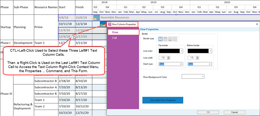
Edits made in the Row/Column Properties form’s Row tab are applied to all selected rows. Using the CTL+Left-Click is effective in selecting rows when done in either of the two text columns shown in the illustration above.
SHIFT+Left-Click Method Used to Select Multiple Sequential Rows
Use SHIFT+Left-Click method to select a sequence of rows for editing with the Row/Column Properties form as shown here:
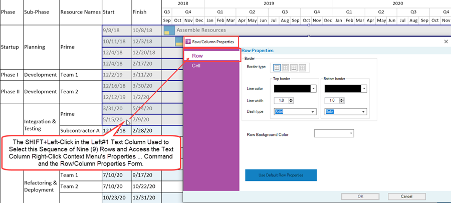
Edits made in the Row/Column Properties form’s Row tab are applied to all selected rows.
Using Slow Left-Click and CTL+Left-Click Methods to Select Multiple Individual Text Column Cells
Use the slow left-click method in conjunction with the CTL+Left-Click method to select individual text column cells in the same or different text column. The method involves first getting the mouse device into the slow left-click mode and then using the CTL+Left-Click method to select the desired individual text column cells as shown below:
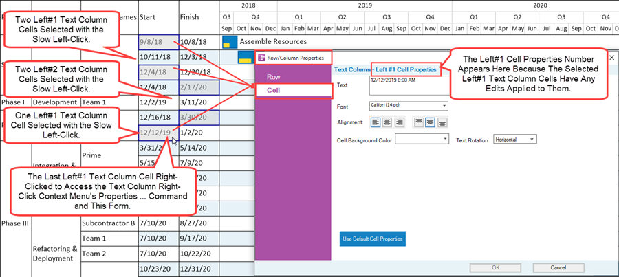
The illustration above purposely shows text column cells selected with the slow left-click method in both the Left#1 and Left#2 text columns. Note that the text column number showing the Text Column control group heading of the above form indicates that the Left#1 Cell Properties are the primary focus of the form. This is because in the illustration above, the right-click used to access the text column right-click context menu is made in the last Left#1 text column cell. Although you can select text column cells in any text column defined and showing in the chart, the edits only apply to those text column cells in the text column number showing in the form.
Once the several individual text column cells are selected, as shown above, a right-click in the last Left#1 selected text column cell accesses the text column right-click context menu. Clicking the Properties … command accesses the Row/Column Properties form’s Cell tab for the Left#1 Cell Properties where any edits that are made to the controls at the Cell tab apply to all selected individual Left#1 text column cells.
For example, we can change the Cell Background Color to red for the selected individual Left#1 text column cells by using the standard OnePager Color Chooser form as shown below:
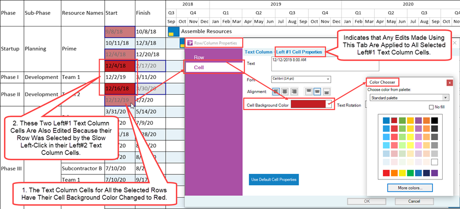
As specified, all selected rows have their text column cells edited such that their Cell Background Color is red. After closing the Row/Column Properties form, the chart looks like this:

Using Slow Left-Click and SHIFT+Left-Click Methods to Select a Sequence of Text Column Cells
Use the slow left-click method in conjunction with the SHIFT+Left-Click method to access a sequence of text column cells in the same text column. The method involves first getting the mouse device into the slow left-click mode and then using the SHIFT+Left-Click method to select the desired sequence of text column cells as shown below:
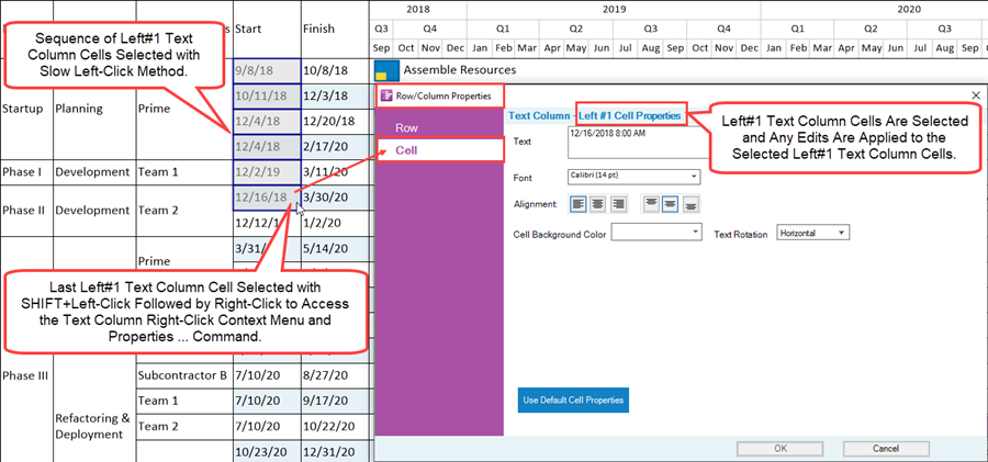
Once the sequence of text column cells are selected, as shown above, a right-click in the last selected text column cell accesses the text column right-click context menu. Clicking the Properties … command accesses the Row/Column Properties form’s Cell tab for the Left#1 Cell Properties where any edits that are made to the controls at the Cell tab apply to all selected individual Left#1 text column cells.
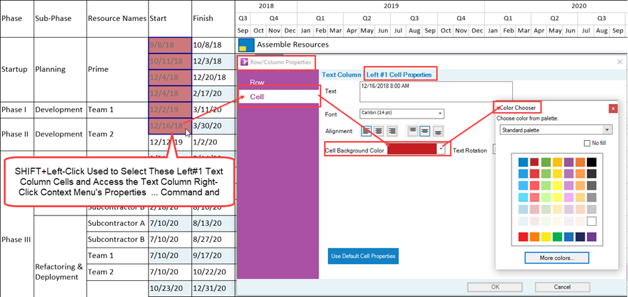
For this example, we can change the Cell Background Color to red for the selected sequence of Left#1 text column cells by using the standard OnePager Color Chooser form as shown below:
Editing Row Properties with the Row/Column Properties Form’s Row Tab
The Row/Column Properties form’s Row tab is shown below:

Requirements for Editing Row Borders
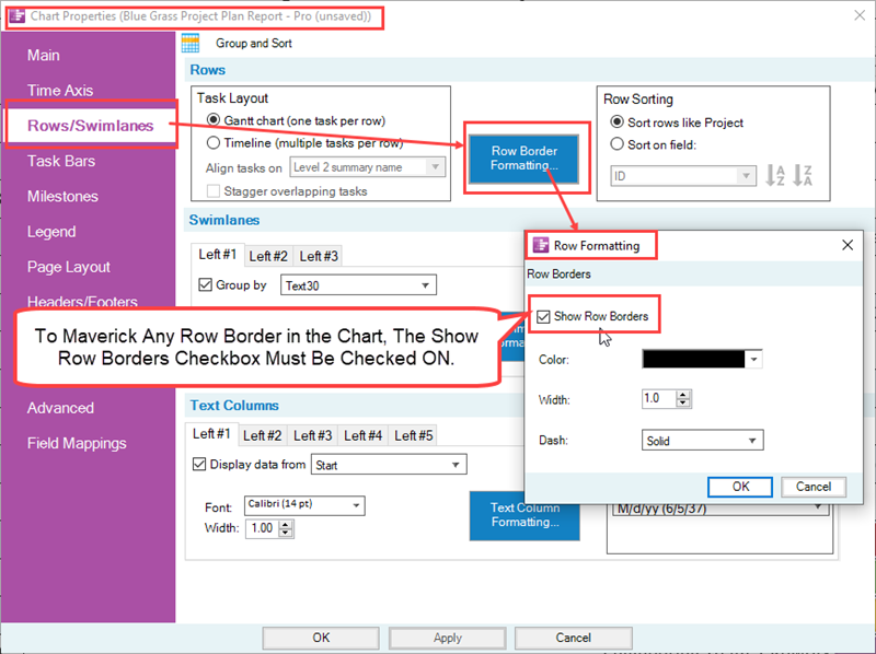
In order to edit row borders using the Row/Column Properties form’s Row tab, the Show Row Borders checkbox in the Row Formatting form, accessed from the Chart Properties or Template Properties form’s Rows/Swimlanes tab’s Rows control group must be checked ON as shown below:
If you intend to maverick some row borders but not all row borders, row borders can be hidden by accessing the Row Formatting form as shown above, then accessing the standard OnePager Color Chooser form, and setting the color for row borders to No fill as shown here:
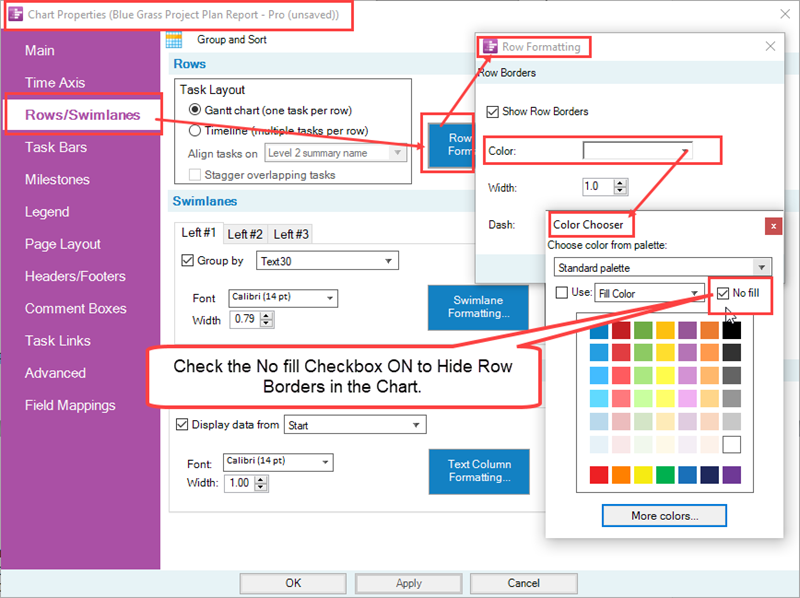
When these actions are taken, the row borders in the chart are reconfigured to look like this:

To further de-emphasize row borders, you have the option of removing the row striping using the controls in the Chart Properties or Template Properties form’s Main tab’s Chart Background control group. Additionally, if desired, you can remove all row borders from the chart which is the starting condition that is used below to demonstrate the mavericking of row borders using the Row/Column Properties form’s Row tab.
Manually Editing Row Properties with the Row/Column Properties form’s Row Tab
There are three control groups on this form for:
- 1) Border,
- 2) Row Background Color,
- 3) Use Default Row Properties button.
There are three sub-control groups in the Border control group shown at the top of this section. You have control over the selected row’s Border type, Top border and Bottom border colors, the Line width of the top and bottom border lines, and the Dash type for the top and bottom border lines.
Border Types for Row Borders
There are four border types available for use in the form. For the selected row or rows there are options for turning ON both the top and bottom borders, either the top or the bottom borders ON, or neither top nor bottom border ON. Any changes made to the global setting of row borders make the row or rows into a maverick.
Mavericking Border Types for Row Borders - Example
To provide an example, the sample BlueGrass Project Plan Report – Pro chart is modified globally to remove all row and swimlane borders as shown below:
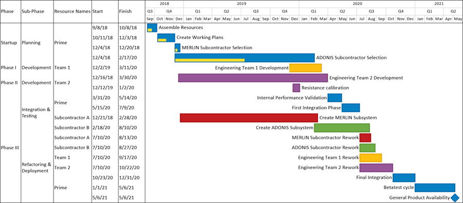
Recall that the Show row borders checkbox in the Row Formatting form referenced in the previous sub-section above, must be checked ON.
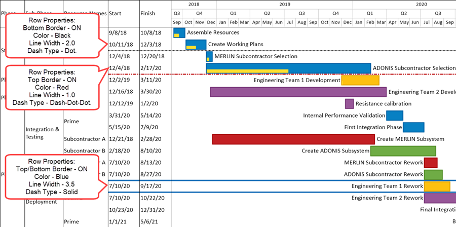
In the illustration that follows, we’ll maverick row borders as follows:
- The row with the Create Working Plans task bar is updated so its bottom border is turned ON with line size 2.0, Color Black, Dash type – Dot.
- The row with the Engineering Team 1 Development task bar is updated so its top border is turned ON with line size 3.0, Color Red, and Dash type – Dash-dot-dot.
- The row with the Engineering Team 1 Rework is updated so that its top and bottom borders are turned ON with line size 3.5, Color Blue, and Dash type – Solid.
When these maverick changes are applied to the individual elements mentioned above using the Row/Column Properties form’s Row tab, the chart is modified to look like this:
Manually Editing Row Background Colors with the Row/Column Properties form’s Rows Tab
The standard OnePager Color Chooser form is used the change the background color of the selected row or rows. Recall that with text columns in the chart, changing the background color for a Left#1 text column cell propagates the color change to the Left#2 text column cells (if present) and into the row itself as shown in the sequence below:
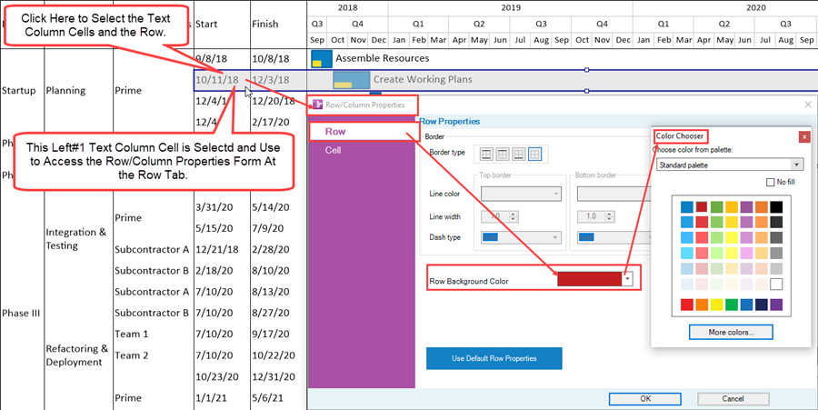
When the OK button is clicked on the Row/Column Properties form, the configuration of the chart is changed to this:

When the selected row is de-selected, the chart looks like this:

Manually Editing Text Column’s Background Colors with the Row/Column Properties form’s Cell Tab
Using the Row/Column Properties form’s Row tab’s Row Background Color control, changes the entire row to the new row background color. If you want to select a Left#1 text column cell and change just the Left#1 text column cell’s background color you must access the Row/Column Properties form at the Cell tab. This can be done by using the slow left-click selection method to just select the Left#1 text column cell or use a standard selection method on the Left#1 text column cell to access the Row/Column Properties form at the Row tab and simply click the Cell tab as shown below:
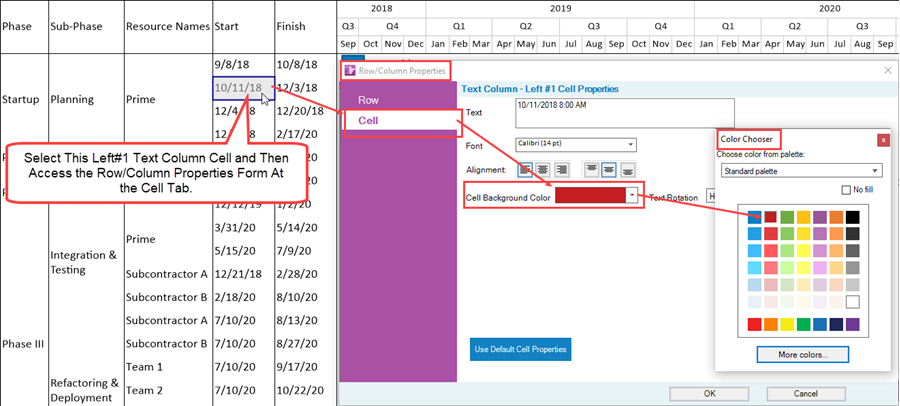
When the OK button on the Row/Column Properties form is clicked and the Left#1 text column cell is de-selected, the chart looks like this:

The procedure for changing the properties of the chart portion of the swimlane (i.e., to the right of the text columns) is explained in the Editing Swimlane Properties article at: Editing Swimlane Properties
The Use Default Row Properties Button in the Row/Column Properties form’s Row Tab
The purpose of the Use Default Row Properties button is to restore the selected row or row’s properties to the settings in the current Chart Properties form or Template Properties form. This is done by first selecting the row or rows that you want to restore, accessing the Row/Column Properties form at the Row tab and clicking the Use Default Row Properties button.
Note that the Use Default Row Properties button is enabled whenever a change is made to a row or row’s properties. As an example, suppose we start with the chart configuration where we mavericked a row by giving it a background color of red as shown below:

If we now select one of the row’s text column cells and access the Row/Column Properties form the chart shows the illustration below:
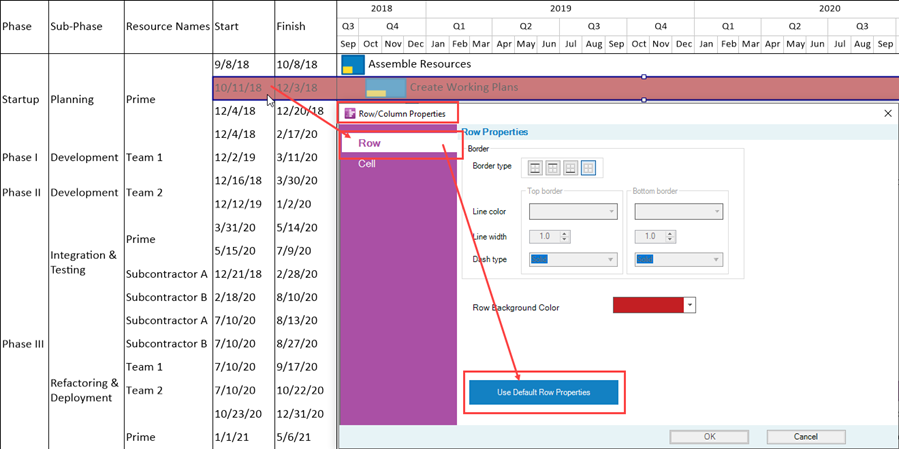
When the Use Default Row Properties form is clicked and the form is closed by clicking the OK button, the chart’s configuration changes to that shown below:

Editing Text Column Cell Properties with the Row/Column Properties Form’s Cell Tab
The Row/Column Properties form’s Cell tab looks like this:

The properties that can be edited in this tab include:
- The text within the selected text column cell,
- The text’s font properties,
- The horizontal and vertical alignment of the text within the text column cell or cells,
- The cell’s background color,
- And the rotation of the text column cell’s text.
Additionally, there is a Use Default Cell Properties button that can be used to restore any mavericked text column cell’s properties back to the global settings in the Chart Properties or Template Properties forms. Several of these controls such as the Text window, the Font control dropdown that accesses the Font properties form, and the two sets of three Alignment buttons are standard within OnePager. These controls perform the same editing functions as when used for editing the properties of text elements for graphic objects such as task bars/milestone symbols, comment boxes, time axis level cells, and vertical curtains.
Extensive examples are not provided here for the above mentioned controls.
Please reference the links in the related links section at: Related Links
Rather, the remaining focus in this sub-section is on the Cell Background Color control, the Text Rotation control, and the Use Default Cell Properties button.
Manually Editing Text Column Cell Background Colors with the Row/Column Properties form’s Cell Tab
Manually editing a selected text column cell or cells for background color requires that the text column cell or cells be individually selected with one of the appropriate cell selection methods. When the text column cell or cells are selected and the Row/Column Properties form’s Cell tab is accessed, then the standard OnePager Color Chooser form can be accessed by clicking on the Cell Background Color dropdown as shown below:
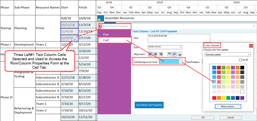
When the OK button on the Row/Column Properties form is clicked, the three selected Left#1 text column cells are reconfigured as shown here:

Recall that text column cell mavericking can only be done in the same text column so that selecting cells in different text columns to change their background colors for must be done on an individual text column basis.
Manually Editing Text Column Cell’s Text Rotation with the Row/Column Properties form’s Cell Tab
The Row/Column Properties form’s Cell tab’s Text Rotation control provides three different orientation of text contained within a selected text column cell or cells. You have the option to rotate text column cell text horizontally (the typical default setting), rotate text column cell text 90 degrees clockwise, and rotate text column cell text 270 degrees clockwise. The dropdown list for the Text Rotation control in the Row/Column Properties form’s Cell tab looks like this:
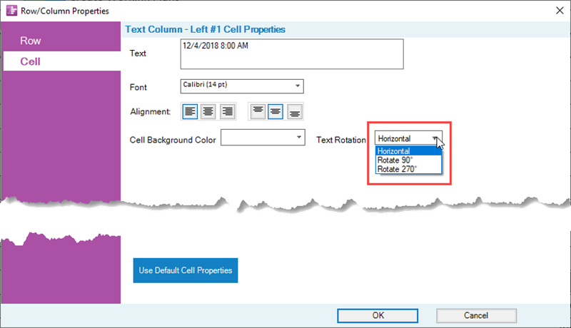
As an example, we can rotate the text 90 degrees in the Left#1 text column cell in the row containing the Create Work Plans task bar to get the configuration of text within the cell shown below:
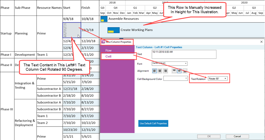
In the illustration above, the height of the row is increased to show the rotated text as a single string.
Text column cell text rotation is sometimes useful in order to help decrease the width of a text column and allow more horizontal space for the chart itself.
The Use Default Cell Properties Button in the Row/Column Properties form’s Cell Tab
The purpose of the Use Default Cell Properties button is to restore the selected text column cell or cell’s properties to the settings in the current Chart Properties form or Template Properties form. This is done by first selecting the text column cell or cells that you want to restore, accessing the Row/Column Properties form at the Cell tab, and clicking the Use Default Cell Properties button. Note that the Use Default Cell Properties button is enabled whenever a change is made to a text column cell or cell’s properties at a cell level.
As an example, suppose we start with the chart configuration where we mavericked the Left#1 text column cell to have a background color of red as shown below:

If we now select this Left#1 text column cell and access the Row/Column Properties form at the Cell tab, the chart shows the illustration below:
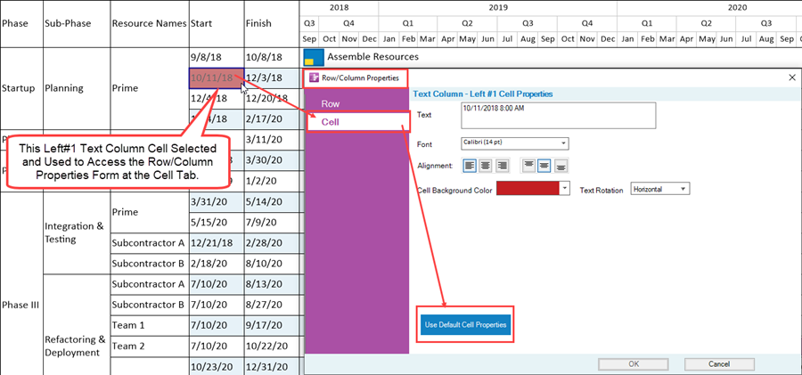
When the Use Default Cell Properties form is clicked and the form is closed by clicking the OK button, the chart’s configuration changes to that shown below:

Related Links
Manual Editing Task/Milestone Shapes and Text Labels (Portal)
Creating and Editing Rows and Swimlanes (Portal)
About OnePager's Rows and Swimlanes
Collecting, Formatting, and Sorting Task/Milestones into Rows
Creating, Formatting, and Sorting Swimlanes Levels
Creating and Formatting Text Columns
Editing Text Columns or Swimlane Labels
Manually Hiding and Unhiding Swimlane Levels
Resizing the Width of Text Columns and Swimlanes
Hiding and Unhiding Rows and Swimlanes
Making Each Row into a Swimlane
Zebra Striping for Rows and Swimlanes for OnePager Pro
Zebra Striping for Rows and Swimlanes for OnePager Express
Editing with the Chart Properties form (Portal)
(12.22.1-70)